
- NewsmagSmart list ads
- NewsmagIntroduction
- NewsmagMain menu
- NewsmagLogo & Favicon
- NewsmagHeader ads
- NewsmagSmart sidebar
- NewsmagSharing buttons
- NewsmagCategory tag on modules/blocks
- NewsmagBackground introduction
- NewsmagTheme colors introduction
 Bogdan B.
 Hi,
The top menu was hidden on mobile as a design choice but it can be activated through css. Please provide a link to your site so I can provide the proper code.
Thank you!
 Akif Hameed
Hi,
I’ve test here https://www.google.com/webmasters/tools/mobile-friendly/ , it says that my website is ‘not-mobile-friendly’. It has mentioned two reasons (i): Content wider than screen (ii): Link too close together.
I’ve checked my website thoroughly with robots.txt. Everything is good.
You can check the robots.txt file setting of my website from this link http://www.tycoonzfitness.com/robots.txt
I’ve allowed the googlebot-mobile but the test is not going to clear it.
Please let me know how to solve this issue, Either it’s problem with theme (updated) or something else.
Regards
 David
David I put $500 into the pot. All I’m looking for:
- Integration of DFP Doubleclick to the Newspaper theme (like the existing theme panel ad section for Adsense)
- Mobile responsiveness and seamless integration of the ads
- Maintained by Tagdiv
Who’s willing to call?
 BrunoBerlanga
Hi guys, I don’t know if this is a particular problem for me or it is a general bug.
It’s very hard to explain for me with my english so I’ll show you an image of the effect. The gallery works perfectly on vertical mode for smartphones but when you turn it to horizontal mode appears a shadow on the botton of the image but not at the end… It is like the sHadow cutS the botton of the image.

 Natasha
Hi,
Would you mind letting me know how we can display all menu options within the menu on mobiles as it only shows infomation on main menu. We would like to display all the menus we have in the mobile menu.
kindest regards
N
 sjlabar
 Thank you it works 🙂 is there any way to display blog layout on mobile phones and an ad after 3 posts ?
 Josan
Josan Do you want to show randome posts below the comment section like this? http://www.mysteryofindia.com/2016/04/awe-inspiring-shiva-temple-kakanmath.html
So here is guide:
1. create new page ( you don’t have to publish it)
2. Click backend Editer to use visual composer
3. Add Block 3 and select the options according to your preferences (like Title, category, Random posts or Latest posts)
4. After you finish adding the block click on Classic Mode to return on normal page
5. You will get a code like this [vc_row][vc_column][td_block_3 custom_title="" sort="random_posts" limit="3" ajax_pagination="infinite" ajax_pagination_infinite_stop="4"][/vc_column][/vc_row]
6. add PHP tag like this: <?php echo do_shortcode('your Visual composer code goes here'); ?>
7. Here is final code that we use on our site: <?php echo do_shortcode('[vc_row][vc_column][td_block_3 custom_title="" sort="random_posts" limit="3" ajax_pagination="infinite" ajax_pagination_infinite_stop="4"][/vc_column][/vc_row]'); ?>
8. Now you have to edit your SIngle_Template.php files. We are using template number 2,5,11 so We have added this code in these files. You can add this code in all the templates that you use.
9. Paste the code at end of file Single_template_##.php after this line </div> <!-- /.td-pb-row -->
and before this line: `</div> <!– /.td-container –>
</article> <!– /.post –>`
Thats it. it will work now.
Last thing add this code in Theme > Custom Code > Advanced CSS > Phones:
.td-pb-row {
    width: 100%;
    margin-left: 0;
    margin-right: 0;
}
It will fix some style issue in mobile phones.
-
This reply was modified 10 years by
Josan.
 George
Hi,
Please find below issues faced in Newspaper theme
i) while scrolling the header menu logo is messed with header menu items in list(Desktop Version)
URL: http://www.appztesting.com
ii) Disable menu in 404 Error page
URL: appztesting.com/jkdlfaldkjfla
iii) Mobile menu is messing with my contact form after feedback is sent
uRL: http://www.appztesting.com(Mobile version. Tested Device: Samsung Galaxy S4)
Steps to reproduce:-
i) Open menu in mobile version
ii) Click contact and submit with a dummy feedback
iii)The mobile menu is collasped
 themajiks
Hi.
The theme is awesome. Please tell me how to enable both the top menu and the main menu in the mobile responsive version? I want both the menus to appear there.
Thanks.
 cooolvita
Dear tagDiv
I’m sending this email as I’ve got a problem while using newspaper theme in Korea.
A location memory problem occurs when backing ajax pagination.
In case of setting ajax pagnation (Next prev ajax, Load more page, Infinite load), if click a “back” button after reading the newly loaded ajax pagnation post, the newly loaded ajax page becomes initialized and it becomes impossible to continue to read the page which I’ve been reading.
If ajax pagination is not used, it remembers its original location even if click a “back” button after reading the post.
But, if read a page which is newly loaded by a “Read more” and “Infinte load” and click a “back” button, it backs to the page location which is before “Read more” and “Infinte load”.
In case of PC, it doesn’t have a problem with Explorer, but the problem occurs when using with other browsers, such has Edge, Chrome, FireFox, and Opera.
But it also doesn’t occur on IOS. When clicking a “back” button, page refresh is not made by itself.
However, the biggest problem is all the browsers on Android doesn’t remember the location due to ajax pagination refreshing, and this causes a serious inconvenience for Android mobile users in using our website. Especially as most of Korea people use Android system, this is a very serious problem.
So I’d like to ask you how to fix this problem on Android mobile phone.
I know it would be simple if opening the post in a new window, but it will cause inconvenience for our users and they will not be willing to use the website.
Also, when uploading a feature image on a post, a big one is partially shown, while a small one is shown to be small, an I’d like to know if there is any solution to automatically adjust the size.
I look forward to hearing from you soon.
Thanks in advance.
Sincerely,
cooolvita
 durgatripathy
 Hi Andrei,
We dont have any plugin which can do so. The plugins we have are
All In One SEO Pack, All In One WP Security, AntiVirus, Easy FancyBox,
Google XML Sitemaps, OneSignal Push Notifications, Revolution Slider, Single Day Posts Export, tagDiv Social Counter, tagDiv Speed Booster, Visual Form Builder, WordPress Importer, WP Cloudy, WP Security Audit Log, WP Smush, WP Super Cache, WP-Mail-SMTP, WPBakery Visual Composer, Youtube Channel Gallery.
I dont think any of these plugins can cause this. I think may be its the google/yahoo ad we put is generating a automatic ad while in mobile browser. It will be good if you can confirm.
Our website – http://odishatv.in
Thanks in advance.
-
This reply was modified 10 years by
durgatripathy.
 sejpost
For some reason, safari is not showing images on my mobile phone (iphone 6). Works fine on the phone when I use Chrome or other browsers, but not safari.

How do I get the images to show up on a mobile phone using safari? The website address is: http://www.eCoronado.com
 Andrei L.
 Hi
I assume that you’re using a plugin to add that ad on the page as it’s not generated by theme’s spots. Also its html source don’t allow to target it with css from outside as it’s css is added inline: http://screencast.com/t/HbAKMMmdku0 You have to edit the plugin/script which generate the ad and change these rules for mobile devices.
To target only mobile devices use media queries:
@media(max-width: 768px){

//css code goes here;

.elemnt-css-clas{

display: none;

}

}
Thanks!
durgatripathyHi,
how to detect and disable the following ads. http://www.screencast.com/t/KUUclS3vbeBd
Its only showing on mobile view. The ad at the bottom stays sticky and its annoying. how to remove or disable it ?
Thanks!!
Andrei L. Hi
I assume that you tried to make the mobile menu active on tablets.
To achieve that it’s required a new function in theme’s js which will detect the tablet devices and will apply a specific style for the menu depending by the header style used. Basically you’ll need to rewrite all header style for tablet so the mobile menu to be displayed fine.
We didn’t make any testes to check how mobile menu will work on tablets and the theme don’t have any implementation for this feature. Unfortunately I can’t provide a solution now as the required customizations involve lot of time and also many tests. This new feature should be tested to work with all theme’s header styles on many devices and various browsers.
Thanks!
 whpro
whpro I believe it’s a mobile ad because when viewing the website on my tablet I see ads interjected between every other three headlines (hopefully you can view on a tablet to confirm ) and I believe those are the ad codes I want to edit. These ads can’t be seen on desktop.
If those suggested ads above, viewed only on my tablet, isnt the right one I was originally looking for please tell me where to locate them within WordPress because I can’t locate them.
whpro This ad company keeps telling me it’s not the same ad.. because when I edit the “custom area 3” section of our themepanel, I am told I was unsuccessful in wrapping the Ezoic ad code around that existing ad.
Furthermore if these ad codes were the same then the code seen below in the imgur image would look the same as the one I pasted below (found currently in the custom area 3 themepanel section)
This ad below is the code I’m searching for:
The code you’re referring to in our custom three are of the themepanel > ad area is the following:
<!– Ezoic – Sidebar 3 – sidebar –><div id=”ezoic-pub-ad-placeholder-104″>
<script async src=”//pagead2.googlesyndication.com/pagead/js/adsbygoogle.js”></script>
<!– below all/ tna/wwe news –>
<ins class=”adsbygoogle”
style=”display:block”
data-ad-client=”ca-pub-4793404262316174″
data-ad-slot=”3674627237″
data-ad-format=”auto”></ins>
<script>
(adsbygoogle = window.adsbygoogle || []).push({});
</script>
</div>
<!– End Ezoic – Sidebar 3 – sidebar –>
I believe the ad theyre trying to target is possibly a mobile ad, and I dont know where to locate it.
 Marto
MartoHello,
how can I create custom share button for page? I tried via Link but it doesn’t work on mobile and stays only on loading while trying to share.
How can I fix this?
Thanks!
 lighterside
Hi guys, I’m using one of your icons (the mail icon, [menu-contact]) for a menu entry. No written text for the entry, just the icon, which links to a opt-in form page.
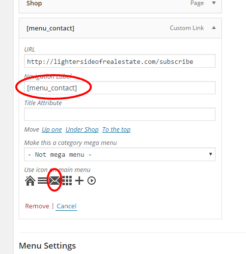
It displays and works correctly on desktop and tablet menus…But on mobile, it shows up as “CONTACT” with no mail icon.
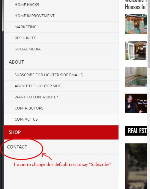
How can I modify the text that appears on mobile menu. I want it to say SUBSCRIBE.
Thanks!
 ben.hinc
Recently, Google released “Page-level” AdSense ads specifically for high-end mobile devices. It’s a single piece of code that’s added to the HEAD tag and then it can show both anchors and vignettes automatically.
I’ve implemented this code manually by editing Header.php and I’ve noticed different behavior of the ads in different mobile browsers.
Using Safari on iOS, the anchor ads (which are fixed to the bottom of the screen) pop up immediately. Using Chrome on Android, the anchors only appear when the page is scrolled all the way to the bottom. They remain when you scroll back up, but again, they only initially appear once the bottom of the page is hit.
Do you think this is a browser issue or maybe the theme is interfering with this new ad format?
Here is a link to more information about the new ads: http://adsense.blogspot.com/2016/04/AdSense-page-level-ads.html
Here are some screen shots showing the ads on our site: http://adobe.ly/239UtVt
Our site is located here: http://www.theapexracing.co/
Also, it would be great if this new ad format/location were added to the Theme Panel. Thank you!
 kepokorea
 Thank you for your attention.
I just realize, its just slow respond of the browser. Maybe just you said, there is a cache which store the previous script. Changing the script at the theme panel, need a time to effect for some browser, especially for the mobile device.
Thank you again for your attention. And i wonder….Wordpress already launch new update for the engine. Newspaper theme have no problem with new engine of WordPress right??And how to update visual composer?Is there any update for newspaper theme?
Regards,
kepokoreaDear Newspaper,
I have header ads problem using newspaper theme. Previously, i uses google adsense script as the advertising on the header. Now, i like to change with non google adsense advertising. I already changes through the newspaper theme panel on WordPress admin page. If i uses Windows OS PC, its look fine. My new advertising is show up in the home page. But, if i uses other OS like Linux or MacOS, the header ads still shows google advertising. Not the new one. It also happening if i use mobile device. You can try my website on http://www.kepokorea.com
Please your advise to address this problem.
Regards,
KepoKorea
Andrei L. Hi
I’ve made a few tests on my side and seems the there is a problem with play button on mobile. I’ve added this on our issue tracker and we will try to fix it in shortest time possible.
Sorry for the inconvenience.
Thanks!
Bogdan B. Hi,
Unfortunately the theme has no such option to change the position of the header ad on mobile, but different header styles provide different layouts. For example a header styles 2, 5, 6, 7, 8, 9, 10, 11 and 12 show the ad below the menu on mobile.
Thank you!
Andrei L. Hy
You can use this css in theme panel > custom code > custom css to hide more article pox on mobile devices: http://screencast.com/t/kQu6zk5n34gU
@media (max-width: 768px){

.td-more-articles-box{

display: none;

}

}
Let me know how it goes.
Thanks!
