- NewsmagSmart list ads
- NewsmagIntroduction
- NewsmagMain menu
- NewsmagLogo & Favicon
- NewsmagHeader ads
- NewsmagSmart sidebar
- NewsmagSharing buttons
- NewsmagCategory tag on modules/blocks
- NewsmagBackground introduction
- NewsmagTheme colors introduction
 idansx
 I followed your instructions exactly as you told me to do and it’s not working for me.
To be honest I don’t like this customization I think there are lots of modifications which are unnecessary. I just want to place my ad below the menu instead of above the menu on mobile view only, it should not be that complicated.
Also if you will look at your screenshot, on mobile view you have a huge space between the ad and the content and the ad is not 100% width.
 gouravgola
Hello, i have been working on mobile speed for my website for a very long time, i followed all the instructions to speed it up. since i changed my template to responsive on mobile, my earnings and pageviews has dropped significantly, that is probably because of slow load on mobile.
my point is, if on desktop my website is making 100 requests and page size is 1 mb then for mobile it will be same.. but where desktop load it easily mobile will take time to load it!
so here is where i am trying to work, i tried to install wptouch plugin to my website but it is not working with it, it is showing shortcodes at home page..i tried to search on forums for solutions but nothing worked for me.
i have been on ur forum for a long, you guys are pretty good and reply all of us, but you need to fix this issue, because people who buy your theme, expect that it would help them to enhance their revenue. no doubt your theme is awesome on desktop but it do killing revenue for people who get most of their traffic from mobile, like me, i have 75% mobile traffic and it killing my mobile revenue!
please take this issue seriously and come up with solution, as mobile traffic is increasing everyday!
please come up with solution for us or we will have to change the theme!
Thank you!
 JDF
JDF Yes. The display + font style is OK on mobile, but the font is still the default font on laptop.
 Alin [tagDiv]
 Hi,
You can try something like this: http://screencast.com/t/iypfdBseavb but you have to find a solution for tablets and mobile view, because you will have to make another custom modification.
.td-header-sp-ads{

width:470px;

margin-right:0px;

}

.td-header-sp-logo{

width:550px;

}
Hope this helps!
 HJKP60
 Thanks for your comments Emil.
It was happening before the W3 Total Cache plugin was added to the site.
I was hoping that the more direct controls options within might force the mobile browsers to fetch the latest version and provide a solution to the problem.
There are several plugins on the home page (Instagram, pinterest, facebook, twitter etc.) I am wondering if they might have some caching instruction in their code that is effecting the whole page when viewed in a mobile browser?
Thanks in advance for any further thoughts or ideas.
Best regards
Henry
 rnbjunk
 Hi Emil, when i load source of my site, i see a lot of codes coming from newspaper theme that actually i don’t use, and that are heaving codes on every page: view-source:http://www.rnbjunk.com/
<!– Style compiled by theme –>
<style>
.block-title a,
.block-title span,
.td-tags a:hover,
.td-scroll-up-visible,
.td-scroll-up,
.sf-menu ul .current-menu-item > a,
.sf-menu ul a:hover,
.sf-menu ul .sfHover > a,
.sf-menu ul .td-menu-item > a:hover,
.td-rating-bar-wrap div,
.iosSlider .slide-meta-cat,
.sf-menu ul .current-menu-ancestor > a,
.sf-menu ul .current-category-ancestor > a,
.td-404-sub-sub-title a,
.widget_tag_cloud .tagcloud a:hover,
.td-mobile-close a,
ul.td-category a,
.td_social .td_social_type .td_social_button a,
.dropcap,
.td-forum-category-title .td-forum-category-name,
.td_display_err,
.td_block_mega_menu .td-ajax-next-page:hover,
.td_block_mega_menu .td_ajax-prev-page:hover,
.post-via span,
.td_wrapper_video_playlist
.td_video_controls_playlist_wrapper
{
background-color: #6e61b0;
}
.block-title,
.sf-menu li a:hover,
.sf-menu .sfHover a,
.sf-menu .current-menu-ancestor a,
.sf-menu .current-category-ancestor a,
.header-search-wrap
.dropdown-menu,
.sf-menu > .current-menu-item > a,
.ui-tabs-nav,
.woocommerce .product .woocommerce-tabs ul.tabs,
.td-forum-list-head,
.td-login-panel-title
{
border-color: #6e61b0;
}
.widget_price_filter .ui-slider-handle,
.td_wrapper_video_playlist .td_video_currently_playing:after
{
border-color: #6e61b0 !important;
}
.author-box-wrap .td-author-name a,
blockquote p,
.page-nav a:hover,
.widget_pages .current_page_item a,
.widget_calendar td a,
.widget_categories .current-cat > a,
.widget_pages .current_page_parent > a,
.td_pull_quote p,
.page-nav-post a:hover span,
.td-forum-last-comment-content .td-forum-last-author,
.td-topics-title-details a,
.td-posted-in a
{
color: #6e61b0;
}
.woocommerce .button,
.woocommerce .form-submit #submit,
.widget_price_filter .ui-slider-handle,
.jetpack_subscription_widget input[type=”submit”],
.pp_woocommerce .pp_close,
.pp_woocommerce .pp_expand,
.pp_woocommerce .pp_contract,
.pp_woocommerce .pp_arrow_previous,
.pp_woocommerce .pp_arrow_next,
.pp_woocommerce
.pp_next:before,
.pp_woocommerce .pp_previous:before,
#bbpress-forums .button
{
background: #6e61b0 !important;
}
.woocommerce .woocommerce-message,
.woocommerce .woocommerce-info,
.bbp-template-notice,
.td-reply-list-header
{
border-color: #6e61b0 !important;
}
.woocommerce .woocommerce-message:before,
.woocommerce .woocommerce-info:before,
.td-login-button
{
background-color: #6e61b0 !important;
}
.buddypress #buddypress div.dir-search input[type=”submit”],
.buddypress #buddypress .message-search input[type=”submit”],
.buddypress #buddypress .item-list-tabs ul li.selected a,
.buddypress #buddypress .generic-button a,
.buddypress #buddypress .submit input[type=”submit”],
.buddypress #buddypress .ac-reply-content input[type=”submit”],
.buddypress #buddypress .standard-form input[type=”submit”],
.buddypress #buddypress .standard-form .button-nav .current a,
.buddypress #buddypress .standard-form .button,
.buddypress #buddypress input[type=”submit”],
.buddypress #buddypress a.accept,
.buddypress #buddypress #activate-page .standard-form input[type=”submit”],
.buddypress #buddypress .standard-form #group-create-body input[type=”button”],
.post-password-required input[type=”submit”]
{
background: #6e61b0 !important;
}
.buddypress #buddypress .groups .item-meta,
.bbp-forum-title:hover,
.td_login_tab_focus,
.block-mega-child-cats a.cur-sub-cat
{
color: #6e61b0 !important;
}
.page-nav .current,
.page-nav-post span
{
background-color: #6e61b0;
border-color: #6e61b0;
}
.wpb_btn-inverse,
.ui-tabs-nav .ui-tabs-active a,
.post .wpb_btn-danger,
.form-submit input,
.wpcf7-submit,
.wpb_default,
.woocommerce .product .woocommerce-tabs ul.tabs li.active,
.woocommerce.widget_product_search input[type=”submit”],
.more-link-wrap,
.td_read_more {
background-color: #6e61b0 !important;
}
.header-search-wrap .dropdown-menu:before {
border-color: transparent transparent #6e61b0;
}
.td-mobile-content .current-menu-item > a,
.td-mobile-content a:hover
{
color: #6e61b0 !important;
}
.category .entry-content,
.tag .entry-content,
.td_quote_box
{
border-color: #6e61b0;
}
.td-timeline-block-title {
background-color: #6e61b0 !important;
}
.td-timeline-wrapper-links {
border-color: #6e61b0 !important;
}
.td-timline-h1-link span {
background-color: #6e61b0 !important;
}
.td-page-title .td-search-query {
color: #6e61b0;
}
.td-sbig-title-wrap .td-sbig-title,
.td-slide-item-sec .td-sbig-title-wrap,
.td-big-grid-title .td-sbig-title-wrap
{
background-color: rgba(110, 97, 176, 0.7);
}
::-moz-selection {
background: #a093e2;
color: #fff;
}
::selection {
background: #a093e2;
color: #fff;
}
a, .widget_recent_comments .recentcomments .url {
color: #6e61b0;
}
.cur-sub-cat {
color:#6e61b0 !important;
}
.blog-stack .sf-menu .current-menu-item a,
.blog-stack .sf-menu .current-menu-parent .current-menu-item a,
.blog-stack .sf-menu .current-menu-parent > a,
.blog-stack .sf-menu > li:hover > a,
.blog-stack .sf-menu ul li:hover > a,
.blog-stack .td-post-text-content .more-link-wrap:hover a,
.blog-stack .sf-menu ul .td_mega_menu_sub_cats a.cur-sub-cat,
.blog-stack .sf-menu ul .td_mega_menu_sub_cats a.cur-sub-cat:hover,
.blog-stack .td-mega-menu .block-mega-child-cats a:hover,
.blog-stack .td_mod_mega_menu:hover .item-details a,
.blog-stack .sf-menu .current-menu-ancestor > a,
.blog-stack .sf-menu .current-category-ancestor > a
{
color:#6e61b0;
}
.blog-stack .sf-menu > .current-menu-ancestor > a,
.blog-stack .sf-menu > .current-category-ancestor > a
{
color:#6e61b0 !important;
}
.blog-stack .sf-menu ul li {
background-color: #6e61b0;
}
.blog-stack .td-post-text-content .more-link-wrap a:hover {
outline-color: #6e61b0;
}
a:hover,
.widget_recent_comments .recentcomments .url:hover
{
color: #ed4fef;
}
.td-menu-header .td-sp,
.sf-sub-indicator{
background-image: url(‘http://cdn.rnbjunk.com/wp-content/themes/Newspaper/images/header/elements-menu.png’);
}
@media only screen and (-webkit-min-device-pixel-ratio: 2),
only screen and (-moz-min-device-pixel-ratio: 2),
only screen and (min-device-pixel-ratio: 2) {
.td-menu-header .td-sp, .sf-sub-indicator{
background-image: url(‘http://cdn.rnbjunk.com/wp-content/themes/Newspaper/images/header/elements-menu@2x.png’);
}
}
</style>
<!– JS generated by theme –>
<script>
var td_blocks = []; //here we store all the items for the current page
//td_block class – each ajax block uses a object of this class for requests
function td_block() {
this.id = ”;
this.block_type = 1; //block type id (1-234 etc)
this.atts = ”;
this.td_cur_cat = ”;
this.td_column_number = ”;
this.td_current_page = 1; //
this.post_count = 0; //from wp
this.found_posts = 0; //from wp
this.max_num_pages = 0; //from wp
this.is_ajax_running = false;
this.header_color = ”;
this.ajax_pagination_infinite_stop = ”; //show load more at page x
}
var td_ad_background_click_link=””;
var td_ad_background_click_target=””;
var td_ajax_url=”http://www.rnbjunk.com/wp-admin/admin-ajax.php”;
var td_get_template_directory_uri=”http://www.rnbjunk.com/wp-content/themes/Newspaper”;
var tds_snap_menu=”snap”;
var tds_header_style=””;
var tds_mobile_swipe=””;
var td_search_url=”http://www.rnbjunk.com/search/”;
var td_please_wait=”Please wait…”;
var td_email_user_pass_incorrect=”User or password incorrect!”;
var td_email_user_incorrect=”Email or username incorrect!”;
var td_email_incorrect=”Email incorrect!”;
var tds_more_articles_on_post_enable=””;
var tds_more_articles_on_post_time_to_wait=””;
var tds_more_articles_on_post_pages_distance_from_top=”0″;
var tds_theme_color_site_wide=”#6e61b0″;
</script>
Woocommerce, Buddypress, are some example and stuff like that. I cannot disable them from the theme panel, i need to know how can i customize the theme so use only the things that are really important for my site, without codes of stuff that are not working on it.
Do you have a guideline to have a lighter version of the theme, in order to load only the essentials?
Fabian
 Emil G
 Hi,
It may be still related to W3 Total Cache, try to disable it and see if the site still delivers an old page on mobiles.
Thank you, Emil G.
Alin [tagDiv] Hi,
Please copy the code exactly how I gave it to you:
@media (max-width: 767px) {
#td-top-menu .sf-menu {
display: none !important;
}
.blog-stack #td-top-search{
right: -50px;
top: -75px;
}
.header-search-wrap .dropdown-menu {
left: -56px!important;
}
.header-style-3 .td-logo img {
width: 30px;
}
.category .td-page-title span {
font-size: 20px !important;
font-family: Vollkorn !important;
}
}
You forgot to close an } that’s why it bellow codes are apply on mobile.
Paste the codes in Theme Panel > Custom Css: http://screencast.com/t/ZLX09QoP
Thanks!
-
This reply was modified 11 years by Alin [tagDiv].
 neakriti
 1 and 2 remains a problem
My URL for my “test site” is http://mobile.neakriti.gr/neakriti2/index.php/main-page/
-
This reply was modified 11 years by
neakriti.
 nias
nias Hi, that works.
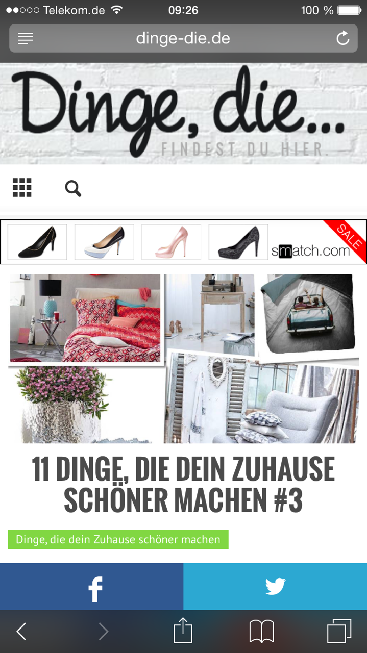
But now i recognized another Problem with the ads. The top ad works fine on the frontpage an on desktop. On other article / posts like this: http://www.dinge-die.de/dein-zuhause-schoener-machen/11-dinge-die-dein-zuhause-schoener-machen-3/ the header ad is not clickable on mobile devices.
http://www.dinge-die.de/wp-content/uploads/2015/02/IMG_9811.png Screenshot Iphone
Thanks a lot and kind regards!
 wagbrag
Hey
I added a revolution slider to the following post. http://wagbrag.com/rescued_shih_tzu_amazing_makeover/ . The slider works fine on my desktop but doesnt work on the IPhone. The slider come up and I see the navigation but the images do not work. Any suggestions.
I use cloudflare and I have purged my cache a few times.
Gerald
JDF Ok I see it. The font only displays on mobile because of the first code.
@media (max-width: 767px) {

#td-top-menu .sf-menu {

display: none !important;

}

.blog-stack #td-top-search{

right: -50px;

top: -75px;

}

.header-search-wrap .dropdown-menu {

left: -56px!important;

}

.header-style-3 .td-logo img {

width: 30px;

}

.category .td-page-title span {

font-size: 20px !important;

font-family: Vollkorn !important;

}
I tried to separate each with a <style></style> but it seems this is not the proper way to do it.
Sorry I’m such a noob !!
idansx I saw your screenshot from the mobile view and I really don’t like it.
I want it to look exactly as the mobile view of ‘header style 4’ and as you can see it’s not the same.
 jtbaker1971
I added a 60×60 logo for the mobile version and saved the settings in the theme panel but the mobile is still showing the main logo 300 px.
Here is the link to the mobile:
http://bestseattledayspas.com/wp-content/uploads/2015/02/mobilelogo.png
neakritiI have three problems so far in a new installation of newspaper theme
1) BigSlide leaves large whitespace… can you tell me why?
http://mobile.neakriti.gr/sandbox/problems/bigslide.jpg
2) Slide leaves spaces too
http://mobile.neakriti.gr/sandbox/problems/slide.jpg
3) selecting “Homepage with bg” as page template sets up the background, but leaves the big slide empty
http://mobile.neakriti.gr/sandbox/problems/slidebackground.jpg
Any help plz?
HJKP60 Hello Chris,
Thank you for the speedy reply
I have tested the same browsers on different similar sites and I do not get an older version.
For example:
I am visiting the page on mobile browser
I then make a text change
I then revisit the page using same browser and can see the change first time.
When doing the same on the site under discussion (http://www.brissi.com/blog) I cannot see the change until I refresh the page.
This make me think there is something about this site and theme that must be causing the issue? I think that there must be something that has changed that is causing this.
I am not sure what code advises a browser to look for a most recent version but is there anything within the theme that might have the potential to change that?
As before any thoughts, comments or solutions really welcome.
Thank you
Henry
HJKP60Recently noticed that when the site viewed in a mobile browser the page is stuck on an older version. It requires the viewer to refresh the page in order to see the latest version with the most recent posts. This is not something that was happening a few months ago.
Site is http://www.brissi.com/blog
Problem here is that many visitors might not know that this is required and presume the site is out of date. Not a good way to impress new visitors
I cannot see this discussed on tagdiv forum. Having looked around the web this type of problem seems to be discussed as a caching issue. However the site was not using any caching plugins.
We have installed W£ Total Cache which looked as if it would not only to improve page loading speed but has an actual option to disable caching for mobile browsers. Plugin is activated – but not using any CDN.
Caching is disabled for mobile by using the reject user agent feature (iPhone,Android and iPad have been listed)
Despite this when visiting home page using an Android or IPhone browser recent changes are not showing unless you refresh the page at which point the latest version can be seen.
What can be done to ensure that mobile visitors always see the latest version which has the most recent posts. What will force mobile browsers to get latest version? Ideally would like to have caching plugin on for all users as it seems boost load time speeds
Many thanks in advance. All comments appreciated.
Henry
Alin [tagDiv] Hi,
You don’t want to hide entire big slide on mobile view. If you want to show only big image from the slide please try this css:
@media (max-width: 767px){

.td-big-grid-post-1,.td-big-grid-post-2,.td-big-grid-post-3{

display: none !important;

}

}
Result: http://screencast.com/t/6i26EXXGmtU – http://screencast.com/t/uiJCSK7hUj
Thanks!
Alin [tagDiv] Hi,
You can use Header style 4, but this will place the header ad bellow the menu also on desktop view, but I think that you know that already.
If you don’t want that you can try some custom modifications, so if you think that you don’t use header style 3 you can edit like this: http://screencast.com/t/lkgEkz1PaI – http://screencast.com/t/j1vA42wVUx7
custom_ad_1
Make this change in header.php: http://screencast.com/t/3Ok7opMJBIZ
Disable header ad on mobile view: http://screencast.com/t/6vl70FnD8
Paste your ad code in Custom Ad 1 and enable it for mobile: http://screencast.com/t/X7sRpdrLrW9c
Result:
Desktop view: http://screencast.com/t/9ivDNcpghz
Mobile view: http://screencast.com/t/39Z68Lz8
Thanks!
-
This reply was modified 11 years by Alin [tagDiv].
 cengizs.com
Hi,
I have “https://forum.tagdiv.com/how-to-manage-the-mobile-theme/” problem.
Deactivated the Mobile Theme but no result.
Do you recommend another way?
PS.
I run Newspaper Theme and very happy with it. Thanks, you do great job.
Cheers,
Mr. Cengiz Saka
Alin [tagDiv] Hi,
2. Your inline ad is visible now: http://screencast.com/t/WlFfywVdNIiE
5. Google ad sense can be disabled from Theme Panel. You can try to find a plugin to display yours ads if you want to disable on mobile and tablets or hide it with css: http://screencast.com/t/h0flnhGxa
@media (max-width: 1024px){

.td-header-sp-ads{

display: none !important;

}

}
Thanks!
idansxI am using header style 1
I would like to put the header ad below the menu and not above the menu
How can I change this ?
 SeanR01
Hi,
I am having issues with using the insert google maps component. Adding a Google Maps component to a post and pasting in the Google Maps embed code displays fine on desktop but not on mobile/ipad. It just displays a grey empty box in Chrome or Safari on mobile where the map should be (Firefox is ok).
Here is an example page: http://velofocus.com/womens-races/preview/preview-womens-tour-of-new-zealand-2015/
Any idea what the issue is?
Thanks
Sean
 kirikovdan
 1) Solved with css edit.
2) I put, but still can’t see, and i need it in middle of each article. Bambinostory.com
3) Thanks, gonna try
4) Thanks!
5) If i try to disable head ad on mobile and tablet, it still visible on both.
-
This reply was modified 11 years by
kirikovdan.
-
This reply was modified 11 years by
 evreychik1