
- NewsmagSmart list ads
- NewsmagIntroduction
- NewsmagMain menu
- NewsmagLogo & Favicon
- NewsmagHeader ads
- NewsmagSmart sidebar
- NewsmagSharing buttons
- NewsmagCategory tag on modules/blocks
- NewsmagBackground introduction
- NewsmagTheme colors introduction
 ediwebroma
 Hi
unfortunately the solution he gave me doesn’t work.
inserting a 640 x165 Google AD sense display ad is fine in PC but in mobile it is cutted righjt and left
Fabrizio
 nimish1995
 I have the same issue, I have make a custom mobile page still the issue is the same.
Check my website https://techniblogic.com
 meri
meriHi,
On standard mobile menu & search (not AMP), how can I change the background color?
Also, how can I change the font colors of the items in the mobile menu (atm active is blue on black background)?
Thanks
 andreabacci7
 Got it, thanks!
Is there a way to save all my settings I’ve made on the mobile plugin, so in future I can quickly go back to the mobile plugin if I want to?
meriHi,
Could you kindly explain the benefit of Mobile Pages?
Because we can already set-up a mobile one in the composer by clicking on the mobile symbol. I mean, if a page (or a cloud template) is optimized for desktop, tablet and mobile, what’s the benefit of generating a mobile page?
Sorry if my question is dumb but I don’t get it (and I’ve been through your documentation but couldn’t find the answer).
NB : I do not use AMP and do not intend to use it.
Thanks in advance.
 Bettina
 Hello @andreabacci7!
If you deactivate the Mobile Theme plugin, then you will see the responsive version of your desktop. When you install again the Mobile Theme plugin , then you can see his own template/layout/design with the settings from Newspaper -> Theme panel -> Mobile theme.
A full explanation you can find here: https://www.youtube.com/watch?v=SpGkOnJeNZY
Thank you!
andreabacci7 Thanks for the exhaustive answer.
I just realised that I have no mobile page template, so that’s probably why I don’t see the page content when I use the mobile version.
I love the mobile plugin homepage, but I need to see my pages. The problem is that I didn’t figure out a way to recreate it using the mobile template, yet.
You suggested to deactivate the mobile theme plugin from the plugin page, I have a question about that: will I loose all my setting when I deactivate it?
Thank you very much, you have been incredibly helpful.
 alessandrogini1
 Hi there,
thanks for the reply.
What do you mean by mobile layout? the plugin?
 michaeldef
 Thank you, but I still don’t understand why the header is acting this way? COrrection: Misalignment happens in CHrome and Safari? I’m not exactly sure sure what to do to fix it as I don’t understand why it’s wrapping instead of not converting to the hamburger menu until it reaches mobile size.
-
This reply was modified 4 years by
michaeldef.
Bettina Hello @sylentears!
Please modify the width from your SVG code for mobile or you can change the width in the settings here: https://www.screencast.com/t/jX9b1Rkx
Thank you!
Bettina Hello @michaeldef!
I recommend you to edit every page with issues from our TagDiv Composer. These issues can be seen while editing with the TagDiv Composer on tablet viewport and mobile viewport:https://www.screencast.com/t/YUVUcyrgh; https://www.screencast.com/t/XDQJedlggSB
Also, the sticky header can be edited from the Website Manager, like in this video: https://www.screencast.com/t/l6v2Belt
Thank you!
 Anamaria
 Hello,
Did you add the element Mobile horizontal menu -> https://i.imgur.com/v8CrXpT.png in the top bar for header and set the menu?
I think you referring to the mega menu with categories and subcategories and page menu.
A mega menu with categories this can be with categories and subcategories like in this article https://forum.tagdiv.com/mega-menu/ for page menu please check this https://forum.tagdiv.com/page-menu/
Yes, you can edit the page with the tagDiv Composer and modify or delete the top bar: https://www.screencast.com/t/JombsN0wAIp
Thank you!
Anamaria Hello,
Using our theme you can choose from 3 mobile versions
-> mobile responsive => https://www.screencast.com/t/oJ2ShOp47
-> mobile theme plugin => https://forum.tagdiv.com/the-mobile-theme/
-> mobile page => https://tagdiv.com/newspaper-10-3-7-update-brings-customizable-and-fast-mobile-pages/
If you created the mobile pages with tagDiv Composer, then when you install the Mobile Theme plugin, your pages will be overwritten by the plugin (the mobile theme comes with its templates for page, post, category, etc so your current templates from the desktop theme will get converted to the mobile theme layout, the page content is made without builders in mobile editor => https://www.screencast.com/t/xbgZG8kH also, the options that are provided to edit the mobile theme version are limited (this keeps the things simple)).
This is a video about Responsive Newspaper Theme, AMP & Mobile Theme, Mobile Pages & Templates -> https://www.youtube.com/watch?v=SpGkOnJeNZY
So, the mobile responsive is what you see then that you select the viewport on phone => https://www.screencast.com/t/matV17hH, so some settings may apply for each viewport(where is the border blue), and others are not(where the border is black).
The mobile page has the mobile templates from Cloud Library => https://www.screencast.com/t/YCcZ8rL8
Mobile responsive version of the theme and the mobile page editor can be edit with tagDiv Composer, the mobile theme plugin not.
For example, you can have the mobile theme plugin activate and use the mobile page/mobile responsive version for the homepage/pages, but for the categories pages/404 page you can’t use the mobile page/mobile responsive version if you have the mobile theme plugin activate.
So, if you want to design the pages with tagDiv Composer, you can use the mobile page or mobile responsive version.
Better deactivate the mobile theme plugin and see the results, and assign the mobile page for page, like this => https://www.screencast.com/t/lektAhyjd
Also, clear your cache.
Hope this helps you!
Thank you!
Anamaria Hello @terahlynn,
I’m sorry to hear that, but can you give me more details on what problems you encountered when trying to install a prebuilt website?
Also, for the logo please let me know if you have installed the mobile theme plugin, if yes, then you need to add the logo in Theme Panel -> Mobile Theme -> Header https://i.imgur.com/xLy7CWY.png
Also, if you use a responsive or mobile page, please check those articles
-> https://forum.tagdiv.com/add-logo-newspaper/
-> https://tagdiv.com/newspaper-10-3-7-update-brings-customizable-and-fast-mobile-pages/
This is a video about Responsive Newspaper Theme, AMP & Mobile Theme, Mobile Pages & Templates -> https://www.youtube.com/watch?v=SpGkOnJeNZY
Also, please us know what plugins you have installed.
Also, please provide some screenshots/video and the link to your website.
Please note the Support team is not 24/7 available. We answer the topics from Latest to Newest Monday – Friday from 08:00 AM to 05:00 PM GMT+2
Thank you!
andreabacci7On mobile the pages content doesn’t appear. This happen with or without mobile theme plugin.
I tried to create a page without using the tagDIV composer, but the problem remains.
I don’t understand what can be the problem.
 Tomasz Trasztok
I am very sad because the theme pannel in version: 11.4 does not have the same functions as in tutorial on YT (9.4).
Features such as:
– !!!! Header Style
– TOP BAR
– MAIN MENU
– LOGO FOR MOBILES
And much more…
Is it ok? is there any other way to change eg the header style?
michaeldefSite – https://bayarearegistry.com/
Pre-Built – Magazine Pro
Header – Living Pro
——————
My Main header doesn’t convert to the hamburger style when i reduce the size of the window until it reaches mobile (tablet?) size. Instead it adds a second line to the menu. I notice that Living Pro pre-built, which is the header I’m using, goes from single line to hamburger. Mine is single line to double line to hamburger. How can I make it go from single line to hamburger?
Note:
• It functions fine on the safari browser, problem is with Chrome.
• On Chrome, Top Header is a little cut off on both sides. Search barely accessible.
 Madalin
 I have same issue few days ago, I am not expert and I suggest you to wait answer from someone from the theme. But just try to uninstall plugins amp and mobile theme and then check your mobile if working 🙂
 terahlynn
I apologize for my ignorance here but I can’t get support to email me back and my site has been down and losing money for half of the day.
I successfully installed the pre-built site (not the one I wanted, just the only one that worked) and I was able to upload my logo, but when in mobile view it still shows the default site name from the theme.
I have tried to go into the cloud template editor, but it doesn’t even show that it’s there when I toggle to mobile view.
WP says this is a theme issue. I’m desperate for help here.
 vikasnangia
Your theme is very confusing when it comes to fonts. Here’s what we have done.
1. We set the fonts of every element in ever cloud template to Default Font.
2. We set all fonts in Theme Panel -> Theme font -> General to Poppins.
3. we set all fonts in Theme Panel -> Mobile theme -> Theme Fonts to Poppins.
4, Theme fonts -> USE GOOGLE FONTS set to OFF
5. Theme fonts -> USE GOOGLE FONTS ON MOBILE set to OFF
6. Theme fonts -> LOAD DEFAULT FONTS set to OFF
The expected outcome is that the site should show no font EXCEPT Poppins. However, the fonts are all over the place. Every page on our site still continues to show a mixture of poppins AND other fonts.
Please tell me what other setting is missing, or if this is a bug? Please be specific.
Idally, there should have just been a MASTER SETTINGS for all fonts, but that doesnt seem there.
 Jose
Jose Thanks, I understand, thank you for the video.
However, something is not right. I am trying to emulate the top menu (column in two, with mobile menu and logo). But it is impossible, there is no way to do it, what am I doing wrong?
The column always gives me 50%+50%, but I want 25% + 75%, just like the original mobile menu. Is it possible?
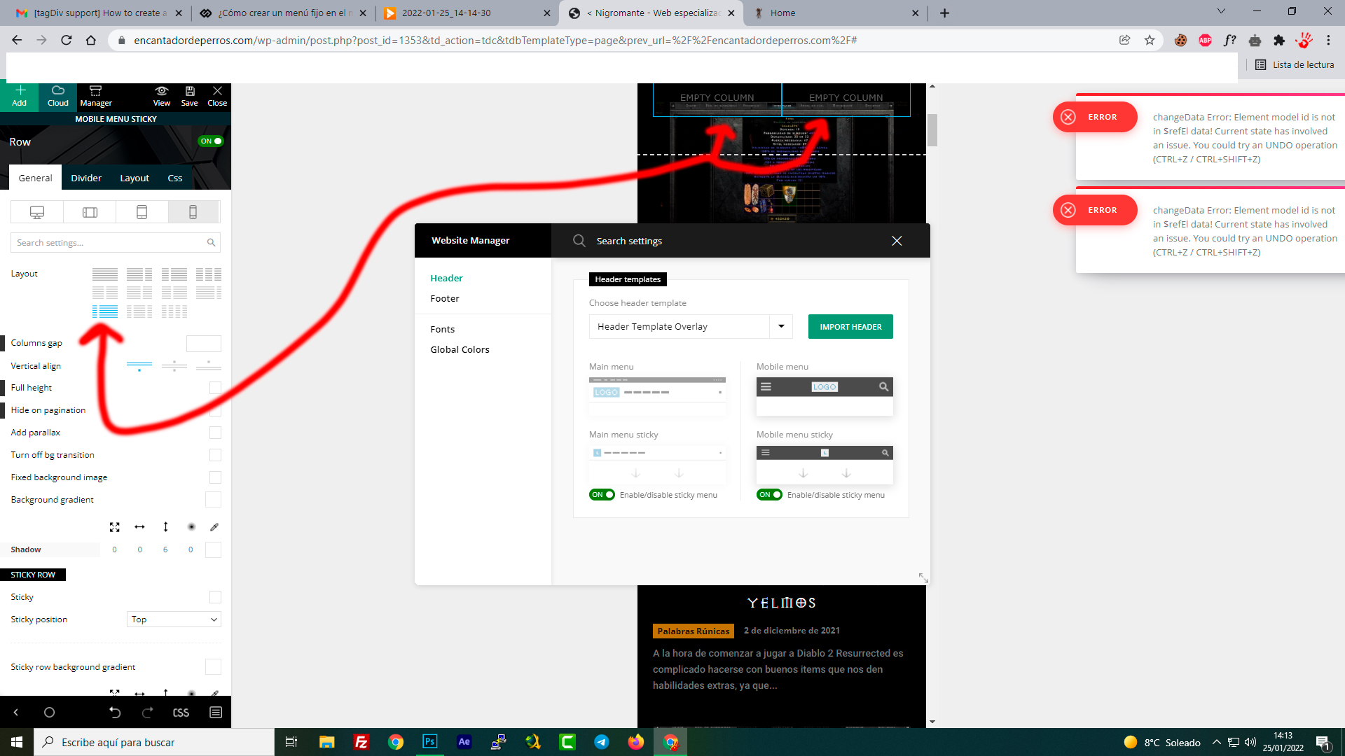
-
This reply was modified 4 years by
Jose.
Bettina Hello Jose!
Smart snap is the effect to let the sticky header to appear only when you scroll up.
Please follow the video to see where you can find, build your sticky header on mobile and desktop too: https://www.screencast.com/t/l6v2Belt
Thank you!
Bettina Hello Karen!
Ok, get it. This issue has been discussed already here, please check this topic: https://forum.tagdiv.com/topic/showing-all-topics-in-mobile-theme-categories/
Add the code and should display all the categories there.
Thank you!
Bettina Hello @Madalin !
1. Please try to add that code after line “# END WordPress” in .htaccess.
2. This issue has been discussed already here, please check this topic: https://forum.tagdiv.com/topic/mobile-speed-2/
3. I described here how the pop-ups works, please check: https://forum.tagdiv.com/topic/smart-pop-up-shortcode/
Thank you!
 kabbolig
 Hi Bettina,
it is the white boxes with black border in the screenshot: Boligpolitik, Byggeri, Drift, Fra KAB. Two-Three boxes are missing and I havent been able to locate where to expand the number shown in Mobile Theme.


