- NewsmagSmart list ads
- NewsmagIntroduction
- NewsmagMain menu
- NewsmagLogo & Favicon
- NewsmagHeader ads
- NewsmagSmart sidebar
- NewsmagSharing buttons
- NewsmagCategory tag on modules/blocks
- NewsmagBackground introduction
- NewsmagTheme colors introduction
 gpeter
 I am using the Mobile Theme on my site along with WP Rocket. However, where exactly can I configure WP Rocket to support the “mobile device” version when using the Newspaper Theme?
Thank you!
-
This reply was modified 1 year by
gpeter.
 dataconurbano
Hello,
I’d like to ask how I can modify the breakpoint at which the mobile and desktop headers switch.
Currently, the layout changes at 768px, but due to a long navigation menu, I’d prefer the switch to occur at 1400px.
Could you please let me know how to adjust this setting?
My test website is: https://dataconurbano.net/test/
Thank you in advance.
gpeter I had previously disabled the mobile theme on the LearnDash course page. Otherwise, the mobile theme works well on several posts and pages. I’ve tested this again. But when it comes to LearnDash course content (and lessons), I notice that the switch isn’t working. I’ve set it in LearnDash to ‘inherit’ the theme, but even after clearing the cache, the problem persists. I’ve deactivated the WP Rocket plugin, but there’s no change. I’m out of ideas. Is it possible to block the JS file with code? Or set it up in a different way to disable the mobile theme (on the course sites)? Any other suggestions?
Thank You!
 CeeN
CeeNHi, the menu on the mobile version of my website is not working. The page freezes when you click on the menu. Here’s the website. Please help.
 Calin
Calin Hi,
The rtl demo do not use any mobile theme, is use the responsive version, so all that is need is to install the rtl demo without any mobile plugin and the responsive eversion will be used.
Also, make sure that the theme requirements are set as mentioned in our guide https://forum.tagdiv.com/requirements-for-newspaper/ this will ensure that everything will work smooth.
Thank you!
 mazalzain
hello please i really need help into gettin g the same mobile theme same as the main rtl demo
 David
David Hi Calin,
Thanks for the clarification!
I’m using a Cloud Header but with the standard mobile menu, and your suggested CSS for the expanded subcategories works perfectly in this setup.
Also, your explanation regarding the social icons makes sense. Since I want to keep them on desktop but remove them on mobile, the CSS approach is exactly what I needed.
Appreciate the quick and helpful support!
Calin Hi,
If you are using the mobile theme plugin then you need to edit the article where you do not want to use the plugin and disable the mobile theme on that page/article https://i.imgur.com/dKjSnJl.png (this can be done only with Gutenberg editor) – https://forum.tagdiv.com/mobile-theme-introduction/
Also, when you are not using a responsive version for mobile you’ll need a cache that can deliver the mobile cache eversion separate on desktop cache version, right now on desktop for me is displaying the mobile version for me – https://i.imgur.com/3ek3Oop.jpeg
Thank you!
gpeterBasically, I am using the “Mobile Theme” plugin, but on LearnDash course description pages, for example, https://ajovokezdete.hu/lajk/mindennapi-pszichologia/, even if I disable the Mobile Theme on the editor page, it still loads according to the Mobile Theme.
How can I set it so that the Mobile Theme does not load on course description pages?
Thanks!
 jorronchi
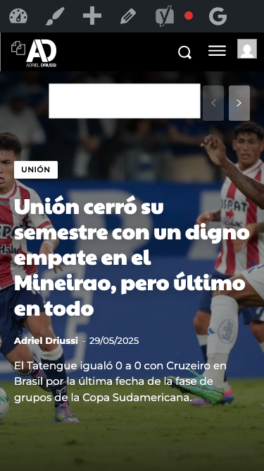
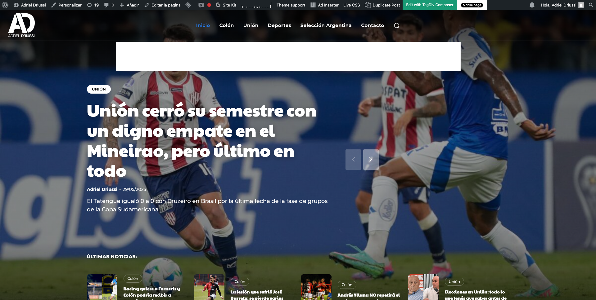
Hello, we would like to insert a banner that appears immediately after the header on https://adrieldriussi.com.ar/. Ideally, the banner should be placed above the featured image, both on desktop and mobile. I’m attaching images showing where we’d like to place the banner.
http://imgfz.com/i/4hW0nIe.png
http://imgfz.com/i/6c4byZN.png
We tried doing this through the Ad Inserter plugin but couldn’t find a way to insert the banner in the correct spot (I tested with different divs). Could you help me with this?
Thanks!
 AngelCodonRamos
Hi. Is there any way to remove the registration buttons and logic, for example in mobile menus, if you don’t want to offer account registration functionality to users? Because in mobile menus the register link/button always appears, and I don’t know where to configure it.
Calin Hi,
There is one left place where the socials are set, this is on mobile menu. I see that for mobile menu you have set a page in popup element, so you need to edit that page and remove the words from socials set there. = https://forum.tagdiv.com/modal-popup/
Thank you!
Calin Hi,
From the theme panel > social networks you need to remove the social networks and this will remove theme from standard headers and mobile menu. But in case that you are using a standard header template and not a cloud then this method will remove the socials from both (desktop and mobile) versions. So, if you are using a standard header and footer then you’ll need to use the above css.
The expanded subcategories on mobile menu can be achieve on cloud header were you can use a popup element as mobile menu and you can create the mobile menu in a page using tagDiv Composer and you can use the element list menu, that one can be configurate to display by default the menu expanded. This can be done only if you are using a cloud header.
If you are using the standard header then you can try this custom css:
.td-mobile-main-menu .sub-menu {

  max-height: max-content;

  opacity: 1;

}

.td-mobile-content .td_mobile_submenu > a .td-icon-menu-right {

    display: none;

}
Thank you!
David Hi Calin,
Thanks for your reply!
Regarding the social icons in the mobile menu, you mentioned removing them via theme panel > social networks. Could you please clarify which exact setting disables them from showing in the mobile menu only? I would like to keep them on desktop (footer) but remove them from mobile menu.
As for the expanded subcategories, you mentioned it “should be working now” — does that mean there is now an option in the admin panel or menu settings to have subcategories expanded by default on mobile? Or is there a specific class, script modification, or menu setup required to enable that behavior?
Would appreciate a bit more detail on both points so I can implement the changes correctly.
Thanks again!
David
 plotwit-team
 1) Still issue with menu alignment and
subscription module
https://ibb.co/9myDSzcm
https://ibb.co/cSbw4Q2n
2) Also, another major issue in mobile view when click on hamburger icon it open the webstory instead of menu
https://ibb.co/h5RHqXW
Please help!
Calin Hi,
If you do not want any socials to be display in the mobile menu, then you can remove theme from the theme panel > social networks or use a custom css like this one:
.td-menu-socials-wrap .td-menu-socials {

    visibility: hidden;

}
The subcategories on menu should be working now, in the thread mentioned by you most probably it was a but or soothing like that – https://i.imgur.com/181eOem.png
Thank you!
 Alessandro
 Thank you as always, you’re truly an invaluable resource.
I cleared the cache and deactivated the SiteGround “Speed Optimizer” plugin, and now the image galleries are working perfectly on both the desktop and mobile versions.
I’ll now look into whether I can continue using the SiteGround plugin with different settings.
Have you encountered this issue before? Do you have any suggestions or best practices to ensure compatibility between Speed Optimizer and the Newspaper theme?
Thanks again, you’re amazing! 😊
Alessandro.
-
This reply was modified 1 year by
Alessandro.
Calin Hi,
This can be done if you are using a cloud header, edit it with tagDiv Composer and use the mobile horizontal menu element – https://i.imgur.com/oOdrVwU.png
Thank you!
Calin Hi,
Thank you for sharing the link. I checked the link and the mobile and desktop versions are using the webp version for images https://i.imgur.com/GDhoE04.png – https://i.imgur.com/46LC7DJ.png
Now the problem I see you have is on mobile were the LCP is on featured image – https://i.imgur.com/RCu2xhu.png here is a video guide that should help you to resolve this situation – https://www.youtube.com/watch?v=7w_MytYluo0
Thank you!
Calin Hi Vunt,
If you want to create mobile header and footer you can do it like this, make a mobile page (for example on homepage or edit one if you already have one) – https://i.imgur.com/zWv6Xiu.png – select the manager and convert header and footer – https://i.imgur.com/W6vZzee.png – https://i.imgur.com/KO9nFa0.png this option will convert one of the current header and footer you have.
Thank you!
Calin Hi,
I think that right no on mobile you do not have the responsive version of your website and I think that you are using the tagDiv Mobile theme plugin, this will change the layout and make it more simple.
It appears that your cloud header is empty, and the 2 top elements from the page (my account and subscribe).
My recommendation is to import the cloud header again from cloud templates – https://i.imgur.com/6LEylkO.png import the cloud header from the demo you have installed then just adjust it using the tagDiv Composer – https://forum.tagdiv.com/tagdiv-composer-tutorial/
Thank you!
DavidHi,
I have a couple of questions regarding the default mobile menu behavior:
Disabling the .td-menu-socials-wrap area:
Is there a way to disable or hide this section in the default mobile menu via the admin settings? If not, what would be the recommended method (CSS or PHP) to remove it cleanly without affecting other parts of the menu?
Expanded subcategories in the mobile menu:
I came across a thread from 2020 stating that subcategories in the default mobile menu could not be shown expanded by default, as they were controlled via JavaScript. However, I recently saw a demo that seemed to use the standard mobile menu and had the subcategories already expanded when the menu opened.
Has this feature been updated or made possible recently? If yes, how can I achieve the same behavior?
Thanks in advance for your help!
 zaildaar
i want to set the mobile main menu to full width. – https://prnt.sc/TcM_c1End6jq
 jakobe75
I have an icon loading on my mobile verison that allows for dark-mode switching and it’s directly over top of the ToTop button. Is it possible to move the button to a different position on the page for example, to the left or in the middle or even above my “dark-mode” icon?
thanks.
 vunt
vuntHello support,
I noticed that when editing Footer templates, there’s an option to “Create mobile template”, but when editing Header templates, that option doesn’t appear.
Is this normal behavior? Or am I missing something in the settings?
Thanks
Vunt