- NewsmagSmart list ads
- NewsmagIntroduction
- NewsmagMain menu
- NewsmagLogo & Favicon
- NewsmagHeader ads
- NewsmagSmart sidebar
- NewsmagSharing buttons
- NewsmagCategory tag on modules/blocks
- NewsmagBackground introduction
- NewsmagTheme colors introduction
 Calin
Calin Hi RENATO,
I understand that this situation is frustrating.
From what I can still see, the cache does not appear to be functioning correctly. Since I do not know the exact configuration or behavior of LiteSpeed Cache (and this is not a tested plugin), I cannot confirm whether the issue is directly related to that plugin, server-side cache, CDN configuration, or another caching layer. There are multiple possible factors involved.
At the moment, the mobile page you created with fewer blocks, smaller thumbnails, and more optimized content should normally provide significantly better mobile performance. However, because the dedicated mobile version is not loading, visitors are instead receiving the responsive desktop version, which is heavier and not fully optimized.
Unfortunately, there is not much more I can assist with from the support side. I have already provided all the recommendations and guidance available, even though performance optimization and PageSpeed improvements are outside the standard scope of support. We still did our best to help, despite the fact that the support period has not been extended for more than 8 years.
If you would like this issue to be investigated further and fully resolved, I recommend submitting a custom work request to services@tagdiv.com. Please include all relevant details and temporary wp-admin and cPanel access. The team responsible for custom services will review the situation and let you know what can be done, along with the associated costs.
Thank you for your understanding.
 PolishExpress
 Hi, thanks for the reply.
My question is not about thumbnails in Flex Blocks.
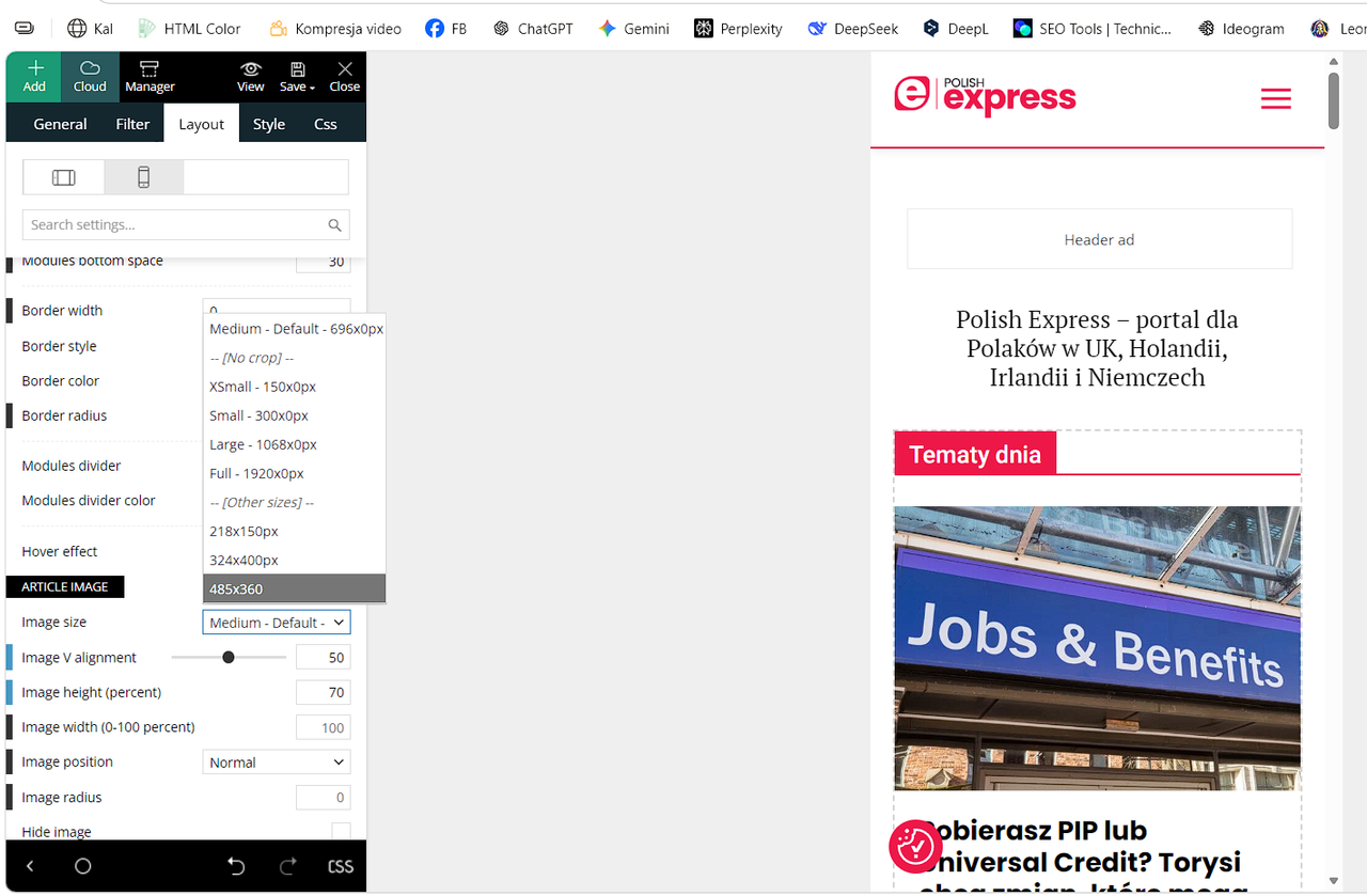
I am asking specifically about the Featured Image size in the Single Post Mobile Template.
Does selecting “Full – 1920px” in the mobile template include the full 1920px file in the HTML srcset? Or does the Mobile Theme generate its own srcset?
I need to know which setting guarantees that Google Discover sees an image ≥1200px in the HTML.
 RENATO
 @Calin, You know what’s happening, the theme is ignoring the post made for mobile (there’s a separate mobile theme), you can see it here: https://ibb.co/DgpbbLbT. It loads the desktop page on the phone, analysis: faint blue header and an ad like this (it’s for desktop), there’s no ad on mobile, the ad is only for desktop. Remember you told me to activate this? https://ibb.co/Rkjbv6bP It’s activated. Even so, the theme is loading the desktop theme on mobile, it doesn’t know how to separate them and isn’t separating them. The cache is correct https://ibb.co/JRVBbRqz it’s activated to generate mobile cache, look at this loading from https://ibb.co/TBT7jJLr, I mean, I did this last year, separate mobile theme, look at this https://ibb.co/x8c0yx07 everything is correct. I ask for a solution to fix this. You saw the performance is bad, horrible, because of this. I think the theme developer needs to create a plugin to redirect pages created on the mobile theme, so that when you open the mobile theme, you only open the desktop theme, and only the desktop theme, to avoid this mess. I’m asking for help; if you can’t help, talk to the person who created this theme and ask for guidance. I’m losing audience and rankings because of this.
PolishExpressHi,
I need clarification on how the image size selector works in Newspaper, especially when using separate templates for desktop and mobile (Single Post Desktop + Single Post Mobile).
Google Discover requires an image ≥1200px in the HTML.
However, the size dropdown (Medium 696, Large 1068, Full 1920, etc.) seems to limit the maximum size included in the HTML.
My questions:
If I select “Full – 1920px” in the mobile template, can mobile devices download the full 1920px file?
Some users report this happens when Mobile Theme or optimization plugins break srcset.
Does selecting Medium/696 or Large/1068 in the mobile template remove larger sizes from the HTML and srcset?
If yes, Discover cannot detect a 1200+ px image.
How does the Mobile Theme handle image sizes when a separate mobile template is used?
Does it override the desktop template or generate its own srcset?
What is the recommended setting for publishers who rely on Google Discover when using separate mobile and desktop templates?
Full/1920 or something else?
I need an official explanation of how this mechanism works so I can configure the theme correctly.
https://i.postimg.cc/Y9Cp6MwT/Zrzut-ekranu-2026-05-06-153554.png
Thanks.
RENATO I appreciate your suggestions and I will follow them. Thank you for reporting this issue to the theme developers. I hope they can fix it permanently in the next update, because mobile traffic is the most important. If it’s already like this on a VPS, I can only imagine how it must be for users on shared hosting.
I also forgot to mention that Google Fonts are significantly affecting performance. The theme depends on them, and they are adding about 37.8 KiB of render‑blocking resources in PageSpeed, as you can see in this screenshot: https://ibb.co/4H1PDGc
You suggested the OMGF plugin (https://wordpress.org/plugins/host-webfonts-local/). I installed it, but unfortunately it’s very limited and constantly shows messages encouraging you to upgrade to the Pro version to improve performance. The Pro version requires an annual payment.
I looked for alternative plugins, but most of them are also paid. My suggestion is something much simpler: please ask the theme developer to include an option to download and host the fonts locally directly within the theme, instead of depending on paid third‑party plugins. This would improve site speed and overall performance.
If you could also pass this suggestion on to the theme developer, it would help a lot.
Calin Hi,
I will forward this to our developers, and they will check it out.
Also, I want to let us know that using a mobile page/template will still load teh tagDiv Composer and cloud library (because those are used to create those pages and cloud templates for the mobile version). Normally, this option should be used when you need to have different content on mobile pages and mobile templates, maybe a smaller page with fewer elements, blocks, and for a different layout. Having the same layout and content will be better to use the responsive version, instead of the mobile page/template.
Here are a few additional recommendations you can try. For some users, all themes work without issues, while for others, only certain ones function properly. This can vary depending on the extra plugins in use, as well as any caching or optimization plugins installed.
-> Footer delayed load https://prnt.sc/FS34hBno40sx (under the theme panel > footer > footer delayed load)
-> MINIFY INLINE CSS and AGGREGATE INLINE CSS – https://prnt.sc/en14t6CQChM- (under the theme panel > block settings> inline css)
-> Don’t load on mobile/desktop, this option is only on the cloud header for HEADER MENU https://prnt.sc/udlAW4icvSPP on HEADER MENU STICKY https://prnt.sc/9pKnilQdWyex on MOBILE MENU https://prnt.sc/ff7fRQvTnaXt and on MOBILE MENU STICKY https://prnt.sc/Mm-4mbC4WB68
-> Flex Blocks cache – https://forum.tagdiv.com/use-flex-blocks-cache-option/
Also, it is recommended to use a good cache plugin and even Cloudflare (CDN)
Thank you!
RENATO Hello @Calin
I am writing to you after a deep technical audit that lasted two days, conducted by a Senior Infrastructure Engineer and Web Performance Specialist. We had to take this measure because our PageSpeed scores are stuck between 31% and 41% on mobile, despite running on a high-end VPS with persistent cache (Redis/Object Cache) and every possible server-side optimization.
Google has officially notified us regarding this poor performance, stating that our site is no longer a priority in search rankings due to failing Core Web Vitals. After a thorough investigation of the source code and database, we have pinpointed the root cause: The Newspaper theme is loading both Desktop and Mobile assets simultaneously on mobile devices.
Even with dedicated mobile pages (separate IDs), the theme “stacks” the entire desktop framework on top of the mobile one. This redundancy is killing our performance.
I need you to take this diagnostic to the tagDiv development team immediately. We need to know if and when a fix will be released. If this architectural flaw is not resolved, I will be forced to migrate to another theme or develop a custom one, as I cannot afford to lose my SEO ranking due to theme bloat.
Technical Diagnostic:
Problem: Mobile pages heavier than desktop pages
Date: 03/05/2026
Theme: Newspaper 12.7.5
Plugin: td-composer
Server: VPS Ubuntu — CyberPanel — LiteSpeed
CONTEXT
The site glostv.com uses the Newspaper 12.7.5 theme with the td-composer plugin and has a system of separate pages for mobile and desktop, where each version was built individually in the Newspaper visual editor (tagDiv Composer). The site owner reported that pages on mobile are significantly heavier than on desktop, even though there are separate and optimized mobile pages already built.
MOBILE SYSTEM ARCHITECTURE
The following pages were created as mobile templates inside the tagDiv Composer itself and are marked in the database with the flag tdc_is_mobile_template = 1:
ID 7584 — tv ao vivo Brasil (mobile version)
ID 7617 — POPULARES TOP (mobile version)
ID 8700 — Estados (mobile version)
ID 8872 — Homepage (mobile version)
ID 9944 — Política de Privacidade (mobile version)
ID 9948 — Termos de Uso (mobile version)
ID 10581 — Sobre Nós (mobile version)
ID 10597 — Política de Cookies (mobile version)
TECHNICAL PROBLEM IDENTIFIED
Problem 1 — td-composer loads assets WITHOUT any device distinction
Confirmed directly in the file:
wp-content/plugins/td-composer/legacy/common/wp_booster/td_wp_booster_functions.php
Line 362 — Composer JS loads for ALL devices:
add_action(‘wp_enqueue_scripts’, ‘load_js_composer_front’, 1000);
Line 430 — Full Newspaper CSS loads for ALL devices:
add_action(‘wp_enqueue_scripts’, ‘load_front_css’, 1001);
Line 744 — Full theme JS loads for ALL devices:
add_action(‘wp_enqueue_scripts’, ‘load_front_js’);
None of these functions have any device check. They load for both desktop and mobile equally, without any condition whatsoever.
Problem 2 — The mobile engine loads ON TOP of the desktop engine
Confirmed in the file:
wp-content/plugins/td-composer/mobile/functions.php
Line 149 — Mobile CSS loads ON TOP of the desktop CSS already loaded:
add_action(‘wp_enqueue_scripts’, ‘tdm_load_front_css’);
Line 173 — Mobile JS loads ON TOP of the desktop JS already loaded:
add_action(‘wp_enqueue_scripts’, ‘load_front_js’);
Line 184 — Mobile specific script loads ON TOP of all previous ones:
wp_enqueue_script(‘td-site’, TDC_URL.’/mobile/js/tagdiv_theme.min.js’);
Problem 3 — The flag tdc_is_mobile_template does NOT remove desktop assets
Confirmed in the file:
wp-content/plugins/td-composer/includes/tdc_state.php
Line 42:
private static $is_mobile_template = false;
Line 202:
public static function set_is_mobile_template($is_mobile_template) {
self::$is_mobile_template = $is_mobile_template;
}
This flag only serves to let the visual editor know it is on a mobile page. It does not execute any removal of desktop CSS or JS. It is purely an internal state variable with no effect on asset loading.
Problem 4 — Proof: Zero wp_dequeue for mobile anywhere in td-composer
I ran the following command directly on the server via terminal:
grep -r “wp_dequeue|deregister” wp-content/plugins/td-composer/ -n | grep -i “mobile|desktop|css|js”
The only result found was the removal of Visual Composer scripts in the backend administrative editor, not in the frontend. Throughout the entire td-composer codebase, there is not a single wp_dequeue_style() or wp_dequeue_script() instruction conditioned on mobile device detection in the frontend.
WHAT THE MOBILE BROWSER IS ACTUALLY DOWNLOADING
When a user accesses the site from a mobile device, the browser downloads all of this before rendering the mobile page:
From the desktop engine (which should NOT load on mobile):
Full legacy CSS of Newspaper
td-composer frontend JS (desktop visual engine)
tagdiv_theme.min.js desktop version
td-cloud-library CSS
td-standard-pack CSS
td-multi-purpose/style.css
Desktop version fonts
From the mobile engine (which loads ON TOP of the desktop):
Newspaper mobile CSS
tagdiv_theme.min.js mobile version
Mobile specific scripts
Fonts loaded again
The mobile browser is downloading the complete Newspaper framework twice. Once for the desktop layout that is discarded and once for the mobile layout that is actually used. This directly explains why mobile pages feel heavier and slower than desktop pages. DIRECT QUESTION TO SUPPORT
Does td-composer 12.7.5 have any native mechanism to remove desktop engine assets—specifically the functions load_front_css, load_js_composer_front, and load_front_js located in td_wp_booster_functions.php—when the page being served is already marked with tdc_is_mobile_template = 1 in the database?
If yes, in which file and on which line does this asset cleanup occur?
If no, when is the development team going to release an update to fix this? It is unacceptable that a high-end theme like Newspaper forces a mobile device to download the entire desktop framework AND the mobile framework simultaneously. My server-side analysis confirms that even when using dedicated mobile pages, the theme simply “stacks” assets instead of “swapping” them.
This redundancy is causing a massive performance overhead and killing our Core Web Vitals. We have separate pages for a reason, and the theme should NOT be loading desktop junk on a mobile-dedicated template. We need a clear position on when this will be resolved so that tdc_is_mobile_template = 1 actually triggers a wp_dequeue of unnecessary desktop resources.
 degelcreatives
 i deleted mobile popup madole how build back
 getnidhi.29
The mobile version I have designed is not showing in the page. When browsing it shows another page and there is a option in footer where it says “Exit Mobile Version” once clicked it shows the mobile version done by me. How to fix it.
Calin Hi,
Here are a few additional recommendations you can try. For some users, all themes work without issues, while for others, only certain ones function properly. This can vary depending on the extra plugins in use, as well as any caching or optimization plugins installed.
-> Footer delayed load https://prnt.sc/FS34hBno40sx (under the theme panel > footer > footer delayed load)
-> MINIFY INLINE CSS and AGGREGATE INLINE CSS – https://prnt.sc/en14t6CQChM- (under the theme panel > block settings> inline css)
-> Don’t load on mobile/desktop, this option is only on the cloud header for HEADER MENU https://prnt.sc/udlAW4icvSPP on HEADER MENU STICKY https://prnt.sc/9pKnilQdWyex on MOBILE MENU https://prnt.sc/ff7fRQvTnaXt and on MOBILE MENU STICKY https://prnt.sc/Mm-4mbC4WB68
-> Flex Blocks cache – https://forum.tagdiv.com/use-flex-blocks-cache-option/
Also, it is recommended to use a good cache plugin and even Cloudflare (CDN)
Thank you!
Calin Hello,
“Performance Optimization
Among the most anticipated features are options to minify and aggregate inline CSS of blocks, accessible directly from the Theme Panel. Additionally, you can now hide the mobile menu and mobile search functions, offering a cleaner user experience on mobile devices.” – here is how you can enable those options:
-> Footer delayed load https://prnt.sc/FS34hBno40sx (under the theme panel > footer > footer delayed load)
-> MINIFY INLINE CSS and AGGREGATE INLINE CSS – https://prnt.sc/en14t6CQChM- (under the theme panel > block settings> inline css)
-> Don’t load on mobile/desktop, this option is only on the cloud header for HEADER MENU https://prnt.sc/udlAW4icvSPP on HEADER MENU STICKY https://prnt.sc/9pKnilQdWyex on MOBILE MENU https://prnt.sc/ff7fRQvTnaXt and on MOBILE MENU STICKY https://prnt.sc/Mm-4mbC4WB68
-> Flex Blocks cache – https://forum.tagdiv.com/use-flex-blocks-cache-option/
“The Newspaper Theme has leveled up its performance by optimizing the Theme Panel’s color settings through CSS variables. Moreover, JavaScript files will only be loaded when they are needed, which should noticeably improve the website’s speed.” – yest this is apply as long you are using cloud tenmplates, so if you do not have the tagDiv STandard pack plugin in used (this is loading all css and js even if is not need), then it will load only the js and css that will be used on that page/template.
Also, it is recommended to use a good cache plugin and even Cloudflare (CDN)
Thank you!
Calin Hi,
I just made some checks using my mobile, unfortunately, I do not have an iOS, but I tested with 2 different Samsungs and it seems to be working without problems – https://prnt.sc/DKspiY6QYnxV
 haipo
haipoin Newspaper tagdiv template the share button to facebook is not working well in mobile It opens the facebook app but not sharing the post.
When using the desktop version it works well.
Please check this post in mobile – IOS:
https://haipo.co.il/item/623610
 nycinsider
My site is abysmally slow – but I’d like to work on the actual issues before I add a caching plugin. I’ve come across many speed articles and supposed Newspaper Optimization – but I can’t figure out what is current, or where any of things mentioned are.
https://tagdiv.com/newspaper-theme-unveils-comprehensive-update-v-12-6-what-you-need-to-know/
Performance Optimization
Among the most anticipated features are options to minify and aggregate inline CSS of blocks, accessible directly from the Theme Panel. Additionally, you can now hide the mobile menu and mobile search functions, offering a cleaner user experience on mobile devices.
The Newspaper Theme has leveled up its performance by optimizing the Theme Panel’s color settings through CSS variables. Moreover, JavaScript files will only be loaded when they are needed, which should noticeably improve the website’s speed.
What are the instructions for this? I have no clue where to click or what to do – AI lies constantly and makes things up. What is a step by step guide to gain the advantages claimed above?
https://tagdiv.com/how-to-increase-page-loading-speed/ – is this still accurate?
I’d love an updated step by step list on how to speed up newspaper before I add a plugin to do so.
Calin Hi,
I checked the website, and now you have H1 enabled on the logo for the sticky menu on both desktop and mobile – https://prnt.sc/G0OOnxzhOmtk – https://prnt.sc/WHBtt6ZWZC43. Disable one of them or both in case you want to use the H1 element on a different element.
Also, each flex block has SEO tag option so you can adjust the H you want for that block – https://prnt.sc/BbWoI66d5I4X even the mega menu element has it – https://prnt.sc/Wu97fyuxm-xT
 Spotahome
Hello,
We are currently working with your Newspaper theme and have encountered an SEO issue when defining headings.
We have a global header with a mega menu, in which we have explicitly specified that the titles should be of the type <p>
If you check the following URL:
– https://living.spotahome.com/
You can see that there are two H1 tags (another error) and quite a few H3 tags coming from the menu; these H3 tags, when checking the page’s source code, start at line 2276.
All the source code for the menu appears as <p>, but it seems to be duplicated in this area, and we can’t figure out why.
We also have an issue with the two H1 tags—we don’t know where they’re coming from, but there should only be one.
Here is the SEO heading structure, where there should only be one H1 heading, and the rest should be H2 headings. The H3 headings are an error in the structure, and we couldn’t find them.
<H1> Spotahome LivingBest info for expats in european cities
<H1> Spotahome LivingBest info for expats in european cities
<H3> Digital Nomad Starter Kit for Spain: Essentials to Set Up Fast
<H3> Erasmus+ in 2026: The Complete Guide for International Students Coming to Europe
<H3> Internet & Mobile Providers in Spain
<H3> Making Friends in Madrid: How to Build a Social Life Fast
<H3> Where to Live in Madrid in 2026: Best Neighborhoods
<H3> Barceloneta Beach Life: What Living by the Sea in Barcelona Is Really Like
<H3> Digital Nomad Starter Kit for Spain: Essentials to Set Up Fast
<H3> Barcelona Metro Guide: Everything You Need to Know Before You Ride
<H3> Erasmus+ in 2026: The Complete Guide for International Students Coming to Europe
<H3> L’Eixample: Barcelona’s Modernist Architecture District
<H3> Your First Week in Valencia: What to Do and What to Set Up
<H3> Common Mistakes New Tenants Make (and How to Avoid Them)
<H3> Erasmus+ in 2026: The Complete Guide for International Students Coming to Europe
<H3> The ultimate rental guide to Living in Valencia in 2026
<H3> Universities in Valencia: Complete Guide for International Students
<H3> Common Mistakes New Tenants Make (and How to Avoid Them)
<H3> Erasmus+ in 2026: The Complete Guide for International Students Coming to Europe
<H3> Erasmus+ in 2026: The Complete Guide for International Students Coming to Europe
<H3> Your First Week in Milan: What to Do and What to Set Up
<H3> Milan Design Week Guide, what to see, events, and tips for visitors
<H3> Living in Milan in 2026: The Complete Guide to Relocating
<H3> Your First Week in Berlin: What to Do and What to Set Up
<H3> Berlin Nightlife and Culture Guide: Clubs, Bars, and Creative Life
<H3> Berlin for Digital Nomads: Complete Guide to Living and Working Remotely
<H3> Erasmus+ in 2026: The Complete Guide for International Students Coming to Europe
<H3> The ultimate rental guide to choosing where to live in Berlin in 2026
<H3> Common Mistakes New Tenants Make (and How to Avoid Them)
<H3> Erasmus+ in 2026: The Complete Guide for International Students Coming to Europe
<H3> First Week in Paris: Checklist for Expats
<H3> Areas to Avoid in Paris: Safe Neighborhood Guide 2026
<H3> Living in Paris 2026: Complete Move and Life Guide
<H3> London first week checklist: essential guide for new residents
<H3> Where to live in London: 3 best neighborhoods to move to
<H3> Common Mistakes New Tenants Make (and How to Avoid Them)
<H3> Erasmus+ in 2026: The Complete Guide for International Students Coming to Europe
<H3> London for Digital Nomads: Where to Live, Work and Connect
<H3> Common Mistakes New Tenants Make (and How to Avoid Them)
<H3> Erasmus+ in 2026: The Complete Guide for International Students Coming to Europe
<H3> First Week in Brussels Checklist: What to Do First
<H3> Your First Week in Lisbon: What to Do and What to Set Up
<H3> Common Mistakes New Tenants Make (and How to Avoid Them)
<H3> Erasmus+ in 2026: The Complete Guide for International Students Coming to Europe
<H3> Lisbon Neighborhoods Guide: Where to Live in 2026
<H3> Living in Lisbon: The Complete Guide for Expats and Newcomers in 2026
<H2> Your First Week in Berlin: What to Do and What to Set Up
<H2> Lisbon Neighborhoods Guide: Where to Live in 2026
<H2> Making Friends in Madrid: How to Build a Social Life Fast
<H2> London first week checklist: essential guide for new residents
<H2> Where to live in London: 3 best neighborhoods to move to
<H2> Barcelona Metro Guide: Everything You Need to Know Before You Ride
<H2> Eating in Barcelona Like a Local: Food Costs, Markets and Daily Habits for Expats
<H2> Valencia Neighbourhood Guide 2026: Find your perfect Barrio for your Lifestyle
<H2> Your First Week in Berlin: What to Do and What to Set Up
<H3> Join or social media
<H2> London first week checklist: essential guide for new residents
<H2> Where to live in London: 3 best neighborhoods to move to
<H2> Your First Week in Lisbon: What to Do and What to Set Up
<H2> Barceloneta Beach Life: What Living by the Sea in Barcelona Is Really Like
<H2> Erasmus+ in 2026: The Complete Guide for International Students Coming to Europe
<H2> Barcelona Metro Guide: Everything You Need to Know Before You Ride
<H2> Common Mistakes New Tenants Make (and How to Avoid Them)
<H2> How to Open a Bank Account in Spain (2026) and Avoid Common Mistakes
<H2> First Week in Paris: Checklist for Expats
<H2> Valencia Neighbourhood Guide 2026: Find your perfect Barrio for your Lifestyle
<H2> Where to live in London: 3 best neighborhoods to move to
<H2> Universities in Valencia: Complete Guide for International Students
<H2> London first week checklist: essential guide for new residents
<H2> Where to live in London: 3 best neighborhoods to move to
<H2> Your First Week in Lisbon: What to Do and What to Set Up
<H2> Barceloneta Beach Life: What Living by the Sea in Barcelona Is Really Like
<H2> Digital Nomad Starter Kit for Spain: Essentials to Set Up Fast
<H2> Your First Week in Valencia: What to Do and What to Set Up
<H2> Your First Week in Berlin: What to Do and What to Set Up
<H2> Berlin Nightlife and Culture Guide: Clubs, Bars, and Creative Life
<H2> Common Mistakes New Tenants Make (and How to Avoid Them)
<H2> Berlin for Digital Nomads: Complete Guide to Living and Working Remotely
<H2> Barcelona Metro Guide: Everything You Need to Know Before You Ride
<H2> Erasmus+ in 2026: The Complete Guide for International Students Coming to Europe
<H4> Enjoying the cityLifestyle
<H2> London first week checklist: essential guide for new residents
<H2> Where to live in London: 3 best neighborhoods to move to
<H2> London first week checklist: essential guide for new residents
<H2> Where to live in London: 3 best neighborhoods to move to
<H2> Your First Week in Lisbon: What to Do and What to Set Up
<H2> Barceloneta Beach Life: What Living by the Sea in Barcelona Is Really Like
<H2> Digital Nomad Starter Kit for Spain: Essentials to Set Up Fast
<H2> Your First Week in Valencia: What to Do and What to Set Up
<H2> Your First Week in Berlin: What to Do and What to Set Up
<H2> Berlin Nightlife and Culture Guide: Clubs, Bars, and Creative Life
<H2> Common Mistakes New Tenants Make (and How to Avoid Them)
<H2> Berlin for Digital Nomads: Complete Guide to Living and Working Remotely
<H2> Barcelona Metro Guide: Everything You Need to Know Before You Ride
<H2> Erasmus+ in 2026: The Complete Guide for International Students Coming to Europe
<H2> London first week checklist: essential guide for new residents
<H2> Where to live in London: 3 best neighborhoods to move to
<H2> Your First Week in Lisbon: What to Do and What to Set Up
<H2> Barceloneta Beach Life: What Living by the Sea in Barcelona Is Really Like
<H2> Digital Nomad Starter Kit for Spain: Essentials to Set Up Fast
<H2> Your First Week in Valencia: What to Do and What to Set Up
<H2> Your First Week in Berlin: What to Do and What to Set Up
<H2> Berlin Nightlife and Culture Guide: Clubs, Bars, and Creative Life
<H2> Common Mistakes New Tenants Make (and How to Avoid Them)
<H2> Berlin for Digital Nomads: Complete Guide to Living and Working Remotely
<H2> Barcelona Metro Guide: Everything You Need to Know Before You Ride
<H2> Erasmus+ in 2026: The Complete Guide for International Students Coming to Europe
<H2> London first week checklist: essential guide for new residents
<H3> Where to live in London: 3 best neighborhoods to move to
<H3> Your First Week in Lisbon: What to Do and What to Set Up
<H3> Barceloneta Beach Life: What Living by the Sea in Barcelona Is Really Like
<H3> Digital Nomad Starter Kit for Spain: Essentials to Set Up Fast
Thank you in advance for your support.
Calin Hi,
I just checked on X and it appears that it is working on both desktop and mobile – https://prnt.sc/qauk4aidqdvO – https://prnt.sc/2iHxEF98iucu
Calin Hi,
In this case, you can edit the footer using tagDiv Composer. Switch to the mobile viewport, then select each footer column and review its CSS settings (you can also check in the layout, as there are 2 places where the width can be set). Adjust the column width from 30–35% to 100% to ensure proper display on mobile devices.
If you need any further assistance, feel free to reach out https://i.imgur.com/CFVHWqA.png
I hope this will help you!
 opinandosinanestesia
I just noticed that the footer in the mobile version looks like this: https://opinandosinanestesia.es/wp-content/uploads/2026/04/whatsapp-image-2026-04-24-at-20.45.05-scaled.jpeg
How can I get the footer to display correctly?
Thanks!
 AjitSirohi
I am creating a Website for Mobile. I need to create Pages where each page will have 90% text and just a small image within it like an icon etc. Please advise which Flexblock should I use where I can mix Text and image in it. I need a free format so that I can put image anywhere within the text content.
Calin Hi,
Yes, this is normal, the theme has 2 heads, one used only on mobile that starts from 737px (https://prnt.sc/VMduZHsWM4r3) width and the other one used for desktop. So if you have a cloud header, you can also edit the mobile header and add the elements you want to have when a mobile device is in use https://prnt.sc/Vd_GP6lzXlJV
Also, there is no real device that will have 767px width, so that case should ot happen on a real device.
 petar777
 PS: I checked a few other websites from the forum and I can confirm that I see this issue on some of them too. The problem is not on my website only. Can you see what is wrong please? Even in the forum here if I go down to 767px I see that there is some kind of an issue with the mobile menu button on 767px it gets misplaced and on 766 or 768 it is back on its normal place. There is a glitch at 767px.
 Atithya
 I have deactivated and enabled it again, and making all changes you have suggested, for mobile it is working fine, but on desktop it is showing empty column.
https://drive.google.com/file/d/1V7KnxBCYT8JqNZ-C3QYgEnR445XHYtg9/view?usp=sharing
 unnanego
Site is here.
Clicking on the serach icon on the desktop opens the search popup for some time, input is not working, clicking anywhere on the page closes the popup and the whole page is locked – can’t click on anything.
Claude is saying there’s a mobile version present at the same time and this somehow blocks the whole page. This is a fresh installation of the site (works on the old version), we have been trying different prebuilt sites and cloud templates, maybe something broke it.
Calin Hi,
It appears that you have a plugin installed that is interfering with the mobile version. I think this is the AMP plugin.
Please disable the amp plugin, clear all cache, and the problem will be resolved.
Thank you!