
- NewsmagSmart list ads
- NewsmagIntroduction
- NewsmagMain menu
- NewsmagLogo & Favicon
- NewsmagHeader ads
- NewsmagSmart sidebar
- NewsmagSharing buttons
- NewsmagCategory tag on modules/blocks
- NewsmagBackground introduction
- NewsmagTheme colors introduction
 krishnick
Hello Team TagDiv,
My site is not showing the posts on homepage. Also when opening any post/page specifically the article is not scrolling down on mobile devices.
Please help me fix this.
Thank you! 🙂
 Vlad S
 Hello !
This is how your website looks on mobile: https://www.screencast.com/t/C8Qfn4mift8Y everything else seems to be in order.
Please clear your cache and let us know the result.
Thank you !
 liamc
liamc Hi Vlad,
Thanks for having a look. The problem on the mobile page still persists when I try and use a Youtube playlist shortcode. I have just added the videos individuall as opposed to a playlist. It looks like a bug for me.
Thanks
Liam
 noahlievable
 Hi Tagdiv Support,
I do not have that button toggled “on” as it is not working well with my site appearance and the “Memberpress” membership plugin I have installed into my website. I was not able to find a way for the two to work together, with Memberpress allowing me to charge for memberships and Newspapers “Login/Logout” not working well with it. It’s been off for some time now.
I don’t know how the login toggle affects the website on the laptop turning into the mobile theme “latest articles” version. It seems a bit separate in application, no?
Please reference this site on your mobile to reference how I’d like my site to appear on mobile. I have attached the below link for context.
Thanks,
Noah
 SquallSFU
Hi guys,
today, after more than two months of work, I finally published my website (http://www.facilesfizioso.it). Newspaper is wonderful and I found myself very well. However, there is one aspect that I have not been able to customize:
In the mobile version, how can I customize the styles of these menus?
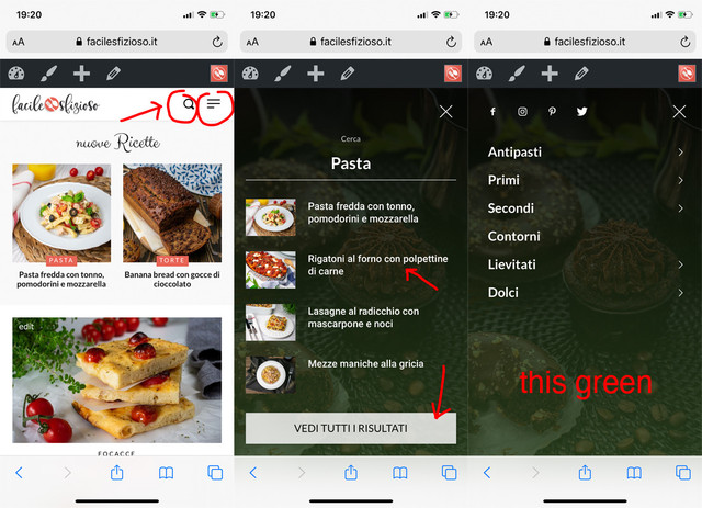
I tried to activate the tagDiv Mobile Theme plugin, but it completely changes the layout of the mobile version.
Thanks for your help.
 demi4444
Hello,
for my site I need to modify the following file:
plugins/td-composer/mobile/search.php
How can I overwrite the file in my Child Theme without modifying the original one?
Thank you
 Calin
Calin Hi,
If you are using mobile theme plugin, please use this custom css:
.single .td-post-featured-image{

display: none;

}
The code need to be set in theme panel> mobile theme > custom code> css.
Hope this will help you!
Thank you!
 thakkarsanket
 https://techquicker.com/
Now I came across a new issue that, the above issue is solved and working on home page only, that I set as a static page. But as soon as I open the posts, the same issue comes.
And also I came across another issue is that, home page which I set as a custom static page, is not working on mobile as AMP page. As soon as I open home page on mobile i.e. https://techquicker.com/ the theme changes itself. in the beginning it was working. But now I tried to work as your guide available for AMP. But it did not help.
Please help me out.
Thanks.
 Renu Bakshi
I was using a Genesis child theme on one of my wordpress sites. In all the posts I had inserted one image at the beginning of each post using wordpress “Add Media” option. I had also selected the same image using “Featured Image” option. The Genesis child theme showed the image once only at the beginning of the posts.
A few days back I switched to Newspaper theme on this site. Same image started appearing twice at the beginning of every post. One way to resolve this was to delete the image added through the “Add Media” option. As this was a time consuming process, so I selected the template # 5 under the Pose Settings. This solved the problems and the images are now appearing once only on desk top & as well as mobile. So far no issue. Every thing Ok.
Now I want to use mobile theme for mobile devices. But the same image appears twice at the beginning of each post in the mobile devices.
Can you please suggest any other way to resolve this issue.
Thanks & Regards…… Renu Bakshi
Vlad S Hello !
If you don’t have mobile theme or amp then your Website runs on the responsive type of the theme. That view counter is the one from desktop version. Please make sure to clear your cache.
Thank you !
 fatih-2
 Hi Calin
Thank you for the updates.
For anyone using wp rocket with newspaper theme;
I contacted wp rocket support and solved the issue by changing the Cache Life span settings under Wp rocket from 10 hours to 6 hours. And the issue seems solved for the moment. We are still testing tough.
Just a suggestion Calin;
As a fan of Newspaper theme and Wp Rocket and a long user of those 2 applications, I strongly suggest that Tagdiv should also do an official testing of WP rocket and list it under the supported caching plugins. There’s a signaficant pros when using WP rocket with newspaper and works really well. Page loads speeds difference is almost 3 seconds compared to supercache and has better gtmetrix score.
Besides, when we were using wp supercache, from time to time the mobile template was showing on desktop and there was no solution to it. with wp rocket, mobile and desktop caches are kept separetly and we did not encounter this issue eversince.
All the best
 Topfgartenwelt
 Thank you very much! But there is still a problem with the div element. I have set it to 300px – 250px as you have recommended. When scrolling just down there is no CLS (cumulative layout shift) but when scrolling up and down the CLS appears again? What is causing that problem? There is no such problem in the mobile theme what kind of code you have used there?
And there is another problem with the responsive ads – it’s completely irrelevant if i use a div container sized 350×250 or 250×250 AdSense always delivers an ad sized 300×600. Why? There shouldn’t be any place for such a size…
Greetings Kathrin
-
This reply was modified 6 years by
Topfgartenwelt.
Topfgartenwelt Calin Hi,
Unfortunately for the moment only the mobile theme plugin can be use as a template for amp, maybe clouds templates will be implement in the coming updates.
Thank you!
Calin Hi,
Yes, you can achieve this, first you need to open the page in tagDiv Composer editor, this is the look from desktop -> https://i.imgur.com/VjdUpNs.png now set on mobile and on each row in layout tab set the order number -> https://i.imgur.com/elZSSoO.png -> https://tagdiv.com/flexibility-rows-columns-newspaper-theme/
Hope this will help you!
Thank you!
Calin Hi,
I checked the single post template 68 pulses pro on my install and this is working properly on desktop and mobile. Maybe you made some adjustment to it and you hide on mobile the post content. What you can do is to get that single post template again from tagDiv Cloud Library and apply it to a post to see if this is displaying correctly.
Also if you want we can investigate the current template, but for this we need at list a post to has this template set, or we can login to check the cloud template.
Thank you!
Vlad S Hello !
The Mobile theme was specially designed for optimization on mobile devices. Unfortunately on mobile theme you cannot do much changes of design. If you want to have the same design as on desktop mode you can achieve that by simply disabling the mobile theme.
You will have to recreate your pages into the Mobile editor or completely disable the mobile theme. The mobile editor will not render shortcodes !
Also you can disable mobile theme on certain pages or posts by following this setting: 
Please take a look here: https://forum.tagdiv.com/the-mobile-theme/
Mobile theme plugin can be disabled from Newspaper Plugins as you can see here: https://www.screencast.com/t/LnkZCEVC
Thank you !
Vlad S Hello !
I am sorry for misunderstanding !
For this you will need to edit one of the themes files as you can see below:
Go to: wp-content/plugins/td-composer/mobile/includes/modules/td_module_mob_1.php
Open the file and find this: https://www.screencast.com/t/Yk8aYIJW it should be the start of the code.
Add this line: <?php echo $this->get_author();?>
And this should be the result: https://www.screencast.com/t/P2h1NLli0u3
Thank you !
 acearaujo
Hi Guys, We are very happy with the theme. And our problem now is: A few days ago the visitor counter stopped counting visits from mobile users. We dont have mobile theme or AMP activated.
Can you helps us.
 Tommes
 I solved the mobile navigation problem :-). But it would be great if the cloud templates for AMP sites are on the roadmap? 😀
Thanks and best regards
 kapeliotis
Hey! Currently working on the pulses pro theme!
Lets say i have a 3 column row. First row is a big block, rest 2 filled with smaller blocks.
By default, on mobile, they will appear one after another just like they are arranged in the desktop theme (big block column first followed by the rest two smaller blocks).
Lets say i want those to appear in reverse when browsing on mobile (smth like smaller blocks first, then the big one below them). How is that achieveable?
Thanks in advance!
Tommes Hi,
are the cloud templates for AMP sites not on the roadmap? I have now changed this as you suggested.
OK, the mobile pages are then transmitted a bit slower. Now there are other problems, for example there is no navigation anymore. In the Theme Panel, under Mobile Theme, I selected the navigation in the header area and before that the navigation was also shown.
Best regards
TopfgartenweltThe header image causes a cumulative layout shift. For the ads in the mobile theme I got the code for a div container which reduced the problem. Can I also use such a div container for the header image? If yes where I have to place it? The code was:
<div style=”width:300px; height:250px;”>
</div>
Greetings Kathrin
Calin Hi,
The only template for amp is the one from mobile theme plugin, cloud templates can not be use per amp templates, you can use to use the mobile theme plugin only for amp using this option -> https://i.imgur.com/bXjeltB.png
Hope this will help you!
Calin Hi FrankFlames,
If you are using mobile theme with amp, you can use a code for amp auto ads, this need to be set where Vlad indicate in that screenshot, (the amp auto ads need to be set only once and this will adapt after your post content, for example in a long post content will be display more amp auto ads, this kind of ads cannot be control by the user).
Also you can use the mobile ads for map too -> https://i.imgur.com/LgrxZsg.png
Thank you!



