
- NewspaperCreate Custom Code with the browser’s Inspector or the Live CSS Box
- NewspaperScroll Animation
- NewspaperWP Rocket and Newspaper Theme: Optimization Guide
- NewspaperHow to setup Twitch for Social Counter
- NewspaperModal Popup
- NewspaperFlex Block Settings Guide
- NewspaperAutoptimize Plugin – install and configuration
- NewspaperAdding Multiple Authors to Your Articles
- NewspaperDesign your Post Pages using the Cloud Library Templates
- NewspaperBig Grid Flex Settings
- NewsmagtagDiv Composer Tutorial
- TutorialsFrom WPBakery to tagDiv Composer
- NewspapertagDiv Composer Tutorial
- NewspaperTheme modules and blocks
- TutorialsDefault Block Settings Guide
- NewspaperThe Mobile Theme
- NewspaperCompare theme files – Winmerge tutorial
- NewsmagBlock settings tutorial
- NewsmagLogo & Favicon
- NewsmagFooter templates
 Bogdan B.
 Hi,
The code i provided removes the bottom border and changes the background color for the ad container.
The theme was not built to support big logos to cover the containers like that. The recommended logo dimensions are these: http://screencast.com/t/wRIpx7CxBGJV. In order to make the logo fit on mobile phone you can make a smaller logo and add it as a background image to the container in the mobile version.
You will need a bit of css knowledge to get it done.
As an example:
@media (max-width: 767px){

.td-header-style-10 .td-header-sp-logo {

    background-image: url("your image url");

}

.td-header-style-10 .td-header-sp-logo img{

display:none

}}
It will need further customization to fit properly though
Thanks
 Catalin
 Hi @byothe,
First custom CSS is for color of the boxes (“REVIEW OVERVIEW” & SUMMARY”): http://screencast.com/t/xHInUkfh645X
.td-review-header .block-title {

background-color: blue;

}

.td-review-summary .block-title {

background-color: red;

}
and the second custom CSS is for color of the review stars displayed in modules and block: http://screencast.com/t/pfRROghA
.td-icon-star, .td-icon-star-empty, .td-icon-star-half {

color:red;

}
Thanks.
Catalin Hi @Yannik97,
If you want to use a different symbol for every block used in visual composer, in CSS code you need to add a speccific class for each block: (.td_block_1 or .td_block_2 or .td_block_3 … or .td_block_18).
For my example, the CSS code look like that:
.td_block_1 .block-title span::before {

content: '\';

margin-right: 10px;

}
Thanks and let me how it goes!
 Andrei L.
 Hi
Replace the above css with this one: http://screencast.com/t/pUEqb7CbVUe
.block-title span, .block-title > a {

background-color: transparent !important;

position: relative;

border-radius: 0;

padding: 3px 70px 3px 20px;

}

.block-title span:before, .block-title > a:before {

content: '';

background-color: red;

width: 100%;

height: 100%;

position: absolute;

top: 0;

left: 0;

z-index: -1;

-webkit-transform: skew(-15deg);

-moz-transform: skew(-15deg);

-o-transform: skew(-15deg);

-ms-transform: skew(-15deg);

transform: skew(-15deg);

border-radius: 3px;

}
Basically you need to add this selectors to the css code: .block-title > a, .block-title > a:before
Thanks!
Bogdan B. Hello George,
The theme does not have an option for that but you can do it with custom CSS:
.page-id-693 .td-header-top-menu-full, .page-id-693 #menu-td-demo-header-menu-1, .page-id-693 #menu-td-demo-footer-menu{

display:none!important

}
result: http://screencast.com/t/gU8G6XWHGcL
Thanks
Andrei L. Hi
Sorry about that.
Try to remove this line of code: position: relative; from the css: http://screencast.com/t/3I6mwNJ5LyL
Thanks!
Bogdan B. Hi,
You can tweak it with custom CSS:
Place the code in the theme panel->custom CSS box.
@media (max-width: 767px){

.td-main-page-wrap {

    padding-top: 30px!important;

}

.td-banner-wrap-full{

    background-color: #222;}

}
Thanks.
 Yannik97
 Thanks for your reply.
When I add the .block-title class in custom css every title on my homepage have this icon. I have to add a class name on the blocks in visual composer. But then all titles in the visual composer block have this icon.
-> 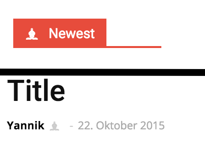
I have to reach only the main title of an area.
.newest span::before {
content: '\265D';
margin-right: 10px;
}-
This reply was modified 11 years by
Yannik97.
 Gwen
Gwen Hi,
that didnt work out completely, but adding the following code in css did:
img {
opacity: 1.0;
transition: opacity 1s ease-in-out;
-moz-transition: opacity 1s ease-in-out;
-webkit-transition: opacity 1s ease-in-out;
}
a:hover img {
opacity: .9!important;
transition: opacity .2s ease-in-out;
-moz-transition: opacity .2s ease-in-out;
-webkit-transition: opacity .2s ease-in-out;
}
That solved my problem! 🙂
Thanks though
Bogdan B. Hello,
There is a tag color in category edit, but it will only apply to posts, not modules: http://screencast.com/t/j719l5DLdJN
You can only target the module category tag with custom CSS:
.td-post-category{

background-color: red

}
This code will apply to all categories at once. If you want to target a specific category you have to change the code and use the specific CSS class for each module/block.
Thanks
Bogdan B. Hello,
Visual composer elements were not tested on posts. They work but lose their CSS and styling. You need custom work to get them to display like on a page.
As an alternative, you can use a different block to achieve your goals. For example a block 14: http://screencast.com/t/JzduopNO1
and style it with CSS:
.single-post .td_module_mx1{

padding-bottom:5px;

padding-right:1px;

}

.single-post .td_block_14{

margin-top:15px;

}
You can change the padding/margin values to your preference.
Add the code to the theme panel->Custom CSS box.
Thanks
 vladica79
I added this code for custom css style to change look of block title, and everything is perfect, but if i put link for block title, my custom style not working. What i need to ad in my code to resolve this?
.block-title span {
background-color: transparent !important;
position: relative;
border-radius: 0;
padding: 3px 70px 3px 20px;
}
.block-title span:before {
content: ”;
background-color: red;
width: 100%;
height: 100%;
position: absolute;
top: 0;
left: 0;
z-index: -1;
-webkit-transform: skew(-15deg);
-moz-transform: skew(-15deg);
-o-transform: skew(-15deg);
-ms-transform: skew(-15deg);
transform: skew(-15deg);
border-radius: 3px;
}
example:
http://prntscr.com/8udpc1
Andrei L. Hi
I am not sure what type of icons you’re trying to use and how they are generated. Try to change the actual css for those icons with a different one and see how it works: http://screencast.com/t/FAC2vBym1 If your using sprite images for your icons you will need to call the image path and use some css properties to place the image in right position. More details in this regard can be found here: http://www.w3schools.com/css/css_image_sprites.asp
Hope this help!
Thanks!
Bogdan B. Hi,
You can replicate the slider you use with an image carousel element in visual composer and set it up similar to your plugin: http://screencast.com/t/eEFvzM1VA or you can apply a custom CSS for your slider to make it scroll on the mobile version as well:
 @media(max-width: 767px) {

.ult-carousel-wrapper .slick-list {

overflow: visible;

}

.ult-carousel-wrapper .slick-prev {

left: 0px;

}

.ult-carousel-wrapper .slick-next {

right: 0;

}

}
result: http://screencast.com/t/9sBHDo0SPb
Thanks.
Andrei L. Hi
That message is generated by Contact Form 7 plugin and to change its position you need to edit the plugins files. Also you can try this css in theme panel custom css, but I’ve test this only on post template 1 and I am not sure will work fine on others post templates: http://screencast.com/t/gdd1sAA4
.wpcf7-form {

margin-top: 100px

}

div.wpcf7-mail-sent-ok{

position: relative;

top:-580px;

}
Thanks!
Catalin Hello @Yannik97,
Please try this code below in theme panel=>custom CSS area and you can add before the title blocks what content do you want.
.block-title span::before {

content: '\';

margin-right: 10px;

}
You can modify the margin value as you like
This content have to be generated in CSS. I suggest to use this link for more symbols: http://htmlarrows.com/symbols/
One example you can see below: http://screencast.com/t/sccS0qjPxt6b
Let me know how it goes!
Thanks.
 Alin [tagDiv]
 Hi,
The tagdiv gallery was not designed to be used in pages or in a text block.
You can try this custom css in Theme Panel > Custom Css – http://screencast.com/t/EXBQ0MoVbL
.page .td-pb-span12 .td_block_wrap .td-slide-on-2-columns .td-slide-galery-figure {

width: 100%;

}

.page .td-pb-span12 .td_block_wrap .td-slide-on-2-columns .td-doubleSlider-1 .td-slide-item img {

max-width: 100%;

}
Thanks!
Bogdan B. Hello
The Newspaper grid wasn’t built with borders in mind so even if you add some they won’t look as the ones on Newsmag. You could try some custom css, ex – http://screencast.com/t/Mm1NwtGk
.vc_row.wpb_row, .td-pb-row{
border: 1px solid #e6e6e6;
}
.td-pb-span8{
border-right: 1px solid #e6e6e6;
}
Some elements may get broken and on some areas the borders may appear on the wrong location – http://screencast.com/t/Zq10e1Acf
You will need custom work to do it for the whole site, and at the moment we cannot provide it. You can hire a freelancer to do it if you really need these borders.
As for the width of the site, if you reduce it, blocks and grids will become broken. All the elements of the theme reside on the width of the site, and every pixel counts. Again, you will need custom work to modify width.
Thank you!
-
This reply was modified 11 years by Bogdan B..
Bogdan B. Hello George,
If you hide blocks with CSS you can try to add the !important attribute to them. CSS stands for cascading style sheets so the first display property gets overwritten by the display:none attribute so if the connection is slow, the blocks will appear at first then disappear from view. Unfortunately this cannot be controlled.
Unfortunately we could not access your mobile site to inspect the issue: http://screencast.com/t/xckx9bNjjy
Please check your server configuration.
Thank you
Bogdan B. Hello Anand,
You need to be more specific with your css code. To target footer elements, you need to add a footer class to your code so it will target just the footer area:
.td-footer-wrapper .td-icon-facebook{

background-color:blue;

}
As for the hover, use this css to change the color:
.td-footer-wrapper .td-social-icon-wrap i.td-icon-twitter:hover, .td-footer-wrapper .td-social-icon-wrap i.td-icon-facebook:hover, .td-footer-wrapper .td-social-icon-wrap i.td-icon-vimeo:hover, .td-footer-wrapper .td-social-icon-wrap i.td-icon-vk:hover, .td-footer-wrapper .td-social-icon-wrap i.td-icon-youtube:hover {

    color: white;}
Thank you!
Alin [tagDiv] Hi tripledm,
If you look to the bottom of that topic I posted a recent solution(for version 6) how to register a new menu and where you can use it, here you can see an example – http://screencast.com/t/oe0mdRGKqg – http://screencast.com/t/J8mCplwyU – http://screencast.com/t/1jJYbw9azbuV – http://screencast.com/t/WPXfWdtud
Unfortunately the time doesn’t allow us to provide custom work and you will need more customization(css) for your menu to look right, so I cannot test this for each device how it looks and also depending the header style you choose.
Hope this helps!
Andrei L. Hi
To make the text bold you you need to include it between tag like here: http://screencast.com/t/4Ln4Alr0 and the font style can be controlled with css: http://screencast.com/t/eV8jjvupuYe
.page .td-social-but-text{

font-style: normal;

}
Thanks!
 jcarr99
 Just began messing with this and everything seems to be functioning BUT… I Added this to my css as stated above…
.td-social-stumbleupon {
background-color: #ff4e2e;
}
.td-social-stumbleupon .td-icon-stumbleupon {
font-size: 15px;
position: relative;
top: 2px;
left: 1px;
}
.td-social-reddit {
background-color: #7db3ef;
}
.td-social-reddit .td-icon-reddit {
font-size: 15px;
position: relative;
top: 2px;
left: 1px;
}
I added the following to td_module_single.php
<i class=”td-icon-stumbleupon”></i>
<i class=”td-icon-reddit”></i>
I must have missed something becuase I can click on a blank space and the link will share on reddit and stubleupon but the button does not appear on the page. Could someone help me out with this? Do I need to have an actual image for this … kinda lost.
 George
Hi there,
I noticed a UI issue that Web page displays hidden blocks in first few seconds (if slow connection) in mobile.
But it shouldn’t happen as it is bad user experience.
Please advise how do we resolve this.
Link: Viralbae.com
Thanks!
PS: few blocks were hidden to show only in desktop through css. It still gets displayed in mobile if slow connection.
Bogdan B. Hi,
You can use an alternative method. Edit td_module_14 in the theme files and just move the title code above the image: http://screencast.com/t/SCRthLrAq. Then use a bit of css styling to adjust the title:
.td_block_13 .meta-info-container h3{

padding-left:20px

}

.td_module_14 .td-module-meta-info{

bottom: -45px;

}
Now the responsiveness does not get affected.
Thanks.
