- NewsmagSocial counter styles on Newsmag
- NewsmagNewsmag documentation
- NewsmagtagDiv Social Counter tutorial
- NewsmagIntroduction
- NewsmagCategory grid styles
- NewsmagTheme colors introduction
- NewsmagPage templates
 Anamaria
 Hello,
If I understood correctly, you want to have a category template -> https://forum.tagdiv.com/cloud-library-category-templates/ from tagDiv Cloud library and displayed all the posts from that category, so you can use the posts loop element => https://forum.tagdiv.com/posts-loop/ or you can use Flex Block 1 and set the filter to “Category -Current category” => https://i.imgur.com/7P99qx0.png
Thank you!
Anamaria Hi,
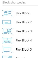
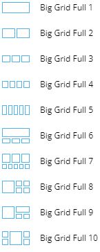
What I can suggest is to use Cloud Templates from tagDiv Cloud Library for posts/categories/header/footer,etc and Flex Blocks and Big Grid Flex, instead Block 1-25, Big Grid Full, elements from tagDiv Standard Pack.
Also, on our channel https://www.youtube.com/channel/UCOT1RiNysIPCTPSnVZskwtQ, you can find more videos that can help you and documentation https://forum.tagdiv.com/newspaper-theme-documentation/ and you can ask us here on the forum if you have any questions.
Thank you!
Anamaria Hello,
1. For logo size for desktop we recommend using is 272 x 90px, and for mobile 140 x 48px, but the logo can be edited with tagDiv Composer and you can set the logo size => https://www.screencast.com/t/Q49YDqYM -> https://www.screencast.com/t/8xupUNEjSS3 – https://i.imgur.com/hAU7jre.png
2. Please edit with tagDiv Composer, select the row from content and set the layout to 1/1 => https://i.imgur.com/kzD3Q20.png and the layout to https://i.imgur.com/u1YeLUo.png
You can find more information about the row here https://tagdiv.com/flexibility-rows-columns-newspaper-theme/
3. Please edit the page, scroll until the footer and select the text => https://i.imgur.com/NPtQ766.png and you can edit it.
4. If you upload the font in the theme panel, to apply to your website you need to set it with tagDiv Composer like in this video https://www.youtube.com/watch?v=jQvA64uTLkI -> https://forum.tagdiv.com/font-customization/
Hope this help you!
Thank you!
Anamaria Hello,
1. If you have the mobile theme and AMP plugins activate, then your pages will be overwritten by the plugin (the mobile theme comes with its own templates for page, post, category, etc so your current templates from the desktop theme will get converted to the mobile theme layout, the page content is made without builders in mobile editor => https://www.screencast.com/t/xbgZG8kH also, the options that are provided to edit the mobile theme version are limited, this keeps the things simple).
You can disable the mobile theme plugin on the pages => https://i.imgur.com/OTAJQSS.png
Also, please check this topic where I explained each mobile version -> https://forum.tagdiv.com/topic/mobile-version-not-working-properly-2/
2. Please try to import the header and footer from here => https://i.imgur.com/jDsslQi.png -> https://i.imgur.com/89ztoQB.png -> https://i.imgur.com/Jtb3hoO.png and make them global => https://i.imgur.com/6qg5arf.png -> https://forum.tagdiv.com/footer-templates/ -> https://forum.tagdiv.com/header-manager/
3. Unfortunately, is not possible to change the Big Grid Flex 5, but you can use it for mobile Flex Block => https://i.imgur.com/hRAQWNc.png
Thank you!
 Matuser
 Hi
When enabling SHOW RELATED ARTICLES option (see screenshot above) with the setting of 2 rows of related posts,
and in the same time
some posts have longer titles than the other posts
the posts look not alligned (some titles displayed are “too long” ). Titles of such posts should be truncated (see red border).
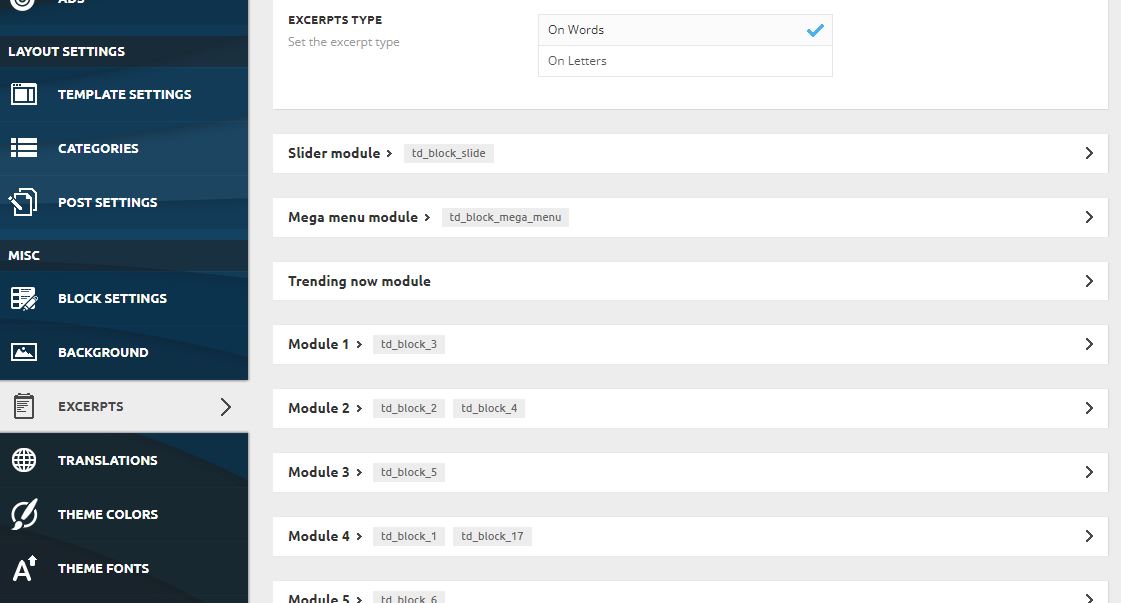
Which excerpt (title excerpt for which element: eg. Module_1, Module_2 etc.) is applicable for titles of posts shown with SHOW RELATED ARTICLES option and should be used here to truncate titles to the same max length?
And please do not write again about FlexBexes usage and FlexBox configuration, because it’s completely not the case here.
Regards
Matuser Hi
I’ve double checked: all the links to screenshots are accessible without any problems (similarly to the ones the were uploaded earlier).
The issue is not related to FlexBox so this answer doesn’t help.
Again: when enabling ““SHOW RELATED ARTICLE” option, by default there are posts from:
– RELATED ARTICLES (posts from the same cathegory)
and
– MORE FROM THE SAME AUTHOR (posts added by the same author)
displayed at hte bottom of an articles / posts .
How to modify/choose this option so that it doesn’t show RELATED ARTICLES and MORE FROM THE SAME AUTHOR posts
but
other types / cathegories / tags / groups of atticles are displayed in this box with so called RELATED ARTICLES?
Eg. in case somebody would like to display for the RELATER ARTICLES eg. articles CATHEGORY_A and CATHEGORY_B or other groups of posts (not posts of the same author and posts from the same cathegory as in default settings) how to configure that?
Regards,
 Bill Fleak
 Thank you for sharing. The CSS. I added the code you supplied and made some edits so it would position correctly. We now have an issue where the CSS is adjusting all td_flex_block_1 elements. How can we only affect specific elements?
See link: https://www.screencast.com/t/xzJpe3zJVn
site: https://dev.hrmasia.com/
/* Authors / Byline to display in 2 rows */
.metainfobreak .td-editor-date .td-author-date .td-post-author-name {
display: block;
}
/* HeadShot, Authors Name and Date formating text to right of photo */
.td_flex_block_1 .td-author-date
.td-post-date{
top: -20px;
right: -50px;
display: block;
}
.td_flex_block_1 .td-post-author-name{
top: -7px;
}
 eemskrant2
How to move the Category tag position from the top of the image on to the lower part in flex block 1.
 rhg
rhgI’ve created my website using the Gossip Pro theme.
It works fine when I’m viewing on my desktop.
When I look at it on mobile, it’s a mess.
I have three issues.
Could you please address each one.
1. Mobile version of home page is not loading.
I’ve created a mobile version of the home page on my desktop.
When I view this page on my mobile phone, a different page entirely appears.
It shows my posts but nothing else.
The logo says “Newspaper discover the art of…’, the footer is wrong, colors are off, etc.
I have the mobile theme and AMP plugins both installed and activated.
How do I get the home page to load on mobile?
2. Header and footers not working.
When I try to edit the header and footer of the mobile page on the desktop I get a message saying ‘this type of header is not editable with Tag Div composer. Please use a cloud template.’ Same with the footer. When I try to install a template, there are none available for Gossip.
How do I use the header and footer from the original home page?
3. Big Grid Flex 5
I’m using Big Grid Flex 5 on my homepage.
On the mobile home page (viewed on desktop) the three smaller images line up horizontally, creating a scroll bar to drag across.
Is it possible to configure Big Grid Flex 5 so that the smaller images line up vertically, or do I need to use another element?
Your help would be appreciated, this is very urgent.
We need our website to work on mobile.
Thanks for your assistance.
 Bettina
 Hello!
You should have it too, please check: https://www.screencast.com/t/Pa2c0BNz ; open the first arrow. Check this video to see how you can put it back: https://www.screencast.com/t/5zuLsMAlRt
For modal video pop-up, the post need to be a video type, to have featured video. Also, for example, if you use a Posts Loop or a Flex Block element, then you will have a setting for the video pop-up: https://prnt.sc/10cxaix
Documentation which can helps you:
– https://forum.tagdiv.com/featured-image-or-video/
– https://forum.tagdiv.com/video-playlist-2/
Thank you!
Bettina Hello!
I can not access your screenshots.
For example, add a flex block in a post go to the filter tab of the element’s settings and from the dropdown category filter you can choose between: Single – More from author, Single – Related by category, Single – Related from tags.
So, for example Related from tags is displaying articles/posts which have the same tags as the article you are currently viewing. Also, you can set Related and sort it as Random for example.
Please note that you should place that flex block in a post template to have effect.
If you do not mean this, then please provide more information about your issue and your website link.
Thank you!
Bettina Hello!
A workaround there could be to add a flex block or a posts loop element in order to achieve a pagination to your posts. Both elements have the option next prev ajax pagination.
Thank you!
Anamaria Hello,
Please use the header template for business from tagDiv Cloud Library https://cloud.tagdiv.com/header-template-22-business/, please check this article https://forum.tagdiv.com/header-manager/ after this you can design it as you want with tagDiv Composer
Also, you can change the color from Theme Panel -> Theme Colors -> Header https://i.imgur.com/7YN8bJM.png
Thank you!
Anamaria Hello,
I made a custom code, but you need to change the value because depends on the author image size => https://i.imgur.com/tW3hy14.png
.td_flex_block_1 .td-author-date

 .td-post-date{

top: -12px;

right: -35px;

display: block;

 }
.td_flex_block_1 .td-post-author-name{
top: -7px;
}
Hope this help you!
Thank you!
 Calin
Calin Hi,
Blocks and Big Grid are part from the standard pack, are blocks that are not adjustable after the screen width also you do not have the possibility to edit the blocks in details. Now the Flexi Block and Big Grid Flex are the blocks that were added with cloud templates, those are adjustable on each width that you set on your pages or cloud templates, also you can full edit them with tagDiv Composer. Also you can check the documentation about those elements where are explain better the settings included:
Flex Block -> https://forum.tagdiv.com/flex-block-settings-guide/
Big Grid Flex -> https://forum.tagdiv.com/big-grid-flex-settings/
We recommend to use flex blocks and grids, also in our latest demos we use only them so those pre-build website can be installed and used without tagDiv Standard pack and the entire website it is full customizable using the frontend editor (tagDiv Composer).
I hope this will help you!
Thank you!
Bill FleakWe would like to have the Authors name and date appear to the right of the Authors headshot. We are using this in Flex Block 1. Please see link https://www.screencast.com/t/8ZuUWgiFC
We currently have the CSS below to make the author’s name and date breaking into 2 lines.
CSS:
/* Authors / Byline to display in 2 lines */
.metainfobreak .td-editor-date .td-author-date .td-post-author-name {
display: block; }
 stockswatcher_website
I am using Pulse Pro theme which is using flex blocks to display post, now i want to display custom taxonomy with posts.. please guide me how i can do this.
Thanks
MatuserHi
What are the differences between:
– Blocks and Flexi Block
– Big Grid and Big Grid Fex and Big Grid Full
?
What are recommended ways of using each?
What are possible ways of using each?
What every of these was designed for?
What usage of each is not remmended?
How every of these should not be used?
Please provide examples.
Thank you,
Matuser Hi
Unfortunatelly the answer (above) / links don’t provide solution.
We want to use (and have already used) Grid-1 in this part of the website and not use Flexi-Block-X (Flexi-Blocks may be used in different parts of the website), so the links in your answer on configuring Flexi-Blocks or using child theme do not apply here.
The thing is that the 265×198 thumbs for 265×198 windows of “Module-MX6“ in Grid-1 are enabled and are generated by the theme ,
as well as
this is newly reated website (not re-design of an existing content) and content (images and text) are added after (not before) Grid-1 has been chosen (content being added to existing Grid-1 element not the other way around).
So if
– Grid-1 is using 1x MODUKE-MX5 and 4x MODULE-MX6 Blocks,
– MODULE MODULE-MX6 has window size of 265×198 [px]
and
– the applicable thumbs are enabled and are generated by the theme
why the images are blurred?
Why the 265×198 [px] thumbs generated for an image are not used in 265×198 [px] window of “Module-MX6“ of Grid-1?
Why the 265×198 thumb description does not say its used for applicable 265×198 MX6 Block [ while in the same time 534×462 thumb is described as to be used also for corresponding 534×462 MODULE-MX5 in Grid-1 ] ?
QUESTIONS REMAIN:
-I- which thumb is used for Module-MX6 in Grid-1 / Big-Grid-1 if the 265×198 thumb is not ?
-II- which thumb, from the list of all thumbs available, should be enabled in Newspaper theme so that it’s used for generating image for 265×198 Module-MX6 if the 265×198 is not (it’s only for Module-M1 according to the description)?
-III- why the feature pictures in Module-MX6 are blurry and how to fix that?
Regards,
Bill FleakWe are using Flex Block 3 and would like a Vertical Divider between Module 1 and Module 2. I am able to add a horizontal divider, but not Vertical on both modules. See video.
Anamaria Hello,
Please use the flex blocks which have the option to adjust the image size => https://www.screencast.com/t/sMBfMtyRW where you can set the height and width.
More information about flex block can find in those guides :
-> https://forum.tagdiv.com/big-grid-flex-settings/
-> https://forum.tagdiv.com/flex-block-settings-guide/
Also, please check this topic https://forum.tagdiv.com/topic/thumbnails-center-top-cropping/
Thank you!
Bettina Hello!
Ok, that’s sound great.
I gave you an example to understand what I mean: for example you can not customize grid in the TagDiv Composer, only big grid, big grid full and big grid flex. I’m not talking about featured image. Also, only cloud templates/PRO can be edited with the TagDiv Composer.
Thank you!
Anamaria Hello,
If you referring to the excerpt on the blocks, you can set the limit, please check this article https://forum.tagdiv.com/excerpts-introduction/ -> https://forum.tagdiv.com/big-grid-flex-settings/ -> https://forum.tagdiv.com/flex-block-settings-guide/
If this is not what you mean, then please provide more information and screenshots.
Thank you!
 OmarBish
is it possible to knot duplicate the same post on the same page .
currently I have three flex block that showing content with the same filter category but all of them duplicate same posts is it possible to avoid this or add kind of offset in these flexpost filters.
this picture show three flexbox and all three of them show the same post : https://drive.google.com/file/d/1ID1ZODaYyKFVrRmTmLCehP6Wo4HiO2jJ/view?usp=sharing
website url: https://ihsan-alotibie.com/
 Fapulous
I have my own posts published but they wont appear on flex blocks, only the demo posts work. Deleting the demo content wont help, I may be missing something on my blog posts or there’s a setting on the Filter that is not correctly setup, I couldn’t find any documentation on that. thank you