- NewspaperThe Newspaper Mobile Theme: Introduction
- NewspaperThe Mobile Theme
- NewsmagMain menu
- NewspaperMain Menu
- NewspaperHow to Add a Logo in Newspaper
- NewspaperBig Grid Flex Settings
- NewspaperHeader Builder
- NewsmagIntroduction
- NewsmagLogo & Favicon
- NewsmagBackground introduction
- NewsmagTheme colors introduction
- TutorialsWhat is Ajax preloading?
- NewspaperFont Customization
- NewspaperTheme Colors Introduction
- NewspaperBackground Introduction
- NewspaperHow to Install Newspaper via FTP
- NewspaperHow to Install Newspaper via WordPress
 mortgageman
The mobile menu bar doesn’t seem to be working correctly?
Sometimes it works fine, at other time it just doesn’t respond.
I’ve tried on multiple phones, deactivated plugins etc and the same issue happens.
My url is http://www.expertmortgageadvisor.co.uk
 angelgallegos
Hi there,
I do not know if this is the correct way to suggest new improvements to the them, but here I go:
– Better Search bar: In desktop, the search is too small and it could be better a full screen search (like in mobile) and like many websites do. Example: https://pitchfork.com/
– Hamburger Desktop menu: A lot of webs have this feature. You can show the post title as you scroll in the menu and show only website logo and a hamburger menu to open all links, or just show big logo centered. Example: https://www.nytimes.com/2018/02/01/theater/come-from-away-sankoff-hein-grammy-awards.html?hpw&rref=theater&action=click&pgtype=Homepage&module=well-region®ion=bottom-well&WT.nav=bottom-well
– Auto Load Next Post. MUST. This is a big thing nowadays for publishers. This could work: https://github.com/AutoLoadNextPost/Auto-Load-Next-Post/issues/85
Thanks in advance.
 Simion C.
 Glad you could sort things as you wanted. A different menu on mobile is possible, with the mobile theme, by default. Other than this, it would only be possible with theme file modifications.
I could try to give you a solution to load a different menu on mobile when the mobile theme is not activated, but it should be noted that the modifications will be lost after an update. Some of the theme files cannot be modified through a child theme.
The mobile theme is meant to be used if you want to display a lighter and different version of the website for mobile devices. Each page has to be created once for desktop, and once for mobile, through the mobile editor
– https://forum.tagdiv.com/the-mobile-theme/
It has predefined templates for category pages, posts etc regardless of what it’s set for desktop. Also it does not have many settings, at the moment.
Please let me know if I missed something.
Thanks
 gb-2
gb-2 Sorry for the delay. I had the mobile menu activated
gb-2 Braaaaaaaaaaaavo!!! Simon. That is exactly wha I needed and the options are awesome.
1 . To move the search to the left so I can insert another nav menu check
2. A way to the X to a spot that doesn’t conflict with extra menu. check
3. Got more than just one options but several Big check. and Looks great.
4. Timely response On Point!
Now another question is that is there a need for a 2nd NAV menu on the right in the industry or multisite such as this. My network is going to grow pretty large and want customers and user to be able to navigate and make it simple and helpful for all to scroll around with no conflict. Check example. Left NAV bar is categories in site 4 i.e gadgets, phones, tvs, smart home etc.. in towards the middle but off slightly is search icon. then on the far right is the extra nav menu of the whole multsite, site 1,2,3,4,5,6 so that user can navigate there quickly without the nav dropdown on left under submenus. Because it will look odd on homepage of site under the home tab with list of sites. Look good on regular mobile.
Will it be better for loading purposes to use the mobile plugin that way I would have two different menus one you pc and one for mobile with the sites listed. But I don’t like the layout of the mobile because I want it to resemble the site.
Or is that where the industry is going to be more compact.
Let me know and keep up the good work. You guys are awesome and I am sure all the your customers and developers who bought the theme can agree. Can’t go wrong with this.
Hope more updates and Mods to come soon!
 Catalin
 Hello longnh.com,
Unfortunately, the anchor link on the mobile menu does not work, sorry! If you want to add it you should use it for top bar or footer menu.
Thanks for the message!
 longnh.com
Like title. When i use custom link like http://abc.com/#contact is don’t click able.
Need help for my landing. Thanks
 arabdebate
Hello,
i have a problem on my site in both mobile and desktop, the website move to the left side and when i move to left side i can see the main menu,how i can make it fixed not moving to left and right
My website is : http://www.arabdebate.net
Thanks
Simion C. The X icon could be easily moved if needed, by default it is aligned to the right. You could align it left or centered
– https://www.screencast.com/t/fgKgA6z0m
– https://www.screencast.com/t/l7ALj0Lso9w
.td-search-close {

text-align:center;

}
I could give you solution for the menu close, that would depend where exactly you want it to be positioned
– https://www.screencast.com/t/NQGpSgNi
Maybe like this – https://www.screencast.com/t/azNPo45Hq
#td-mobile-nav .td-menu-socials {

padding: 0 20px 0 65px;

}

.td-mobile-close {

left: 1px;

}
Thanks
Simion C. Hi,
The top menu is not displayed on mobile by default, it could be made visible if absolutely required, with custom code (only when then mobile theme plugin is not active). It will be the same top menu from desktop, not a different menu.
Regarding the search icon positioning, I could give you a code to make it display for example next to the menu
– https://www.screencast.com/t/qyORyGNiR1f1
This is the code used for that, it must be entered in Theme panel->Advanced CSS in the phones section
.header-search-wrap {

left:54px;

right:auto;

}
Or you can move it to the right as you wanted (use the value you want in the code)
– https://www.screencast.com/t/6pqX6Way
.header-search-wrap {

right: 60px;

}
These codes must be entered in the location I mentioned above, so they will apply only on mobile.
Thanks
Simion C. Hi,
The theme package provides a mobile theme plugin, this is optional. If you decide to install and activate it, you can select a menu to be used specifically for it
– https://www.screencast.com/t/uHA3oBKvJ
You can find out more about this plugin functionality here
– https://forum.tagdiv.com/the-mobile-theme/
As I mentioned this is optional. When it is not active, the mobile version is created using the theme responsive design. The same elements from desktop will be displayed on mobile devices, including the menu.
If this is not what you wanted to know, please try to provide some more details for a better understanding.
Thanks
 ayo1w
ayo1wHello,
I just updated the newspaper theme from an older version 7.4 to the latest one, I created a new folder for that with a different name (newspaper1) and uploaded the new theme there, then activated. All good expect when I checked the website on my mobile I got this error right below the main menu and blocks are not showing :
Fatal error: Call to undefined method vc_row::set_font_settings() in /home4/u5k5z9h5/public_html/wp-content/plugins/td-composer/includes/tdc_composer_block.php on line 36
Desktop version works fine.
I tried to disactivate the tag div composer plugin but the error is still there.
Thanks
gb-2Hello I am setting up an big network for a multisite. I read the post about adding a top menu on mobile view and tried it and works. My problem is that it looks tacky. MY question is if you can move the search icon on mobile view on the default layout without the mobile plugin or with it as well, To move the search icon to the left a little so I can insert another menu next to it so that I can use that space for navigation to parent sites. example. site 1,2,3,4,5,6. because as of now you can only do it by making the menu on the main page but then it loos off and then if you put a topbar it doesn’t show on mobile without the plugin
Simion C. The mobile theme plugin is not required, it is optional to install it. This plugin is intended to be used if you would like to present a different and simpler version of the website
– https://forum.tagdiv.com/the-mobile-theme/
So it is up to you whether you want to use it or not. When the mobile plugin is not active the background image can be changed as shown above, and the colors here
– https://www.screencast.com/t/ZXq72ZvIEjfp
A setting for setting a color when the menu is sticky does not exist, this could only be done with CSS. Like this
– https://www.screencast.com/t/QZD4ylWkngz
This code will make the menu bar have a different color chosen by you, when the menu is sticky. It can be entered in Theme panel->Advanced CSS in the phones section
.td-header-menu-wrap.td-affix .td-header-main-menu{

background-color: red!important;

}
Thanks
 tariqrana
 alvaroizquierdo
 Thank you so much for the answer!
I also would like to ask you about changes for the header in the mobile version, it is necessary to install the plugin? I am very happy with the mobile version without it and I wouldnt like to install the mobile plugin only for basic changes.
I would like to know if I can change the bakcground color of the mobile menu and also change the option of smart sticky mobile menu, because I changed it in the theme panel but only happens in the computer version not mobile version.
Thank you so much again
Simion C. Hi,
Regarding the mobile menu background, if the mobile theme plugin is not active it can be changed here
– https://www.screencast.com/t/7fAAHdYQ
If the mobile plugin is active the settings are here
– https://www.screencast.com/t/XPrfrNbV
Also the scroll would be present when the mobile theme is active
– https://www.screencast.com/t/sGXK6QYLR2
When inactive it will not appear, it could be made visible by entering this code in Theme panel->Custom CSS
– https://www.screencast.com/t/OctmuN7BL7
@media (max-width: 767px) {

.td-scroll-up {

display: block;

}
The news ticker text can be changed in the theme translation settings
– https://www.screencast.com/t/5YY0QzJy6e
Same for the related articles – https://www.screencast.com/t/hZzfVfoRPeG
Thanks
 Bogdan B.
 Hello,
The color of the mobile menu icons can be changed from the theme colors section: https://www.screencast.com/t/K8YysS9Qm7bY
If you use the mobile theme plugin, a similar colors section will be found in the mobile theme settings at the bottom of the theme panel.
Thank you!
alvaroizquierdoHi,
I have several questions but very fast ones:
· About the mobile version I would like to ask you two questions. I want to change the background pic of the mobile menu but I dont know how to do it. Also I would like to add a button in the mobile version to do scroll to the top, but I dont know how to put it.
· About the item news ticker, I would like to change the text but the item doesn´t have this option, how can I do that?
· And also in the spanish translation for related articles, it is writen “artículos relacionado” so one s at the end in missing, I also would like to change that.
Thank you so much for your time 😉
 Mercuriel
Hi there,
My sticky mobile menu has an issue just on mobile phones in which it’s right-hand side is full width even though the CSS code is supposed to stop it doing that. The CSS code works as well because, when I view my website from any width below 767px on a laptop, the sticky menu is not full width and looks perfect. It is only when I view my website on my actual mobile phone does this right-hand-side sticky menu problem occur. Any ideas?
tariqranaSimion C. I don’t recall page builder shortcodes working in the mobile theme as you mention. The solution does work, the same content from desktop will appear on mobile devices, if the mobile theme plugin is deactivated.
In that case the mobile menu bar and other menu color settings can be made here
– https://www.screencast.com/t/frwnJxOY
If the setting does not work, please set the color you want and provide a link to the website so we can inspect it. Also on mobile a different logo can be displayed
– https://www.screencast.com/t/Pk5KLjfs
Set the logo you want to appear on mobile there, or the default header logo will be shown.
The mobile theme was created to eliminate the use of page builder elements, thus increasing performance. If the page builder elements could be used, there would be no point to use the mobile theme in the first place.
Thanks
 maismeh
 but I bought the same theme about a year ago as well – and in that version it works without problems when I put in the composer-code on several pages. I was wondering why it does not work anymore. In the old version there where also more options with several fields.
your solution does not work: When I deactivate the mobile theme I have several troubles on mobile: first of all I cannot define the background color of the mobile header. It is black in the desktop version but white in the mobile version and with a white logo – that sucks. second the menu does not work before the page is fully loaded.
I cannot build every page two times – thats really not practical. Please don’t give me the “leave us alone answers”, rather than some constructive tipps. It worked already, so you can make it work again I guess. Or tell me how to deactivate the mobile theme only on several sites.
 Alin [tagDiv]
 Hi,
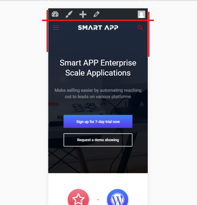
Please provide your site url and let me know which the issue is. Do you want to change the transparent(Smart App color for mobile menu) background color to black?
Let us know.
Also please change your one star rating provided, to a better one.
Thanks!
 m2sahin
https://i.hizliresim.com/1JrZqp.png – my settings
https://i.hizliresim.com/bBYEz8.png – smart app demo settins
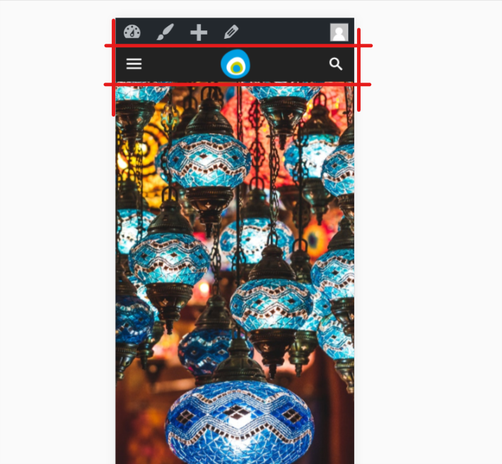
I did all the settings like in the demo but I look different. I didn’t find the right setting. help please.
note: The main slice is not English. If I speak rude, I apologize.