
- NewspaperThe Newspaper Mobile Theme: Introduction
- NewspaperThe Mobile Theme
- NewspaperMain Menu
- NewspaperHow to Add a Logo in Newspaper
- NewspaperBig Grid Flex Settings
- NewspaperHeader Builder
- NewspaperFont Customization
- NewspaperTheme Colors Introduction
- NewspaperBackground Introduction
- NewspaperHow to Install Newspaper via FTP
- NewspaperHow to Install Newspaper via WordPress
 jitendrachrysolite
hello,
please lemme know how I can change the mobile menu background image?
check the screenshot: https://paste.pics/EG7PS
 willkar
Hello .
After the last update, all my posts with video format, when open on mobile, it open in a very weird design. I cannot fully wscroll the page, the header menu is not well formated, etc.
Please check this pages as an example:
or
https://gamingnovato.com/category/gaming-videos/
I tested this on android phone and like i said, it happend when i try to open any posts with video format.
 trebol30
Hello team,
I comment.
I wanted to know if in the Newspaper theme there is an option to make an element float on the screen when scrolling in the mobile version of the screen just like the top menu can do. (I use the TagDiv composer)
If the answer is negative, they know or recommend a plugin through their extensive experience with other users, that works well with Newspaper and completes this functionality.
I have a website focused on reviews and, therefore, on call to click and it would be very useful for me. Also, your new approach to WooCommerce would also be useful for adding floating “Add to Cart” buttons.
I’ll look forward for your answer.
Thank you for your time
 PauloCot
 Hi Bettina,
I don’t want any pages to look different between desktop and mobile, just what’s on the respective menus.
For example if the main menu on desktop shows a, b, c, d, e pages, I want the mobile menu (for all pages) to show a, c, e, f and pages.
Everything remains the same between the two, they just have different menus – is that possible?
Thanks, Paul
 institutMises
Hello,
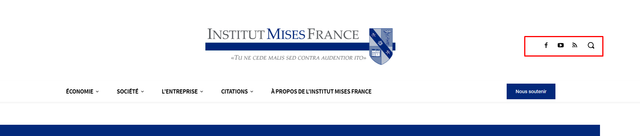
I don’t know how to customize my mobile menu to make it possible to use the same social icons as desktop.
Desktop :
Mobile :
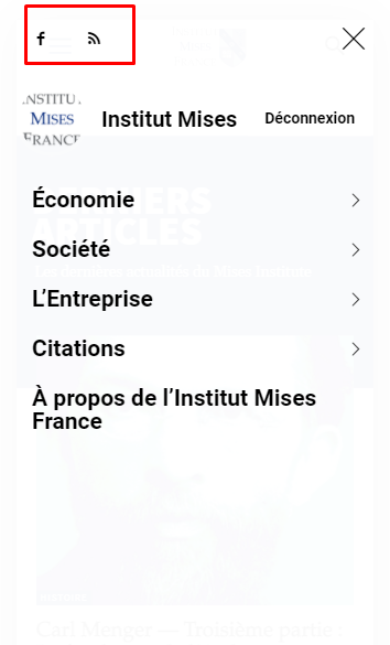
I don’t know how to customize mobile menu for changing this. It seems Tagdiv composer does not allow to change the content inside mobile menu.
My website is : https://www.mises-fr.org
 byteblock
After updating, the menu opens only after a few clicks on the button
PauloCotHi,
Is there a way to have a different menu display between desktop and mobile? I want the main menu to remain on the desktop (not use the top bar instead) and have the main menu on mobile display different pages.
Thanks
 Tom C
Tom CHello, I am working on the following website: https://jailbirds.com/
On my iPhone 11, using the Safari browser, I get a message from iOS asking to “login to jailbirds.com?” even when I am logged in as a user. Could anyone please share any ideas on how I can fix this? It doesn’t do this on Brave Browser from my phone.

https://cdn.jailbirds.com/wp-content/uploads/2021/10/14132006/IMG_9302.png
Also, is there a way I can edit the side menu that pops out (in mobile view) from within the TD Composer?

https://cdn.jailbirds.com/wp-content/uploads/2021/10/14131931/IMG_9303.png
Thank you for your help!
Thomas
 Anamaria
 Hello,
I verified your website and seems you have the mobile theme activate, so you need to set the menu in Theme Panel -> Mobile Theme -> Header -> Main menu => https://i.imgur.com/AjjhTfB.png
Also, please check this topic where I explained each mobile version -> https://forum.tagdiv.com/topic/mobile-version-not-working-properly-2/
Thank you!
 markyj2000
Hi all, so with my ongoing issues with newspaper, one of my customers noticed that when they access my website on a mobile device the dropdown menu on the left doesn’t show them any of the other pages. Instead they get a weird sign-in/join for WP menu builder. Not sure why this is, but does anyone know how to get our menus back?
Our main site is http://www.mediashotz.co.uk – if you look at it on a mobile, you will see the issue with the dropdown menu.
Cheers.
 Umut
Umut Dear Annamaria,
When I use Mobile theme / Menu dissepear / Pages do not work
When use no mobile page page looks same as pc. menu works ok but not all pages seen.
Anamaria Hello,
@beyond90,
I saw you have an older theme version 9.6 and the latest WordPress version 5.8.1
Also, I saw you use the WP Bakery plugin, and this plugin is in conflict with our plugin tagDiv Composer.
Usually, this problem related to the mobile menu is caused by a plugin conflict, so please check it.
@machimanmarker,
I investigate your website and now seems to work properly => https://www.screencast.com/t/4N3UwTSNnNmV
I verified your website and seems that the image comes from the cache plugin https://i.imgur.com/s0bUCeJ.png, so seems to be a plugin conflict.
Please do a test using only the tagDiv plugins and see if the problem persists.
Thank you!
 machimanmarker
 Hi, I am having practicaly the same, the mobile menu does not work in posts, also the GA code is not working in posts since last Theme update.
Example of not working page – https://www.necesidadesfinancieras.es/pedir-un-prestamo-personal-que-deberias-tener-en-cuenta/
I need to fix this ASAP please
 AEGISAlliance
 Sorry, I didn’t mean to try and hijack your thread. The correct schemas do show up in the google schema validator for me. Close to fixing this mobile menu button issue, it wasn’t because of that code I posted.
AEGISAlliance It looks like it’s been disabled and is using the Rank Math Pro schemas. I’ve just been having problems with the mobile menu button not working and it looks like a standard pack code is included where the schema shows up, it’s the part of code where the menu button is.
This is just before the menu button script code: <body class="post-template-default single single-post postid-253921 single-format-standard td-standard-pack cookies-not-set td-menu-mob-open-menu" itemscope="itemscope" itemtype="https://schema.org/WebPage" style="position: relative; min-height: 100%; top: 0px;" aria-hidden="false">
 Bettina
 Hello!
In order to edit the order of the elements in the mobile menu, you can modify the file located at: td-composer/legacy/Newspaper/parts/menu-mobile.php
Unfortunately, for the animations, this will require custom work which is not covered by the support team.
Thank you for understanding!
Anamaria Hello,
Please edit the responsive version, select the viewport for the phone, and delete the Header main menu and set the mobile menu https://i.imgur.com/NtH9jJ1.png
Thank you!
 podcastmovement
I am looking to modify how the mobile menu slides in and out, how to update the location of the social icons, how to expand the menu items by default instead of collapse, etc.
See this video of my menu first, followed by what I am trying to modify it to be like: https://www.loom.com/share/1468943e1fef40079d835e7c4428d86e
 admin-forum
Hello, I’ve probably a problem of compatibility with in my wordpress installation :
Website display works good on desktops and Laptops.
Concerning mobiles, there is a problem apparently with the AMP display for the newspaper theme.
Maybe it comes from the template itself, from from a conflict with other plugins or from something else. I don’t know…
I’ve installed properly AMP with the wizard, following your documentation, AMP Plugin Tab appears in my WordPress Admin Menu and I can configurate it normally.
The mobile page is good displayed without AMP. With AMP, it doesn’t work good !
Maybe, there are other problems – I don’t know really.
Anyway, it’s impossible to select the tab option MOBILE + AMP in the theme Administration – Theme Panel – Mobile Theme.
Here is the address of the website : https://www.tiktokk.info
Thanks in advance for your help.
 Dibbes
I am switching from the mobile plugin to responsive. This because of high load times. So I moved the site behind Cloudflare.
The the problem was that mobile gets desktop and the other way around.
Now the next problem and the one I write about:
It is not possible to load the mobile menu. No matter what I do the desktop menu keeps showing in a mobile view port. No error message returns. See screenshot. ( the menu stay’s the same )
https://myrocknews.com/mobile-not-working.PNG
Please help. It is a live site what is cripple now..
 Calin
Calin Hi,
That image it is from the pre-build website that you are using, and I think that the image it is set for the mobile menu in the theme panel -> https://i.imgur.com/16UAsgZ.png just remove or replace it from there and there won’t be any problems.
I hope this will help you!
Thank you!
 afratus
Hi, I’m having issues with main menu on mobile. It’s not working since I updated to Newspaper 11. Can you help me?! Here’s my website: topensandoemviajar.com
Thanks!
Bettina Hello!
I recommend you to use mobile pages in order to have different pages on mobile version. Please do not forget to assign them in order to display on mobile devices. Build them with TagDiv Composer and you can customize your header with the help of our elements/shortcodes. It could help you the element called “Mobile menu”. This element can be used also in a responsive version: A responsive version of your website is looking similar like on desktop, edit the page with TagDiv Composer, click on the mobile viewport: https://www.screencast.com/t/XDQJedlggSB ; there you can see your mobile version and you can edit the elements there.
A full explanation of the mobile versions you can find here: https://www.youtube.com/watch?v=SpGkOnJeNZY
Thank you!
 ventamar
Hi, where do I change the logo to be displayed on sticky menu? The dark background works well in the whole design, but I need to provide a different logo as this one is too dark. See screenshot below with logo in top left.
 kalim0155
When I load my home page, a broken menu (mobile menu and mobile search box) appears on screen. After page loading complete home page comes up.
Need a quick solution.
Broken page here




