
- NewsmagTheme colors introduction
- NewsmagSmart list ads
- NewsmagIntroduction
- NewsmagMain menu
- NewsmagLogo & Favicon
- NewsmagHeader ads
- NewsmagSmart sidebar
- NewsmagSharing buttons
- NewsmagCategory tag on modules/blocks
- NewsmagBackground introduction
 nolandolce
 Hi Bettina,
The block was from the theme. We didn’t add any custom code to it. I did try to add a new flex1 block and you’re right the pagination works, however, in mobile the blocks don’t stack the way they do in the current block. So it’s possible the theme had added code in order to get the blocks to stack? Either way, we do need that block to operate in the same way as it does now (as it came in the theme). As such, do you know how to get a new block to stack OR any idea of how to fix the pagination in the theme’s block?
Thanks!
Megan
 Snippet Media
When i go to our site: http://www.saarmagazine.nl
most of the time it shows our mobile template in stead of our desktop desktop homepage. The desktop homepage shows a grid of three recent posts, dhe mobile template shows one large post. Next to this it doesnt show the logo and menu header on desktop (when it shows the mobile layout).
Also when I go to a blog from the website on my desktop, it shows the mobile layout for posts in stead of the desktop layout. So the image shows smaller and the text is on the left side of the screen and very narrow. Also without logo/menu header.
When i do a hard refresh on that page it seems like the cache erases so i get the right version, but my colleages never get to see the right version.
Here you see the mobile layout showing on a blog desktop (just showing the top of the page), + missing logo and menu and text on the left side):
https://www.saarmagazine.nl/wp-content/uploads/2023/12/Schermafbeelding-2023-12-04-om-14.59.41.png
Here you see what it should look like (image showing entire page):
https://www.saarmagazine.nl/wp-content/uploads/2023/12/screencapture-saarmagazine-nl-ik-wil-zeggen-tegen-vrouwen-die-wel-kinderen-hebben-2023-12-04-15_02_59.png
We’re already usng WP super cache.
And I also tried the Newspaper Mobile Theme, but the same problem appears. I hope you can help me!
 nagi
nagi mobile horizantal menu our css settings
—————————
https://gallery.123telugu.com/images/theme_test/Narender12-02—1.jpg
https://gallery.123telugu.com/images/theme_test/Narender12-02—2.jpg
my navbar error links
——————
1.https://gallery.123telugu.com/images/theme_test/Narender12-02—6.jpg
2.https://gallery.123telugu.com/images/theme_test/Narender12-02—7.jpg
3.https://gallery.123telugu.com/images/theme_test/Narender12-02—8.jpg
4.https://gallery.123telugu.com/images/theme_test/Narender12-02—3.jpg
 Bettina
 Hello @eman!
All about translations, check these guides:
– https://forum.tagdiv.com/loading-translations/
– https://forum.tagdiv.com/customize-a-translation/
– https://forum.tagdiv.com/using-theme-translations-together-wpml/
I think there is no option for this word to translate: “go to mobile version”.
Thank you!
 Calin
Calin Hello,
Indeed, the website looks like this – https://imgur.com/a/1zYtTGP when the mobile theme plugin is not used and the amp template is not set on “Reader” – https://i.imgur.com/h07Jdi0.png. What can be done is to use only the amp with the reader option or use the mobile theme only for amp – https://i.imgur.com/ABYtYsQ.png
Thank you!
 safeersiddique1
I’m using your newspaper theme, And had designed and now website working good, I want my this theme layout as an mobile application development is there any possibility I can development mobile application for Android and iOS.
 Youcef
Good evening, I am currently experiencing an issue with AdSense on mobile. While the ads are displaying correctly on desktop, there is an absence of AdSense advertisements on mobile devices. I am using the Baby Pro theme. Could you please help me identify the root cause of this problem?
 mashmedia
Hi, I found a lot of css problems in the RTL theme.
The header is not correct and I can’t edit it, also the footer.
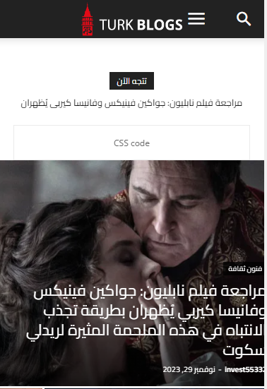
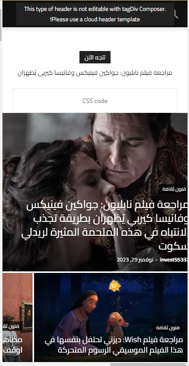
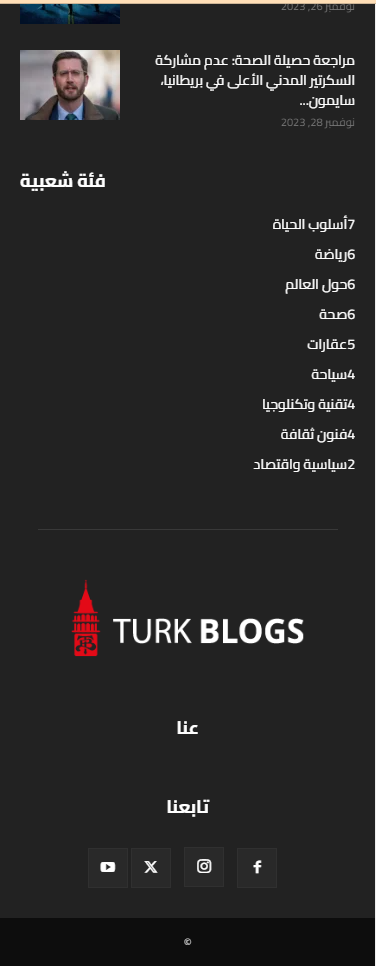
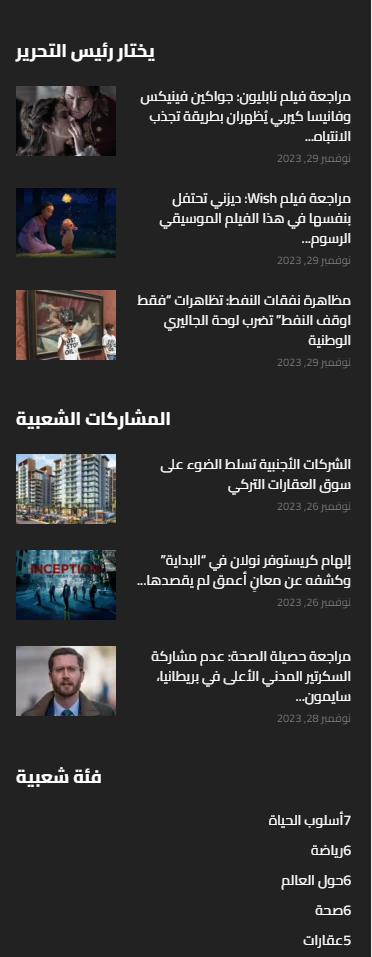
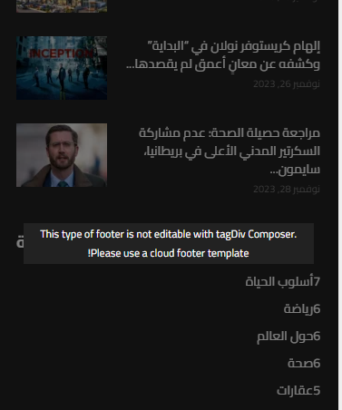
As you can see, the titles in footer is from left to right.
And at the header the menu and search to close to each others. that’s not correct ! and not acceptable..
the demo should work without any problems I just import it and didn’t do anything on it.
So if you can’t fix this issues I need a refund because I can’t work on something like this.
nagiRespected Sir/Mam,
I am a developer at Mallemaala Entertainments, located in Hyderabad. our website 123telugu.com. I am hereby mentioning that requirement.
MOBILE VERSION:
————–
1. When it comes to website speed, the mobile performance isn’t crossing beyond 40-50
2. We must solve the issues in contentful paint, large contentful paint, total blocking time, and speed index. How should we do that? Send us through screenshots
3. We are getting only 4 pics in the view tree map. We need a total of 8 pictures. What is the solution for this? Please provide the answer in a detailed manner.
PC VERSION:
———-
1. Performance is not constant. It is in the range of 60-80. We need it to be beyond 90 both in mobile and PC.
MAIN ISSUE: We want the performance to increase. We are facing severe issues due to low performance. We need 8 images in PC version and Mobile version. What should we do?
my site link
———–
https://tv.123telugu.com/telugu/ (newspaper theme installed)
my site speed screen shorts
————————–
https://gallery.123telugu.com/images/theme_test/Narender12-02—5.jpg
https://gallery.123telugu.com/images/theme_test/Narender12-02—4.jpg
Thanking you,
Regards,
Narendhar.
nagiRespected Sir/Mam,
I am a developer at Mallemaala Entertainments, located in Hyderabad. our website 123telugu.com. I am hereby mentioning that requirement.
1. In the mobile horizontal menu navbar, the menu is being displayed differently on small, medium, and large mobiles. But we need it to be of same size on every device. We will send the CSS settings as screenshots through a link. We are sending you the screenshots of our website’s mobile version navbar as screenshots. We want the navbar to be stretchable along with padding.
my site link
————-
https://tv.123telugu.com/telugu/ (newspaper theme installed)
my navbar error links
——————
1.https://gallery.123telugu.com/images/theme_test/Narender12-02—6.jpg
2.https://gallery.123telugu.com/images/theme_test/Narender12-02—7.jpg
3.https://gallery.123telugu.com/images/theme_test/Narender12-02—8.jpg
4.https://gallery.123telugu.com/images/theme_test/Narender12-02—3.jpg
mobile menu our css settings
—————————
https://gallery.123telugu.com/images/theme_test/Narender12-02—1.jpg
https://gallery.123telugu.com/images/theme_test/Narender12-02—2.jpg
I want this stretchable
————
https://www.123telugu.com/index.php
https://gallery.123telugu.com/images/theme_test/Narender12-02—12.jpg
https://gallery.123telugu.com/images/theme_test/Narender12-02—11.jpg
https://gallery.123telugu.com/images/theme_test/Narender12-02—10.jpg
Thanking you,
Regards,
Narendhar.
 Anamaria
 Hello,
I checked the canonical tag with a few testers and this is passing all of them – https://www.seoptimer.com/canonical-checker/www.justonefortheroad.com
The problem related to the mobile header is happening on the desktop also. Usually, it is related to a cache or optimized plugin. What I can recommend is to to a test without those plugins and see if the problem persists. Also, if the theme analyzer is used, please remove the generated css – https://i.imgur.com/mTO9dkQ.png
This problem can be also related to this parameter – https://i.imgur.com/5GtGtcU.png
Thank you!
Anamaria Hello,
Usually, this happens with cache plugins. If the cache plugin does not have mobile support then the mobile theme version can be delivered instead.
The solution would be to use the recommended WP Super Cache plugin instead and activate these settings (especially the mobile device support): https://forum.tagdiv.com/cache-plugin-install-and-configure/
Also, please let me know what plugin for the cache you use now.
I hope this helps.
Thank you!
Anamaria Hello,
You can’t add the web stories to the mobile theme.
Thank you!
 abhishekpandaay
Hi Tagdiv team,
I would like to know best practices to add google web-stories to mobile version of newspaper theme.
Thanks
AP
 thalesbrandao
 You advised us to deactivate the mobile plugins and I believe that this error was caused by this situation. I reactivated the plugin today, 11/30, after updating the theme. The first article after activating the plugin accessed by Google appears to be normal. I need to know how to resolve the other pages that were completely disconfigured. see attached thanks
-
This reply was modified 2 years by
thalesbrandao.
 SP1
SP1Hello Team Tagdiv,
Hope you have had a good holidays.
We are facing a problem since today.
We have the latest NewsPaper theme 12.6.2 on http://www.GadgetBridge.com and today morning when were editing the front page by clicking on edit with TD composer green button on top a problem has started to occur.
We wanted to add a link in the footer menu.
However as soon as we clicked save. Every resource in our (RAM, DISK iO and CPU) dedicated server went to 100%. We have lot of RAM and CPU cores, yet this happened. The site would just not open or respond because of that.
Upon looking the error logs we found this error – AH01067: Failed to read FastCGI header, referer: https://www.gadgetbridge.com/
Upon searching, found out it has to do with a plugin problem.
So, we carefully 1 by 1 from the server end renamed each plugin to deactivate.
As soon as we deactivated the tagDiv Cloud Library plugin, this website came back.
We rebooted the server and all resources went back to normal below 20%.
We thought it could be a plugin mismatch, so –
1) We deactivated all plugins and then just activated TagDiv ones like mobile, composer and all resources were fine. As soon as we activated tagDiv Cloud Library, the website went down again and resources went to 100%. We deactivated and rebooted, the website came back.
2) We have tried uninstalling and reinstalling tagDiv Cloud Library, that does not work. (all other plugins were deactivated)
3) We have tried going back to Newspaper 12.6.1 and activated that tagDiv Cloud Library plugin again same problem. (all other plugins were deactivated).
4) We have deactivated the tagDiv Cloud Library, and reactivated all others so some part of the website is working, however because tagDiv Cloud Library is not active, menu and other systems are not working and there is a naked code on every desktop page in header and footer.
We cannot figure out what the issue is and how to make it work.
Please help, how to solve this problem.
Best Regards
SP
 fermin
Hello.
I keep a digital diary with the newspaper theme.
I have problems with placing code in the banners.
The following code only works for me in Ads header Ad mobile version.
For the cover it does not work for me in Customs Ad 1, 2, 3, 4 or 5.
It also doesn’t work with ad code customs, or anything else I’ve tried.
The code is the following, an advertising company gave it to me:
I can’t send you the code, your system doesn’t allow it. If you can enable me so I can send you the code
How can I solve it.
I’ve been having this problem for a long time.
Greetings
 info@simonebarbone.net
 Ok I changed Page title and content font-size for pages in Theme Panel > Theme Fonts > Page but it applies for Desktop viewport only, where I change for other viewports (tablet, mobile)?
 marty84
Hello,
I would delete from my page (example: https://www.psiconarrativa.it/2023/09/10/viktor-frankl-crescita-sofferenza/?amp)
Exit mobile version
an I would understand because the image modal not appear in ?Amp
I have activing in my theme only AMP, not mobile+amp
And I wuold delete in code on my page for example: https://www.psiconarrativa.it/2023/09/10/viktor-frankl-crescita-sofferenza/?noamp=mobile& and attribute: “nofollow”
Bettina Hello Paul!
Change that from the theme panel settings: https://www.screencast.com/t/PbU3hQpDqHh
The social icons from the mobile menu are coming from the Theme Panel -> Social/Apis -> Social Networks -> https://i.imgur.com/kKYIECB.png remove/edit them after your needs.
Or you can delete that element and create a fully customizable page there using the modal popup: https://forum.tagdiv.com/modal-popup/
Thank you!
Anamaria Hi,
Please disable the tagdiv mobile theme plugin.
Using our theme you can choose from 3 mobile versions
-> mobile responsive => https://www.screencast.com/t/oJ2ShOp47
-> mobile theme plugin => https://forum.tagdiv.com/the-mobile-theme/
-> mobile page => https://tagdiv.com/newspaper-10-3-7-update-brings-customizable-and-fast-mobile-pages/
If you created the mobile pages with tagDiv Composer, then when you install the Mobile Theme plugin, your pages will be overwritten by the plugin (the mobile theme comes with its templates for page, post, category, etc so your current templates from the desktop theme will get converted to the mobile theme layout, the page content is made without builders in mobile editor => https://www.screencast.com/t/xbgZG8kH also, the options that are provided to edit the mobile theme version are limited (this keeps the things simple)).
This is a video about Responsive Newspaper Theme, AMP & Mobile Theme, Mobile Pages & Templates -> https://www.youtube.com/watch?v=SpGkOnJeNZY
So, the mobile responsive is what you see when that you select the viewport on phone => https://www.screencast.com/t/matV17hH, so some settings may apply for each viewport(where is the border blue), and others are not(where the border is black).
The mobile page has the mobile templates from Cloud Library => https://www.screencast.com/t/YCcZ8rL8
The Mobile responsive version of the theme and the mobile page editor can be edit with tagDiv Composer, the mobile theme plugin cannot.
For example, you can have the mobile theme plugin activated and use the mobile page/mobile responsive version for the homepage/pages, but for the categories pages/404 page, you can’t use the mobile page/mobile responsive version if you have the mobile theme plugin activated.
So, if you want to design the pages with tagDiv Composer, you can use the mobile page or mobile responsive version.
Thank you!
Anamaria Hi,
To remove a background image, go in Theme Panel -> Background -> Mobile menu/mobile search => https://www.screencast.com/t/uvDejzbX and delete the image, because this no longer exists.
Thank you!
Anamaria Hello,
Unfortunately, there is no option because the amp works with mobile theme and has a different structure.
Using our theme, you can choose from 3 mobile versions
-> mobile responsive => https://www.screencast.com/t/oJ2ShOp47
-> mobile theme plugin => https://forum.tagdiv.com/the-mobile-theme/
-> mobile page => https://tagdiv.com/newspaper-10-3-7-update-brings-customizable-and-fast-mobile-pages/
If you created the mobile pages with tagDiv Composer, then when you install the Mobile Theme plugin, your pages will be overwritten by the plugin (the mobile theme comes with its templates for page, post, category, etc so your current templates from the desktop theme will get converted to the mobile theme layout, the page content is made without builders in mobile editor => https://www.screencast.com/t/xbgZG8kH also, the options that are provided to edit the mobile theme version are limited (this keeps the things simple)).
This is a video about Responsive Newspaper Theme, AMP & Mobile Theme, Mobile Pages & Templates -> https://www.youtube.com/watch?v=SpGkOnJeNZY
So, the mobile responsive is what you see when that you select the viewport on phone => https://www.screencast.com/t/matV17hH, so some settings may apply for each viewport(where is the border blue), and others are not(where the border is black).
The mobile page has the mobile templates from Cloud Library => https://www.screencast.com/t/YCcZ8rL8
The Mobile responsive version of the theme and the mobile page editor can be edit with tagDiv Composer, the mobile theme plugin cannot.
For example, you can have the mobile theme plugin activated and use the mobile page/mobile responsive version for the homepage/pages, but for the categories pages/404 page, you can’t use the mobile page/mobile responsive version if you have the mobile theme plugin activated.
So, if you want to design the pages with tagDiv Composer, you can use the mobile page or mobile responsive version.
Thank you!
Calin Hello,
Are you referring that on mobile you see a different layout then desktop version? If so, this is because you have the mobile theme plugin enabled, this overwrites the responsive version and use a mobile theme standard layout to provide better performances on mobile. If you need the same layout and content on mobile like on desktop please disable the tagDiv mobile theme plugin.
Thank you!
Anamaria Hello,
Please let me know what version you use the mobile theme or mobile page.
Using our theme, you can choose from 3 mobile versions
-> mobile responsive => https://www.screencast.com/t/oJ2ShOp47
-> mobile theme plugin => https://forum.tagdiv.com/the-mobile-theme/
-> mobile page => https://tagdiv.com/newspaper-10-3-7-update-brings-customizable-and-fast-mobile-pages/
If you created the mobile pages with tagDiv Composer, then when you install the Mobile Theme plugin, your pages will be overwritten by the plugin (the mobile theme comes with its templates for page, post, category, etc so your current templates from the desktop theme will get converted to the mobile theme layout, the page content is made without builders in mobile editor => https://www.screencast.com/t/xbgZG8kH also, the options that are provided to edit the mobile theme version are limited (this keeps the things simple)).
This is a video about Responsive Newspaper Theme, AMP & Mobile Theme, Mobile Pages & Templates -> https://www.youtube.com/watch?v=SpGkOnJeNZY
So, the mobile responsive is what you see when that you select the viewport on phone => https://www.screencast.com/t/matV17hH, so some settings may apply for each viewport(where is the border blue), and others are not(where the border is black).
The mobile page has the mobile templates from Cloud Library => https://www.screencast.com/t/YCcZ8rL8
The Mobile responsive version of the theme and the mobile page editor can be edit with tagDiv Composer, the mobile theme plugin cannot.
For example, you can have the mobile theme plugin activated and use the mobile page/mobile responsive version for the homepage/pages, but for the categories pages/404 page, you can’t use the mobile page/mobile responsive version if you have the mobile theme plugin activated.
So, if you want to design the pages with tagDiv Composer, you can use the mobile page or mobile responsive version.
Thank you!



