
- NewsmagSmart list ads
- NewsmagIntroduction
- NewsmagMain menu
- NewsmagLogo & Favicon
- NewsmagHeader ads
- NewsmagSmart sidebar
- NewsmagSharing buttons
- NewsmagCategory tag on modules/blocks
- NewsmagBackground introduction
- NewsmagTheme colors introduction
 techpaced
 Yes, even i got this message. here is the thread that i posted – https://productforums.google.com/forum/?utm_medium=email&utm_source=footer#!msg/adsense/quoFGFBxI-U/hjKdi7SXCAAJ
In newspaper only inline content ad is mobile responsive. And the big limitation is we can have only one inline ad. There is no option provided by theme author to add more inline ads (after paragraph 3, 6, 8 etc). If you show the ads above and below content, the banner ads work fine in desktop view. But in mobile they take lot of space. Sometimes I get a big ad box in mobile if i place the banner ad. I was about to raise a support ticket and I saw your question.
@newspaper team – Can you fix this in next update ?.
 insomniac79
Hi,
I am using the Newspaper theme for http://www.daydreamdistrict.com. I haven’t done any modifications, it’s the pure theme. I have now received a warning message from Google that my website does not comply to Adsense policy! If I don’t change it, they will block my account! Is the Newspaper theme not compliant to Adsense policy?? Here Google’s email:
——————————
This is a warning message to alert you that there is action required to bring your AdSense account into compliance with our AdSense program policies. We’ve provided additional details below, along with the actions to be taken on your part.
Affected website: daydreamdistrict.com
Example page where violation occurred: http://www.daydreamdistrict.com/daydream-view-vs-gear-vr/
Action required: Please make changes immediately to your site to follow AdSense program policies.
Current account status: Active
Violation explanation
Publishers may not implement Google ads in a manner that disguises the ads in any way. In order to maintain a good user experience, it is important for publishers to clearly distinguish Google ads from site content. This includes, but is not limited to: site layouts in which the ads push content below the fold on mobile devices; placing 300×250 or larger ad units above the fold on a mobile optimized site.
In order to remain fully compliant please ensure that your site and ad layout remain compliant across all devices. More information about this policy can be found in our help center and on this short video.
How to resolve:
If you received a notification in regard to page content, we request that you immediately remove Google ads from the violating pages. If you are unable to, or unsure of how to remove the ads from these pages, or would like to continue monetizing the page with Google ads, please modify or remove the violating content to meet our AdSense policies.
If you received a notification in regards to the way ads are implemented on your site, please make the necessary changes to your implementation.
You do not need to contact us if you make changes. Please be aware that if additional violations are accrued, ad serving may be disabled to the website listed above. You should immediately take time to review your pages with Google ads to ensure that they comply with our policies.
Additionally, please be aware that the URL above is just an example and that the same violations may exist on other pages of this website or other sites that you own. To reduce the likelihood of future warnings from us, we suggest that you review all your sites for compliance. Here are some useful resources you might be interested in.
AdSense policy FAQs
Using site: search to find violations
Recommended solutions for policing your content
Content filtering
For more information regarding our policy warning notifications, visit our Help Center.
We thank you in advance for your cooperation.
Sincerely,
The Google AdSense Team
——————————
I am really worried now. What should I change? Do you need to change something on the Newspaper theme?
Please get back to me ASAP!
Sincerely, Sebastian
 newsguru
I have advert that display on my website http://www.thenewsguru.com that is on Desktop and Laptop but on mobile the advert does not display is this normal
 angiewattie
My blog post photos show on desktop but not on mobile.
 newdesigner8
Good morning,
I’m having problems removing a footer when someone views my website on a mobile phone. I inspected the elements with the browser and found that this is the problem <div class=”td-mobile-footer-wrap”> if i just remove it from the browser the footer goes away but im having a problem doing this from the theme. I don’t know what would actually be the code necessary to be added to the custom code section of the theme (no experience coding).
Another problem is that when I load the website from a phone the main layout of the first couple of articles changes and under the top articles this short code comes up “[td_block_big_grid3 sort=”featured”] [td_block_big_grid_5td_grid_style-6″ sort=”randomposts”].
Any help would be much appreciated I’ve been at this all morning.
 Mela Rossa
Hi,
i have found a big bug to Android Browser if have a Android ver < 4.3!
The bug also occurs using your online demo.
The page loads properly, but as soon as it finishes loading the site, it is completely covered by the background or mobile menu area, but without mobile menu content, and without close icon!
You have no idea how to fix it? I have thousands of customers who complain about it and they do not use “modern” browser on your mobile device (like Chrome or Firefox)! Obviously they can not use the site and leave!
Thanks a lot
 rebel.mindset91
Hi can someone help me.
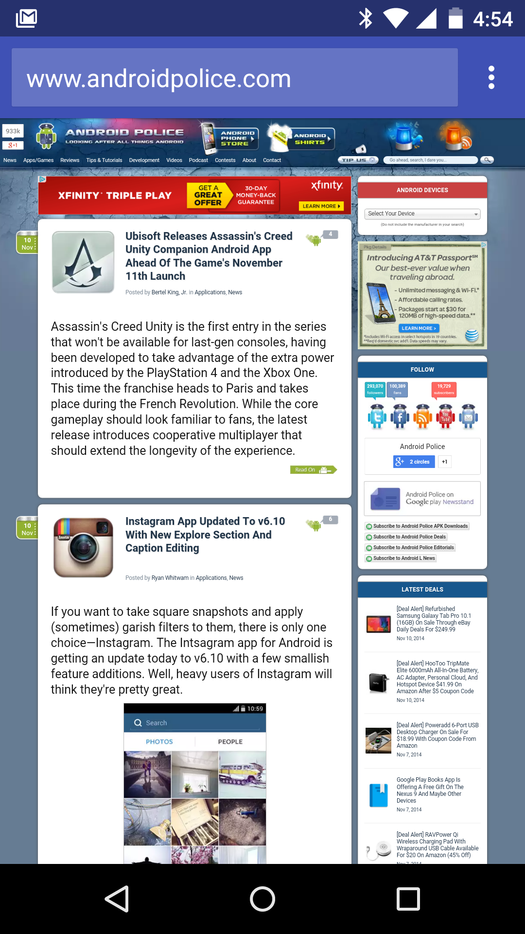
Is the tinted address bar like in the image above working for anyone in the mobile theme? It’s working in the standard newspaper theme, but not mobile.
 pauloalmeida
 Olá BogdanB.
Taí um link para comprova o problema que estou tendo no modo mobile ao abri
os links com marcadores etão aparecendo todo desfigurado toda vez quando posto um artigo novo
link abaixo abra no modo mobile para você conferir como está ficando
http://www.praiasdefortaleza.net/praia-de-tabuba-mar-sombra-e-muito-kitesurfe/
 theleaderdotinfo
Hello –
I have set up and customised the homepage. It works fine on a desktop but I receive errors on the mobile platform (Android, Google Chrome). The errors are:
wp booster error:
td_api_base::mark_used_on_page: a component with the ID: td_remote_cache is not set.
wp booster error:
Missing parameter: ‘file’
Any ideas on how I can resolve this? The articles seem to display fine.
Best regards,
Neil.
 Bogdan B.
 Hello Nancy,
Pleas make sure the image is present in the url you specify. The url seems ok but you also need to make sure the image is present in the destination. Here is an example ad you can use instead. It’s from an extrenal source so it should work on your end as well just as a test:
<div class="td-all-devices"><a href="#"><img src="http://bigmobile.com/wp-content/uploads/2014/08/728x902.gif" /></a></div>
(this is another code which targets all devices, not a specific viewport)
If you still have trouble with the ad, please provide a link to your site so I can inspect the ad and see why this happens.
I hope this helps.
Thank you!
 Catalin
 Hello NathanAripez,
Please keep in mind that the Footer for Mobile theme cannot be changed from panel and it is created by default with looks like this -> http://screencast.com/t/mHRaXkEDC If you want to make some changes to your mobile theme footer, you should edit the core file from Mobile version where the footer is created, like footer.php, like this -> http://screencast.com/t/eszLQrvK3 If you want to display more levels in our theme and if you are not aware of the steps which are needed to take in this regard, please consider hiring a freelancer/developer to help you because we cannot provide custom work at the moment, sorry!
Thanks for the message!
Catalin Hello techpaced,
Further after deeper investigations, I notice that this issue appears on your demo. I have added this to our list of improvements and we will try fixing it in future updates. Please notice that this remark does not influence your page speed. This is only a penalty from Google because our buttons on mobile are too short.
Sorry for the inconvenience!
Catalin Hello arisdla,
Please keep in mind that our theme has 2 possibilities regarding on mobile mode, like as -> General Responsive Mobile Mode and Mobile Theme. So, if you want to have different menu on mobile version you should use the Mobile Theme plugin -> https://forum.tagdiv.com/the-mobile-theme/ because this allows you a way to change the menu on mobile, like this -> http://screencast.com/t/NzopIdglTuE5 Please notice that the footer will be the only one for entire website because the theme does not have any such an option that offers you a way to change it for mobile mode, sorry!
If you want to display more levels in our theme and if you are not aware of the steps which are needed to take in this regard, please consider hiring a freelancer/developer to help you because we cannot provide custom work at the moment, sorry!
Thanks for the message!
 Dimitron
 Hi,
I checked again (I checked before writing here), and there’s no logo added anywhere whatsoever.
This code and
.td-mobile-footer-wrap{
display:none!important;
}
.td-mobile-footer-wrap .td-footer-description{
display:none!important;
}
and this, neither of them worked.
I just want to remove the amilucid.com and about us part. I tweaked every setting in the theme panel, otherwise I would not write, as I respect other people’s time.
Thank you.
Bogdan B. Hello,
I have checked your site but did not find any problems with your posts on mobile. Please provide a link to such a post that has problems on mobile so I can inspect it.
Thank you!
 NathanAripez
 How do I get the mobile theme to update? I have made changes to the footer at the link you provided and it looks fine on the desktop but nothing changes on the mobile version.
Catalin Hello NathanAripez,
Unfortunately, our theme does not have any such an option that allows you a way to make some modifications and customizations to your footer on mobile theme, sorry! All the available settings for footer section can be found here -> http://screencast.com/t/HQ7rDz3IZrb
If you want to display more levels in our theme and if you are not aware of the steps which are needed to take in this regard, please consider hiring a freelancer/developer to help you because we cannot provide custom work at the moment, sorry!
Thanks for the message!
Bogdan B. Hello,
It seems the mobile and the category template 7 require special targeting as they will not take into consideration the global css for these elements.
Please replace your previous code with this one:
.home .entry-crumbs{

display:none;

}

.entry-crumbs{

text-align:center!important;;

}

.td-crumb-container{

width:100%!important;

}
Thank you!
 javid
javid thanks i fix my problem with
#td-mobile-nav {
display: none;
}
but you most support rtl user
because we love your theme
and this is good for your theme
good luck
 xhera
xhera arisdla
I love Newspaper Theme, it’s really simple and nice.
The mobile menu use the main menu.
however I want to use another menu for mobile for better experience.
like different menu items, and how can i customise the mobile menu to add some html codes before and after the menu section in mobile menu? I would like to add a logo and some text before the menu items section and add a footer for the mobile menu.
Thx
 lethow
 I had checked under theme fonts>> fonts settings and line height is default line height in all settings.
Moreover, you can see search icon is also not on its location on desktop as well…it is a line above its position….this is the same in mobile menu and search icon and 1 line above…
-
This reply was modified 9 years by
lethow. Reason: more details
pauloalmeidaOlá estou tendo um problema ao abri o meu site no modo Mobile
quando escrevo artigos novos e coloco links com marcadores neles
eles não aparecem quando acesso no modo mobile
por favor quero saber o que está causando isso
me ajudem meu site é http://www.praiasdefortaleza.net/
 simchris
 One solution is to use a browser sniffer, along with the /AMP/ plugin from Automattic (the folks who make WordPress), and redirect Opera MINI users to the “amp” minimal mobile version of page.
NathanAripezI am working on my site and the footer on the desktop version is easy to change but none of the changes I am applying are happening on the mobile version. I loaded the logo and on the mobile version is still shows the demo version. How can i change the information on the mobile version. The website is http://www.temeculabeat.com
Thanks
