
- NewsmagSmart list ads
- NewsmagIntroduction
- NewsmagMain menu
- NewsmagLogo & Favicon
- NewsmagHeader ads
- NewsmagSmart sidebar
- NewsmagSharing buttons
- NewsmagCategory tag on modules/blocks
- NewsmagBackground introduction
- NewsmagTheme colors introduction
 gstraton
With the recent upgrade to Newspaper 12.6, in the mobile browser, the magnifying glass icon will not open the site search bar on the home page.
It will open a search bar on sub-pages.
Please review to correct the issue.
http://www.roadblazing.com on Google Chrome Mobile Browser
Regards
G. Straton
gstraton Please be aware there is now an issue with Newspaper 12.6 in viewed in the Mobile Browser.
The magnifying glass search bar will not open on the home page. It will open in the sub pages.
 DocDigit
 All plugins are updated. Pls see @ https://imgur.com/jF4fHcb
Only this one isn’t:
Plugins disabled automatically
The following plugins were disabled because they are incompatible with this version of Newspaper: tagDiv Mobile Theme
For update please check the plugins section
Which I checked, but no outdated after last upgrade?
In fact, when creating a post, I just have my standard editor without any Newspaper options available. Should I go back to the previous version of Newspaper or can you assist online? Thank you.
Perhaps my Newspaper subscription period has been broken?

 Bettina
 Hello @xenia.arg !
Everything can be fixed. I can see the mobile theme displaying on the desktop and mobile versions too. This situation appears when you are using the mobile theme plugin and the cache plugin that you have does not feature options for a separate mobile theme plugin therefore do not know when to deliver the mobile version and when to deliver the desktop version. We have 3 options for mobile versions that you can use:
1. Responsive version: A responsive version of your website looks similar to the desktop version. TagDiv Composer is used to edit the page.Click on the mobile viewport: https://www.screencast.com/t/XDQJedlggSB. There, you can see your mobile version and edit or adjust the elements to look better.
2. Mobile pages: https://tagdiv.com/newspaper-10-3-7-update-brings-customizable-and-fast-mobile-pages
3. Mobile theme plugin: The Mobile Theme is a performance-optimized theme included in the main Newspaper theme that only loads on mobile devices. It comes with its own templates and designs for pages, posts, categories, etc., so your current templates from the desktop theme will get converted to the mobile theme layout. Please see https://forum.tagdiv.com/the-mobile-theme/ and https://forum.tagdiv.com/mobile-theme-introduction/ for more information.
A full explanation is here: https://www.youtube.com/watch?v=SpGkOnJeNZY
If you need to use the mobile version 1 or 2, then you need to uninstall the Mobile Theme plugin and AMP.
Make sure that all the settings are like in our requirements, please follow the guide carefully: https://forum.tagdiv.com/requirements-for-newspaper/
and please increase all requirements that are lower, and follow all steps.
Thank you!
Bettina Hello @hmader !
We have 3 options for mobile versions that you can use:
1. Responsive version: A responsive version of your website looks similar to the desktop version. TagDiv Composer is used to edit the page.Click on the mobile viewport: https://www.screencast.com/t/XDQJedlggSB. There, you can see your mobile version and edit or adjust the elements to look better.
2. Mobile pages: https://tagdiv.com/newspaper-10-3-7-update-brings-customizable-and-fast-mobile-pages
3. Mobile theme plugin: The Mobile Theme is a performance-optimized theme included in the main Newspaper theme that only loads on mobile devices. It comes with its own templates and designs for pages, posts, categories, etc., so your current templates from the desktop theme will get converted to the mobile theme layout. Please see https://forum.tagdiv.com/the-mobile-theme/ and https://forum.tagdiv.com/mobile-theme-introduction/ for more information.
A full explanation is here: https://www.youtube.com/watch?v=SpGkOnJeNZY
If you need to use the mobile version 1 or 2, then you need to uninstall the Mobile Theme plugin and AMP.
Sometimes, the issue can be from a plugin conflict or a cache issue. That’s why we recommend first deactivating ALL plugins except tagDiv ones; if you are using a cache plugin, deactivate it, clear all cache (also from your browser), and see the results.
Thank you!
Bettina Hello @MatHuk !
We have 3 options for mobile versions that you can use:
1. Responsive version: A responsive version of your website looks similar to the desktop version. TagDiv Composer is used to edit the page.Click on the mobile viewport: https://www.screencast.com/t/XDQJedlggSB. There, you can see your mobile version and edit or adjust the elements to look better.
2. Mobile pages: https://tagdiv.com/newspaper-10-3-7-update-brings-customizable-and-fast-mobile-pages
3. Mobile theme plugin: The Mobile Theme is a performance-optimized theme included in the main Newspaper theme that only loads on mobile devices. It comes with its own templates and designs for pages, posts, categories, etc., so your current templates from the desktop theme will get converted to the mobile theme layout. Please see https://forum.tagdiv.com/the-mobile-theme/ and https://forum.tagdiv.com/mobile-theme-introduction/ for more information.
A full explanation is here: https://www.youtube.com/watch?v=SpGkOnJeNZY
If you need to use the mobile version 1 or 2, then you need to uninstall the Mobile Theme plugin and AMP.
Thank you!
Bettina Hello @maribilerm !
We have 3 options for mobile versions that you can use:
1. Responsive version: A responsive version of your website looks similar to the desktop version. TagDiv Composer is used to edit the page.Click on the mobile viewport: https://www.screencast.com/t/XDQJedlggSB. There, you can see your mobile version and edit or adjust the elements to look better.
2. Mobile pages: https://tagdiv.com/newspaper-10-3-7-update-brings-customizable-and-fast-mobile-pages
3. Mobile theme plugin: The Mobile Theme is a performance-optimized theme included in the main Newspaper theme that only loads on mobile devices. It comes with its own templates and designs for pages, posts, categories, etc., so your current templates from the desktop theme will get converted to the mobile theme layout. Please see https://forum.tagdiv.com/the-mobile-theme/ and https://forum.tagdiv.com/mobile-theme-introduction/ for more information.
A full explanation is here: https://www.youtube.com/watch?v=SpGkOnJeNZY
If you need to use the mobile version 1 or 2, then you need to uninstall the Mobile Theme plugin and AMP.
Thank you!
Bettina Hello @ameeralisalman !
Yes. You can do that if you are using one of these 2 options for your mobile version: 1. Responsive version: A responsive version of your website looks similar to the desktop version. TagDiv Composer is used to edit the page.Click on the mobile viewport: https://www.screencast.com/t/XDQJedlggSB. There, you can see your mobile version and edit or adjust the elements to look better.
2. Mobile pages: https://tagdiv.com/newspaper-10-3-7-update-brings-customizable-and-fast-mobile-pages
Check this useful guide too: https://forum.tagdiv.com/modal-popup/
Thank you!
 zoldfulu
Since the last update, the front page of our website (Egzostive) is basically “gone”.
This means that it starts with a “lite” view (maybe the mobile view?) With a lite menu on the side, and the three line to access it.
This one does not have the slider or the widgets, just a list of latest articles. And it also misses the front banner, and instead it shows “Newspaper Discover the art of publishing” as logo.
Once I click to the second page (in the bottom navigation menu), I get the full page layout.
I thought this could be badly archived update that comes back from some cache, but I deleted it manually in the Dashboard.
 hmader
Hi,
My header is self-designed with TD composer. As long as I’m logged in, everything’s fine. When I watch my site with e. g. private browsing, I see an unstyled mobile header on top of the desktop header and, in mobile, the desktop header under the the correct mobile header. In TD composer everything looks fine. What can I do?
 yash31141
Hello, My website header is not visible on all sites with desktop version or mobile version, and I can’t access it. I mean, I can’t use the tagDiv composer either.
 nmanikrishnan
 But will that change all the existing templates of mobile?
nmanikrishnan But will that change all the existing templates of mobile?
Bettina Hello @nmanikrishnan !
There is an option called accent color in the Newspaper -> Theme panel -> Mobile theme -> Theme colors -> Accent color.
Thank you!
Bettina Hello @ameeralisalman !
You can adjust the design of your website in the 3 viewports: desktop, tablet, mobile. If you click here: https://www.screencast.com/t/XDQJedlggSB , you can verify also the mobile viewport, and tablet viewport: https://www.screencast.com/t/YUVUcyrgh
You can also add some CSS code: https://forum.tagdiv.com/create-custom-code-using-the-browsers-inspector/
Thank you!
 MatHuk
Right now, On the website Global desktop header is set from here: https://prnt.sc/Xj-ELYHL2H_S
Right now, On the website mobile header different different for all the mobile pages.
How to create a global header for mobile and setup?
Please check and let me know.
 Prateek
Hi,
Please add an option to add and style menu descriptions for menu items and display them for all menu shortcodes in TD composer (Header menu main, mobile horizontal menu, mobile menu, and list menu) like in newspaper default demo “FEATURES” menu item and tagdiv homepage “Services” menu item, etc.
Thanks.
 maribilerm
 Hello Bettina
I don’t have any post settings in the mobile theme. And I have completely another style for my website in the mobile version
How I can fix it?
 ameeralisalman
Hello,
Can i create a different menu for the mobile view of my news site. Because the default one does not look professional and i want to create/customize the existing menu sidebar which opens up when i click the hamburger icon.
 Satheeshraj
Hi,
When I use any single page template, I’m facing rendering delay issue in mobile. But When I use mobile theme there is no rendering delay. The delay is nearly 1000 times higher when using any single page template. How to reduce this rendering delay without using mobile theme.
Note: Rendering delay can be seen clearly in Google page speed insight. Here is the screenshot of my issue: https://prnt.sc/Wv6lff8mbfvC
Post url: https://simplytamil.com/the-new-comedy-legend-from-tamil-movie-industry/
 Calin
Calin Hi, if you are using the mobile theme plugin and you have Newspaper v12.6 please check the inline css option from the theme panel to be off – https://i.imgur.com/6QIAL32.png (this can interfere if you are using other plugins for cache or css optimize).
Also if the amp is used without the mobile theme plugin make sure that this is set on “reader” -https://i.imgur.com/VoeQ4Dn.png
Thank you!
ameeralisalmanHello, my website has the menu bar which is not responsive for some aspect ratios, For mobile it converts to a different menu sidebar but for desktop or tablet view it changes. So if the aspect ratio is 100% on macOS m1 pro then it seems to be appearing fine but if we open the same site on a dell laptop with smaller size the menu bar feels not to be in the same horizontal manner but rather breaks inline. So i have 14 pages mentioned on the menu bar and two or sometime three seem to get on a line below the actual menu bar. Let me know if there is a way that i can format the extras in a ‘Other’ heading and when someone hovers over the extra title they see those extras listed below in a bulleted or column format. It will be much easier for some apect ratios to work perfectly fine.
 shahjada
 Thanks Calin for the quick response.
As per your suggestion,
1. Disabled mobile theme: It loads super slow, and images are misshaped.
2. Enabled mobile theme and configured AMP only: Loading is good; Images are misshaped and The pages break down.
Could you please point what needs to be done??
Current config: Mobile theme enabled with AMP.
Thanks!
 taketwo10
 Hi Calin, thanks for your quick response. The representations of the footer, for example, are device-dependent. I use Newspaper’s mobile theme, which also works very well. The translations in Newspaper’s theme panel settings also apply to Newspaper’s mobile theme. Everything works perfectly on devices like the iPad because the mobile theme doesn’t yet work here. With a viewport <768 pixels, the mobile display takes effect and the translations in the footer are only partially adopted. I have attached a link you can find a screenshot where the differences become clear.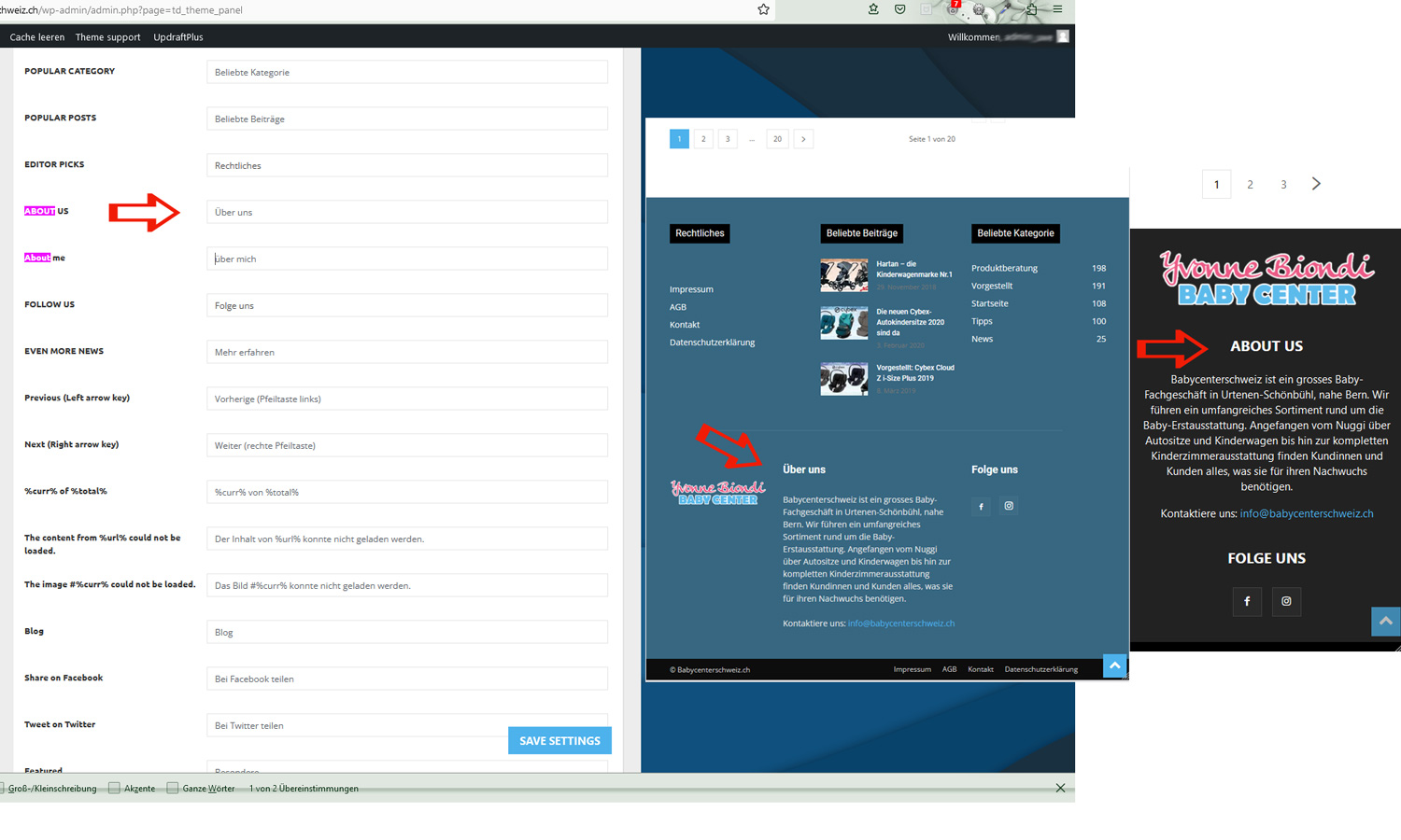 The domain is https://blog.babycenterschweiz.ch Best regards Uwe
-
This reply was modified 3 years by
taketwo10.
 positivenewsfoundation
 Hi Calin, could you please have a look also to our mobile blogposts?
we ran into some problems with mobile about a year ago, and had it fixed by a 3rd party because we could not figure it out. Our website after the help looked perfect on mobile homepage and blog pages alike.
Between a year ago and some theme updates further, the mobile blog page changed. We just
noticed. The mobile home page of https://positivenewsfoundation.org looks fab, but all the blog pages look weird.
How to fix this?
Kind regards,

