
- Apitd_api_single_template::update_key
- Apitd_api_single_template::update
- Apitd_api_single_template::add
- ApiAPI – Single Template – Introduction
- ApiPractical example – How to add a new Block and Module
- ApiAPI – Category top section style – Introduction
- Apitd_api_module::update
- Apitd_api_module::add
- ApiAPI – Modules – Introduction
- Apitd_api_block::update
- Apitd_api_block::add
- ApiAPI – Blocks – Introduction
- ApiUsing the Theme API in plugins
 Bettina
 Hello!
Here is the setting for Mobile theme: https://app.screencast.com/yYhHkpNzYa75u
We have 3 options available for mobile versions that you can use:
1. Responsive version: A responsive version of your website looks similar to the desktop version. TagDiv Composer is used to edit the page. Click on the mobile viewport: https://www.screencast.com/t/XDQJedlggSB. You can see your mobile version there and edit or adjust the elements to look better.
2. Mobile pages: https://tagdiv.com/newspaper-10-3-7-update-brings-customizable-and-fast-mobile-pages
3. Mobile theme plugin: The Mobile Theme is a performance-optimized theme included in the main Newspaper theme that only loads on mobile devices. It comes with its own templates and designs for pages, posts, categories, etc., so your current templates from the desktop theme will get converted to the mobile theme layout. Please see https://forum.tagdiv.com/the-mobile-theme/ and https://forum.tagdiv.com/mobile-theme-introduction/ for more information.
A full explanation is here: https://www.youtube.com/watch?v=SpGkOnJeNZY
If you need to use mobile version 1 or 2, then you need to uninstall the Mobile Theme plugin and AMP.
Thank you!
 info@shemm.am
If one of my websites has an old version of Newspaper theme, and now I want to buy the new version Newspaper 12, and import it, will it crush the styling of existing theme, pages and templates or no?
 MzMaffei
I am managing two separate development environments that need to be unified:
Environment 1 (mac1):
Contains the most recent update of the TagDiv theme
Has updated display configurations, templates, layouts, and customizations
>>> Does NOT have the updated set of posts and images
Environment 2 (mac3):
Contains the latest version of posts and images
Does not have the updated theme/template/layout configuration
Objective
I want to transfer ONLY the display configurations, templates, and layouts from mac1 to mac3, while maintaining all existing content (posts and images) on mac3.
Specific Questions
What is TagDiv’s recommended method for transferring ONLY the theme configuration (layouts, header, footer, custom templates) without affecting the existing content?
Will using the “Export Theme Settings” function in Theme Panel > Import/Export correctly transfer all customizations, including:
– Custom page layouts
– Custom headers and footers
– Article/category templates
– Global display settings
– Custom CSS
Are there specific components not included in the export that I should transfer separately?
What precautions should I take to avoid conflicts or issues during this type of migration?
Bettina Hello!
We have 3 options available for mobile versions that you can use:
1. Responsive version: A responsive version of your website looks similar to the desktop version. TagDiv Composer is used to edit the page. Click on the mobile viewport: https://www.screencast.com/t/XDQJedlggSB. You can see your mobile version there and edit or adjust the elements to look better.
2. Mobile pages: https://tagdiv.com/newspaper-10-3-7-update-brings-customizable-and-fast-mobile-pages
3. Mobile theme plugin: The Mobile Theme is a performance-optimized theme included in the main Newspaper theme that only loads on mobile devices. It comes with its own templates and designs for pages, posts, categories, etc., so your current templates from the desktop theme will get converted to the mobile theme layout. Please see https://forum.tagdiv.com/the-mobile-theme/ and https://forum.tagdiv.com/mobile-theme-introduction/ for more information.
A full explanation is here: https://www.youtube.com/watch?v=SpGkOnJeNZY
If you need to use mobile version 1 or 2, then you need to uninstall the Mobile Theme plugin and AMP.
Thank you!
Bettina Hello Vunt!
Unfortunately, you can not edit with the tagdiv Composer the blog page generated by WordPress. Apply these changes: https://app.screencast.com/rd5HXhCY5MHne
When you access an article, it should be the single post template from the Default pro demo. You can upload another single cloud template from the Cloud Library to your posts for more customization options.
More documentation about the cloud templates is here:
– https://forum.tagdiv.com/cloud-library-templates/
– https://forum.tagdiv.com/design-post-pages-using-cloud-library-templates/
– https://forum.tagdiv.com/cloud-library-category-templates/
About pages here: https://forum.tagdiv.com/page-templates-2/ -> https://forum.tagdiv.com/homepage-how-to-build-and-set-it/
Check out this video about how to create a website from scratch: https://www.youtube.com/watch?v=SoGQ0d5kIBg
Thank you!
 stemalo
 Hello Bettina,
thanks for your help. Got it. The thing with the mobile view.
I used already a cloud template and created a page which fits for me.
And also there I added the shortcode Single Post Subtitle.
Worked all well. Take a look at the subtitle here, straight under the title:
https://2024.gartenwoche.ch/pflanzen/pflanzenempfehlungen/pearls-of-perfume-ein-bauernjasmin-der-begeistert/
I wanted to know where can I change text color, font size and so on.
Another thing: please take a look at the footer. There are three widgets.
Directory, Event and Jobs. Whilst Footer 1 and Footer 3 are showing up
h4 class td-block-title, the widget Event in the middle don’t so. Any idea
how to fix this?
 DeanLand_OTC
When accessing my site, ourtravelcafe.com, using a mobile phone, the site is not responsive. Instead, users on Android see my 2-column desktop format page.
Today, I confirmed deletion of the Mobile and Amp plug-ins. Then, I set up a new mobile home page following detailed instructions provided in support:
(Support Content.
I double checked the new mobile template and confirmed each element was set in the ROW tab for a SINGLE setting.
I also confirmed on my WordPress PAGES view that the new Mobile page is identified as a mobile template and it has a “published” status.
Still, when I access on my Android device, the two-column desktop format appears.
 arungoyal
I am using Newspaper theme on my website with cloud templates – Crypto Gaming Pro
It is breaking on AMP pages. Can checked here
Please check and let me know the possible cause.
 Babawomba
 Hi Bettina,
You currently can reproduce the problem when opening these two different pages directly from the Google SERPs, at least I can with incognito mode:
– https://tinyurl.com/4u83xw2r
– https://tinyurl.com/mpmtevue
I have attached two new full page screenshots for you for these two pages:
https://1drv.ms/i/s!AlQHsqtJGzeatY9lkO8LPT26n-sodg?e=wLnhz8
https://1drv.ms/i/s!AlQHsqtJGzeatY9mSXcAdYX9FRN83A?e=zaUWMr
Here is the tagdiv composer view for our posts template:
https://1drv.ms/i/s!AlQHsqtJGzeatY9kLtq2PHDsn4wmrQ?e=KE6lXv
The issue seems to be somewhat related to how “Googlebot smartphone” renders the pages and then stored some data which is now being used when users click on the Google SERPs.
This means the issue appears only for some pages when users come from Google, as some cached version or parts of the code (that had been served on a previous crawl) is being applied
If the user then reloads the affected page the problem disappears. All visits/loads that are not coming from Google appear to render the pages correctly – including from Bing SERPs
My assumption as of now is that some dynamically served image (container/element) code to “Googlebot Smartphone” sometimes produces a flawed cache result – which then affects desktop users when they visit the site from Google SERPs.
In the meanwhile I did some tests with the previously reported page:
– Doing a minor change on the affected article
– Reducing the featured image dimensions and saving the page
– Re-indexing it again manually via Google Search Console.
This removed the problem. But this could be just a random success as in general not all pages are affected.
Further changes I have implemented in an effort to fix things:
I added this custom CSS code to my wordpress theme to force a limit for maximum image size rendering on mobile devices, to target Googlebot smartphone which seems to have some rendering issues with the code it gets:
@media (max-width: 767px) { .tdb_single_featured_image img { width: 100% !important; max-width: 696px !important; height: auto !important; } }
Bettina Hello!
Is this the blog page generated by WordPress? If yes, please create another one.
We recommend using cloud/PRO templates to have the possibility to edit them with the TagDiv Composer, which contains a lot of functions and features; please check our tutorial here: https://forum.tagdiv.com/tagdiv-composer-tutorial/
More documentation about the cloud templates is here:
– https://forum.tagdiv.com/cloud-library-templates/
– https://forum.tagdiv.com/design-post-pages-using-cloud-library-templates/
– https://forum.tagdiv.com/cloud-library-category-templates/
About pages here: https://forum.tagdiv.com/page-templates-2/ -> https://forum.tagdiv.com/homepage-how-to-build-and-set-it/
Check out this video about how to create a website from scratch: https://www.youtube.com/watch?v=SoGQ0d5kIBg
Thank you!
Bettina Hello!
You can install only one demo. You can install the templates and sections of other demos for other pages. You can see all the templates in the Cloud Templates.
Check the guide: https://forum.tagdiv.com/installing-demos/
More documentation about the cloud templates is here:
– https://forum.tagdiv.com/cloud-library-templates/
– https://forum.tagdiv.com/design-post-pages-using-cloud-library-templates/
– https://forum.tagdiv.com/cloud-library-category-templates/
About pages here: https://forum.tagdiv.com/page-templates-2/ -> https://forum.tagdiv.com/homepage-how-to-build-and-set-it/
Check out this video about how to create a website from scratch: https://www.youtube.com/watch?v=SoGQ0d5kIBg
Thank you!
 Anamaria
 Hello,
You have the mobile theme version now, so you can disbale the plugins to check the responsive version.
Using our theme, you can choose from 3 mobile versions
-> mobile responsive => https://www.screencast.com/t/oJ2ShOp47
-> mobile theme plugin => https://forum.tagdiv.com/the-mobile-theme/
-> mobile page => https://tagdiv.com/newspaper-10-3-7-update-brings-customizable-and-fast-mobile-pages/ The option that you need to use.
Suppose you created the mobile pages with tagDiv Composer. In that case, when you install the Mobile Theme plugin, your pages will be overwritten by the plugin (the mobile theme comes with its templates for page, post, category, etc, so your current templates from the desktop theme will get converted to the mobile theme layout, the page content is made without builders in mobile editor => https://www.screencast.com/t/xbgZG8kH also, the options that are provided to edit the mobile theme version are limited (this keeps the things simple)).
This is a video about Responsive Newspaper Theme, AMP & Mobile Theme, Mobile Pages & Templates -> https://www.youtube.com/watch?v=SpGkOnJeNZY.
So, the mobile responsive is what you see when that you select the viewport on phone => https://www.screencast.com/t/matV17hH, so some settings may apply for each viewport(where is the border blue), and others are not(where the border is black).
The mobile page has the mobile templates from Cloud Library => https://www.screencast.com/t/YCcZ8rL8
The Mobile responsive version of the theme and the mobile page editor can be edit with tagDiv Composer, the mobile theme plugin cannot.
For example, you can have the mobile theme plugin activated and use the mobile page/mobile responsive version for the homepage/pages, but for the categories pages/404 page, you can’t use the mobile page/mobile responsive version if you have the mobile theme plugin activated.
So, if you want to design the pages with tagDiv Composer, you can use the mobile page or mobile responsive version.
Thank you!
 richbilt2
Hi, I’m using a category cloud template with a category siblings module to show subcategories when you click onto each category page.
At the moment, if i click onto a category page, it will display EVERY category that’s nested under that top level category. Is there a way to get every category page to only display the next level categories down?
For example, i have a top level category name ‘Automotive’. That has ‘Cars’ ‘Accessories’ and ‘Motorcycle’s as three sub categories. Within each of those subcategories are maybe 10 sub-subcategories each. So when a user clicks onto the ‘Automotive’ category page, i only want it to show the three subcategories, not the 10 sub-subcategories (so about 30 subcategory names in total!) – and i want that sort of behaviour across the site – so each category, sub, and sub-sub category page only display the next level of category pages down. That means I don’t want to have to use Category IDs in the ‘Terms IDs’ box to manually add or remove categories.
thanks
 Oktay
Oktay A similar thing happen to me too as in this post for my website. When I updated to new version I lost all my edits. Then I tried to revert to the old version (via hosting backup) and it was the same thing. I had to recreate the whole design on all pages, and then I had to reassign the cloud templates to the relevant pages. I’m concerned about this update, so I’m stayed with the previous version for now until the team develops it further.
 DaveKinetic
Since the last update, the Subcategories shortcode has stopped showing the individual images. I have images set up for each category in the theme panel and the images are appearing correctly in a custom template I made for category pages. Just the subcategories block now shows a blank image.
Rolling back to the previous version 12.6.8 fixes the issue, so only an issue on the latest update.
Anamaria Hello,
You have a header template from Cloud Library, then you need to edit with tagDiv Composer https://www.screencast.com/t/Y5j6ArY8Ug, select the logo and set there the image, make sure that is set to show and delete the logo text or SVG code-> https://imgur.com/ve11Fwt -> https://forum.tagdiv.com/add-logo-newspaper/ For mobile please edit with tagDiv Composer, select the viewport on phone, select the header logo and change it => https://i.imgur.com/cR7F0v4.png
Also, if the logo is in a modal popup, you need to edit that page to change the logo.
Thank you!
 Presstart
https://drive.google.com/file/d/1by5lBt0T5TB5clW9APfAFLpYBWiIEQCb/view?usp=drive_link
My WhatsApp: +5511989863178
Anamaria Hello,
You can design the page as you want with tagdiv Composer, but there are elements for each template that are characteristic elements, and these cannot be used on the page.
Thank you!
Bettina Hello!
Go to pages -> create a new page, edit it with the tagdiv Composer, and choose to use no header and no footer from the Website Manager: https://app.screencast.com/p31PTYPuJTaoT
You can add a new footer for the landing page only without making it global (duplicating the existing one or by importing a blank footer template.
Thank you!
Bettina Hello!
1. A responsive version of your website looks similar to the desktop version. TagDiv Composer is used to edit the page. Click on the mobile viewport: https://www.screencast.com/t/XDQJedlggSB. You can see your mobile version there and edit or adjust the elements to look better. Make sure you set the row/inner row to display horizontally like this: https://app.screencast.com/pP2VLHMKvhRCq, and you can set up the flex block to display in 1 column on mobile: https://app.screencast.com/6anFiiOrILAVV
2. You should edit the article with the tagDiv Composer and use the shortcode Single Post Subtitle. Or if you mean the caption of the featured image, then there are some settings if you use this shortcode: https://app.screencast.com/kJkfArS2iurHs
More documentation about the cloud templates is here:
– https://forum.tagdiv.com/cloud-library-templates/
– https://forum.tagdiv.com/design-post-pages-using-cloud-library-templates/
– https://forum.tagdiv.com/cloud-library-category-templates/
About pages here: https://forum.tagdiv.com/page-templates-2/ -> https://forum.tagdiv.com/homepage-how-to-build-and-set-it/
Check out this video about how to create a website from scratch: https://www.youtube.com/watch?v=SoGQ0d5kIBg
Thank you!
Bettina Hello!
You need to edit and customize the pages and your header with the tagdiv Composer: https://forum.tagdiv.com/main-menu/
A responsive version of your website looks similar to the desktop version. TagDiv Composer is used to edit the page. Click on the mobile viewport: https://www.screencast.com/t/XDQJedlggSB. You can see your mobile version there and edit or adjust the elements to look better.
More documentation about the cloud templates is here:
– https://forum.tagdiv.com/cloud-library-templates/
– https://forum.tagdiv.com/design-post-pages-using-cloud-library-templates/
– https://forum.tagdiv.com/cloud-library-category-templates/
About pages here: https://forum.tagdiv.com/page-templates-2/ -> https://forum.tagdiv.com/homepage-how-to-build-and-set-it/
Check out this video about how to create a website from scratch: https://www.youtube.com/watch?v=SoGQ0d5kIBg
Thank you!
Bettina Hello!
You need to edit and customize the pages and your header with the tagdiv Composer: https://forum.tagdiv.com/main-menu/
A responsive version of your website looks similar to the desktop version. TagDiv Composer is used to edit the page. Click on the mobile viewport: https://www.screencast.com/t/XDQJedlggSB. You can see your mobile version there and edit or adjust the elements to look better.
More documentation about the cloud templates is here:
– https://forum.tagdiv.com/cloud-library-templates/
– https://forum.tagdiv.com/design-post-pages-using-cloud-library-templates/
– https://forum.tagdiv.com/cloud-library-category-templates/
About pages here: https://forum.tagdiv.com/page-templates-2/ -> https://forum.tagdiv.com/homepage-how-to-build-and-set-it/
Check out this video about how to create a website from scratch: https://www.youtube.com/watch?v=SoGQ0d5kIBg
Thank you!
Bettina Hello!
You didn’t add the menu shortcode, and the needed plugins were not installed or active. Check now.
More documentation about the cloud templates is here:
– https://forum.tagdiv.com/cloud-library-templates/
– https://forum.tagdiv.com/design-post-pages-using-cloud-library-templates/
– https://forum.tagdiv.com/cloud-library-category-templates/
About pages here: https://forum.tagdiv.com/page-templates-2/ -> https://forum.tagdiv.com/homepage-how-to-build-and-set-it/
Check out this video about how to create a website from scratch: https://www.youtube.com/watch?v=SoGQ0d5kIBg
Thank you!
 konsume
 Hi Anamaria,
The page that I’m trying to load in page content renderer is:
https://www.konsume.com/keyword-trends-list/
https://app.screencast.com/hz4xOtudxYa1R
When I’m in TagDiv editor and I attempt to insert this page’s content (Page content renderer) into a section of a template, I get the following error:
https://app.screencast.com/JLrYBcWIYeAds
I’ve tried this a few different ways, and nothing I do will allow the content to be rendered into a TagDiv editor page.
 Tony
Tony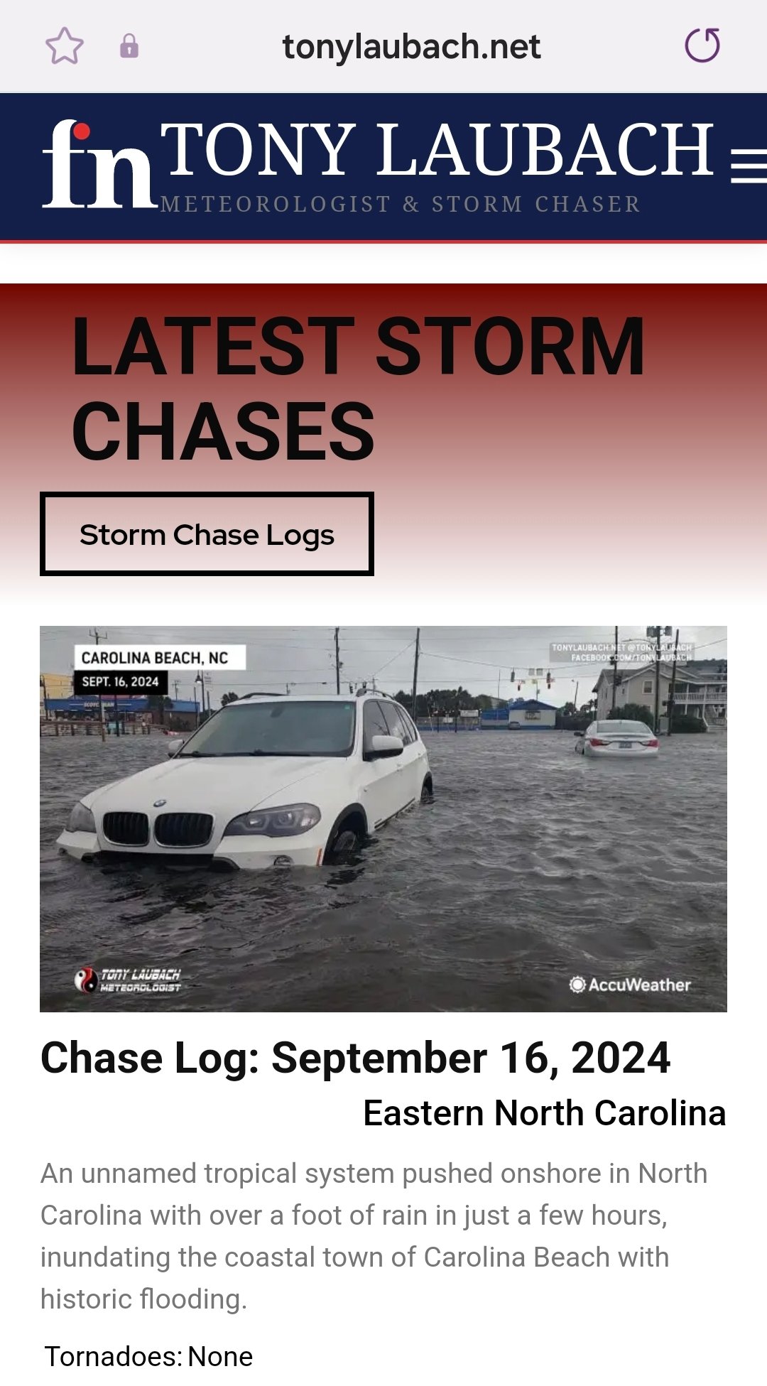
Trying to figure out why I get the default template header when loading up the site on a mobile phone. I have turned off all the mobile options, and even the footer seems to display properly.
What I have done to this point…
In THEME PANEL under Header>Mobile Header, I have changed the Logo Mobile/Retina Logo Mobile to the Yin/Yang design.
In THEME PANEL under THEME COLORS>Mobile Menu, I have changed the background colors to the deep red.
In Newspaper Plugins, I have deactivated ‘tagDiv Mobile Theme’ and ‘Official AMP for WP’
In CLOUD TEMPLATES, I have ‘Main Header’ as Global (as I do with Main Footer, which is showing up).
I feel like I am missing something fairly obvious and just overlooking a setting or a checkbox somewhere. But I’m all out of ideas at the moment. Would love to display the proper header when viewing page from a mobile device.
Thank you!

