
- NewsmagUsing the theme translations together with WPML
- NewsmagHow to update a plugin
- NewsmagCustom Post Type Support
- NewsmagAbove footer ads
- NewsmagWeather Widget
- NewsmagHow to update the theme
- NewsmagIntroduction
- NewsmagLogo & Favicon
- NewsmagFooter templates
- NewsmagUsing other ads
- NewsmagCustom ad spots
- NewsmagArticle ads
- NewsmagSidebar ads
- NewsmagHeader ads
- NewsmagLoading image effects
- NewsmagCategory top post styles
- NewsmagSmart Lists
- NewsmagGeneral settings
- NewsmagTheme thumbs
- NewsmagtagDiv slider gallery
 Signlops
Hi I have installed app find pro template and customised the website, on the home page i have added filters and Apps, but the filters are not working, please check the screenshot i have selected the advertising tool, but still it shows all other categories
Website URL: https://signlops.au/
 aj.reynolds
Hi
We require a for the Newspaper theme. We use this theme on our website (https://www.indianlink.com.au/), and we use a simple app provided by AIM (https://www.thisisaim.com/) to deliver the articles of our website to our customers. The app can be found on the Apple or Play store and is called: Indian Link.
The app functions by pulling the Featured Image, Title, and Post content from a WordPress post using RSS, and delivering it to the app as an article to be tapped on. When tapped, the app diverts the user to the URL of that article.
We have discussed functionality with the app developer, and asked if any custom XML or PHP is required to make this function, but they have assured (and even showcased using a brand new WordPress installation), that the Featured Image, Title and Content pulls to the app without any additional plugins or changes to a standard WordPress installation.
Sadly, when the Newspaper theme is turned ON, the Title and the Content is pulled through, but the Featured Image is not. The image that appears in the app, is a default “fallback” image that has been set up in the AIM backend. If we turn the theme OFF, the featured images feed through to the app successfully.
At one stage, we had a programmer add this line of code to the bottom of the functions.php file, contained within: public_html/wp-content/themes/newspaper
// Add the 'media' namespace to the RSS feed

function custom_rss_namespace() {

    echo 'xmlns:media=http://search.yahoo.com/mrss/ ';

}

add_action('rss2_ns', 'custom_rss_namespace');
// Add the media:thumbnail to the RSS feed
function custom_rss_media_thumbnail() {
global $post;
if (has_post_thumbnail($post->ID)) {
$thumbnail = wp_get_attachment_image_src(get_post_thumbnail_id($post->ID), 'full');
$thumbnail_url = $thumbnail[0];
echo '<media:thumbnail url="' . esc_url($thumbnail_url) . '" />';
}
}
add_action('rss2_item', 'custom_rss_media_thumbnail');
It seemed to work, and the Featured Images began feeding correctly to the app. However as soon as there was a theme update, this file was overridden, and readding the same code did not result in the same outcome.
We’re in search of a permanent solution here, that would withstand future theme updates. I believe that there must be something in the Newspaper theme files that actively alters the original state of Featured Images, causing the app to not be able to find the image it is looking for when drawing from the RSS feed. If you use any online RSS viewer (example:https://rss.app/feed/y0F9FOXcarlvA9HX?utm_source=rssviewer&utm_medium=website), you will see that the featured images also do not appear.
Thank you in advance for your help!
 Greg19
 check this please:
https://www.magdasnews.gr/me-to-thriamveytiko-73-epanexelegi-apo-tin-a-kyriaki-dimarchos-ellinikoy-argyroypolis-o-giannis-konstantatos/
as you can see the article has not image like missing.
On backend as you can see like destroyed:
https://www.magdasnews.gr/wp-admin/post.php?post=938857&action=edit&classic-editor
thank you for the quickly respose…
 stefanegirard
 Hi,
From my desktop
On my Homepage: When I click on the Phone Viewport, I have a mobile menu (not configured – PULSES PRO appearing) with a magnifying glass and a burger menu.
If I click I have a menu sliding or a sliding research (not configured). So different from my desktop view.
Without being connected with the back office (therefore without Composer): When I shrink the Chrome window to a minimum (to simulate mobile view): the configuration of the Homepage seems ok (responsive, one column) therefore I see the mobile menu with a magnifying glass and a burger menu. I can see the content but when I click on an image or a title, I do not see the content of my post. Only title, main image and popular posts below. Just like on my cell phone.
I do not use AMP plugin
Thanks
-
This reply was modified 2 years by
stefanegirard.
 Bettina
 Hello @rockman008 !
We have 3 options for mobile versions that you can use:
1. Responsive version: A responsive version of your website looks similar to the desktop version. TagDiv Composer is used to edit the page.Click on the mobile viewport: https://www.screencast.com/t/XDQJedlggSB. There, you can see your mobile version and edit or adjust the elements to look better.
2. Mobile pages: https://tagdiv.com/newspaper-10-3-7-update-brings-customizable-and-fast-mobile-pages
3. Mobile theme plugin: The Mobile Theme is a performance-optimized theme included in the main Newspaper theme that only loads on mobile devices. It comes with its own templates and designs for pages, posts, categories, etc., so your current templates from the desktop theme will get converted to the mobile theme layout. Please see https://forum.tagdiv.com/the-mobile-theme/ and https://forum.tagdiv.com/mobile-theme-introduction/ for more information.
A full explanation is here: https://www.youtube.com/watch?v=SpGkOnJeNZY
If you need to use mobile version 1 or 2, then you need to uninstall the Mobile Theme plugin and AMP.
You can add the ad box element in the tagdiv Composer and add the code there in the mobile viewport. Read all about it here: https://forum.tagdiv.com/ads-adsense-overview/
Thank you!
Bettina Hello Paolo!
If you updated the theme to the latest version, then you need to activate the Standard Pack plugin in order to have all the default templates available.
We recommend using cloud/PRO templates in order to have the possibility to edit them with the TagDiv Composer, which contains a lot of functions and features. Please check out our tutorial here: https://forum.tagdiv.com/tagdiv-composer-tutorial/
More documentation about the cloud templates is here:
– https://forum.tagdiv.com/cloud-library-templates/
– https://forum.tagdiv.com/design-post-pages-using-cloud-library-templates/
– https://forum.tagdiv.com/cloud-library-category-templates/
You can redesign the website using the tagdiv Composer, or import the cloud template you like from the Cloud Library, or install an entire demo (without content) with design only.
You can reproduce this block as well using Flex Block 1 for example: https://prnt.sc/CKfblif2FWAJ
Thank you!
Bettina Hello!
I can see that you have a lot of errors in the console. Make a test and deactivate ALL plugins except tagDiv ones, also if you are using a cache plugin, deactivate it, clear all cache and try again.
We have 3 options for mobile versions that you can use:
1. Responsive version: A responsive version of your website looks similar to the desktop version. TagDiv Composer is used to edit the page.Click on the mobile viewport: https://www.screencast.com/t/XDQJedlggSB. There, you can see your mobile version and edit or adjust the elements to look better.
2. Mobile pages: https://tagdiv.com/newspaper-10-3-7-update-brings-customizable-and-fast-mobile-pages
3. Mobile theme plugin: The Mobile Theme is a performance-optimized theme included in the main Newspaper theme that only loads on mobile devices. It comes with its own templates and designs for pages, posts, categories, etc., so your current templates from the desktop theme will get converted to the mobile theme layout. Please see https://forum.tagdiv.com/the-mobile-theme/ and https://forum.tagdiv.com/mobile-theme-introduction/ for more information.
A full explanation is here: https://www.youtube.com/watch?v=SpGkOnJeNZY
If you need to use mobile version 1 or 2, then you need to uninstall the Mobile Theme plugin and AMP.
Thank you!
 nedo
nedoHi,
I do have a problem updating the Theme. Here is the website: https://evergreenseeds.com/
I have an old version and the theme has not been updated since 2019, when I proceed with the update all get messed up.
-Is there a way we can use the same header and footer in the updated theme? These seem to be the parts harder to replicate.
For example, how to replicate the “Header style” and “Footer Templates” in the latest theme version?
– Also there are some blocks not available in the tag div composer plugin’s latest version. We were using those blocks in our Homepage.
Thanks, Paolo
Bettina Hello @stefanegirard !
There is no layout for the mobile theme on your website. Your mobile version looks the same as your desktop version. TagDiv Composer is used to edit the page. Click on the mobile viewport: https://www.screencast.com/t/XDQJedlggSB. There, you can see your mobile version and edit or adjust the elements to look better.
Do you use AMP plugin instead?
Thank you!
 Anamaria
 Hi,
Please check this guide https://wpengine.com/resources/how-to-add-google-search-in-a-wordpress-site/
A shortcode can be inserted by using the element called “Column text” or “Text with title”. For example, in the step3 here: https://forum.tagdiv.com/add-cryptocurrency-price-ticker-widget/
“Column text” and “text with title” elements have a button called “edit content” and if you click on that button, the WP Editor will open, and you can add some text/code/shortcode there. Close the WP Editor from X, save the changes from Composer and view the page to see the changes.
Thank you!
 pawl
pawlHi all!
Recently switched to Newspaper from another theme, and while very happy overall I have a couple of niggly things I’ve not yet worked out – the biggest one is page templates.
I’m trying to find a way to create pages using the Gutenberg editor, but have the content added to a page template, in much the same way that regular posts are. This would allow for consistent formatting, ease of page creation, and the ability to use blocks from the Kadence plugin or things like drop caps.
For example:
Take the layout of this post – https://warhamateur.com/tools/clippers/dspiae-st-a-single-blade-nipper/
I want the sidebar to be consistent throughout the site, excepting the home page. I can’t create this using the standard widget function, however, so I would like to set it in the page template like I have the post template. The page template editor however doesn’t have a ‘content’ block like the post editor.
Assuming this makes sense, is what I’m trying to do actually possible?
(also I’m aware that some pages/posts look a little off. I’ve been editing on the live site because I’m apparently an idiot!)
Bettina Hello @novodia!
If you use cloud templates, then you need to change the logo in the tagdiv Composer.
Please check our tutorial here: https://forum.tagdiv.com/tagdiv-composer-tutorial/
More documentation about the cloud templates is here:
– https://forum.tagdiv.com/cloud-library-templates/
– https://forum.tagdiv.com/design-post-pages-using-cloud-library-templates/
– https://forum.tagdiv.com/cloud-library-category-templates/
We have 3 options for mobile versions that you can use:
1. Responsive version: A responsive version of your website looks similar to the desktop version. TagDiv Composer is used to edit the page.Click on the mobile viewport: https://www.screencast.com/t/XDQJedlggSB. There, you can see your mobile version and edit or adjust the elements to look better.
2. Mobile pages: https://tagdiv.com/newspaper-10-3-7-update-brings-customizable-and-fast-mobile-pages
3. Mobile theme plugin: The Mobile Theme is a performance-optimized theme included in the main Newspaper theme that only loads on mobile devices. It comes with its own templates and designs for pages, posts, categories, etc., so your current templates from the desktop theme will get converted to the mobile theme layout. Please see https://forum.tagdiv.com/the-mobile-theme/ and https://forum.tagdiv.com/mobile-theme-introduction/ for more information.
A full explanation is here: https://www.youtube.com/watch?v=SpGkOnJeNZY
If you need to use mobile version 1 or 2, then you need to uninstall the Mobile Theme plugin and AMP.
Thank you!
Anamaria Hi,
You need to disable the mobile theme and amp to have mobile responsive version.
Using our theme you can choose from 3 mobile versions
-> mobile responsive => https://www.screencast.com/t/oJ2ShOp47
-> mobile theme plugin => https://forum.tagdiv.com/the-mobile-theme/
-> mobile page => https://tagdiv.com/newspaper-10-3-7-update-brings-customizable-and-fast-mobile-pages/
If you created the mobile pages with tagDiv Composer, then when you install the Mobile Theme plugin, your pages will be overwritten by the plugin (the mobile theme comes with its templates for page, post, category, etc so your current templates from the desktop theme will get converted to the mobile theme layout, the page content is made without builders in mobile editor => https://www.screencast.com/t/xbgZG8kH also, the options that are provided to edit the mobile theme version are limited (this keeps the things simple)).
This is a video about Responsive Newspaper Theme, AMP & Mobile Theme, Mobile Pages & Templates -> https://www.youtube.com/watch?v=SpGkOnJeNZY
So, the mobile responsive is what you see then that you select the viewport on phone => https://www.screencast.com/t/matV17hH, so some settings may apply for each viewport(where is the border blue), and others are not(where the border is black).
The mobile page has the mobile templates from Cloud Library => https://www.screencast.com/t/YCcZ8rL8
The Mobile responsive version of the theme and the mobile page editor can be edit with tagDiv Composer, the mobile theme plugin cannot.
For example, you can have the mobile theme plugin activated and use the mobile page/mobile responsive version for the homepage/pages, but for the categories pages/404 page, you can’t use the mobile page/mobile responsive version if you have the mobile theme plugin activated.
So, if you want to design the pages with tagDiv Composer, you can use the mobile page or mobile responsive version.
Thank you!
 datingvergleich
 I have deactivated mobile theme and AMP pages for testing, now.
However, the links to the 404 pages are still there. After investigating the source code for the desktop version of the theme, I have found following section:
</div></div><div class="tdm_block td_block_wrap tdm_block_button tdi_30 tdm-block-button-full tdm-content-horiz-right td-pb-border-top td-press-button td-move-arrow td_block_template_1"  data-td-block-uid="tdi_30"     >

<style>@media (max-width:767px){.tdi_30{text-align:left!important}}</style>

<style>.tdm_block.tdm_block_button{margin-bottom:0}.tdm_block.tdm_block_button .tds-button{line-height:0}.tdm_block.tdm_block_button.tdm-block-button-inline{display:inline-block}.tdm_block.tdm_block_button.tdm-block-button-full,.tdm_block.tdm_block_button.tdm-block-button-full .tdm-btn{display:block}.tdc-row .tdi_30 .tdm-btn{height:auto;padding:15px 25px}@media (min-width:768px) and (max-width:1018px){.tdc-row .tdi_30 .tdm-btn{height:auto;padding:12px 20px}}</style>

<style>.tdc-row .tdi_31{padding:15px 25px;height:auto;line-height:1}.tdc-row .tdi_31 i{font-size:16px}body .tdc-row .tdi_31 .tdm-btn-icon:last-child{margin-left:10px}body .tdc-row .tdi_31{background-color:var(--tt-accent-color)}body .tdc-row .tdi_31:after{background-color:var(--tt-hover)}body .tdc-row .tdi_31 .tdm-btn-text,body .tdc-row .tdi_31 i{color:#ffffff}.tdc-row .tdi_31 svg{fill:#ffffff;fill:#ffffff}.tdc-row .tdi_31 svg *{fill:inherit;fill:inherit}body .tdc-row .tdi_31:hover .tdm-btn-text,body .tdc-row .tdi_31:hover i{color:#ffffff;-webkit-text-fill-color:unset;background:transparent;transition:none}body .tdc-row .tdi_31:hover svg{fill:#ffffff;fill:#ffffff}body .tdc-row .tdi_31:hover svg *{fill:inherit;fill:inherit}body .tdc-row .tdi_31 i{color:#ffffff;-webkit-text-fill-color:unset;background:transparent}body .tdc-row .tdi_31:hover i{color:#ffffff;-webkit-text-fill-color:unset;background:transparent;transition:none}.tdc-row .tdi_31:before{border-width:0px;border-style:solid}.tdc-row .tdi_31{font-size:16px!important;line-height:1.2!important;font-weight:600!important;text-transform:uppercase!important;letter-spacing:0.5px!important;height:auto}@media (min-width:768px) and (max-width:1018px){.tdc-row .tdi_31{padding:12px 20px;height:auto;line-height:1}.tdc-row .tdi_31{font-size:14px!important}}</style><div class="tds-button td-fix-index"><span class="tdm-btn-text">See pricing</span><i class="tdm-btn-icon td-icon-arrow-right-rounded"></i></div></div></div></div><div class="vc_column tdi_33  wpb_column vc_column_container tdc-column td-pb-span4">

<style scoped>.tdi_33{vertical-align:baseline}.tdi_33>.wpb_wrapper,.tdi_33>.wpb_wrapper>.tdc-elements{display:block}.tdi_33>.wpb_wrapper>.tdc-elements{width:100%}.tdi_33>.wpb_wrapper>.vc_row_inner{width:auto}.tdi_33>.wpb_wrapper{width:auto;height:auto}.tdi_33{justify-content:center!important;text-align:center!important}@media (min-width:768px) and (max-width:1018px){.tdi_33{padding-top:30px!important;width:36%!important}}</style><div class="wpb_wrapper" ><div class="tdm_block td_block_wrap tdm_block_socials tdi_34 tdm-content-horiz-left td-pb-border-top td_block_template_1"  data-td-block-uid="tdi_34" >

<style>.tdm_block.tdm_block_socials{margin-bottom:0}.tdm-social-wrapper{*zoom:1}.tdm-social-wrapper:before,.tdm-social-wrapper:after{display:table;content:'';line-height:0}.tdm-social-wrapper:after{clear:both}.tdm-social-item-wrap{display:inline-block}.tdm-social-item{position:relative;display:inline-block;vertical-align:middle;-webkit-transition:all 0.2s;transition:all 0.2s;text-align:center;-webkit-transform:translateZ(0);transform:translateZ(0)}.tdm-social-item i{font-size:14px;color:var(--td_theme_color,#4db2ec);-webkit-transition:all 0.2s;transition:all 0.2s}.tdm-social-text{display:none;margin-top:-1px;vertical-align:middle;font-size:13px;color:var(--td_theme_color,#4db2ec);-webkit-transition:all 0.2s;transition:all 0.2s}.tdm-social-item-wrap:hover i,.tdm-social-item-wrap:hover .tdm-social-text{color:#000}.tdm-social-item-wrap:last-child .tdm-social-text{margin-right:0!important}</style>

<style>.tdi_35 .tdm-social-item i{font-size:14px;vertical-align:middle}.tdi_35 .tdm-social-item i.td-icon-linkedin,.tdi_35 .tdm-social-item i.td-icon-pinterest,.tdi_35 .tdm-social-item i.td-icon-blogger,.tdi_35 .tdm-social-item i.td-icon-vimeo{font-size:11.2px}.tdi_35 .tdm-social-item{width:28px;height:28px;margin:5px 10px 5px 0}.tdi_35 .tdm-social-item i{line-height:28px}.tdi_35 .tdm-social-item-wrap:last-child .tdm-social-item{margin-right:0!important}.tdi_35 .tdm-social-item i,.tds-team-member2 .tdi_35.tds-social1 .tdm-social-item i{color:var(--tt-accent-color)}.tdi_35 .tdm-social-item-wrap:hover i,.tds-team-member2 .tdi_35.tds-social1 .tdm-social-item:hover i{color:var(--tt-hover)}.tdi_35 .tdm-social-text{display:none;margin-left:2px;margin-right:18px}@media (min-width:768px) and (max-width:1018px){.tdi_35 .tdm-social-item i{font-size:12px;vertical-align:middle}.tdi_35 .tdm-social-item i.td-icon-linkedin,.tdi_35 .tdm-social-item i.td-icon-pinterest,.tdi_35 .tdm-social-item i.td-icon-blogger,.tdi_35 .tdm-social-item i.td-icon-vimeo{font-size:9.6px}.tdi_35 .tdm-social-item{width:24px;height:24px}.tdi_35 .tdm-social-item i{line-height:24px}}</style><div class="tdm-social-wrapper tds-social1 tdi_35"><div class="tdm-social-item-wrap"><i class="td-icon-font td-icon-instagram"></i><span style="display: none">Instagram</span></div><div class="tdm-social-item-wrap"><i class="td-icon-font td-icon-linkedin"></i><span style="display: none">Linkedin</span></div><div class="tdm-social-item-wrap"><i class="td-icon-font td-icon-twitter"></i><span style="display: none">Twitter</span></div></div></div><div class="td_block_wrap td_block_raw_css tdi_36 td-pb-border-top td_block_template_1"  data-td-block-uid="tdi_36" ><div id=tdi_36 class="td_block_inner td-fix-index"><style>.td-coaching-mm .td-sd-menu-icon.tdm_block_icon_box {

  cursor: pointer;

}

.td-coaching-mm .td-sd-menu-icon.tdm_block_icon_box .tdm-col-icon {

  transition: padding 0.1s ease-in-out;

}

.td-coaching-mm .td-sd-menu-icon.tdm_block_icon_box:hover .tdm-col-icon {

  padding-right: 10px;

}

</style></div></div></div></div></div></div></div></div>
Here, these problematic links are inserted in the header section. However, the links are not visible (i.e. hidden) on the rendered web pages and I cannot find them in the tagdiv composer templates.
Do you have a clue how to remove them and why/how they are inserted?
Bettina Hello Joachim!
Check this guide: https://forum.tagdiv.com/tagdiv-amp-plugin-tutorial/ and set up only the posts.
Thank you!
datingvergleich Dear Bettina,
as I like the concept of the mobile theme and AMP pages, it would be a pity to deactivate them. Isn’t there another configuration or tweaking option to hinder them from creating those URLs?
According to your documentation, the AMP option should only create slugs with /amp/ added to the post URLs. I don’t understand why the other slug endings are created or whether they have a function at all.
Kind regards
Joachim
Anamaria Hi,
For the mobile theme and amp, this option will not be added. The option is available for mobile responsive and mobile pages/templates.
Thank you!
Bettina Hello Joachim!
Please uninstall the mobile theme and amp because amp creates those URLs.
Thank you!
datingvergleichDear Support Team,
the activation of your theme has created thousands of 404-pages on my site. This, in fact, hurts my SEO rankings.
For instance, it creates pages with URL slug …/switching-plans-wizard/ added to them automatically for many URLs.
Example: https://www.dating-vergleich.com/kategorien/spezielle-singleboersen/russische-singles/switching-plans-wizard/ is created for category page https://www.dating-vergleich.com/kategorien/spezielle-singleboersen/russische-singles/
Then, it creates thousands of links to these error pages.
Please kindly check the following screenshot:
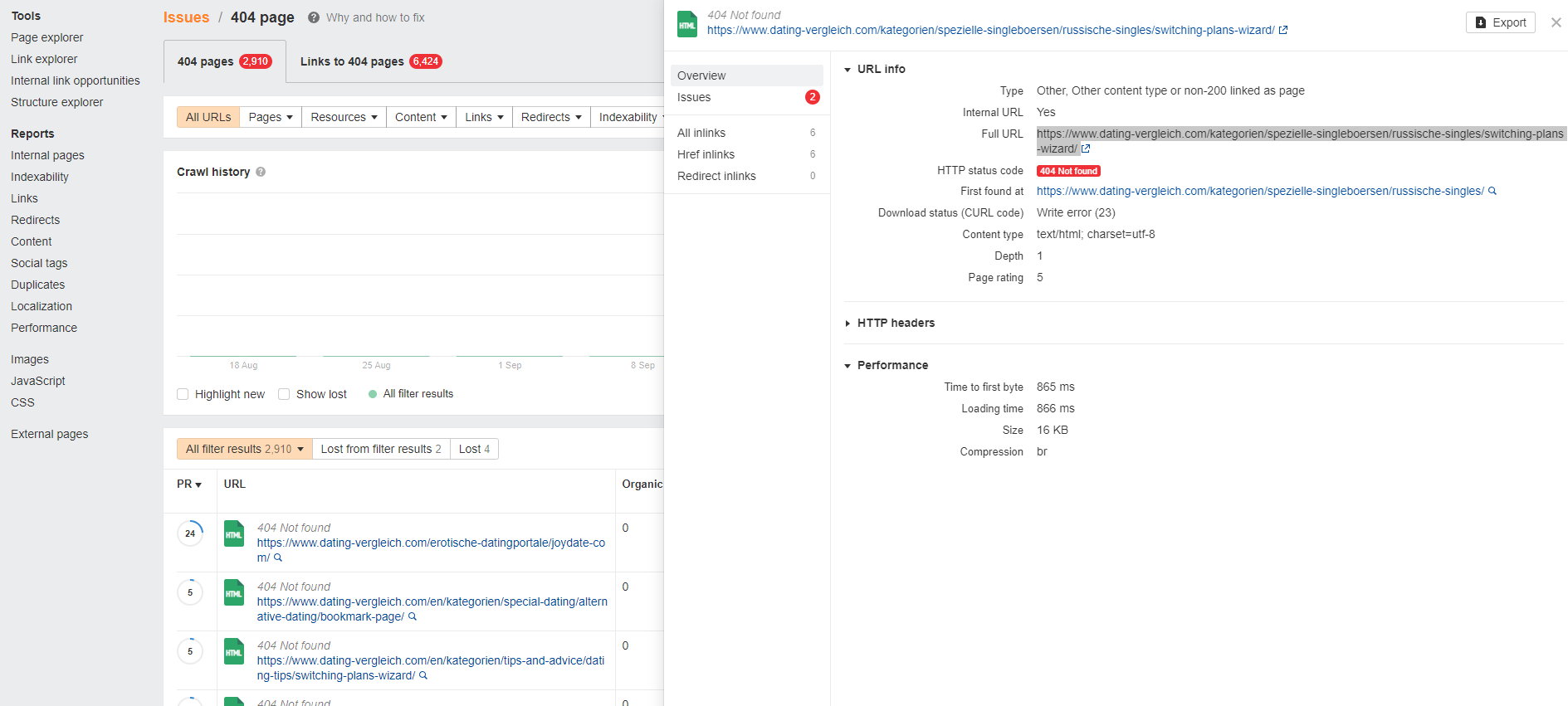
As I do not understand this feature, how can I deactivate it completely in your theme?
Thanks for a brief feedback!
Kind regards
Joachim
datingvergleichDear Support Team,
the bookmark feature of your theme creates thousands of 404-pages on my site. This, in fact, hurts my SEO rankings.
For instance, it creates pages with URL slug …/bookmark-page/ added to them automatically for all URLs.
Example: https://www.dating-vergleich.com/kategorien/spezielle-singleboersen/russische-singles/bookmark-page/ is created for category page https://www.dating-vergleich.com/kategorien/spezielle-singleboersen/russische-singles/
Then, it creates thousands of links to these error pages.
Please kindly check the following screenshot:
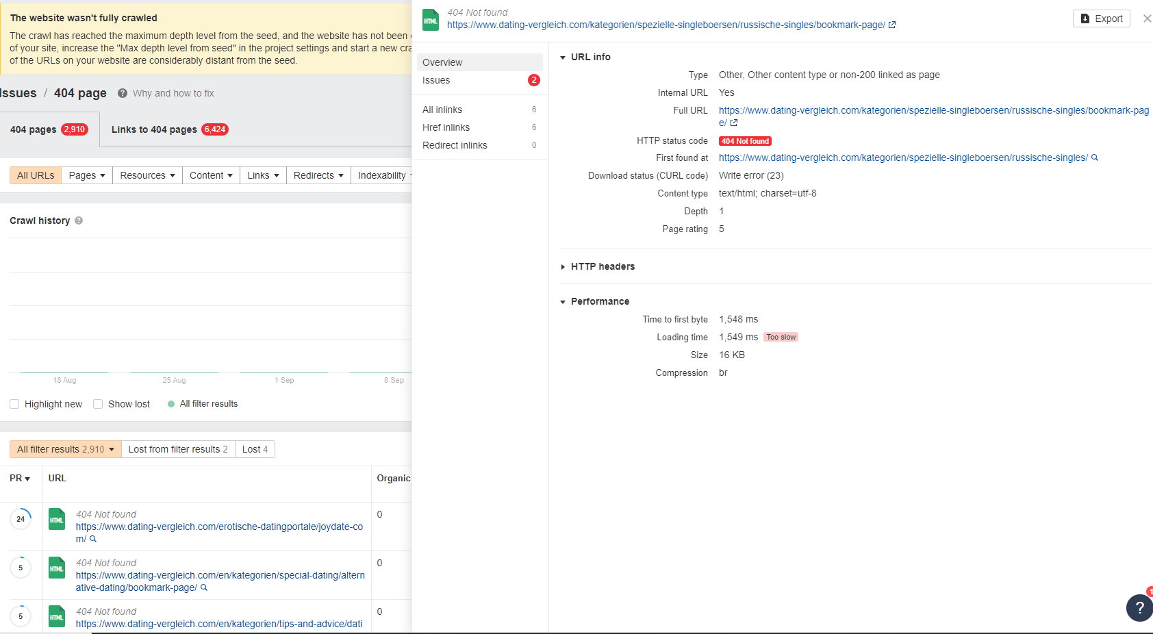
As I do not need the bookmark feature, how can I deactivate it completely in your theme?
Thanks for a brief feedback!
Kind regards
Joachim
 ArtSeine
 Thanks that’s it 🙂 ?
But new problem I have a gray bar (see photo) that I cannot select to remove it.
https://www.dropbox.com/scl/fi/niuc2kanx8zgam4ccx95t/save3.jpg?rlkey=cw3aiix97juzrfkuq66ows8bq&dl=0
 giulian
 I am referring to something like this:
View Your Page Structure & Quickly Navigate To Any Element
https://www.elegantthemes.com/blog/theme-releases/divi-layers-view
Sometimes it is hard to select the inner row columns and move elements, etc…
This option gives you better access to all the elements.
Bettina Hello!
We have 3 options for mobile versions that you can use:
1. Responsive version: A responsive version of your website looks similar to the desktop version. TagDiv Composer is used to edit the page.Click on the mobile viewport: https://www.screencast.com/t/XDQJedlggSB. There, you can see your mobile version and edit or adjust the elements to look better.
2. Mobile pages: https://tagdiv.com/newspaper-10-3-7-update-brings-customizable-and-fast-mobile-pages
3. Mobile theme plugin: The Mobile Theme is a performance-optimized theme included in the main Newspaper theme that only loads on mobile devices. It comes with its own templates and designs for pages, posts, categories, etc., so your current templates from the desktop theme will get converted to the mobile theme layout. Please see https://forum.tagdiv.com/the-mobile-theme/ and https://forum.tagdiv.com/mobile-theme-introduction/ for more information.
A full explanation is here: https://www.youtube.com/watch?v=SpGkOnJeNZY
If you need to use mobile version 1 or 2, then you need to uninstall the Mobile Theme plugin and AMP.
Every mobile version has its own settings section.
Thank you!
ArtSeine Bettina Hello @ramiz1819 !
Unfortunately, AMP is not working with the cloud templates because the AMP’s layout is not fully customized.
The AMP version works best with default templates and not cloud templates. That’s why we integrated it with the Mobile theme plugin.
The feedback from our clients about AMP was negative and it is not used anymore, that’s why we didn’t add more customization options. From my point of view, if you don’t use the Mobile Theme plugin, then there is no reason or benefit to AMP.
We have 3 options for mobile versions that you can use:
1. Responsive version: A responsive version of your website looks similar to the desktop version. TagDiv Composer is used to edit the page.Click on the mobile viewport: https://www.screencast.com/t/XDQJedlggSB. There, you can see your mobile version and edit or adjust the elements to look better.
2. Mobile pages: https://tagdiv.com/newspaper-10-3-7-update-brings-customizable-and-fast-mobile-pages
3. Mobile theme plugin: The Mobile Theme is a performance-optimized theme included in the main Newspaper theme that only loads on mobile devices. It comes with its own templates and designs for pages, posts, categories, etc., so your current templates from the desktop theme will get converted to the mobile theme layout. Please see https://forum.tagdiv.com/the-mobile-theme/ and https://forum.tagdiv.com/mobile-theme-introduction/ for more information.
A full explanation is here: https://www.youtube.com/watch?v=SpGkOnJeNZY
If you need to use mobile version 1 or 2, then you need to uninstall the Mobile Theme plugin and AMP.
Thank you!

