- NewspaperThe Newspaper Mobile Theme: Introduction
- NewspaperThe Mobile Theme
- NewspaperMain Menu
- NewspaperHow to Add a Logo in Newspaper
- NewspaperBig Grid Flex Settings
- NewspaperHeader Builder
- NewspaperFont Customization
- NewspaperTheme Colors Introduction
- NewspaperBackground Introduction
- NewspaperHow to Install Newspaper via FTP
- NewspaperHow to Install Newspaper via WordPress
 leapdsc
Hey there, as the topic suggests, is it possible for me to achieve it for the main menu? Taking into consideration, the home button is an icon (during Desktop display), meanwhile in Tablet/Mobile display, remaining as text.
Image 1 (working currently working on): https://1drv.ms/i/s!Ai3uwVtbSehut-p5hAGOP83xEZOspQ
Image 2 (desired look): https://1drv.ms/i/s!Ai3uwVtbSehut-p4CENa4JfpIG1Y2Q
Current website url: http://leapdsc.com/leapdsc/client/hdb/
 EquipaRefrigeracao
 Hello, Catalin!
Thanks for your answer.
The mega menu sounds good for me, but only on the Desktop. On mobile, its not a dropdown menu 🙁 How can I get a page menu like a dropdown menu on mobile?
 Bogdan B.
 Hi,
If the mobile layout is different and will not allow a top menu. Only a main menu and footer menu. What you want is to enable the top menu on mobile devices. Please provide a link to your site and I will provide a css code to re-activate the top menu on mobiles.
Thanks.
Bogdan B. Hi,
The thumbs on your page seem fine. They are clear and crisp: https://www.screencast.com/t/op3Cfs7GmT
You cannot have blocks show the exact image size as the one you upload. Each block uses it’s own thumbnail size: https://forum.tagdiv.com/theme-thumbs/
As for the logo the sticky menu logo will grab the main logo and shrink it to fit the main menu bar https://www.screencast.com/t/vDbKNIcBOu8p
You can choose to grab the mobile logo for the scrolling menu: https://www.screencast.com/t/p22UglQr
Thanks.
 norm0722
 Update: resolved this by deactivating the mobile plugin, and then using visual composer (wp bakery) I hid the items I didn’t want on mobile devices.
However, I’m getting a double menu situation right now, and I’m not sure why. the hamburger menu icon is there but then there’s another one below it.
EquipaRefrigeracaoHello,
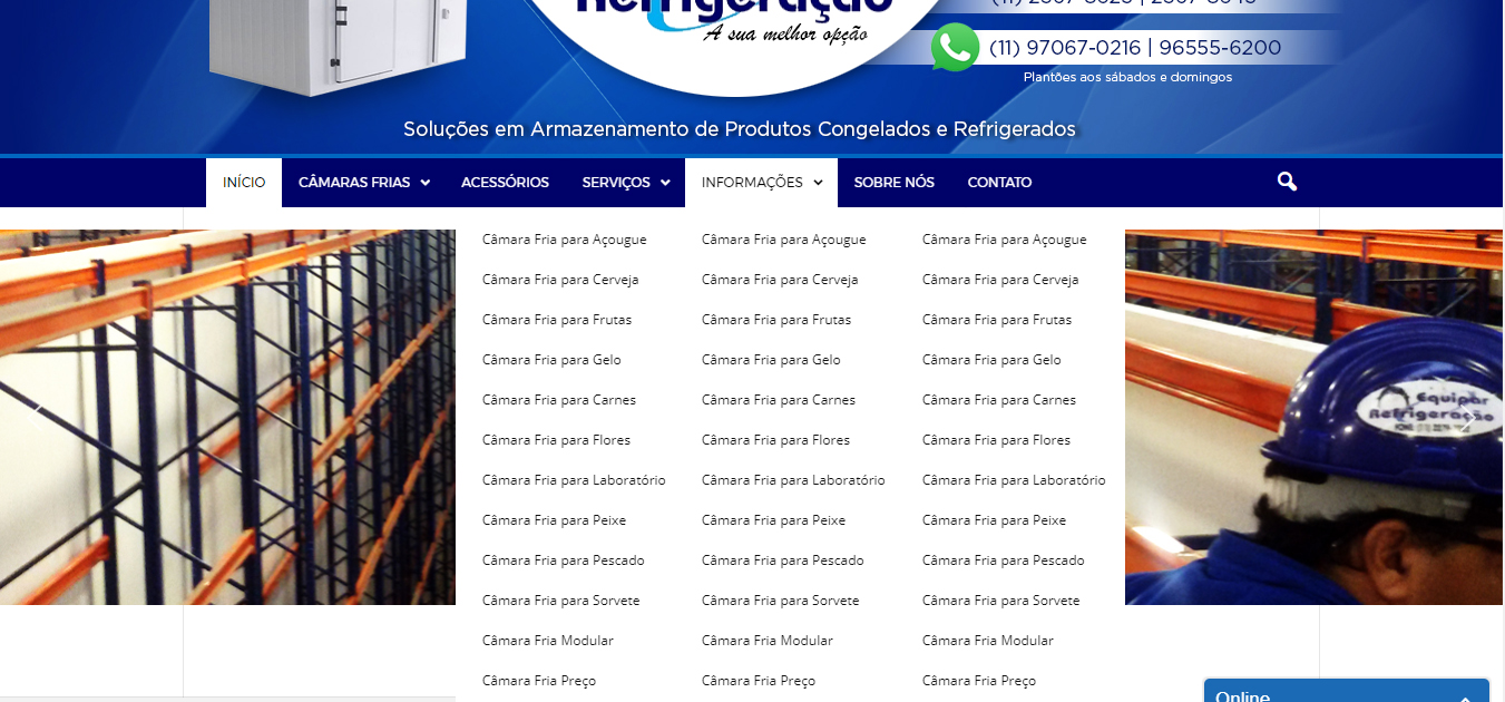
I would like to know how can I split the submenu into columns without plugins (the plugins is not working good because the default mobile menu).
I would like something like that: https://equiparrefrigeracao.com.br/wp-content/uploads/2017/09/how-to-do.jpg
My website is https://equiparrefrigeracao.com.br/
Thank you
 SuperArmySoldiers
 Sorry I think I have not explained myself very well… the Mobile layout doesn’t seem to allow for 3 menus… I cant see any setting to allow ‘Top Menu’ ‘Main Menu’ ‘Footer Menu’
http://www.caffeinegaming.com
You can see on the desktop site 3 menus.
But on the mobile only 2.
Thanks!
 Ali Zoghi
Hi
I shared the header of http://www.example.com/parent with http://www.example.com/child with switch-blog function of multisite. It means that the child site has no menu for itself and it uses the menu and header+footer of the parent site. There are some issues:
1) Mega menu ajax is not working
2) search button in mobile size is not working (I think again it relates to ajax call)
3) Sticky menu is not working
Would you please say me what is the problem and how can I solve them.
 Catalin
 Hello Hero,
Notice that the Mega Menu works only for Desktop version and not for mobile devices, sorry! The same main menu will be displayed for mobile devices. If you want to have that arrow you should create a sub-category.
Thanks.
SuperArmySoldiersHey,
I need to display 3 menus on my mobile site. Same as my desktop site.
Top Menu
Main Menu
Footer Menu
But the theme seems to only allow to set 2 of them.
Any way to set all 3?
 Coin Hero
 I need the subcatogeries just for the mobile menu. At the desktop version i have the mega menu which works fine.
For the mobile menu i need the arrows and not the mega menu.
How can I figure this out?
Coin Hero ok thanks! How Can I change it that there is a mega menu at the desktop version BUT an arrow at the mobile version?
Catalin Hello Coin Hero,
I have inspected your website and I saw that your Mega Menu and mobile menu work as expected. Please notice that the arrow appears on the desktop version because you are using the Mega Menu and below the Wissen category will be displayed all the posts from this category. So, on the mobile menu, the arrow does not appear in front of this category because the Wissen does not have any subcategories and that’s why these does not exist.
I hope this helps!
Thanks for your understanding!
 Jair Prandi
 I think there’s a problem. When you click on the Mobile menu icon, the link appears with # at the end.
 Festileaks
Hi!
To make our website as clean and distraction-less as possible, we are looking for a way to use the mobile (hamburger) menu also on the desktop version of our website. Is that a possibility with a few (CSS?) tweaks in de code?
Looking forward to hearing from you!
 Simion C.
 Hi,
For a better understating please specify what exactly are you trying to do, and what is the problem. And provide a link to your website if possible so we can inspect it.
The mobile theme has an option that allows different menus to be displayed on mobile
– https://www.screencast.com/t/f4CxoVrLbN2f
More information about the mobile theme plugin here
– https://forum.tagdiv.com/the-mobile-theme/
Please note that content for mobile pages is limited to the Mobile editor
– https://www.screencast.com/t/HeyeaLwQ
If you want the same content form desktop to be displayed on mobile devices, deactivate the mobile theme. The plugin is optional.
Thanks
Coin HeroI got two Screenshots. For the navigation point “Wissen” the mega menu is enabled. This works pretty well on the desktop version, I marked it with red.
BUT: On the mobile menu, there are two little arrows to look at the subitems (marked with green). But there are no subitems for the mega Menu “Wissen”. but I need those subitems also at the mega menu, what can i do?
My site is https://coin-hero.de/


 luca8link
 Hey Chris, thanks for your reply. Unfortunately, nothing worked.
I convinced the client to add the mobile theme, so I solved this part. But if you try to navigate the main menu, you will notice that pages working on desktop seem to be empty on mobile. E.g. https://positiveprescription.com/sessions/
Any suggestion?
Thanks again
Simion C. Hi,
The theme is not installed at the moment on the website you provided, so we cannot inspect the issue
– https://www.screencast.com/t/U0zpejnjYo
The mobile menus should display the same menu that you have set on desktop, the socials and login/register
– https://www.screencast.com/t/EdCZN8bOy
Thanks
 bloggingindian
 I am still facing the issue
I created new menu assigned to mobile menu option i cant see the content on the page.
plz help
Catalin Hello awoodhams,
I have inspected your website for mobile devices on Chrome and it seems that your top menu bar is centered aligned for any others page.
Thanks for your understanding!
 ahmetekinler
That’s what I see when I click on the mobile menu and search icon on my test page. -> https://prnt.sc/gg7uyr
My test website is: http://version2.cepkolik.com/
How can i fix it?
Note: I try below
***
Tagdiv: This could be a plugin conflict so please disable all plugins except the page builder, clear cache and reset cdn files if you use it. Please also check any custom code you might have added to the theme panel or the theme files. If you use a child theme, please switch to the main theme to make sure it does not affect the proper functionality of the theme.
Simion C. Hi,
A code like this will remove the socials and login from the mobile menu
– https://www.screencast.com/t/mEvrihEd7g
Enter it in Theme panel->Custom CSS section
.td-menu-socials,

.td-menu-login-section {

display: none;

}
Thanks
Catalin Hi jobo9968,
Thanks for your suggestion but we have taken this decision because most of our users want to have the Top Bar into the Main Menu bar in mobile mode.
Thanks for the message!
Catalin Hi,
@awoodhams, sorry for this but please notice that code which I gave you above it’s possible to need more adjustments for mobile devices. It was just a hint in this case. If you want to adjust your main menu for mobile with this code, you should do it yourself because we cannot provide custom work at the moment, sorry!
@Jair Prandi, I have inspected your website and I saw that you are using some untested plugins which can interact with the theme core files and cause a lot of unknown issues. Try to disable all of the untested plugins, use only the bundled plugins, clear all the caches and check the results. Should work as expected.
Thanks for your understanding!