- NewspaperThe Newspaper Mobile Theme: Introduction
- NewspaperThe Mobile Theme
- NewspaperMain Menu
- NewspaperHow to Add a Logo in Newspaper
- NewspaperBig Grid Flex Settings
- NewspaperHeader Builder
- NewspaperFont Customization
- NewspaperTheme Colors Introduction
- NewspaperBackground Introduction
- NewspaperHow to Install Newspaper via FTP
- NewspaperHow to Install Newspaper via WordPress
 Anamaria
 Hello Patrick,
To change the font and color for the mobile menu please go to Theme Panel -> Theme Colors -> Mobile menu/mobile search => https://www.screencast.com/t/0CvSgXp9H to set a background image go in Theme Panel -> Background -> Mobile menu/mobile search => https://www.screencast.com/t/uvDejzbX to change the font from Theme Fonts => https://www.screencast.com/t/ANBQe7hQhJd
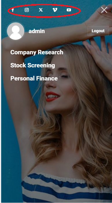
The social icons from the mobile menu are coming from the Theme Panel -> Social/Apis -> Social Networks -> https://i.imgur.com/kKYIECB.png remove/edit them after your needs.
Thank you!
 pwisker
Hi!
When I am on my mobile home page and I click on the search button or mobile menu at 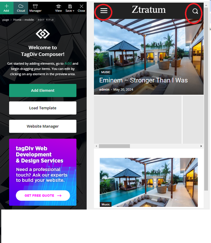
how/where can I change these pages:
Mobile menu I want to remove the background image and some of the social buttons
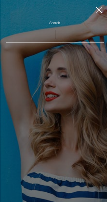
and also at the mobile search page, how do I remove the background image: Mobile search
Thank you!
Patrick
 mediagod
Hello,
I currently have the Newsweek Pro theme installed to my website but I like the layout of the mobile menu in the theme Urban Observer. How can I incorporate the mobile menu design from the Urban Observer theme into the Newsweek Pro theme? I don’t see any options to add anything to the mobile menu in terms of search boxes, horizontal menu elements, etc.
 AlanDogg
Hi, I keep getting Romanian news menu, all I want is to turn it off completely, I have wasted 3 hours of my life going round in circles. I want to use a 3rd part mobile menu to create a simple default one which you would have thought would have been created by this template as default but no, that would be too easy, the current mobile menu doesn’t disable or go away even though it says it is.
I would appreciate any help thanks
 itgrcapitallink
 How can I use the modal popup on the mobile menu view?
 Bettina
 Hello Lamiaa!
Sure. Edit the mobile viewport: https://app.screencast.com/TffmDPVrdAg0Z, add a new row in the header and add the menu you want too.
Thank you!
Bettina Hello!
The social icons from the mobile menu are coming from the Theme Panel -> Social/Apis -> Social Networks -> https://i.imgur.com/kKYIECB.png remove/edit them after your needs.
Thank you!
 Lamb
Lamb Ok, however, I realize there isn’t a secondary menu in the mobile version. Is there a way to have a secondary menu in the mob version (My secondary menu = contact, events, etc. and I need to make it available somewhere in the menu).
Thanks for your help.
Lamiaa
 OTAdmin1
In TagDiv Composer, I am able to create a Social Icons element and place that wherever I would like on the page. Currently, I have it in the Header of my website. However, the element does not display in my header on mobile—which is fine, because there are social icons displayed in the mobile hamburger menu.
However, I cannot edit the icons shown in the mobile menu. There are some missing, and I cannot click on them to edit/manipulate them in TagDiv Composer. How do I edit the social icons displayed in the mobile menu?
Screenshots:https://imgur.com/a/bxBet7C
 Kaneta Makoto
 Hello Bettina!
Thank you for message.
What is the name of this element?
My screen does not have the settings you provided in the screenshot.
What I’m using is
Mobile horizontal menu
Thank you.
Bettina Hello!
Try to change those settings: https://app.screencast.com/cfEYsL3JnJ0oB
Also, you can drop the menu items in More if your menu is so long. For mobile, I recommend you to use the Mobile menu element and select your menu.
Thank you!
 FFUser01
Hi I am currently running into an issue where I my menu tabs are showing in the menu naivigation bar in the header. Desktop view isn’t showing any items despite the fact that there is a fully built out menu structure and each of these pages are populated. They menu items are, however visible on the mobile view. Here is a link to the website: https://wisdominstitutedetroit.org/
I’m not quite sure how to rectify this issue. I have done some preliminary research on it and most my results are suggesting that I may be using a custom menu link. Not sure if that is the case because the menu items are visbile in mobile view. Open to any suggestions you all may have. Thanks!
 curistorian
Hi – this page (https://www.houselore.com/tdtax_property_transaction/historic-hotels/) is acting strange on mobile. The first listing ‘jumps’ leaving a large blank space at the start and the scrolling doesn’t work properly. Why would this be happening? I do have a sticky row filter menu on desktop and tablet, could that be interfering?
 Bikul
BikulHello,
I am new and a little confused about the mobile options.
Without installing the mobile plugin I created a mobile page for my Startpage.
Where do I change the Menu after clicking on the Hamburger Icon?

Thanks for Feedback
Bernd
Lamb Hi again,
1/ Actually I clicked on sticky in the manager setting area.. so the main header is sticky for the desktop version.
What I want instead is to have the secondary menu sticky (this is the second row below the header menu, where you have about, contact, etc.)
To make it sticky, I clicked on that row, and then selected sticky.
Then when I do so, the header menu becomes white and disappear. Then when I scroll down I see indeed the secondary menu being sticky but there is no header menu instead.
It seems I can have one or the other sticky but not both on the same time.
Can you help me ?
2/ On the mobile version even though I selected the header menu (in manager) to be sticky, the header menu is sticky only when I scroll up and not when I scroll down.
Can you help me to make the header menu sticky when I scroll up or down ?
Thank you!
Lamiaa
LambTo explain the issue more accurately. On the mobile version, when I scroll up and arrive to the top of the page, there a short laps of time (less than a second) in which the header menu is loading. During that laps of time the header menu color is by default purple. And we see only a purple header banner with no logo and no menu. Then after that seconds, the header menu appears (green customized color + logo + menu). Can you help me ?
 chip303
 It only seems to affect categories and individual links on the desktop. The menu no longer opens on mobile, but the search works there. But the footer graphic is not displayed on mobile either.
Anamaria Hello,
There is a modal popup element and it needs to have a page id there. Read more about it here: https://forum.tagdiv.com/modal-popup/
Go to the mobile viewport, click on the menu icon and check if you choose a menu from this dropdown: https://app.screencast.com/kXblv69NkhU60
Thank you!
Anamaria Hi,
The social icons from the mobile menu come from the Theme Panel -> Social/Apis -> Social Networks -> https://i.imgur.com/kKYIECB.png. Remove/edit them as needed.
Thank you!
Bettina Hello!
There is a modal popup element and it needs to have a page id there. Read more about it here: https://forum.tagdiv.com/modal-popup/
Go to the mobile viewport, click on the menu icon and check if you choose a menu from this dropdown: https://app.screencast.com/kXblv69NkhU60
Thank you!
 raikouchu
Hi.
I have a problem with the mobile menu. As in the screenshot at the link – https://pokeserwis.pl/error-mobile.png – I have no idea how to remove / add social media icons. They are completely different from what I have on the home page.
In addition – the problem with the background – how to set the background for the menu?
In the editor I do not have the ability to select these parameters
 wzyzyzy
The menu bar in the upper right corner of the mobile web version of nztoau.nz.co used to be valid. Recently, I found that the menu bar is missing. I don’t know where the problem occurred. The mobile version used to use the id: 29 template, but now the background prompts that I cannot use it. You Can you help me recover? Thank you very much!
 victor.gz
Greetings.
After update to 12.6.5 from 12.5.4 a blue bar appears in the top of my site.
This is the code:
<div class=”td-scroll-up td-hide-scroll-up-on-mob” data-style=”style1″><i class=”td-icon-menu-up”></i></div>

This appears also on non-logged users, mobile and normal site.
Already deleted cache from redis and cloudflare. So i supose this is a bug from code.
How we can fix this ?
 milesb
I’m using Header Template – Center PRO on a website, but on mobile the menu popup is blank and clicking the search icon does nothing.
I have tried turning off other plugins, clearing cache, different browsers and devices, all with no luck.
Any advice?
 Mar
MarHi,
I have a button “ADD SESSION” on the menu: it works only on desktop version. mobile version gives back 404 erro, but only from smartphone. If I click on mobile version from desktop is working good
Can you check it why please?
How can I give you Access to the website?
Thanks. 😉
Mar