
- NewspaperThe Newspaper Mobile Theme: Introduction
- NewspaperThe Mobile Theme
- NewspaperMain Menu
- NewspaperHow to Add a Logo in Newspaper
- NewspaperBig Grid Flex Settings
- NewspaperHeader Builder
- NewspaperFont Customization
- NewspaperTheme Colors Introduction
- NewspaperBackground Introduction
- NewspaperHow to Install Newspaper via FTP
- NewspaperHow to Install Newspaper via WordPress
 Bolongo
 Hello Ana Maria,
Thank you for your feedback, but it still doesn’t work. For your information:
I have installed and activated all the required plugins
I have also deactivated the tagdiv Standard pack plugin as you recommended.
I have followed all the configuration information for “tagDiv Opt-In Builder – Paywall/Subscription”.
I have consulted the topic “https://forum.tagdiv.com/topic/tagdiv-composer-does-not-save-only-content-of-homepage/” which apparently does not concern me as I do not have any save issues or 40x errors.
I have uninstalled and reinstalled the theme, but I still have the same problem on this page “https://www.pressebits.com/checkout-week_pro/?plan_id=1”.
The Issues
The action button does not work.
The menu is also not functional.
I have not installed any extensions other than those required for the theme.
Request
I really bought your theme for paid article subscriptions. Could you please let me know if there is a refund program in my case? I really need this module. Please help me. Below is the “Newspaper system status” and everything is okay on that side. Thank you for your understanding.
heme config
Registration key i 828a4626 – **** – **** – **** – 1a21327f3673 Reset key
Theme name i Newspaper
Theme version i 12.6.6
Theme database version i 12.6.6
HTTP channel test wordpress
Installed demo i Newsweek PRO – demo ID: week_pro | install type: full
tagDiv advertisement i
Theme Mobile Newspaper mobile version
php.ini configuration
Server software i Apache
PHP Version i 7.4.33
post_max_size i 512M – You cannot upload images, themes and plugins that have a size bigger than this value. To see how you can change this please check our guide here.
max_execution_time 360
max_input_vars 250000
SUHOSIN installed false
PHP extensions
mbstring available
GD library available
WordPress and plugins
WP Home URL i https://www.pressebits.com
WP Site URL i https://www.pressebits.com
WP version i 6.5.4
WP multisite enabled i No
WP Language i fr_FR
WP Memory Limit 256 Mo/request
WP_DEBUG False
Caching plugin WP super cache – for best performance please check the plugin configuration guide here.
 Bettina
 Hello @tinegregory !
Go to Newspaper -> Theme panel -> Header -> Sign In/Join and disable that option.
You can also use a modal popup for mobile menu and create your own design into a separate page that display into a modal: https://forum.tagdiv.com/modal-popup/
Thank you!
 tinegregory
Hello, I use Newspaper and in the Header part of the mobile format there is the mobile menu in the form of a logo (3 white horizontal bands in a square) when I click on this logo a file opens with the list menu items. My problem is that I would like only this list to appear and not the “account avatar with photo” elements at the top left or the “disconnect” button at the top right. Is it possible?
Where should I go to change these items?
my web site: onvousdessine.com
Thank you.
 this is my
  carlstarus
 Hi Anamaria, The only page I can edit is the home page. All other page templates give the same error as the video. I did add the code to my .htaccess Here is what I’m getting from the rrror.log
[11-Jun-2024 09:06:38 UTC] WordPress database error Table ‘tacomaencounter_wp575.tds_plans’ doesn’t exist for query SELECT * FROM tds_plans made by require_once(‘wp-load.php’), require_once(‘wp-config.php’), require_once(‘wp-settings.php’), include(‘/themes/Newspaper/functions.php’), require_once(‘/themes/Newspaper/includes/wp-booster/tagdiv-wp-booster-functions.php’), do_action(‘td_wp_booster_legacy’), WP_Hook->do_action, WP_Hook->apply_filters, {closure}, require_once(‘/plugins/td-composer/legacy/Newspaper/functions.php’), require_once(‘/plugins/td-composer/legacy/common/wp_booster/td_wp_booster_functions.php’), do_action(‘td_wp_booster_loaded’), WP_Hook->do_action, WP_Hook->apply_filters, tdc_plugin_init, do_action(‘tdc_loaded’), WP_Hook->do_action, WP_Hook->apply_filters, tds_config::on_tdc_loaded, tds_config::get_plans
[11-Jun-2024 09:06:41 UTC] WordPress database error Table ‘tacomaencounter_wp575.tds_plans’ doesn’t exist for query SELECT * FROM tds_plans made by require_once(‘wp-load.php’), require_once(‘wp-config.php’), require_once(‘wp-settings.php’), include(‘/themes/Newspaper/functions.php’), require_once(‘/themes/Newspaper/includes/wp-booster/tagdiv-wp-booster-functions.php’), do_action(‘td_wp_booster_legacy’), WP_Hook->do_action, WP_Hook->apply_filters, {closure}, require_once(‘/plugins/td-composer/legacy/Newspaper/functions.php’), require_once(‘/plugins/td-composer/legacy/common/wp_booster/td_wp_booster_functions.php’), do_action(‘td_wp_booster_loaded’), WP_Hook->do_action, WP_Hook->apply_filters, tdc_plugin_init, do_action(‘tdc_loaded’), WP_Hook->do_action, WP_Hook->apply_filters, tds_config::on_tdc_loaded, tds_config::get_plans
[11-Jun-2024 09:06:44 UTC] WordPress database error Table ‘tacomaencounter_wp575.tds_plans’ doesn’t exist for query SELECT * FROM tds_plans made by require(‘wp-blog-header.php’), require_once(‘wp-load.php’), require_once(‘wp-config.php’), require_once(‘wp-settings.php’), include(‘/themes/Newspaper/functions.php’), require_once(‘/themes/Newspaper/includes/wp-booster/tagdiv-wp-booster-functions.php’), do_action(‘td_wp_booster_legacy’), WP_Hook->do_action, WP_Hook->apply_filters, {closure}, require_once(‘/plugins/td-composer/legacy/Newspaper/functions.php’), require_once(‘/plugins/td-composer/legacy/common/wp_booster/td_wp_booster_functions.php’), do_action(‘td_wp_booster_loaded’), WP_Hook->do_action, WP_Hook->apply_filters, tdc_plugin_init, do_action(‘tdc_loaded’), WP_Hook->do_action, WP_Hook->apply_filters, tds_config::on_tdc_loaded, tds_config::get_plans
[11-Jun-2024 09:06:45 UTC] WordPress database error Table ‘tacomaencounter_wp575.tds_options’ doesn’t exist for query SELECT value FROM tds_options WHERE name = ‘my_account_page_id’ made by require(‘wp-blog-header.php’), require_once(‘wp-includes/template-loader.php’), include(‘/plugins/td-cloud-library/wp_templates/tdb_view_single.php’), get_header, locate_template, load_template, require_once(‘/themes/Newspaper/header.php’), do_action(‘tdc_header’), WP_Hook->do_action, WP_Hook->apply_filters, {closure}, require_once(‘/plugins/td-standard-pack/Newspaper/header.php’), do_shortcode, preg_replace_callback, do_shortcode_tag, td_global_blocks::proxy_function, tdc_zone->render, tdc_composer_block->do_shortcode, do_shortcode, preg_replace_callback, do_shortcode_tag, td_global_blocks::proxy_function, vc_row->render, tdc_composer_block->do_shortcode, do_shortcode, preg_replace_callback, do_shortcode_tag, td_global_blocks::proxy_function, vc_column->render, tdc_composer_block->do_shortcode, do_shortcode, preg_replace_callback, do_shortcode_tag, td_global_blocks::proxy_function, tds_menu_login->render
[11-Jun-2024 09:06:45 UTC] WordPress database error Table ‘tacomaencounter_wp575.tds_options’ doesn’t exist for query SELECT value FROM tds_options WHERE name = ‘create_account_page_id’ made by require(‘wp-blog-header.php’), require_once(‘wp-includes/template-loader.php’), include(‘/plugins/td-cloud-library/wp_templates/tdb_view_single.php’), get_header, locate_template, load_template, require_once(‘/themes/Newspaper/header.php’), do_action(‘tdc_header’), WP_Hook->do_action, WP_Hook->apply_filters, {closure}, require_once(‘/plugins/td-standard-pack/Newspaper/header.php’), do_shortcode, preg_replace_callback, do_shortcode_tag, td_global_blocks::proxy_function, tdc_zone->render, tdc_composer_block->do_shortcode, do_shortcode, preg_replace_callback, do_shortcode_tag, td_global_blocks::proxy_function, vc_row->render, tdc_composer_block->do_shortcode, do_shortcode, preg_replace_callback, do_shortcode_tag, td_global_blocks::proxy_function, vc_column->render, tdc_composer_block->do_shortcode, do_shortcode, preg_replace_callback, do_shortcode_tag, td_global_blocks::proxy_function, tds_menu_login->render
[11-Jun-2024 09:06:45 UTC] WordPress database error Table ‘tacomaencounter_wp575.tds_options’ doesn’t exist for query SELECT value FROM tds_options WHERE name = ‘my_account_page_id’ made by require(‘wp-blog-header.php’), require_once(‘wp-includes/template-loader.php’), include(‘/plugins/td-cloud-library/wp_templates/tdb_view_single.php’), get_header, locate_template, load_template, require_once(‘/themes/Newspaper/header.php’), do_action(‘tdc_header’), WP_Hook->do_action, WP_Hook->apply_filters, {closure}, require_once(‘/plugins/td-standard-pack/Newspaper/header.php’), do_shortcode, preg_replace_callback, do_shortcode_tag, td_global_blocks::proxy_function, tdc_zone->render, tdc_composer_block->do_shortcode, do_shortcode, preg_replace_callback, do_shortcode_tag, td_global_blocks::proxy_function, vc_row->render, tdc_composer_block->do_shortcode, do_shortcode, preg_replace_callback, do_shortcode_tag, td_global_blocks::proxy_function, vc_column->render, tdc_composer_block->do_shortcode, do_shortcode, preg_replace_callback, do_shortcode_tag, td_global_blocks::proxy_function, tds_menu_login->render
[11-Jun-2024 09:06:45 UTC] WordPress database error Table ‘tacomaencounter_wp575.tds_options’ doesn’t exist for query SELECT value FROM tds_options WHERE name = ‘create_account_page_id’ made by require(‘wp-blog-header.php’), require_once(‘wp-includes/template-loader.php’), include(‘/plugins/td-cloud-library/wp_templates/tdb_view_single.php’), get_header, locate_template, load_template, require_once(‘/themes/Newspaper/header.php’), do_action(‘tdc_header’), WP_Hook->do_action, WP_Hook->apply_filters, {closure}, require_once(‘/plugins/td-standard-pack/Newspaper/header.php’), do_shortcode, preg_replace_callback, do_shortcode_tag, td_global_blocks::proxy_function, tdc_zone->render, tdc_composer_block->do_shortcode, do_shortcode, preg_replace_callback, do_shortcode_tag, td_global_blocks::proxy_function, vc_row->render, tdc_composer_block->do_shortcode, do_shortcode, preg_replace_callback, do_shortcode_tag, td_global_blocks::proxy_function, vc_column->render, tdc_composer_block->do_shortcode, do_shortcode, preg_replace_callback, do_shortcode_tag, td_global_blocks::proxy_function, tds_menu_login->render
[11-Jun-2024 09:06:48 UTC] WordPress database error Table ‘tacomaencounter_wp575.tds_plans’ doesn’t exist for query SELECT * FROM tds_plans made by require_once(‘wp-load.php’), require_once(‘wp-config.php’), require_once(‘wp-settings.php’), include(‘/themes/Newspaper/functions.php’), require_once(‘/themes/Newspaper/includes/wp-booster/tagdiv-wp-booster-functions.php’), do_action(‘td_wp_booster_legacy’), WP_Hook->do_action, WP_Hook->apply_filters, {closure}, require_once(‘/plugins/td-composer/legacy/Newspaper/functions.php’), require_once(‘/plugins/td-composer/legacy/common/wp_booster/td_wp_booster_functions.php’), do_action(‘td_wp_booster_loaded’), WP_Hook->do_action, WP_Hook->apply_filters, tdc_plugin_init, do_action(‘tdc_loaded’), WP_Hook->do_action, WP_Hook->apply_filters, tds_config::on_tdc_loaded, tds_config::get_plans
[11-Jun-2024 09:06:54 UTC] WordPress database error Table ‘tacomaencounter_wp575.tds_plans’ doesn’t exist for query SELECT * FROM tds_plans made by require_once(‘wp-load.php’), require_once(‘wp-config.php’), require_once(‘wp-settings.php’), include(‘/plugins/td-composer/mobile/functions.php’), do_action(‘td_wp_booster_loaded’), WP_Hook->do_action, WP_Hook->apply_filters, tdc_plugin_init, do_action(‘tdc_loaded’), WP_Hook->do_action, WP_Hook->apply_filters, tds_config::on_tdc_loaded, tds_config::get_plans
 Anamaria
 Hello,
1. Yes, you can add the logo more near to the menu, but you need to set the row layout like this -> https://i.imgur.com/DMqn02Y.jpeg and stretch row https://i.imgur.com/29Aet0y.jpeg You can not delete the empty column, only the row that contains empty columns.
If you want to delete a row, you can delete a row with the empty column using the right click on the row icon -> https://i.imgur.com/JodWvlW.png -> https://i.imgur.com/e6bb8U5.png or using the drag and drop or you can simply click on the row and press the delete button from your keyboard -> https://www.screencast.com/t/Mai7iyEG The same steps are to delete the elements.
2. Please disable the mobile theme and amp plugins.
Using our theme, you can choose from 3 mobile versions
-> mobile responsive => https://www.screencast.com/t/oJ2ShOp47
-> mobile theme plugin => https://forum.tagdiv.com/the-mobile-theme/
-> mobile page => https://tagdiv.com/newspaper-10-3-7-update-brings-customizable-and-fast-mobile-pages/ The option that you need to use.
Suppose you created the mobile pages with tagDiv Composer. In that case, when you install the Mobile Theme plugin, your pages will be overwritten by the plugin (the mobile theme comes with its templates for page, post, category, etc, so your current templates from the desktop theme will get converted to the mobile theme layout, the page content is made without builders in mobile editor => https://www.screencast.com/t/xbgZG8kH also, the options that are provided to edit the mobile theme version are limited (this keeps the things simple)).
This is a video about Responsive Newspaper Theme, AMP & Mobile Theme, Mobile Pages & Templates -> https://www.youtube.com/watch?v=SpGkOnJeNZY.
So, the mobile responsive is what you see when that you select the viewport on phone => https://www.screencast.com/t/matV17hH, so some settings may apply for each viewport(where is the border blue), and others are not(where the border is black).
The mobile page has the mobile templates from Cloud Library => https://www.screencast.com/t/YCcZ8rL8
The Mobile responsive version of the theme and the mobile page editor can be edit with tagDiv Composer, the mobile theme plugin cannot.
For example, you can have the mobile theme plugin activated and use the mobile page/mobile responsive version for the homepage/pages, but for the categories pages/404 page, you can’t use the mobile page/mobile responsive version if you have the mobile theme plugin activated.
So, if you want to design the pages with tagDiv Composer, you can use the mobile page or mobile responsive version.
3. Format need to be MP4, File size for embedded video should ideally be 500KB, as the ideal page size from Google’s standpoint is <1MB. File size of 1-2MB is acceptable.
Video duration should be no longer than 25 seconds.
4. You need to use a plugin that provides this option. Please check our guide -> https://forum.tagdiv.com/using-theme-translations-together-wpml/
5. The images are responsive; please let me know what you mean.
6. I recommend using the WP ROCKET plugin.
Also, we don’t recommend to using amp, because it is deprecated -> https://developer.bigcommerce.com/docs/storefront/wordpress/platform-integration/enabling-amp
There are many optimization guides provided by our users here in the forum, some made by us; you could check some of them
– https://www.infophilic.com/get-almost-100-pagespeed-newspaper-theme/
– https://forum.tagdiv.com/cache-plugin-install-and-configure/
– https://forum.tagdiv.com/how-to-make-the-site-faster/
– https://forum.tagdiv.com/topic/high-number-of-ajax-request/
– https://forum.tagdiv.com/topic/score-100100-pagespeed-with-newspaper-wordpress-theme/
– https://www.andraware.com/wp-rocket-for-newspaper-theme/
– https://forum.tagdiv.com/topic/page-speed-guide-for-2023-beginners-and-advanced/
– https://forum.tagdiv.com/topic/newspaper-theme-speedify-your-website/
– https://forum.tagdiv.com/topic/tutorial-chriss-custom-optimizations-for-functions-php-etc/
– https://forum.tagdiv.com/cloudflare-cdn/
– https://forum.tagdiv.com/topic/theme-causing-high-cpu-usage-2/
– https://forum.tagdiv.com/topic/sql-querys-high-cpu/
– https://forum.tagdiv.com/topic/newspaper-theme-slow-to-respond/
– https://premium.wpmudev.org/blog/optimizing-your-wordpress-database-a-complete-guide/
– https://underconstructionpage.com/optimize-wordpress-database/
– https://crunchify.com/better-optimize-wordpress-database-all-in-one-guide/
7. I recommend using Duplicator plugin, but you can try other plugins from this list -> https://www.bluehost.com/blog/best-wordpress-backup-plugins/
8. Usually, the color and image are set on the row, so please edit with tagDiv Composer and select the row and go in the tab CSS, and there you can set it https://i.imgur.com/IkbGWUS.png -> https://forum.tagdiv.com/topic/background-color-of-the-main-menu-be-changed/
Thank you!
 Vi_design
Good afternoon.
I purchased a newspaper theme and I have a number of questions about using the product, I ask you to give me technical advice.
I’m currently using the theme INTERIOR DESIGNER and have a number of questions.
1. I imported header school pro. Is it possible to place menu text near the logo? There is a fairly large empty area, can this area be removed or made smaller? Is it possible to remove empty column at all, or change their size, or is this a preset value that cannot be changed?
Screenshot 1.
2. In the browser of a personal computer, the mobile version opens correctly, I can fully customize it. However, when I log in from a mobile phone, I see a completely different newspaper template and different content. I don’t understand what this is connected with, please provide information on how to enable the display of the same site on a mobile phone, the template for which I have installed. Screenshot 2.1 Screenshot 2.2
3. I use the INTERIOR DESIGNER theme. How can I install my video in animation in the header of the site not from YouTube, but from my server? Please indicate the format of the video clip, what is the optimal duration, what are the technical parameters of the video clip for best performance, how to encode this video? And accordingly, how can I place it on hosting (directory) and how can I connect it to the site? Where are the video dimming settings?
4. I made two buttons in order to direct them to separate language versions of the site. Give instructions on how to connect language versions, for example, mysite.com/pl
Screenshot 3.
5. How to make pictures responsive to clicks so that they open in full size?
6. List everything that can lead to improving site loading speed. I want to have a green area when loading. Specify plugins and optimization methods.
7.Which backup plugin is best to use to roll back to a previous version of a website if an error is made?
8. I want to change the color in the menu SKOOL PRO, how do I change the background color of the menu from light to dark? I didn’t find any settings.
 cloverjim
 .td_data_time {margin-left: 32px; margin-right: auto;}
.top-header-menu li a {margin-left: 16px; margin-right: auto;}
.top-header-menu .avatar {margin-left: 6px; margin-right: auto;}
.top-header-menu .td-icon-logout {margin-left: 2px; margin-right: auto;}
.mfp-content .td-login-inputs label {left: auto; right:0;}
.td-header-row [class*=”td-header-sp”] {float: right;}
.top-bar-style-1 .td-header-sp-top-widget {float: left;}
.sf-menu li {float: right;}
.td-header-main-menu {padding-right: 0; padding-left: 48px}
#td-top-search {right: auto; left:0;}
.sf-menu .td-icon-menu-down {padding-left: 0; padding-right: 7px;}
.sf-menu a.sf-with-ul {padding-left: 31px; padding-right: 14px;}
.td-mega-menu ul.sub-menu {left: auto !important; right:-23px !important;}
.sf-menu li:hover ul, .sf-menu li.sfHover ul {left: auto; right:0;}
.sf-menu > li.td-normal-menu > ul.sub-menu {left: auto; right:-15px;}
.td-mega-span {margin-left: auto; margin-right: 22px; float: right;}
.td-admin-edit {left: auto; right: 0;}
.td-post-category {margin-right: auto; margin-left: 5px;}
.td-mega-span h3 {line-height: 24px;}
.td_mega_menu_sub_cats .cur-sub-cat::before {right: auto; left: 0;}
.td_mega_menu_sub_cats::after {right: auto; left:0;}
.td-mega-menu .td_block_mega_menu .td-next-prev-wrap {margin: 0 22px 22px 0;}
.td-icon-menu-right::before {content: ‘\e80c’;}
.td-icon-menu-left::before {content: ‘\e80d’;}
.header-search-wrap, .header-search-wrap .td-drop-down-search {right: auto; left: 0}
.header-search-wrap .td-drop-down-search::before {right: auto;left: 19px;}
.td-header-wrap #td-header-search {border-left: 0; border-right: 1px solid #e1e1e1;}
.header-search-wrap .td-drop-down-search .btn {right:auto; left: 20px}
.td-next-prev-wrap .td-ajax-next-page {padding-right: 2px; padding-left: 0;}
.td-next-prev-wrap .td-ajax-prev-page {padding-left: 1px; padding-right: 0;}
.header-search-wrap .td-aj-search-results .td-module-thumb {margin-left:auto; margin-right: 20px;}
.header-search-wrap .td-aj-search-results .item-details {margin: 5px 115px 10px 20px;}
.header-search-wrap .td-aj-search-results {padding: 10px 0 5px 0;}
.td-main-menu-logo {float: right; margin-right: auto; margin-left: 10px;}
.td-trending-now-wrapper .td-next-prev-wrap {right: auto; left: 0px; position: absolute;}
.td-trending-now-wrapper .td-trending-now-nav-right {padding-left: 0; padding-right: 2px;}
.td-next-prev-wrap a {margin-right: auto; margin-left: 7px;}
.td-trending-now-post {padding-right: 0; padding-left: 119px;}
.td-trending-now-display-area {padding: 0 15px 0 0;}
.td_block_big_grid_3 .td-big-grid-post {float: right;}
.td_block_big_grid_3 .td-big-thumb {margin-right: auto; margin-left: 3px;}
.td_block_big_grid_3 .td-big-grid-post-3 {margin-left: auto; margin-right: 3px;}
.td-grid-style-1 .td-big-thumb .td-big-grid-meta {margin: 0 20px 0 0;}
.td-big-grid-post .td-module-meta-info {margin: 11px 20px 20px 0;}
.td-grid-style-1 .td-medium-thumb .td-big-grid-meta {margin: 20px 19px 14px 0;}
.td-big-grid-post.td-small-thumb .td-big-grid-meta .entry-title {line-height: 32px;}
.td-grid-style-1 .td-small-thumb .entry-title {font-size: 14px;}
.td-grid-style-1 .td-medium-thumb .entry-title {font-size: 18px;}
.td-big-grid-post.td-big-thumb .td-big-grid-meta .entry-title {line-height: 46px;}
.td-grid-style-1 .td-big-thumb .entry-title {font-size: 24px;}
.td-subcat-filter .td-subcat-list .td-subcat-item {margin-left: auto; margin-right: 30px;}
.td-subcat-filter {right: auto; left: 0;}
.td-subcat-filter .td-subcat-dropdown .td-subcat-more {margin-left: auto; padding-left: 0; margin-right: 15px; padding-right: 15px;}
.td-subcat-filter .td-subcat-dropdown ul {right: auto; left: 0;}
.td-block-row [class*=”td-block-span”] {float: right;}
.td_module_wrap .entry-title {line-height: 32px; font-size: 16px;}
.td-module-comments {float: left;}
.td_module_6 .entry-title {font-size: 13px; line-height: 26px;}
.td-excerpt {line-height: 26px;}
.td-module-comments a::after {right: 0; left: auto;}
.td_module_6 .td-module-thumb {right: 0; left: auto;}
.td_module_6 .item-details {margin-right: 116px; margin-left: auto;}
.td_module_mx2 .entry-title {font-size: 13px; line-height: 24px;}
.td-social-style4 .td-sp {margin-right: auto; margin-left: 5px;}
.td_social_type .td_social_info {padding: 0 9px 0 0;}
.td_social_type .td_social_button {float: left;}
.td_module_mx4 .entry-title {font-size: 14px;}
.td-column-1 .td_module_mx4 .entry-title {line-height: 25px;}
.td_module_10 .td-module-thumb {left: auto; right: 0;}
.td_module_10 .item-details {margin-left: auto; margin-right: 244px;}
.td_module_mx2 .item-details {margin: 0 90px 20px 0;}
.td-grid-style-6 .td-small-thumb .td-big-grid-meta .entry-title {line-height: 32px;}
.td_ajax_load_more i {margin-left: auto; margin-right: 6px;}
.page-nav a, .page-nav span {float: right;}
.page-nav .pages {float: left;}
.widget_categories li .td-cat-no {float: left;}
.td-footer-wrapper .widget_categories li span {margin-left: 0; margin-right: auto;}
#td-mobile-nav {transform: translate3d(99%, 0, 0); -webkit-transform: translate3d(99%, 0, 0); -moz-transform: translate3d(99%, 0, 0); -ms-transform: translate3d(99%, 0, 0); -o-transform: translate3d(99%, 0, 0); right: -1%; left: auto;}
.td-subfooter-menu li a {margin-right: auto; margin-left: 16px;}
.td-subfooter-menu li:last-child a {margin-right: auto; margin-left: 0;}
.footer-text-wrap {line-height: 28px;}
.td-social-style-2 .td-social-icon-wrap {margin: 5px 0 10px 10px;}
.td-pb-row [class*=”td-pb-span”] {float: right;}
.td-social-style-2 .td-social-icon-wrap:last-child {margin-left: 0;}
.td-sub-footer-container .td-sub-footer-menu {float: left;}
.td-search-wrap-mob .td_module_wrap {text-align: right; padding-bottom: 35px;}
#td-mobile-nav .td-guest-wrap .td-menu-avatar {margin-right: auto; margin-left: 10px;}
.td-mobile-content .td-icon-menu-right {float: left; right: auto; left: -4px;}
.td-mobile-content .td-icon-menu-right::before {content: ‘\e80c’;}
.td-mobile-content .td-icon-menu-right{transform: rotate(0deg); -webkit-transform: rotate(0deg); -moz-transform: rotate(0deg); -ms-transform: rotate(0deg); -o-transform: rotate(0deg);}
.td-mobile-content .td-sub-menu-open > a i {transform: rotate(-90deg); -webkit-transform: rotate(-90deg); -moz-transform: rotate(-90deg); -ms-transform: rotate(-90deg); -o-transform: rotate(-90deg);}
.td-mobile-content .sub-menu a {padding: 9px 36px 9px 26px !important;}
.td-mobile-content li a {font-size: 18px;}
.td-mobile-close {right: auto; left: 1px;}
#td-mobile-nav .td-menu-socials {padding: 0 20px 0 65px;}
#td-mobile-nav .td-social-icon-wrap {margin: 20px 0 0 5px;}
.td-icon-read-down::before {content: ‘\e83d’;}
#td-mobile-nav .td-register-section .td-icon-read-down {transform: rotate(-90deg); -webkit-transform: rotate(-90deg); -moz-transform: rotate(-90deg); -ms-transform: rotate(-90deg); -o-transform: rotate(-90deg);}
#td-mobile-nav .td-login-panel-title span {margin-bottom: 30px;}
#td-mobile-nav label {left: auto; right: 10px;}
.entry-crumbs .td-icon-right::before {content: ‘\e802’;}
.post header .entry-title {font-size: 28px;}
header .td-post-author-name {float: right;}
.td-post-author-name div {margin-right: auto; margin-left: 2px;}
header .td-post-author-name a {margin-right: auto; margin-left: 3px;}
header .td-post-date {margin-left: auto; margin-right: 4px; float: right;}
header .td-post-comments {float: left;}
.td-post-template-default .td-post-title .td-post-comments {margin-left: auto; margin-right: 22px;}
header .td-icon-comments {margin-right: auto; margin-left: 5px;}
header .td-post-views {float: left;}
.td-post-template-default .td-post-title div.td-post-views {margin-right: auto; margin-left: 0;}
header .td-icon-views {margin-right: auto; margin-left: 5px;}
.td-social-sharing-buttons {margin-right: auto; margin-left: 10px;}
.td-social-facebook .td-social-but-text, .td-social-twitter .td-social-but-text {border-right: 1px solid rgba(255, 255, 255, 0.1); border-left: none;}
.td-social-but-text {padding-left: 0; padding-right: 10px; margin-left: auto; margin-right: 12px;}
.td-social-google .td-icon-googleplus {left: auto; right: -4px;}
h3 {font-size: 18px; line-height: 38px;}
.wp-caption-text, .wp-caption-dd {text-align: right; line-height: 24px;}
.td-page-content p, .td-post-content p, .wpb_text_column p, .td_block_text_with_title p, .woocommerce #tab-description p, .mce-content-body p, .td-page-content li, .td-post-content li, .wpb_text_column li, .td_block_text_with_title li, .woocommerce #tab-description li, .mce-content-body li {line-height: 30px; font-size: 14px;}
.td-page-content, .td-post-content, .wpb_text_column, .td_block_text_with_title, .woocommerce #tab-description, .mce-content-body {line-height: 30px; font-size: 14px;}
ul li, ol li {margin-left: auto; margin-right: 21px;}
.td-footer-wrapper li {margin-right: 0;}
.top-header-menu li {margin-left: auto; margin-right: 0;}
.td-subfooter-menu li {margin-left: auto; margin-right: 0;}
.td-page-content .td-arrow-list li::before, .td-post-content .td-arrow-list li::before, .wpb_text_column .td-arrow-list li::before, .td_block_text_with_title .td-arrow-list li::before, .woocommerce #tab-description .td-arrow-list li::before, .mce-content-body .td-arrow-list li::before {content: ‘\e802’; float: right; margin-right: -16px; margin-left: auto; line-height: 30px;}
.td-page-content blockquote p, .td-post-content blockquote p, .wpb_text_column blockquote p, .td_block_text_with_title blockquote p, .bbpress blockquote p, .woocommerce #tab-description blockquote p, .mce-content-body blockquote p, .comment-content blockquote p {line-height: 45px; font-size: 26px;}
.td-post-share-title {margin-right: auto; margin-left: 20px;}
.td-post-next-prev-content a {line-height: 28px;}
.author-box-wrap .avatar {float: right;}
.author-box-wrap .desc {margin-left: auto; margin-right: 117px;}
.author-box-wrap .td-author-social .td-icon-font {margin-right: auto; margin-left: 15px;}
.td_block_related_posts .td-module-title {line-height: 26px;}
.comment .avatar {float: right; margin-right: auto; margin-left: 15px;}
.comment {margin-left: auto; margin-right: 0;}
.comment .children {margin-left: auto; margin-right: 70px;}
.comment .comment-content p {line-height: 26px;}
.comment .comment-content, .comment .comment-meta, .comment .comment-respond {margin-left: auto; margin-right: 70px;}
.comment-link {padding-left: 0; padding-right: 10px;}
textarea {line-height: 26px;}
.comment .children .comment .comment-content, .comment .children .comment .comment-meta, .comment .children .comment .comment-respond {margin-left: auto; margin-right: 56px;}
.td_block_18 .td-column-1 .td_module_mx8 .entry-title {font-size: 16px;line-height: 30px;}
.td_module_mx8 .td-post-date {margin-right: auto; margin-left: 22px;}
.td-tags li {margin-right: 0; margin-left: auto; float: right;}
.td-tags span:first-child {margin-right: 0;} /* ino khodam add kardam */
.td-post-template-11 .td-post-header .entry-title {line-height: 42px;}
.td-post-template-11 .td-post-title .td-post-date {margin-left: 22px; margin-right: 4px;}
header .td-post-views {margin-right: auto; margin-left: 22px;}
.td-post-template-11 .td-related-title {text-align: right !important;}
.td-post-template-11 .td-related-title .td-related-left, .td-post-template-11 .td-related-title .td-related-right {padding: 9px 0 5px 20px !important;}
.td-post-template-11 .td-related-title .td-related-right {margin-left: 50px !important; margin-right: 0 !important;}
.td-post-template-11 .td-related-title .td-related-left {margin-right: 0 !important; margin-left: 0 !important;}
.td-post-template-11 .td_block_related_posts .td-next-prev-wrap {right: auto; left:0;}
.td-post-template-11 .td_block_related_posts .td-next-prev-wrap a {margin-right: 10px; margin-left: 0;}
.td-related-row [class*=”td-related-span”] {float: right;}
.td-related-full-width .td-related-row .td-related-span4 {padding-left: 0; padding-right: 22px;}
.td_block_big_grid_7.td-grid-style-5 .td-small-thumb .td-meta-info-container {padding: 0 18px 0 30px;}
.td-grid-style-5 .td-small-thumb .entry-title {font-size: 16px; line-height: 32px !important;}
.td_block_20 .td-module-comments {margin-right: auto; margin-left: 0; right: auto; left: 20px;}
.td_block_big_grid_1 .td-big-grid-post {float: right;}
.td_block_big_grid_1 .td-big-thumb {margin-right: auto; margin-left: 3px;}
.td_block_big_grid_1 .td-big-grid-post-1, .td_block_big_grid_1 .td-big-grid-post-3 {margin-right: auto; margin-left: 3px;}
#td-mobile-nav .td-menu-avatar {left: auto; right: 20px;}
#td-mobile-nav .td-menu-username {margin: 0 95px 0 100px;}
#td-mobile-nav .td-menu-logout {left: 20px; right: auto;}
.td-theme-slider {direction: ltr;}
.td_block_slide .td-slide-meta {direction: rtl;}
.iosSlider-col-3 .entry-title {font-size: 28px;}
.td_block_slide .td-post-date {margin-left: auto; margin-right: 4px;}
.td_block_slide .td-post-comments {margin-left: auto; margin-right: 10px;}
.td_block_slide .td-icon-comments {margin-right: auto; margin-left: 5px;}
.widget li {margin-right: 12px;}
.td-block-span6 .td_module_8 .entry-title {font-size: 14px;}
.td_module_16 .td-module-thumb {left: auto; right: 0;}
.td_block_21.td-column-1 .item-details {margin-left: auto; margin-right: 115px;}
.td_block_21.td-column-1 .entry-title {font-size: 14px; line-height: 28px; padding-right: 0;}
.td_module_16 .item-details {margin-left: auto; margin-right: 174px;}
.td-post-template-8 .td-post-header-holder {text-align: right;}
.td-post-template-8 .td-post-header .entry-title {font-size: 32px;}
.td-post-template-8 .td-post-title .td-post-date {margin-right: 4px; margin-left: 22px;}
.td-image-gradient-style8::after {left: auto; right: 0;}
body .td-stretch-height {left: -50%; transform: translateX(50%); -webkit-transform: translateX(50%); -moz-transform: translateX(50%); -ms-transform: translateX(50%); -o-transform: translateX(50%);}
.td_block_big_grid_8 .td-big-grid-scroll .td-big-grid-post .td-big-grid-meta .entry-title {line-height: 32px;}
.td-grid-style-3 .td-big-thumb .td-big-grid-meta {margin: 20px 20px 20px 0;}
.td-grid-style-2 .td-big-grid-post.td-big-thumb .td-big-grid-meta .entry-title, .td-grid-style-3 .td-big-grid-post.td-big-thumb .td-big-grid-meta .entry-title {font-size: 28px; line-height: 58px;}
.td_block_18 .td_module_mx8 .entry-title {font-size: 22px; line-height: 42px;}
.td-grid-style-5 .td-big-grid-post.td-big-thumb .td-big-grid-meta .entry-title {font-size: 24px;}
.td_block_big_grid_2 .td-big-grid-post {float: right;}
.td_block_big_grid_2 .td-big-thumb {margin-right: auto; margin-left: 3px;}
.td-subcat-filter .td-subcat-dropdown li {margin-right: 0;}
.td-big-grid-slide .td_block_wrap {direction: rtl;}
.td-big-grid-post.td-big-thumb .td-big-grid-meta .entry-title {font-size: 20px;}
.td_block_19 .td_module_mx2 .item-details .entry-title {line-height: 28px; font-size: 13px;}
.iosSlider-col-1 .entry-title {font-size: 16px; line-height: 30px;}
.td_module_7 .entry-title {font-size: 13px; line-height: 28px;}
.td-big-grid-post.td-small-thumb .td-big-grid-meta .entry-title {font-size: 16px;}
.td_block_16 .td_module_mx7 .entry-title {font-size: 15px; line-height: 28px;}
.td_module_11 .td-module-thumb {left: auto; right: 0;}
.td_module_11 .item-details {margin-left: auto; margin-right: 350px;}
.td-big-grid-post.td-tiny-thumb .td-big-grid-meta .entry-title {font-size: 14px; line-height: 28px;}
.iosSlider-col-2 .entry-title {font-size: 22px; line-height: 44px;}
.td-footer-instagram-container .td-footer-instagram-title {letter-spacing: 0;}
.td-category-header .td-category-pulldown-filter {right: auto; left: 0;}
.td-category-header .td-pulldown-filter-item {margin-left: auto; margin-right: 0;}
.td-category-header .td-pulldown-filter-list {text-align: right;}
.td-weather-top-widget {margin-right: auto; margin-left: 32px;}
.td-category-header .td-icon-menu-down {margin-left: auto; margin-right: 5px; top: 0;}
.td-grid-style-2 .td-big-thumb .td-big-grid-meta {margin: 20px 20px 20px 0;}
.td-category-description p {line-height: 32px;}
.td_block_template_1 .block-title {text-align: right;}
.mfp-title {text-align: right;}
.td_block_template_2 .td-block-title {text-align: right;}
.td-mega-menu ul.sub-menu {transform: unset; -webkit-transform: unset; -moz-transform: unset; -ms-transform: unset; -o-transform: unset;}
.td-post-small-box span {float: right;}
.td-post-small-box a {float: right; margin-right: 4px; margin-left: auto;}
#td-mobile-nav .td-guest-wrap .td-menu-login {margin-right: 20px;}
.td-post-template-12 .td-post-header .entry-title, .td-post-template-13 .td-post-header .entry-title {line-height: 68px; letter-spacing: 0;}
.td_block_big_grid_9 .td-big-grid-post .entry-title {line-height: 32px;}
.td-page-content .td_quote_box, .td-post-content .td_quote_box, .wpb_text_column .td_quote_box, .td_block_text_with_title .td_quote_box, .bbpress .td_quote_box, .woocommerce #tab-description .td_quote_box, .mce-content-body .td_quote_box, .comment-content .td_quote_box {border-left: none; border-right: 2px solid #4db2ec;}
.td-location-icon {right:auto; left: 10px;}
.td-weather-city {margin-bottom: 14px;}
.td-post-template-12 .td-post-header .td-post-title .td-post-comments, .td-post-template-13 .td-post-header .td-post-title .td-post-comments, .td-post-template-12 .td-post-header .td-post-title .td-post-views, .td-post-template-13 .td-post-header .td-post-title .td-post-views {margin-right: 22px; margin-left: 0;}
.td-search-form-widget .wpb_button {right: auto; left: 0;}
.td-search-form-widget .td-widget-search-input {border-right: 1px solid #e1e1e1; border-left: 0;}
.td-search-form-widget div {text-align: right;}
.td_block_template_8 .td-block-title {text-align: right;}
.td_block_template_8 .td-block-title > * {padding-right: 0; padding-left: 20px;}
.td-block-title-wrap .td-wrapper-pulldown-filter {right: auto; left: 0;}
.td-block-title-wrap .td-wrapper-pulldown-filter .td-pulldown-filter-display-option span {padding-left: 0; padding-right: 20px; margin-right: auto; margin-left: -14px;}
.td-block-title-wrap .td-wrapper-pulldown-filter .td-pulldown-filter-display-option i {margin-left: 10px; margin-right: 20px;}
.td-block-title-wrap .td-wrapper-pulldown-filter .td-pulldown-filter-list {left: 0; right: auto;}
.td-post-sharing-top, .td-post-sharing-bottom {direction: ltr;}
.td-post-sharing-top .td-social-but-text, .td-post-sharing-bottom .td-social-but-text {padding-left: 12px; padding-right: 17px; margin-left: -6px;}
.td-ps-border-grey .td-social-but-icon, .td-ps-border-grey .td-social-but-text {border-color: #e9e9e9;}
.td-page-content .dropcap, .td-post-content .dropcap, .wpb_text_column .dropcap, .td_block_text_with_title .dropcap, .bbpress .dropcap, .woocommerce #tab-description .dropcap, .mce-content-body .dropcap, .comment-content .dropcap {float: right; margin: 9px 0 0 13px;}
.td_category_template_7 .td-crumb-container {left: auto; right: 0;}
.td_mega_menu_sub_cats {text-align: left;}
.td-header-style-5 .td-main-menu-logo img {margin-right: auto; margin-left: 20px;}
.td_block_template_5 .td-block-title {text-align: right;}
.td-post-template-3 .td-post-title .td-post-comments, .td-post-template-3 .td-post-title .td-post-views {margin-left: 0; margin-right: 22px;}
.td-page-content .td_box_left p, .td-post-content .td_box_left p, .wpb_text_column .td_box_left p, .td_block_text_with_title .td_box_left p, .bbpress .td_box_left p, .woocommerce #tab-description .td_box_left p, .mce-content-body .td_box_left p, .comment-content .td_box_left p {text-align: right;}
.td-page-content .td_quote_box p, .td-post-content .td_quote_box p, .wpb_text_column .td_quote_box p, .td_block_text_with_title .td_quote_box p, .bbpress .td_quote_box p, .woocommerce #tab-description .td_quote_box p, .mce-content-body .td_quote_box p, .comment-content .td_quote_box p {line-height: 26px;}
.td-page-content .td_box_right p, .td-post-content .td_box_right p, .wpb_text_column .td_box_right p, .td_block_text_with_title .td_box_right p, .bbpress .td_box_right p, .woocommerce #tab-description .td_box_right p, .mce-content-body .td_box_right p, .comment-content .td_box_right p {text-align: right;}
.td-category-siblings .td-subcat-dropdown li {margin-left: auto; margin-right: 0;}
.td-category li {margin: 0 0 5px 5px;}
.td_block_author .td-author-description {line-height: 26px;}
.td_module_18 .td-module-comments {right: auto; left: 0;}
.tdc-row[class*=”stretch_row”] > .td-pb-row > .td-element-style {right: 50% !important; left: auto !important;}
.sf-menu .sub-menu .td-icon-menu-down {right: auto; left: 19px;}
a.sf-with-ul i.td-icon-menu-down::before {content: ‘\e807’;}
.sf-menu .td-normal-menu ul ul {left: auto !important; right: 100% !important;}
.td-boxed-layout .td-post-template-3 .td-post-header-holder {left: auto; right: -48px;}
.select2-container {z-index: 99999;}
.td-instagram-user {direction: ltr;}
.td-instagram-meta {direction: ltr;}
.td_block_template_11 .td-block-title {text-align: right;}
.td_module_19 .td-module-image {right: 0; left: unset;}
.td-pb-span12.td-main-content .td_module_19 .td-item-details {margin-right: 564px; margin-left: auto;}
.td_module_19 .td-item-details {margin-right: 294px; margin-left: auto;}
.td_module_19 .td-post-category {right: 0; left: auto;}
.td_block_template_11 .td-related-title a {margin-right: auto; margin-left: 20px;}
.td_block_24 .td-column-3 .td-item-details {margin-right: 564px; margin-left: auto;}
.td_module_9 .entry-title {line-height: 32px;}
.td-next-prev-wrap .td-trending-now-nav-right {margin-right: auto; margin-left: 0;}
.comment-form-cookies-consent label {margin-left: auto; margin-right: 8px;}
.widget_recent_comments a, .td_wp_recentcomments a {margin-left: auto; margin-right: 5px;}
.td-post-template-2 .td-post-title .td-post-date {margin-right: auto; margin-left: 22px;}
.td-header-style-6 .td-main-menu-logo {margin-right: auto; margin-left: 42px;}
.td_block_template_4 .td-block-title {text-align: right;}
.td_block_template_4 .td-block-title > ::before {left: auto; right: 10px;}
.td_block_template_8 .td-related-title a:last-child::after {right: 100%; left: auto;}
.td_block_big_grid_8.td-grid-style-2 .td-video-play-ico img, .td_block_big_grid_8.td-grid-style-3 .td-video-play-ico img {left: 0; right: auto;}
.td-post-template-2 .td-post-header .entry-title {font-size: 28px;}
.td-subfooter-menu li a {line-height: 28px;}
.td-smart-list-button .td-icon-right {padding-left: unset; padding-right: 11px;}
.td-smart-list-button .td-icon-left {padding-right: unset; padding-left: 11px;}
.td-smart-list-button .td-icon-right::before {content: ‘\e802’;}
.td-smart-list-button .td-icon-left::before {content: ‘\e803’;}
.td-mx-13 .entry-title {font-size: 13px; line-height: 24px;}
.td-big-grids-fl .td-module-meta-info {margin-right: 0; margin-bottom: 0;}
.td-post-template-4 .td-post-title {padding: 21px 0 0 21px;}
.td_block_big_grid_fl_2 .td-big-grid-post .entry-title {line-height: 32px;}
.td_block_template_13 .td-block-title {text-align: right;}
.td_block_template_13 .td-block-subtitle {right: -4px; left: auto; font-size: 70px;}
.td_block_template_2 .td-related-title a {padding: 0 0 0 20px;}
.td_block_template_12 .td-related-title > a.td-related-left, .td_block_template_13 .td-related-title > a.td-related-left, .td_block_template_12 .td-related-title > a.td-related-right, .td_block_template_13 .td-related-title > a.td-related-right {margin-right: 0 !important; margin-left: 15px !important;}
.td_block_template_12 .td-related-title a, .td_block_template_13 .td-related-title a {margin-right: auto; margin-left: 20px;}
.tdc-row[class*=”stretch_row”] > .td-pb-row > .td-element-style {transform: translateX(50%) !important;}
.td_block_template_12 .td-block-title {text-align: right;}
.td-pinterest-wrap {direction: ltr;}
.td-footer-template-13 .td-social-name {margin-left: auto; margin-right: 10px;}
.td-category-title-holder .td-page-title {font-size: 24px; line-height: 42px;}
.td-instagram-wrap {direction: ltr; text-align: left;}
.td-search-wrap-mob .td_module_wrap .entry-title {font-size: 14px; line-height: 28px;}
.td-post-template-6 .td-post-title .td-post-date {margin-right: auto; margin-left: 22px;}
.td-header-style-8 .td-header-top-menu {margin-left: auto; margin-right: 282px;}
.td-header-style-8 .td-header-main-menu {padding-left: unset; padding-right: 282px;}
.td_module_8 .entry-title {font-size: 15px; line-height: 30px;}
.td-post-template-7 .td-post-header .entry-title {font-size: 32px; line-height: 62px;}
.td-post-template-7 .td-post-title .td-post-date {margin-right: 4px; margin-left: 22px;}
.td_mega_menu_sub_cats a {font-weight: 500;}
.td_module_18 .td-icon-menu-right {margin-right: 8px; margin-left: auto; vertical-align: -1px;}
.td-header-style-7 .sf-menu {float: left;}
.td-header-style-7 .td-header-sp-logo {margin-right: auto; margin-left: 42px; float: right;}
.td-scroll-up {right: unset; left: 5px;}
.td_smart_list_6 .td-number-and-title {text-align: right;}
.td_smart_list_6 .td-sml-current-item-title {padding-left: unset; padding-right: 56px;}
.td-sml-current-item-nr {left: unset; right: 0;}
.td_smart_list_7 .td-smart-list-pagination .td-smart-next {float: left;}
.td_smart_list_7 .td-smart-list-pagination .td-smart-back {float: right;}
.td_block_big_grid_fl_8 .td-big-grid-post {float: right;}
.sf-menu a.sf-with-ul {padding-right: 14px; padding-left: 31px;}
.td_block_related_posts .td-module-title {font-size: 14px;}
.td_block_slide .iosSlider-col-1 .entry-title {line-height: 32px;}
.td-post-template-3 .td-post-header .entry-title {font-size: 28px;}
.td-post-category {font-size: 12px;}
.author-box-wrap .desc {font-size: 13px;}
.td_module_19 .entry-title {font-weight: 700;}
.td_module_19 .td-excerpt {font-size: 14px;}
.td-header-menu-social {float: left;}
.td-header-menu-no-search .td-header-main-menu {padding-left: 0;}
.td-header-menu-no-search .td-header-menu-social {margin-right: 3px !important; margin-left: 0 !important;}
.td_block_template_9 .td-block-title {text-align: right;}
.td_block_template_9 .td-block-title::after {left: auto; right: 0;}
.td_block_template_9 .td-related-title a {margin-right: auto; margin-left: 20px;}
.td_module_17 .td-icon-menu-right {margin-left: auto; margin-right: 8px; vertical-align: 0;}
.td_module_17 .td-read-more a {padding: 0 0 10px 10px;}
.td-page-title {font-size: 27px; line-height: 42px;}
.tdm-social-wrapper {direction: ltr;}
.tdb-author-social, .tdb-author-socials {direction: ltr;}
.tdb-author-social {float: right;}
.tdm-btn i:last-child {margin-left: auto; margin-right: 14px;}
.tdm-header-style-1 .td-main-menu-logo, .tdm-header-style-2 .td-main-menu-logo, .tdm-header-style-3 .td-main-menu-logo {margin-right: auto; margin-left: 42px;}
.tdm-header .header-search-wrap {float: left; margin-left: auto; margin-right: 15px;}
.tdb-single-related-posts .td-category-pos-image .td-post-category {right: 0; left: auto;}
.td_module_flex_3 .td-module-meta-info, .td_module_flex_4 .td-module-meta-info {padding: 0 16px 0 0;}
.wp-block-image figcaption {text-align: right;}
.td-post-content .td-gallery {direction: ltr;}
.td-gallery-slide-count {direction: rtl;}
.td-gallery-slide-copywrite {text-align: right; direction: rtl;}
@media (max-width: 1140px) {
.td-boxed-layout .td-post-template-3 .td-post-header-holder {left: auto; right: 0;}
.td-big-grid-post.td-medium-thumb .td-big-grid-meta .entry-title {line-height: 32px;}
}
@media (min-width: 1019px) and (max-width: 1140px) {
.td-full-layout .td-category-grid-fl .td_block_big_grid_fl_5 .td-big-grid-post .entry-title,
.td-full-layout .td-stretch-content .td_block_big_grid_fl_5 .td-big-grid-post .entry-title {line-height: 28px;}
.td-big-grid-post.td-medium-thumb .td-big-grid-meta .entry-title {font-size: 17px;}
.td-header-style-8 .td-header-top-menu {margin-right: 212px;}
.td-header-style-8 .td-header-main-menu {padding-right: 212px;}
}
@media (min-width: 1019px) and (max-width: 1140px) {
.td-header-style-1 .td-header-sp-logo {margin-left: 28px; margin-right: 0;}
.iosSlider-col-3 .entry-title {font-size: 26px;}
.td-pb-span8 .td_module_11 .item-details {margin-left: auto; margin-right: 324px;}
.td-header-style-5 .sf-menu a.sf-with-ul {padding-right: 12px; padding-left: 26px;}
}
@media (min-width: 1141px) {
.td_stretch_content .td_block_mega_menu .td_mega_menu_sub_cats .cur-sub-cat,
.td_stretch_content_1200 .td_block_mega_menu .td_mega_menu_sub_cats .cur-sub-cat,
.td_stretch_content_1400 .td_block_mega_menu .td_mega_menu_sub_cats .cur-sub-cat,
.td_stretch_content_1600 .td_block_mega_menu .td_mega_menu_sub_cats .cur-sub-cat,
.td_stretch_content_1800 .td_block_mega_menu .td_mega_menu_sub_cats .cur-sub-cat {border-left: none; border-right: 1px solid #eaeaea;}
.td_stretch_content .td_block_mega_menu::before, .td_stretch_content_1200 .td_block_mega_menu::before, .td_stretch_content_1400 .td_block_mega_menu::before, .td_stretch_content_1600 .td_block_mega_menu::before, .td_stretch_content_1800 .td_block_mega_menu::before {left: 100%; right: auto;}
}
@media (max-width: 1018px) {
.td-post-template-11 .td-post-header header .entry-title {line-height: 46px;}
.td-post-template-2 .td-post-header header .entry-title {font-size: 24px; line-height: 38px;}
.td-mx-15 .entry-title {line-height: 24px !important;}
.td-mx-23 .entry-title {line-height: 32px !important;}
.td-mx-17 .entry-title {line-height: 28px !important;}
.td-post-template-12 .td-post-header header .entry-title, .td-post-template-13 .td-post-header header .entry-title {font-size: 24px; line-height: 42px;}
}
@media (min-width: 1018px) {
.td_block_big_grid_fl_3 .td-big-grid-post .entry-title {line-height: 32px;}
.td_block_big_grid_fl_4 .td-big-grid-post .entry-title {line-height: 28px;}
.td_block_big_grid_fl_8 .td_module_mx19 .entry-title {line-height: 34px;}
.td_block_big_grid_fl_8 .td_module_mx25 .entry-title {font-size: 14px; line-height: 28px;}
.td_block_big_grid_fl_1 .td-big-grid-post .entry-title {line-height: 42px;}
}
@media (min-width: 768px) and (max-width: 1018px) {
.td_block_big_grid_fl_7 .td_module_mx23 .entry-title {line-height: 24px !important;}
.td_block_big_grid_fl_5 .td-big-grid-post .entry-title {line-height: 26px !important;}
.td-big-grid-post.td-big-thumb .td-big-grid-meta .entry-title, .td-big-grid-post.td-medium-thumb .td-big-grid-meta .entry-title {line-height: 34px;}
.td_module_6 .item-details {margin-left: auto; margin-right: 90px}
.td-pb-span8 .td_module_10 .item-details {margin-left: auto; margin-right: 210px;}
.td-pb-span8 .td_module_10 .entry-title {line-height: 28px;}
.td_block_inner .td_module_mx2 .item-details {margin-left: auto; margin-right: 95px;}
.td_module_mx4 .entry-title {font-size: 14px; line-height: 28px;}
.td_module_mx1 .entry-title, .td-pb-span8 .td_module_10 .entry-title, .td-block-span6 .entry-title, .td_module_5 .entry-title {line-height: 28px; font-size: 15px;}
.td-block-span4 .entry-title {font-size: 14px;}
.td_module_6 .entry-title {font-size: 13px; line-height: 24px;}
.td-grid-style-6 .td-small-thumb .entry-title {line-height: 26px !important;}
.td-post-template-default .td-post-header header .entry-title {font-size: 24px; line-height: 42px;}
.td-post-template-11 .td-post-title .td-post-author-name, .td-post-template-11 .td-post-title .td-post-date, .td-post-template-11 .td-post-title .td-post-comments a, .td-post-template-11 .td-post-title .td-post-views {float: right;}
.td-post-template-11 .td_mod_related_posts .td-module-title {font-size: 13px; line-height: 24px;}
.iosSlider-col-3 .entry-title {line-height: 50px;}
.td_block_21.td-column-1 .item-details {margin-right: 60px;}
.td-post-template-8 .td-post-header header .entry-title {font-size: 28px; line-height: 46px;}
.td-grid-style-2 .td-big-grid-post.td-big-thumb .td-big-grid-meta .entry-title, .td-grid-style-3 .td-big-grid-post.td-big-thumb .td-big-grid-meta .entry-title {font-size: 22px; line-height: 42px;}
.td-grid-style-5 .td-big-grid-post.td-big-thumb .td-big-grid-meta .entry-title {font-size: 20px; line-height: 44px;}
.td-big-grid-post.td-small-thumb .td-big-grid-meta .entry-title {font-size: 14px;}
.td-pb-span8 .td_module_14 .entry-title {font-size: 16px; line-height: 30px;}
.td-pb-span8 .td_module_11 .item-details {margin-left: auto; margin-right: 210px;}
.td_block_big_grid_6.td-grid-style-1 .td-big-thumb .td-big-grid-meta {margin: 0 14px 0 0;}
.td_block_big_grid_6.td-grid-style-1 .td-big-thumb .td-module-meta-info {margin: 7px 14px 14px 0;}
.td-pb-span12.td-main-content .td_module_19 .td-item-details {margin-right: 430px; margin-left: auto;}
.td_module_19 .td-item-details {margin-right: 230px; margin-left: auto;}
.td_block_24 .td-column-3 .td-item-details {margin-left: auto; margin-right: 430px;}
.td_block_big_grid_fl_7 .td_module_mx24 .entry-title {line-height: 22px !important;}
.td-mx-19 .entry-title {line-height: 32px !important;}
.td-post-template-6 .td-post-header header .entry-title {font-size: 22px; line-height: 38px; font-weight: 500;}
.td-header-style-8 .td-header-top-menu {margin-right: 152px;}
.td-header-style-8 .td-header-main-menu {padding-right: 152px;}
.td-post-template-7 .td-post-header header .entry-title {font-size: 24px; line-height: 54px;}
.td_block_big_grid_fl_8 .td_module_mx25 .entry-title {font-size: 14px !important; line-height: 28px !important;}
.td-big-grid-post.td-medium-thumb .td-big-grid-meta .entry-title {font-size: 90%;}
.td-trending-now-wrapper .td-next-prev-wrap {left: 30px;}
}
@media (min-width: 1140px) {
.td-full-layout .td-category-grid-fl .td_block_big_grid_fl_5 .td-big-grid-post .entry-title,
.td-full-layout .td-stretch-content .td_block_big_grid_fl_5 .td-big-grid-post .entry-title {line-height: 36px;}
.td_block_big_grid_fl_7 .td_module_mx24 .entry-title {line-height: 22px;}
.td-full-layout .td-category-grid-fl .td_block_big_grid_fl_3 .td-big-grid-post .entry-title, .td-full-layout .td-stretch-content .td_block_big_grid_fl_3 .td-big-grid-post .entry-title {line-height: 32px;}
}
@media (max-width: 767px) {
.td-big-grids-fl.td-big-grids-scroll .td-big-grid-post-0 .entry-title {line-height: 38px !important;}
.td-big-grids-fl.td-big-grids-scroll .td-big-grid-scroll .td-big-grid-post .entry-title {line-height: 32px !important;}
.td-trending-now-post {padding-left: 0;}
.td-trending-now-display-area {padding: 0;}
.td-column-1 .td_module_mx4 .entry-title {line-height: 32px;}
.td_module_10 .item-details {margin-right: 165px;}
.td-sub-footer-container .td-sub-footer-menu {float: none;}
.td_block_inner .td_module_mx2 .entry-title {font-size: 14px;}
.td_module_mx4 .entry-title, .td-column-1 .td_module_mx4 .entry-title {font-size: 14px; line-height: 26px;}
.td_module_6 .entry-title {font-size: 14px;}
.post header .entry-title {margin-bottom: 15px;}
.td-post-template-default .td-post-header header .entry-title {font-size: 24px; line-height: 38px;}
.author-box-wrap .avatar {margin-bottom: 5px; float: none;}
.author-box-wrap .desc {margin-left: auto; margin-right: 0;}
.td_block_related_posts .item-details {padding-right: 110px; padding-left: 0;}
.td_block_related_posts .td-module-title {font-size: 14px;}
textarea, input[type=”text”], input[type=”url”], input[type=”tel”], input[type=”email”] {font-size: 13px;}
.logged-in-as a:last-child {float: left;}
.td-footer-wrapper li {margin-left: auto; margin-right: 0;}
.td-big-grid-post.td-big-thumb .td-big-grid-meta .entry-title {line-height: 38px;}
.td-post-template-11 .td_block_related_posts .item-details {padding-left: 10px; padding-right: 110px;}
.iosSlider-col-3 .entry-title {font-size: 22px; line-height: 46px;}
.td-column-3 .td_module_mx4 .entry-title {line-height: 22px;}
.td_module_16 .item-details {margin-right: 95px;}
.td_block_21.td-column-1 .item-details {margin-right: 95px;}
.td-post-template-8 .td-post-header header .entry-title {line-height: 48px;}
.td-grid-style-5 .td-big-grid-post.td-big-thumb .td-big-grid-meta .entry-title {font-size: 20px;}
.td_block_big_grid_8 .td-big-grid-post-0.td-big-grid-post .td-big-grid-meta .entry-title, .td_block_big_grid_8 .td-big-grid-post-1.td-big-grid-post .td-big-grid-meta .entry-title {line-height: 46px !important;}
.td_block_big_grid_8 .td-big-grid-scroll .td-big-grid-post .td-big-grid-meta .entry-title {line-height: 32px !important;}
.td_block_big_grid_7 .td-big-grid-post-0 .entry-title {font-size: 19px !important;}
.td_block_16 .td_module_mx7 .td-module-image {float: right;}
.td_block_16 .td_module_mx7 .item-details {margin-left: auto; margin-right: 115px;}
.td_block_16 .td_module_mx7 .entry-title {font-size: 14px; line-height: 26px;}
.td_block_19 .td_module_mx2 .item-details .entry-title {font-size: 14px;}
.td_module_11 .item-details {margin-left: auto; margin-right: 220px;}
.td-big-grids-fl.td-big-grids-scroll.td-grid-style-7 .td-big-grid-post-0 .entry-title {line-height: 43px !important;}
.td-post-template-3 .td-post-header header .entry-title {line-height: 38px;}
.td_block_14 .td-block-span12, .td_block_14 .td-block-span4 {float: right;}
.td-header-style-5 .td-main-menu-logo img {margin: auto;}
.td-pb-span12.td-main-content .td_module_19 .td-item-details {margin-right: 115px; margin-left: auto;}
.td_block_24 .td-column-3 .td-item-details {margin-right: 115px; margin-left: auto;}
.td_block_big_grid_3 .td-big-grid-post-0 {float: none;}
.td-category-title-holder .entry-title.td-page-title {font-size: 24px; line-height: 42px;}
.td-mx-19 .entry-title {line-height: 32px !important;}
.td-post-template-6 .td-post-header header .entry-title {font-size: 22px; line-height: 38px; font-weight: 500;}
.td_category_template_7 .td-crumb-container {right: 10px;}
.td-header-style-8 .td-header-main-menu {padding-right: 0;}
.td-post-template-7 .td-post-header header .entry-title {font-size: 22px; line-height: 42px;}
.td-post-content .alignnone, .wpb_text_column .alignnone, .td_block_text_with_title .alignnone, .woocommerce #tab-description .alignnone, .mce-content-body .alignnone {margin: 0 0 0 10px;}
.td_block_big_grid_5.td-grid-style-1 .entry-title, .td_block_big_grid_5.td-grid-style-2 .entry-title, .td_block_big_grid_5.td-grid-style-3 .entry-title {font-size: 18px !important; line-height: 32px !important;}
.td_block_big_grid_10 .td-big-grid-post .entry-title {line-height: 30px !important;}
.td_block_slide .iosSlider-col-1 .entry-title {font-size: 20px;}
.td_block_wrap .td-big-grid-wrapper .td-big-grid-scroll .td-big-grid-post {float: none;}
.td_block_big_grid_fl_1 .td-big-grid-post {float: none;}
.td_block_big_grid_fl_2 .td-big-grid-post {float: none;}
.td_block_big_grid_fl_3 .td-big-grid-post {float: none;}
.td_block_big_grid_fl_4 .td-big-grid-post {float: none;}
.td_block_big_grid_fl_5 .td-big-grid-post {float: none;}
.td_block_big_grid_fl_6 .td-big-grid-post {float: none;}
.td_block_big_grid_fl_7 .td-big-grid-post {float: none;}
.td_block_big_grid_fl_8 .td-big-grid-post {float: none;}
.td_block_big_grid_fl_9 .td-big-grid-post {float: none;}
.td_block_big_grid_fl_10 .td-big-grid-post {float: none;}
}
@media (min-width: 767px) {
.td_block_big_grid_fl_9 .td_module_mx25 .entry-title {font-size: 13px; line-height: 24px;}
.td-header-style-10 .td-affix .td-main-menu-logo {right: 0;}
}
@media (max-width: 500px) {
.td_module_mx4 .td-module-image {left: auto; right:0;}
.td_module_mx4 .entry-title {padding-left: 0; padding-right: 115px;}
.td-column-1 .td_module_mx4 .entry-title {padding-left: 0; padding-right: 0;}
.td_module_10 .item-details {margin-right: 115px;}
.td_module_wrap .entry-title {line-height: 26px; font-size: 14px;}
.td_block_inner .td_module_mx2 .entry-title {line-height: 26px;}
.td-pulldown-size {margin-right: 0 !important;}
.iosSlider-col-3 .entry-title {font-size: 18px; line-height: 32px;}
.td-column-3 .td_module_mx4 .entry-title {padding-left: 0;}
.td_block_18 .td_module_mx8 .entry-title {font-size: 14px; line-height: 26px;}
.td_module_11 .item-details {margin-left: auto; margin-right: 0; padding-left: 0; padding-right: 110px;}
.td_module_14 .td-post-author-name {margin-left: auto; margin-right: 14px;}
}
Can these codes be used to right-align the template?
This link not working: https://i.imgur.com/JAbOAa2.png
Thank you!
 Hamidf2
Good morning,
I created a site and everything was going well. But I wanted to integrate a sort of store (shop) into my site. So I downloaded a second home page that I named Shop, a second category Template, and a second single Template, all three for affiliate products that I want to integrate into my site. For the computer version everything is fine, everything is displayed normally. But for the mobile version, there is a serious problem with the main menu: when you click on a category, it is displayed as if you had just created the site: no logo, no articles, no header, no footer ….
I cleared the caches, but that didn’t do anything.
Please give me a solution, because I really want to add the store in the way I described above.
thank you so much
 Jabed
JabedMy site’s menu bar is working well at home page in both desktop view and mobile view. But when I try to see all the menus from a post page on mobile view in incognito mode, it’s not showing.
I need help to be honest. It’s been 4 days, and I’m working on just fixing my my header again and again.
I’m learning from my mistakes.
Whenever I need help, I post here. But it takes too much time to get a reply from tagdiv team that’s why I reset my site with wp reset plugin and started working with it from the beginning.
This is what I’ve been doing in circle : Trying > Making Mistakes > Fixing > If it doesn’t get fixed, I try to reach tagdiv team here, but it does not work all the time, even after getting indications > Then I reset my site to start working on it from the beginning 😅
I’m sharing two images.. Check them out please. and tell me how to fix this problem. 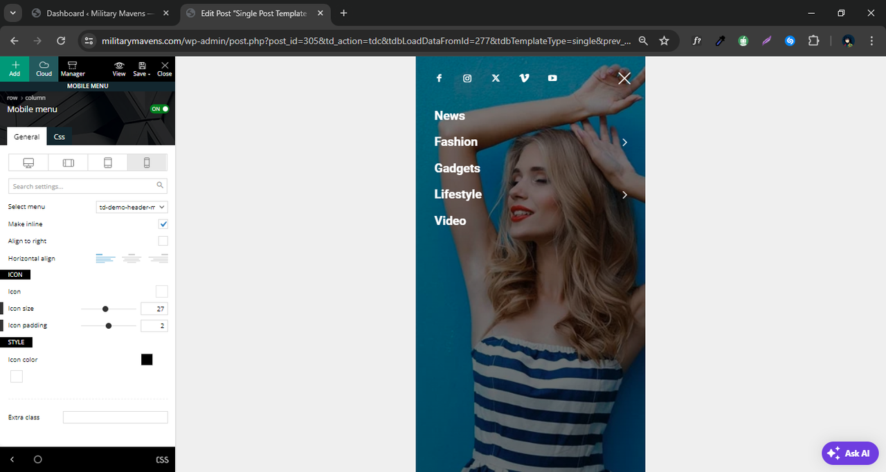
 Davidpinto
 Ok perfect!
I use now the 3rd solution with mobile theme plugin with the settings so how explain in the guide.
But I always a problem with menu and search. If i click on search icon or on menu icon they didn’t work.
🙁
thank you
Davidpinto Hi Bettina,
yes I use AMP official plugin as also suggest on theme panel
And I’ve already activated the settings from the theme panel for mobile menu and mobile search.
But doesn’t works
Bettina Hello David!
I can see that you use the Mobile theme plugin for now.
You can deactivate it and use the responsive version if you like to be customizable with the tagdiv Composer. Enable these settings from the theme panel for mobile menu and mobile search: https://app.screencast.com/pUtCgElyRwzjo
Make sure you choose a menu in order to display there: https://app.screencast.com/TffmDPVrdAg0Z?tab=Details&conversation=AKSAQD3gCjYHzgr0YLpH4k
Thank you!
DavidpintoHi All,
I have a problem in mobile mode with my site davidpinto.it
When I click on menu or search in mobile mode these not appear on diplay but I have only a fade screen.
Could you help me please?
all the best
David
Anamaria Hi,
You have H1 on the logo for mobile menu sticky; please check it if you want to disable it -> https://i.imgur.com/hldV9qV.png
Thank you!
 nachtwache
 Hello Anamaria,
I needed some time to cath up with this… but after trying I think it doesn´t work as requested.
We have “mobile menu horizontally” already on our mobile version and when I add another category it just ads another menu-line instead of scrolling as seen on https://www.berliner-zeitung.de

 pwiskerAnamaria
 Hello!
Please check if you have enable these settings from the theme panel for mobile menu and mobile search: https://app.screencast.com/pUtCgElyRwzjo
Thank you!
 firdante
Hi, the mobile menu and search module are not working on mobile. I dont know if they are blocked or something.
this is the site. http://ingratanoticia.com.mx/
Bettina Hello!
It could be a conflict that’s why they are not opening.
Here you can remove/set a picture for mobile menu background: https://www.screencast.com/t/x3Xrln2b88x
And the background color here: https://www.screencast.com/t/PbU3hQpDqHh
The opacity of the mobile modal can be changed from Theme panel -> Background -> Mobile menu/search background: https://www.screencast.com/t/hcRoHastuO -> https://www.screencast.com/t/SQapAaaiLRwY
You can also use a modal popup for mobile menu and create your own design into a separate page that display into a modal: https://forum.tagdiv.com/modal-popup/
Thank you!
 tsbiz
tsbiz Hi!
They’re enabled already: https://imgur.com/PJjo47j
And there is a menu choosed. Do not work properly. The effect https://imgur.com/b4eWfn1.
When I test on TagDivComposer, seems like this: https://imgur.com/bZ8uXGY.
But when I test on mobile, shows like this: https://imgur.com/undefined.
Seems like something is not working properly. The blue background effect doesn’t show up on mobile and appears transparent on live search. The menu doesn’t show up at all.
I don’t know what to do.
Could be a conflict with any other WordPress plugin?
How do I change the menu design and the live search design or maybe create my own menu design and live search design?
Thanks
Bettina Hello!
Enable these settings from the theme panel for mobile menu and mobile search: https://app.screencast.com/pUtCgElyRwzjo
Make sure you choose a menu in order to display there.
Thank you!
tsbizHi,
My mobile menu is not working. But when I test on desktop with mobile mode, it seems to be fine. But when I go to Chrome, Brave or Firefox on mobile, it’s not working at all.
See here: https://imgur.com/y7SMGla
Seems like nothing is happening.
The Search mobile shows up to me when I click, but with terrible UX.
See here: https://imgur.com/Q9fkqDa
I’m trying to change that, but nothing is working.
What can I do, please?
Thanks.
Anamaria Hello,
The menu is made using the modal popup and you can create the page of the mobile menu as you want.
Thank you!
Anamaria Hello,
You can add those icons with the elements of social icons, and there you can add your social custom icon, set the links, and so on. You can add those using tagdiv Composer, and for the mobile menu, you can now create a modal popup and set the element you want in the menu; you do not need to use the social network elements.
Thank you!



