
- NewspaperThe Newspaper Mobile Theme: Introduction
- NewspaperThe Mobile Theme
- NewspaperMain Menu
- NewspaperHow to Add a Logo in Newspaper
- NewspaperBig Grid Flex Settings
- NewspaperHeader Builder
- NewspaperFont Customization
- NewspaperTheme Colors Introduction
- NewspaperBackground Introduction
- NewspaperHow to Install Newspaper via FTP
- NewspaperHow to Install Newspaper via WordPress
 laurenskok
Hello,
I had a question concerning the mobile menu. Is it possible to create and select a menu in mobile mode that is different from the desktop?
I’ve already tried with tag div composer but the problem is when I select another menu in mobile, it changes the desktop.
At the moment, I have this type of menu : https://pasteboard.co/jCmFSvYHQLgY.png
For example I would like to erase the avatar picture + logout button and replace them by a company logo.
Is it possible with Tagdiv and the prebuilt sport theme?
How can I proceed?
Thank you
 ngotuannghia
 Website Manager in my side very different
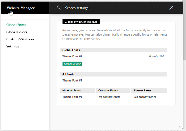
I also have same issue with owner topic. When enable sticky row on desktop then mobile lost menu.
 JJ0000
 Thanks. I actually am doing direct ads (not adsense script just image) and have to change the layout position of the advert images, that’s why I was wondering which template to access to edit the actual layout stuff. I have a custom menu on mobile view so I need it to go under menu.
 Anamaria
 Hello!
You can disable/enable sticky mobile menu and main menu when you access Website Manager, like this: https://www.screencast.com/t/EdpjIpsBHunx
Hope that helps you!
Thank you!
 gabrielbotezatu
It is simply disapearing when I try to make it sticky:
[video src="https://dobrogealive.ro/wp-content/uploads/2023/03/chrome_SHFE9ssCs6.mp4" /]
 libertylens
I am looking to create a secondary menu for static pages which appears cleanly on desktop and mobile alike. What is a good way to go about implementing something like that?
 The Irish Place
Hi,
When I click on the menu selector/accordian icon when using the mobile theme I am getting a display asking me to ‘Click here – to use the wp menu builder’.
Site url is theirishplace.com
I have set the mobile theme to ‘mobile+AMP’
All else appears to work. Please advise.
Anamaria Hi,
To change the font and colour for the mobile menu please go in Theme Panel -> Theme Colors -> Mobile menu/mobile search => https://www.screencast.com/t/0CvSgXp9H to set a background image go in Theme Panel -> Background -> Mobile menu/mobile search => https://www.screencast.com/t/uvDejzbX to change the font from Theme Fonts => https://www.screencast.com/t/ANBQe7hQhJd
The social icons from the mobile menu are coming from the Theme Panel -> Social/Apis -> Social Networks -> https://i.imgur.com/kKYIECB.png remove/edit them after your needs.
Thank you!
 beyonduality
If i click on the menu button (responsove newspaper theme) i have this background https://imgur.com/a/5u1TZT1
But we want a background on mouse click with this color 040024
 Patrianto
Please help us. We are quite frustrated with the mobile-friendly issue in the google search console, we just activated the mobile theme newspaper to fix the problem, but that also didn’t solve the problem. The problem that arises is that:
(1) Clickable elements are too close together.
(2) Content is wider than screen.
(3) Text is too small to read.
Here is a list of problematic URLs:
https://exploraphones.com/brimo/cara-bayar-adira-lewat-brimo/
https://exploraphones.com/brilink-mobile/cara-byar-baf-lewat-brilink-mobile/
https://exploraphones.com/mandiri/cara-bayar-ipaymu-lewat-livin-mandiri/
https://exploraphones.com/brimo/cara-setor-tunai-tanpa-kartu-atm/
https://exploraphones.com/news/cara-enable-kartu-atm-bri-lewat-brimo/
https://exploraphones.com/atm-bri/persyaratan-bikin-atm-bri-2021/
https://exploraphones.com/brimo/cara-bayar-bukalapak-lewat-brimo/
https://exploraphones.com/shopee/virtual-account-shopee/
https://exploraphones.com/atm-bri/ini-kode-gopay-untuk-top-up-lewat-atm-bri/
https://exploraphones.com/bri-news/kur-bri/
https://exploraphones.com/bri-news/jadwal-operasional-bank-bri-selama-libur-nataru/
https://exploraphones.com/bri-news/dana-kur-bank-bri-2021/
https://exploraphones.com/news/wah-sekarang-pengajuan-kur-bisa-melalui-shopee-tokopedia-grab-dan-gojek/
https://exploraphones.com/news/p3k-guru/
https://exploraphones.com/bisnis/budidaya-ikan-lele/
https://exploraphones.com/bisnis/mengelola-keuangan/
https://exploraphones.com/news/real-mallorca-vs-barcelona/
https://exploraphones.com/mandiri/cara-bayar-pdam-lewat-livin-by-mandiri/
https://exploraphones.com/bri-news/pinjaman-online-bri-hingga-rp-50-juta-untuk-umkm/
https://exploraphones.com/bri-news/keamanan-digital-bank-bri-dengan-standard-internasional/
https://exploraphones.com/mandiri/cara-bayar-mitra-shopee-lewat-livin-mandiri/
https://exploraphones.com/bisnis/menu-takjil/
https://exploraphones.com/sport/everton-vs-manchester-united/
 simonetelelombardia
Hi everyone, I can’t understand why for a few days my site hasn’t shown the hamburger menu icon anymore (used for both the desktop and mobile versions) and shows this code in the header:
[tdb_header_logo align_vert=”content-vert-center” url=”https://www.mediapason.it” media_size_image_height=”180″ media_size_image_width=”544″ image_retina=”12401″ show_title=”none” show_svg=”none” ttl_tag_space=”20″ tagline_align_vert=”content-vert-bottom” show_tagline=”none” align_horiz=”content-horiz-left” image=”12400″]
[tdb_mobile_menu menu_id=”735″ align_horiz=”content-horiz-right” icon_size=”45″ icon_color=”#ffffff” icon_color_h=”#0b9a2f” tdicon=”tdc-font-fa tdc-font-fa-navicon-reorder-bars”]
If you need you can see it at http://www.mediapason.it
I tried to recover a previous version of the site and databasewith a backup, but after a few days the problem occurred again, without me updating anything (theme, wordpress, plugin)
thanks
 nicholasyou
 I am having the same issue on my site. The mobile menu is not the same as the menu on my homepage (desktop). How do I fix this?
theundroppables.com
-
This reply was modified 3 years by
nicholasyou.
 sandeepb
Hi team,
We are seeing the following issues on our blog. Could you please help us resolve these?
Issue 1: Tagdiv editor takes 4-5 minutes to load after clicking on the “Edit with TagDiv” button on the admin menubar.
Issue 2: Hamburger menu not working on mobile. You can check by opening https://abhibus.com/blog/ on a mobile phone.
Issue 3: Tagdiv Editor not loading options for Raw HTML element. 
Issue 4: Browser console error in tagdiv editor: 
Issue 5: Save button is not showing properly. Reference: 
My email is pradyu@cultnerds.io
Thanks,
Pradyumna
 samvhughes
https://calrow.dreamhosters.com/
So I’ve edited the mobile header menu for responsive. For some reason the site is displaying a different mobile header on the homepage. Once you click through to a different page it displays what it should. Any ideas?
 fgarran
We are trying to make the site to be the same on mobile , but it is very different, including the mobile menu, can you please help us to fix that?
Site: mundofinanceiro.com
Thanks
 Arielgb
When viewing the articles, in the mobile version, the logo appears on the left, superimposed on the menu.
I can’t find how to change this.
 Luca
LucaBăieți , am nevoie să elimin nenorocitul de meniu principal din antet , care este afișat și pe dispozitivele mobile .
Deși pentru dispozitivele mobile folosesc “mobile menu”
Ambele sunt afișate .
De asemenea, încercați și de pe desktop și tabletă este ok , de pe mobil este oribil .
link-ul este https://www.trendtize.com
 leagcooks
 Hi Calin,
Thanks for getting back to me..
Is it possible then to HIDE the mobile logo, search and menu icon from the top of the mobile version so i can use a plugin that adds there own?
Lea.
leagcooksHi,
Is it possible to set up a different menu for mobile users without using plugins please?
thank you
Lea.
Anamaria Hi,
To change the font and colour for the mobile menu please go in Theme Panel -> Theme Colors -> Mobile menu/mobile search => https://www.screencast.com/t/0CvSgXp9H to set a background image go in Theme Panel -> Background -> Mobile menu/mobile search => https://www.screencast.com/t/uvDejzbX to change the font from Theme Fonts => https://www.screencast.com/t/ANBQe7hQhJd
The social icons from the mobile menu are coming from the Theme Panel -> Social/Apis -> Social Networks -> https://i.imgur.com/kKYIECB.png remove/edit them after your needs.
Thank you!
Anamaria Hello,
To add the social icons you need to edit with tagDiv Composer, search after social icons and set the link for social platforms https://www.screencast.com/t/kATmr6b3yg
You can manage the social icons for the mobile menu from the Theme Panel -> Social Networks => https://prnt.sc/10112uu
Hope this helps you!
Thank you!
 KimimilaWin
I can’t edit the mobile menu pop-out of my site! It’s the theme’s imported demo. My website is on “under construction” as the mobile menu pop-out does not match my website. I’ve tried to follow the theme documentation Header Builder and nothing!
 george921
 It was never an issue before the membership plugin (we are talking 5 years).
I disabled the mobile plugin but now the mobile menu doesn’t work
G
 pten-foundation
ptenfoundation.org. I want my mobile view to mirror site and to get menu to work again.
 Beisik
When I am on desktop the menu and the sticky menu look very different. Even though I have used the same logo for both headers, the sticky menu has completely different sizes and spacings.
The same goes for mobile.
The menu’s also look very different from what you see in the tagdiv builder, so when I think I have made it visually nice and save it. It doesn’t look like how I have made it.
Is there a way to just make 1 menu for desktop that remains sticky and 1 menu for mobile that remains sticky.. instead of having to keep adjusting 4 elements to look the same and never being able to get them to look the same.


