
- NewspaperThe Newspaper Mobile Theme: Introduction
- NewspaperThe Mobile Theme
- NewspaperMain Menu
- NewspaperHow to Add a Logo in Newspaper
- NewspaperBig Grid Flex Settings
- NewspaperHeader Builder
- NewspaperFont Customization
- NewspaperTheme Colors Introduction
- NewspaperBackground Introduction
- NewspaperHow to Install Newspaper via FTP
- NewspaperHow to Install Newspaper via WordPress
 raketenaffiliate
 Thank you for your quick reply.
First of all, I got it setup a bit cleaner now, thanks to your answer.
First, I uninstalled the mobile plugin and the omgf google fonts plugin, then I deactivated the “use google fonts” and “use default fonts” option in the theme panel.
Then I uploaded the fonts and added css to style.css from this link: https://google-webfonts-helper.herokuapp.com/fonts/comfortaa?subsets=latin
After then choosing the right fonts again in theme panel, everything seems to load properly, just SAFARI on my IPHONE shows times new roman, here’s a screenshot below. I tried google chrome mobile and it showed up just fine. Is there any Solution to this?

Also one more thing. How can I change the color gradient of the mobile theme menu to match my theme (no plugin, i use the mobile pages)?
-
This reply was modified 3 years by
raketenaffiliate.
 mojopatrakar
https://mojopatrakar.com/
If we scroll up in the blog page or single page post so sidebar is fixed and overlap the whole screen
and footer cant be set in all page once i selected one.and login/sign up button not remove in menu
or the header is not proper align and the mobile is not responshive .. I just recently buy this theme but its not work well as i thought
 davinity12
 Hi. Thank you.
I am having a hard time getting elements to drop when I drag them in general. I deleted the menu shown. When I try to add a mobile menu, I drag and try to drop into the row that highlights blue but it does not drop.
 zenka
zenka its a mobile menu. SOCIAL LINKS. HOW TO EDIT IT 🙂
 Bettina
 Hello @theangrydude!
The colors can be changed from the theme panel -> theme colors -> Mobile menu/ Mobile search.
Thank you!
zenka Hello my dear friends, i have another one problem. Social buttons on mobile menu. How to disable some of them and add links to others. Willing to hear from you soon ! 🙂
Bettina Hello @catalingeangos!
Add this element called Mobile menu and select your created menu: https://prnt.sc/HIozGSkPDt08
A menu can be created in the Dashboard -> Appearance -> Menus.
Thank you!
Bettina Hello @catalingeangos!
Your link for the “Discover” item is #. Also, you did not choose a menu for the mobile menu. Please edit the homepage with the TagDiv Composer, and select a menu. You can add the link for that menu items in the Appearance -> Menus. Choose a menu and edit it.
Thank you!
Bettina Hello @davinity12!
You have clicked on the zone and not the element: https://prnt.sc/fwMvTXVVklHh
If you click the element, you can see the modal popup: https://prnt.sc/KjlT9II_9ZPN which is used for that menu: https://forum.tagdiv.com/modal-popup/ You can delete the element and insert a new element called “mobile menu” and choose a menu there which you created in the Appearance -> Menus.
You can create a mega menu like this: https://forum.tagdiv.com/mega-menu/
Or you can create a page mega menu like this: https://forum.tagdiv.com/page-menu/
Thank you!
 theangrydude
Hey,
I would like to transform the Header menu into a Hamburger menu on mobile devices.
I don’t want to use a different mobile theme nor to change the theme. I would like everything to stay as it is, except that the Header Menu becomes a Hamburger menu on mobile devices.
Any advices?
Thanks in advance
 falcon11
Hi I need to increase the opacity of the mobile menu background. There are 2 colors in the mobile/search background color settings. Which one should I change? Please advise. Thanks!
 catalingeangos
Hi, i’m looking to debug my website because when i open on the mobile and click on the top bar menu it doesn’t load.
Not sure exactly what blocks it if you can take a look, please?
Thank you
davinity12Hello,
In the mobile version, when I click the menu nothing happens. In the editor there isn’t an option to set the menu.
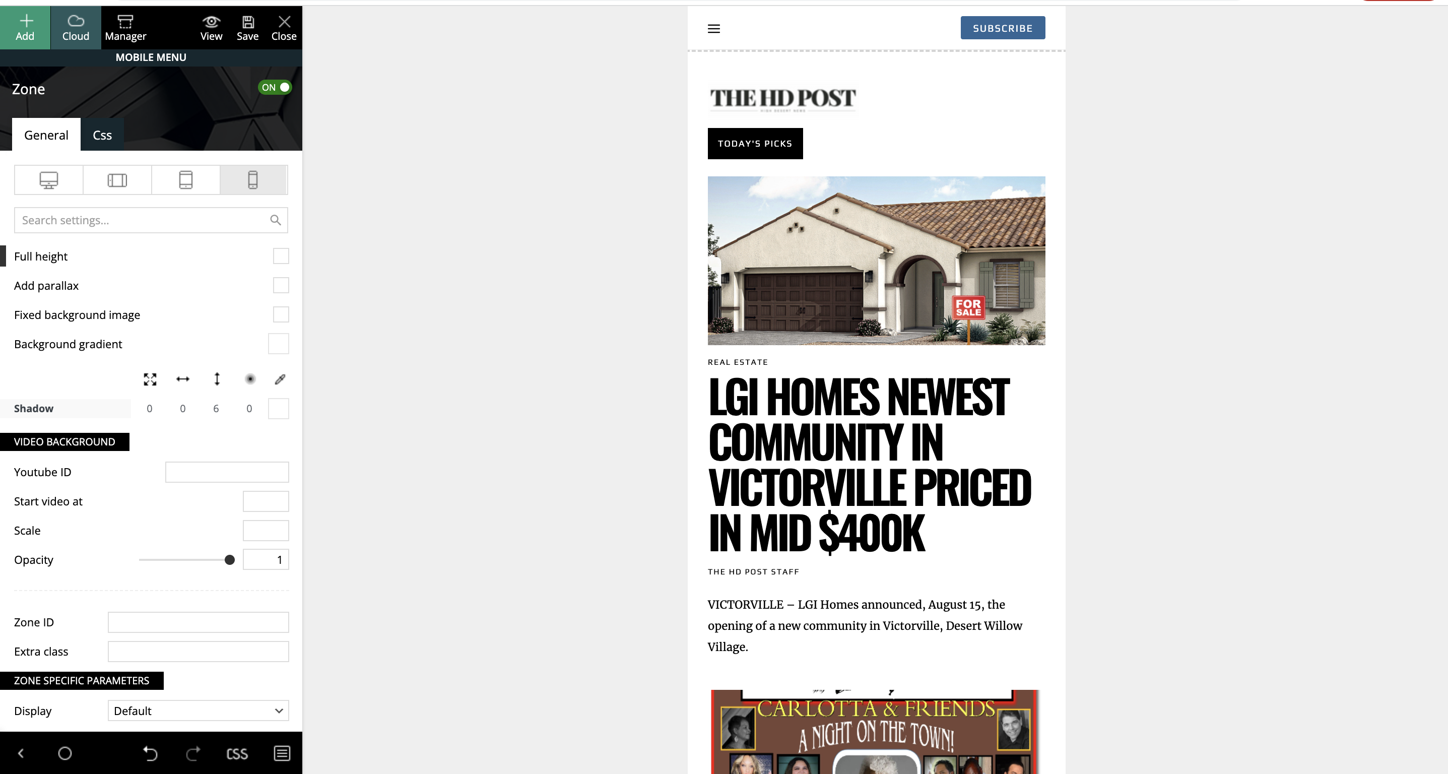
theangrydudeHey,
In Black Pro theme, how do I transform the header menu into hamburger menu for mobile devices?
I looked everywhere and I dont see this option, only vertical scrolling.
Thanks,
Alex
 kaitlin
 Thanks Anamaria.
I am not trying to make a separate mobile site. The staging site is here: http://newmlp.raisingglobalhealth.org/.
We are trying to switch over from Visual Composure (which worked fine but seems increasingly less supported by the theme) to TagDiv, and it’s the latter I’m struggling with. In the old visual composer I could hide elements on different resolutions. TagDiv seems to have the same option (see screenshot here: https://snipboard.io/wsY6hJ.jpg). However the “on/off” toggle doesn’t actually do anything.
So, for example, if I add a mobile menu in responsive design like so: https://snipboard.io/0T2lmH.jpg [aside, the alignment options also look like they are broken?]
Then even if I tell it to be off for desktop, it still appears: https://snipboard.io/epnA9l.jpg.
It is also a problem in other spaces, for example if I’d like to display three posts in a row on the desktop site but only two on a tablet, I cannot do this. Whatever option I choose gets promulgated to all sizes 🙁 So it just seems like none of the responsive editing I was used to with VC works in TagDiv?
Any ideas why this is happening?
Thanks,
Kaitlin
 Simion C.
 Hi,
The composer provides options to remove elements per device/viewport.
So if you want in this case to not display the respective menu on these 3 viewports https://i.imgur.com/GuxSnWG.png you can click on the horizontal menu in the composer, and switch to the viewports one at a time, and hiding it.
The option is in the CSS tab at the bottom https://i.imgur.com/xjows44.png
So basically select the desktop viewport and hide the element, then the tablet viewports and hide the element for them as well. As a result it will remain visible only on mobile.
If you need help with it, you can send us an email at contact@tagdiv.com and provide access to the website, so we can do it and explain more how it is done.
Thank you!
 suaraumkm
Hi, how to hide mobile horizontal menu when we access on desktop/landscape/portrait view or non phoneview?
 Calin
Calin Hi crodexter,
You are right, the sticky menu crates cls on both mobile and desktop if is used.
If you do need a sticky menu we suggest to use a cloud header (this will be display on desktop, and responsive version, for mobile it can be use a mobile page template) and set the row to be sticky -> https://i.imgur.com/3eIf8ss.png
Unfortunately for standard pack and mobile theme there is no option to use it without causing cls.
Thank you!
 crodexter
 Hello,
I am pretty sure that sticky menu in mobile theme is creating CSL 0,11
As soon I turned it off CSL is 0
I don’t know enough to know is this problem with my installation or it is general problem.
And important thing is that I am checking CSL in Google Chrome developer tool.
Google Insight is useless for hings like that.
Can you please respond? This seems pretty important.
 Luciana123
Hi, in the mobile version, if I click on the menu, instead of appearing the menu, the page shrinks and you can no longer navigate.
kaitlinHi,
I’m trying to create a responsive design but the “on-off” toggle for elements has no impact whatsover. So if, e.g. I want to use a mobile hamburger menu on mobile and display a full menu on desktop, the system just puts both the full menu and the mobile menu no matter what size the screen is so it looks super messy. Any ideas?
Thanks,
Kaitlin
Calin Hi,
The mobile logo should be 140x48px -> https://i.imgur.com/nh0dNDW.png
.td-newsmag-voice .td-header-style-5 .td-main-menu-logo img {

    width: 140px!important;

}
The code need to be set in this place -> https://i.imgur.com/1DOhU0q.png
Thank you!
 Tim
TimHi,
Running Newspaper 11.5.1 on this site of ours: https://www.globalafricanetwork.com/
Mobile menu not showing to users, mobile settings not showing in the theme panel even though both AMP and Tagdiv Mobile Plugin are installed.
Please advise.
Thanks
Tim
 Anamaria
 Hello,
Please let me know what you want to edit.
You can edit the mobile header with tagDiv Composer -> https://i.imgur.com/EJRp0P8.png
To change the font and colour for the mobile menu please go in Theme Panel -> Theme Colors -> Mobile menu/mobile search => https://www.screencast.com/t/0CvSgXp9H to set a background image go in Theme Panel -> Background -> Mobile menu/mobile search => https://www.screencast.com/t/uvDejzbX to change the font from Theme Fonts => https://www.screencast.com/t/ANBQe7hQhJd
Thank you!
 Libertarian-hub
Hi guys, I just need a simple tip: I’m trying to edit the mobile version of the header’s main menu without modifying the desktop version’s one. Is it possible? How can I do it?



