
- NewsmagSmart list ads
- NewsmagIntroduction
- NewsmagMain menu
- NewsmagLogo & Favicon
- NewsmagHeader ads
- NewsmagSmart sidebar
- NewsmagSharing buttons
- NewsmagCategory tag on modules/blocks
- NewsmagBackground introduction
- NewsmagTheme colors introduction
 Calin
Calin Hi,
You can use the same header and footer for desktop and mobile version and this will not affect if you make the pages with the Gutenberg or with the tagDiv Composer.
I see in that documentation that you can also use the shortocde in classic editor, so you can also set it using tagDiv Composer.
Thank you!
 MeghaRajpara
I am using Newspaper – News & WooCommerce WordPress Theme. I just installed it’s prebuilt website, but it’s google page speed insight score very low in mobile. It is just 58, I didn’t even do any customization in website just demo content.
 zazenwebdesign
Hi guys,
When I make updates to a page and then check on my or any phone the updates show great.
But not the home page updates. I tried to clear the cache etc.. all things I DONT need to do on all the other pages after an update.
Not sure what to do to make home page edits show up on mobile devices.
https://okcgnosis.com/
Also on this page https://okcgnosis.com/gnostic-courses/ the register button works perfect on desktop, but on mobile it goes t the 404 page – trying for days to figure this out.
Ben
 neweuropa
 So i can’t use Gutenberg in pages and use the same mobile header used for mobile articles?
I need to use Gutenberg for GeoDirectory: https://wpgeodirectory.com/docs-v2/integrations/gutenberg
But obviously need the same header on pages as on articles…
Regards
 Anamaria
 Hello,
You need to disable the sign-in/join from Theme Panel -> Mobile Theme -> Header https://i.imgur.com/1XdWker.png
Thank you!
 tw144
tw144How can I hide the “Login” link from the Mobile Menu?
https://www.awesomescreenshot.com/image/24005328?key=909c9b96f642df28dcd76d8c0138a9da
Calin Hi,
If you want to use the tagDiv Composer, then you can set the shortcodes on column text and text with title where it is also use the classic editor -> https://i.imgur.com/fngLIwW.png
Or you can just used the Gutenberg editor and use for mobile the responsive version or the mobile page template (not the mobile theme plugin).
Thank you!
Calin Hi,
Yes, you can override the Mobile theme plugin, but this must be done individually on each page and post, for this you must use the Gutenberg from WordPress -> https://i.imgur.com/FyrtoCD.png -> https://i.imgur.com/VadkbsV.png -> https://forum.tagdiv.com/mobile-theme-introduction/
Maybe this can help you!
Thank you!
Calin Hi,
I just made some tests and for me the mobile page looks like this https://i.imgur.com/aiBK36N.png it is this like it suppose to be? If not, can you please provide a screenshot on how should be!
Also, if you want you can make a test without cache plugin or maybe logged in (to not use the cache) and see if is delivered the right version for the mobile.
Thank you!
Calin Hi,
Yes, you can share it via email contact@tagdiv.com, just add the link of this topic too.
When the mobile version is on desktop, usually is a problem with the cache plugin. Most probably you are using the mobile theme or mobile page template and the cache plugin that you have do not recognize it. Most of the time this is solving by enabling from the cache plugin the mobile support. We recommend to use Wp Super Cache plugin.
Thank you!
Calin Hi,
If the changes are saved but after page refresh old settings are back, then it is possible that the changes to be delivered from an object cache.
Also, some times can be a plugin conflict, so you can also make a test using only tagdiv plugins.
On this post https://www.rcrwireless.com/qualcomm-analyst-day-2022 you have set a different header per single post template and this is also set on the mobile using the same element from desktop and not the mobile menu (you can edit it using tagDiv Composer) -> https://i.imgur.com/qExqf5r.jpg -> https://i.imgur.com/w00kC00.png
Thank you!
 maxonline
Hi guys
I tried hard to get good results with WP super cache, but on mobile this solution doesn’t seem to work fine.
So I’m triyng with WP-Rocket which boosts my performance by 15 point on google page speed.
Further optimization could be done with the “remove unused css” feature, but there is a problem with loading some images.
This seem due to a feature in Style.css sheet. Can you help me ?
I paste the solution from wp-rocket support.
thank you in advance
Max
sample page: https://www.massimobasso.com/partire-per-gli-stati-uniti-le-cose-importanti-da-sapere/
—-
I reproduced the problem on my testing environment and found the root cause of the issue.
The issue was caused by Remove Unused CSS feature in WP Rocket, but it is coming from an underlying issue in one of the stylesheets.
This stylesheet: https://www.massimobasso.com/wp-content/themes/Newspaper/style.css?ver=11.4.2 contains an error.
It has a non-valid value width: auto\9;.
Please see the validation error report: https://jigsaw.w3.org/css-validator/validator?uri=https%3A%2F%2Fwww.massimobasso.com%2Fwp-content%2Fthemes%2FNewspaper%2Fstyle.css%3Fver%3D11.4.2&profile=css3svg&usermedium=all&warning=1&vextwarning=&lang=en
The \9 is a hack to make the rule only readable by IE8 up to IE11.
This error is negated on the non-cached page. The browser simply removes this non-existing value.
See the screenshot: https://i.imgur.com/NpugXvX.png
When Remove Unused CSS is enabled and the stylesheet is processed, the value is parsed as width: auto; and added to the Used CSS this way. This value is valid and therefore it is preserved by the browser. But the presence of this value breaks the layout.
See the screenshot: https://i.imgur.com/kcnZ97U.png
The solution would be to resolve the underlying error in the https://www.massimobasso.com/wp-content/themes/Newspaper/style.css?ver=11.4.2
stylesheet.
Removing width: auto\9;
line from the CSS stylesheet will resolve the problem for you.
The issue will be back when you update Newspaper theme. You would need to remove the line again.
Calin Hi,
The “-” from the post can be removed only using custom css. You can use this code:
.single .td-post-author-name .td-author-line {

display: none;

}
The code need to be set in the theme panel > custom code> custom css.
In case that you are using mobile theme plugin, then please set the code in the theme panel > mobile theme > custom code> css too.
I hope this will help you!
neweuropaI need to use Gutenberg & shortcodes on pages for example: Privacy page, Contact form, Donation form, but when I set page to mobile page… the content doesn’t show on mobile.
How do I set global mobile header & footer, while using Gutenberg & shortcodes on pages?
Regards
 thelastpoet
Hello Calin,
The mobile plugin takes over everything on mobile.
Is there a way to override some pages to use the responsive version on mobile? If not yet, can this be planned?
I would like to:
1. Create a Cloud Template for Single Posts
2. Assign this template to specific categories
3. Make sure this template is available to mobile users even though I have the mobile theme plugin installed.
I am doing this because I have the mobile theme installed with Ads in the content on it.
I want different posts without Ads in the content body.
I don’t want to disable the mobile theme for the whole site.
Thanks
 Bamsfoldigital
 i have built some mobile pages starting from the mobile home page, but my wbsite is still loading the contents from my desktop website each time I use my Phone.. I have cleared the cashe from the browser and I have also deleted the Tagdiv Mobile Plugin. What may be the reason for thhis
 westropMEF
 Actually, now I note that it’s doing it for all alignments. Pictures break the responsiveness. So that text overlaps the edge of the screen when in tablet or mobile view.
 Sekhar
 Hi calin,
I took the slider from the tagdiv composer and arranged as per my vision of the website. I don’t know if it is from the revolutionary slider. Anyways, could i share my website link with you through email at contact@tagdiv.com? Actually i made some minor changes to the homepage(of default pro prebuilt website) and I am on the way to design the site as per my expections. At first i didn’t get the sliders right and later, it went exactly as planned even though i didn’t made any changes. So i was happy that issue got solved on its own.But today the same problem appeared. On top of the that, mobile version is being even on desktop version too.
 Eighthats
Currently, when using the tagdiv editor, changes made to the mobile menu, such as selecting which menu it should use,
do not save when the page is updated.
The mobile menu always pulls up the menu from the main header, even if the menu itself is set to a different menu.
This page is using a different overall header:
https://www.rcrwireless.com/qualcomm-analyst-day-2022
The mobile menu will not retain the settings so we’ve had to leave the horizontal menu layout in place.
I have also been unable to change the CSS on the page. Any changes made are erased when the page is updated.
Theme status page:
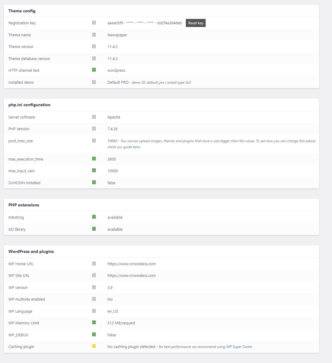
 PatWire
The mobile menu fails in 11.4.2 – rolled back to 11.4.1 and it works again
There was also a WordPress update today to 5.9
Mobile theme plugin not activated because I don’t use the mobile theme plugin
Thanks
 channeld
Hi. I have this issue with desktop menu (mobile works).
When the menu has subcategories, the main one is not clicked.
In console I see 1 error: r ‘tds_more_articles_on_post_pages_distance_from_top is not defined’
I read the forums topics and says it has to activate and set value on more box. did that. the value shows in the code (and then deactivated the Standard Pack) but the menu still doesn’t work.
I use wprocket. Without wprocket it works but that makes no sense as everything else works with wprocket (in your theme too).
So, what is the solution? Why I get the same error despite the more box having value?
 RGLAS
RGLASI have a problem with my mobile layout.
Everything works except my home page, scrips don’t work and top logo is not what it should be.
Anamaria Hello,
For mobile theme +AMP, you can change the fonts from Theme Panel -> Mobile Theme -> Theme Fonts -> Post Content -> https://i.imgur.com/SdAOwE3.png
Thank you!
Anamaria Hello ludyma,
The options the Reading Time Shortcode and the Reading Progress Bar are available in Single Post Templates -> https://i.imgur.com/P6gWJ6d.png
You can now add unlimited ads in the post loop shortcode is available in Posts Loop and Posts Loop 2-> https://i.imgur.com/qxGrllf.png
RAW HTML ACE Editor -> now you can extend the element Raw HTML -> https://i.imgur.com/uZE3aRt.png
Option to Enable / Disable Saving History can be found in Manager(Website Manager) -> Settings -> https://i.imgur.com/nazGJvt.png and refers to these options -> https://i.imgur.com/O0asy16.png
Option To Set The Background Color For Mobile Navigation Toolbar from Theme Panel -> Theme Colors -> General theme colors -> https://i.imgur.com/Yood0aL.png and is for mobile browser toolbar.
Thank you!
Calin Hi,
Our theme can use 3 options for mobile version:
1 – the responsive version
2 – the mobile page template (can be used on pages and cloud templates -> https://prnt.sc/XVq4TcxR0lwJ)
3 – the mobile theme plugin
To have the same layout, then you need to avoid the mobile theme plugin. Use the responsive version or the mobile page template (if you want to edit the mobile version to have a different look or content).
Also, here is a video tutorial that maybe can help you!
Thank you!



