- NewspaperThe Newspaper Mobile Theme: Introduction
- NewspaperThe Mobile Theme
- NewspaperModules Builder in Newspaper Theme
- NewspaperFilters and sorting for taxonomies
- NewspaperHow to Add a Logo in Newspaper
- NewspaperBig Grid Flex Settings
- NewspaperHeader Builder
- NewspapertagDiv AMP Plugin Tutorial
- NewspaperNewspaper theme documentation
- NewspaperBest Of Forums
- NewspaperCache plugin – install and configure
- NewspaperFont Customization
- NewspaperTheme Colors Introduction
- NewspaperBackground Introduction
- NewspaperHeader ads
- NewspaperPost template ads
- NewspaperCustom ad spots
- NewspaperMain Menu
- NewspaperHow to Install Newspaper via FTP
- NewspaperHow to Install Newspaper via WordPress
 Calin
Calin Hi,
Usually, this kind of situation is created by the cache used, you’ll need to use a cache that can create a separate cache for the mobile version.
Thank you!
 zoldfulu
Good Morning,
I tried to update my (https://egzostive.com/) website’s php to the latest (8.3) via the bluehost dashboard.
After an initial boost in speed the site crashed completely (web, mobile even the WP dashboard), and I had to have it rolled back to 7.4 by the Bluehost helpdesk.
Now the website works but the mobile pages come up with a service not available message (the main page works but none of the posts, e.g. https://egzostive.com/the-ultimate-2025-car-show-and-events-list/?amp=1).
Can you have a look?
Also, what is the latest compatible php for the theme?
If it is already 8.3 how can I upgrade to 8.3 without crashing?
Thanks in advance,
Calin Hi,
The theme has only a single js file and that is on a different path:
wp-content/themes/Newspaper/includes/js/tagdiv-theme.min.js
The part for the mentioned js files is from the tagDiv Composer plugin
wp-content/plugins/td-composer/legacy/Newspaper/js/tagdiv_theme.min.js also, the theme do not have a file like tdb-site.js
My recommendation: make sure that you have the latest theme version 12.73, and in case you are using a child theme, set the main theme.
Check when you are logged in and no cache and minify code is applied to see if the same error appears.
For the mobile version, you need a very good cache plugin.
You can also use the tagDiv mobile theme plugin, which will change the layout but will provide very good results – https://forum.tagdiv.com/mobile-theme-introduction/
Calin Hi,
You ned to use a custom css, as example:
.tagdiv-type {

    font-size: 15px;

    line-height: 1.74;

    color: #222;

}
Set the code in the theme panel only for mobile – https://i.imgur.com/ESQ9r7l.png
Calin Hi,
Do you use the tagDiv Mobile theme plugin? If yes, please disable it. Also, please check if your homepage header is set as global – https://i.imgur.com/LMZozTv.png https://forum.tagdiv.com/header-manager/
Calin Hi,
Usually, this situation appears when you are using the tagDiv Mobile theme plugin. When this plugin is used you need to set the page content using the mobile theme editor, or to disable it from the pages manually. You can check more using this guide https://forum.tagdiv.com/mobile-theme-introduction/
Another solution is to disable the tagDiv mobile theme plugin and use the responsive version.
 Mallouni
My Newsmag photoblog site https://thestorybehindthepicture.com/ actually works perfectly. But I’m having problems with the mobile version. All articles and navigation are displayed correctly on the home page. Even when I click on an article there, it is displayed correctly. However, when I try to click on a subpage via the main menu, the page opens but only the header and footer are displayed—no content. What am I doing wrong?
Translated with DeepL.com (free version)
 SteveWA
Sometimes the site doesn’t show the mobile template on some articles.
I created a second Cloud Template for mobile posts.
Sometimes it works, sometimes it doesn’t.
Resaving the mobile template seems to force it for a short while to use the mobile version, but then it stops.
 stanekc
 Yes, it should be the first image you referenced. What do you mean by “check to have that log on the mobile version”? I am not using a mobile page.
Here are what my settings are in the Manager on the Mobile menu. Note that it is displaying correctly in the editor but it does not when saving and opening it on a phone.
 newspatron
Hello TagDiv Support,
I am using the Newspaper theme (latest version) on my WordPress site, and am experiencing critical issues with missing frontend JavaScript files and related mobile performance problems.
Description of the Problem:
On my live site, the following critical theme JS files are returning 404 errors:
/wp-content/themes/Newspaper/js/tagdiv_theme.min.js
/wp-content/themes/Newspaper/js/tdb-site.js
This results in:
Broken frontend features (menus, blocks, theme interactivity).
Console errors such as “wp is not defined” and failures for any code dependent on the wp JS object.
Failed scripts when trying to use or customize TagDiv Composer, blocks, or advanced layouts.
File/Folder Structure Verified:
My Newspaper theme is installed at: /wp-content/themes/Newspaper/
The only theme folders present are: css, images, includes, translation, woocommerce (see attached screenshot).
No top-level /js/ directory is present in the parent Newspaper theme folder.
I checked within /includes/, where there’s a separate js folder, but it contains only backend/admin scripts, not the required frontend ones.
I have unzipped the original theme package from your download. There is still no /js/ directory at the theme root with the two required JS files.
Steps Taken:
Searched and extracted all folders in the downloaded Newspaper theme package, but could not find tagdiv_theme.min.js or tdb-site.js anywhere.
Cleared all WordPress, server, and browser caches, rechecked file system and browser console—issue persists.
Verified the problem recurs with a freshly installed, untouched Newspaper theme (not a child theme or plugin conflict).
Impact:
Site is not functioning properly for end users due to missing JavaScript.
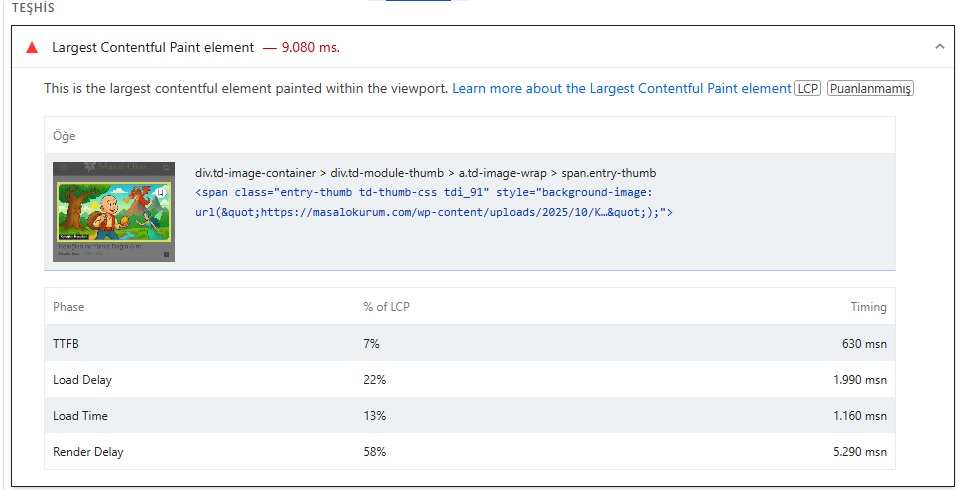
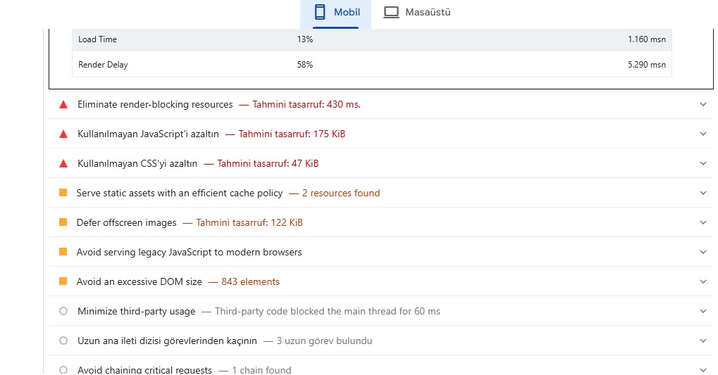
Mobile Lighthouse audits show increased load times (LCP 5.6s+), slow visual completion, and warnings about render-blocking JS/CSS, many of which are worsened by missing or broken theme scripts.
Fundamental site features and performance are degraded on mobile and desktop.
Expected Resolution:
Please provide the correct /js/ directory and the latest versions of:
tagdiv_theme.min.js
tdb-site.js
so I can properly restore these to /wp-content/themes/Newspaper/js/.
If the theme package download I received is incomplete or missing files, please advise and provide a new download link or updated theme zip.
Advise if there may be a packaging, deployment, or installation issue on your end that affects the inclusion of essential JS files.
Optional/Additionally:
Please share a recommended method to ensure all critical JS assets are retained through future theme updates and can be verified after installation.
Any additional suggestions for resolving mobile loading/Lighthouse issues when all scripts are present and loading correctly.
Thank you for your help. Screenshots of my folder structure and file audits are attached for your reference.
Best regards,
Ameet
Newspatron.com
Console error screenshot
https://drive.google.com/file/d/1WisGWNru277WMt6d0twc0EvxeIVW0XkF/view?usp=sharing
Lighthouse screenshot
https://drive.google.com/file/d/1iAFtFb6z26XJdPg4myLTj0KlIoa4qnuS/view?usp=sharing
 m
mHi,
I’m using an older template that doesn’t have cloud templates enabled. I want to change font size on mobile for the single posts, but I can’t find a way to do that. The site is https://1001ideja.si/
What is the best way to approach this?
Thank you for your help.
 Michael Wong
I created a homepage using the tagdiv editor, and it displays correctly on both the desktop and mobile versions. However, when I access an article page from the homepage using a mobile device, the logo in the header menu of the mobile article page still displays the default logo, which is different from the homepage logo. The desktop version doesn’t have this issue. How should I set the logo for the mobile article page?
https://drive.google.com/file/d/1x7n1XMaCsqiqu_nEKJvCKQyaY7iYPMfk/view?usp=drive_link
Calin Hi,
I believe it should be this one – https://i.imgur.com/D9jP4kt.png and instead is displaying this one https://i.imgur.com/C81iylJ.png. Check to have that log on the mobile version and make sure that you are not using a mobile page – https://i.imgur.com/R2jv49d.png https://i.imgur.com/3o9iIzc.png
Calin Hi,
It is possible to have a background color on your inner column or column. Please use tagDiv Composer, select the mobile version and check the inner columns and column if there is any background color in css tab – https://i.imgur.com/SXsB3nM.png
stanekcI have a different logo for the mobile version of our site. In the Manager, I’ve selected the “mobile menu” option, selected the “header logo” element, and changed it to the proper mobile logo. It shows correctly in the editor view. It also shows correctly in a desktop web browser when I shrink the window size down to mobile size.
However, when looking at the site on an actual mobile phone, both Android and IOS, it only shows the logo from the “main menu”, not the mobile logo. I can see that it briefly loads the mobile logo but then swaps it with the desktop logo. Is there a setting that I am missing?
The site is EUValorMedia.com
 mdtonmoyfaraji
 andros1983
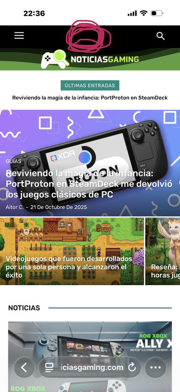
In the mobile version I need to put the logo between the hamburger menu and the search but every time I move it the logo is off-center and I have no way to place the 3 in the same row. can you help me??
 nalamuddin
 Brilliant, Calin – it worked. I’ve added the CSS on both mobile and desktop.
Amazing, thanks!
nalamuddin Thanks Calin for your reply.
I am attaching what my desktop shows as comments, and how it shows on mobile. To be honest, I think this is a bug as I don’t think it’s intended to be displayed differently on desktop vs. mobile. Ideally, this should be done on the main template, rather than via CSS. If we go the CSS route, please be specific to exactly what I need to do as I have never done anything in CSS before.
Much appreciated
Michael Wong Hello, it works.
How do I make the ad full width on mobile screens? I tried setting the row margin and padding to 0px, but it didn’t work.
https://drive.google.com/file/d/1vVrPlX2yBCVCsEcsQH32-nv6hTJYmF9N/view?usp=sharing
https://drive.google.com/file/d/15oPh_A5tUlSlH2_rL0tl7cb8XNNK5h2w/view?usp=drive_link
nalamuddinIn my posts, the “Comments” heading is written in grey on black text background, which is very hard to see. In retrospect, the mobile version has the Comments clearly stated on the white background of the page. I have not configured anything in my theme to make it so.
My website is https://blogandgetpaid.com – this can be observed on any post within (on desktop only). I’ve looked at theme panel and cannot find any setting to configure the comments section.
Calin Hi,
Use tagDiv Composer, edit the category template https://i.imgur.com/vEQa9PD.jpeg and check for that banner on both mobile and desktop viewports – https://i.imgur.com/Gf8Uxz1.jpeg
All the edits can be done using tagDiv Composer – https://i.imgur.com/26ou4If.png https://i.imgur.com/u6LAi5c.png https://i.imgur.com/rQpb0ce.png https://i.imgur.com/vJXkLni.png
Thank you!
Calin Hi,
Our theme provides for the logo the option to set an image, text, icon, and SVG.
Use tagDiv Composer to change the logo https://i.imgur.com/HgCpJ5P.png select the element and check the text and svg logo – https://i.imgur.com/aC8gVlR.png https://i.imgur.com/8NILLxD.png check it on mobile header too – https://i.imgur.com/2xn9Bba.png
Thank you!
 kurshed50
Hi, sir help me how i can Change mobile menu background opacity i can’t option..
 mrozangir
I’m using the Litespeed Cache plugin. I’m getting a score of 61 on mobile. What are the ideal Lscache settings for the Newspaper theme to fix these issues?
Thank you.