
- NewspaperThe Newspaper Mobile Theme: Introduction
- NewspaperThe Mobile Theme
- NewspaperModules Builder in Newspaper Theme
- NewspaperFilters and sorting for taxonomies
- NewspaperHow to Add a Logo in Newspaper
- NewspaperBig Grid Flex Settings
- NewspaperHeader Builder
- NewspapertagDiv AMP Plugin Tutorial
- NewspaperNewspaper theme documentation
- NewspaperBest Of Forums
- NewspaperCache plugin – install and configure
- NewspaperFont Customization
- NewspaperTheme Colors Introduction
- NewspaperBackground Introduction
- NewspaperHeader ads
- NewspaperPost template ads
- NewspaperCustom ad spots
- NewspaperMain Menu
- NewspaperHow to Install Newspaper via FTP
- NewspaperHow to Install Newspaper via WordPress
 housenest
Hello,
I hope you are well.
I’d like to make author name and post date elements in the same row. It looks good in desktop and tablet versions, however on mobile version the date is not in the same row.
I’ve attached image below:
https://imgur.com/a/ljFhQDd
Website: https://www.housenest.net/
Is there any way to make it be on the same row?
Regards,
 Anamaria
 Hello,
please tell me if you want to use an AMP or not, if you want to use AMP set the mobile to AMP -> https://i.imgur.com/BqDm8C0.png . If you want to use the mobile theme for the amp, only for the amp version, then the mobile page will be displayed, but make sure you have this option unchecked -> https://i.imgur.com/IN6Kz14.png
Thank you!
 Bettina
 Hello Sarah!
If you are using the Mobile theme plugin, please set the text size and choose a perfect font style from here: https://prnt.sc/R_mWyTatEpZW and make it compatible with Google.
Thank you!
 Tinystepsbabyclub
 Hi Bettina
Thanks for your reply but I don’t understand what you are telling me?
What do I need to do to make sure Google doesn’t flag my pages as issues regarding text size being too small and clickable items being too close together?
Isn’t the mobile theme compatible with Google?
Thanks
Sarah
 ripunjay
 Hello Bettina,
Thanks for the reply, this is my website url: https://www.mymobileindia.com/
Kindly review it and let me know your suggestion and solution.
Thanks,
Ripunjay
Bettina Hello Sarah!
There are only some settings in the Theme panel -> Mobile Theme. You can not add a shortcode like in the TagDiv Composer or edit the layout with this builder.
Any other adjustments? You can do it by code: https://forum.tagdiv.com/create-custom-code-using-the-browsers-inspector
Thank you for understanding!
TinystepsbabyclubHi Guys,
I’ve noticed that Google Console is flagging errors on all my pages for text size too small and items too close together.
I’m using the mobile theme and my post body text is set to 18px, which shouldn’t be flagged as too small?
For the items too close together, isn’t the mobile theme responsive? I have no control over this?
I’m a little confused as I assumed the mobile theme was designed to fit into Googles ecosystem.
Please advise.
Best
Sarah
 davixstudio2022
 That was unchecked.
Now I checked only Mobile in Theme Panel ( https://prnt.sc/0l-eaNmAVsoR ) and deselect everything in AMP settings and now every page is opening in AMP on the mobile devices, even the homepage ( https://prnt.sc/EUoTUO7e36_Q )… Can you check what is going on with my website?
https://prnt.sc/-4gE9keY152j – Page section
Thanks.
 xiona
xionaHello
I would like to customise the mobile menu, is it possible? I found only background changing. And I want for example add lines etc.
now it looks this way:

And I want to make these for example:


Anamaria Hello,
Please let me know if you have the mobile theme plugin activated, if yes, then please disable it, clear all cache and check the results.
Also, please check this topic where I explained each mobile version -> https://forum.tagdiv.com/topic/mobile-version-not-working-properly-2/ and choose what mobile version you want.
Thank you!
 Gen Fujiwara
hello.
I am Japanese.
I have a question about tag composer and mobile theme.
I ran the following process.
Install one theme from the cloud template.
↓
Then modify the content and save.
↓
Change template name
↓
Add a mobile template to that template.
↓
Select a mobile template from the pull-down.
Modify and save mobile content.
* However, it is not reflected even if you check it on your smartphone.
But the original cloud template.
If you make corrections from here, the changes will be reflected normally (smartphone screen).
--
Is it the cause of changing the template name?
davixstudio2022 Hi dear Anamaria,
I will ask here for my problem because I can’t create a new topic, I don’t know why…
I also have a problem with the AMP on my page, strictly only on my product page. I have my Mobile Template for the Product page but on the mobile devices it doesn’t work and it opens another product page, which I don’t know how I can find, a classic amp wrong page… I will show that on the print screens down below.
Here is my mobile template: https://prnt.sc/vhU4f_Grg8ww
Here is how it needs to look like on the mobile devices: https://prnt.sc/V7dX6Z-jUVqo
And here is what it looks like: https://prnt.sc/by1zVgkjF5Eh
How I can edit this AMP look page, or how I can disable not to open AMP, just don’t want to do that manually on every product because I have a lot..
Thank you.
Anamaria Hello,
Yes, you can disable the mobile theme plugin on the pages from the Gutenberg editor using the following option => https://www.screencast.com/t/axXRJsWby
I’m glad you found the option.
Have a great day!
 popseo
 Ok, Got it, I can disable the mobile theme individually.
Anamaria Hello,
Seems you have the Mobile theme plugin activate, when you install and activate the Mobile Theme plugin, your pages will be overwritten by the plugin (the mobile theme comes with its own templates for page, post, category, etc so your current templates from the desktop theme will get converted to the mobile theme layout, the page content is made without builders in mobile editor => https://www.screencast.com/t/xbgZG8kH also, the options that are provided to edit the mobile theme version are limited (this keeps the things simple)).
Better deactivate the plugin and see the results
Also, if you create a mobile page, please make sure you assign it like this https://www.screencast.com/t/lektAhyjd
This is a video about Responsive Newspaper Theme, AMP & Mobile Theme, Mobile Pages & Templates -> https://www.youtube.com/watch?v=SpGkOnJeNZY
Thank you!
popseo Calin
Calin Hello,
If I understood you correctly use mobile page template and WPML. If so, you must have a mobile page made for each language (it must be made untranslated).
I also remember that you had some problems with mobile page template and WPML, one of my colleagues met a similar case and solved it by email.
If you agree, please make a backup on the website and contact us at contact@tagdiv.com, provide wp-admin access and include the link in this topic to identify you. We will try to solve the problems as soon as possible.
Thank you!
 sil2
sil2 I think I found the issue.
in cloud templates Ive no english version for home page somehow.
but if I check home page in Gutenberg editor – I have english WPML version of the home page. Somehow I lost the mapping in TagDiv. Don’t know how. As the result now, I see correct version of the home page in all languages except English. How can I fix it?
#2: post mobile pages in all languages shows desktop versions still.
sil2 what I found, actually….. the mobile theme works for the main language, not for translations. I’m using WPML.
sil2 my home page has mobile version as you can see on this screenshot
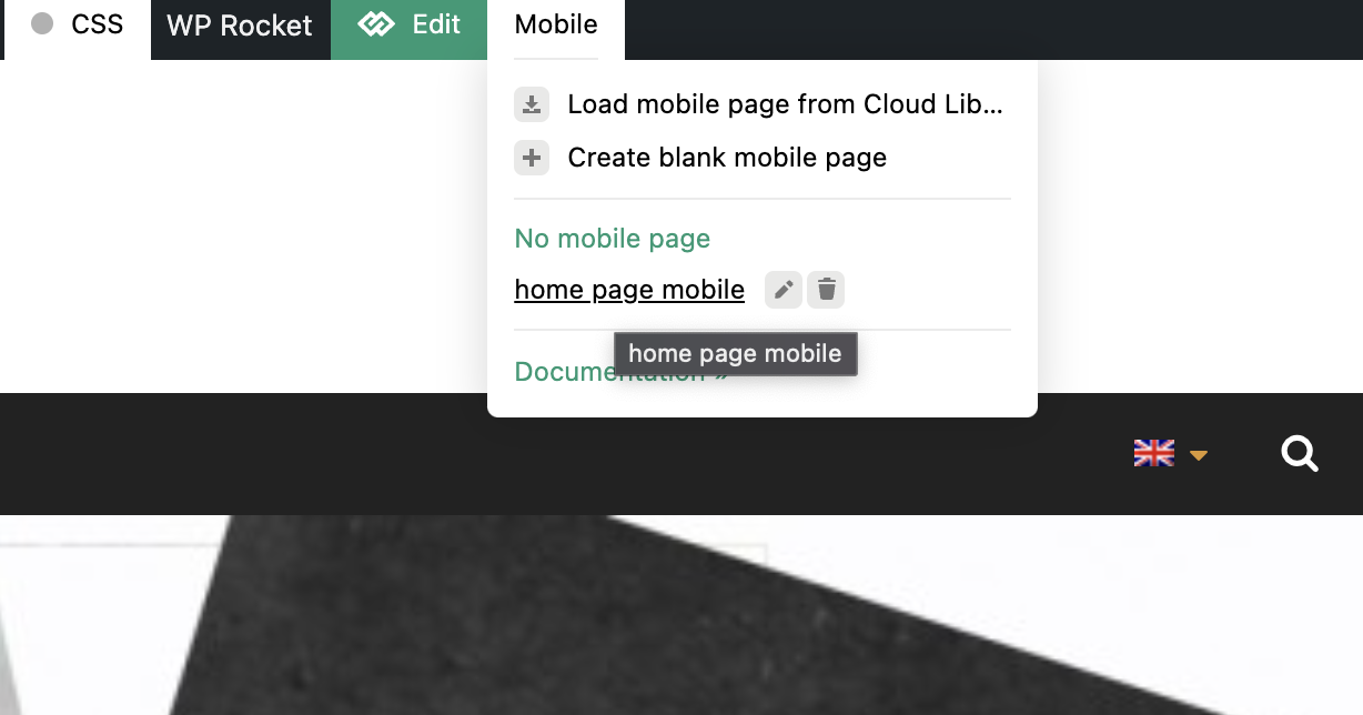
and this is how it should look like
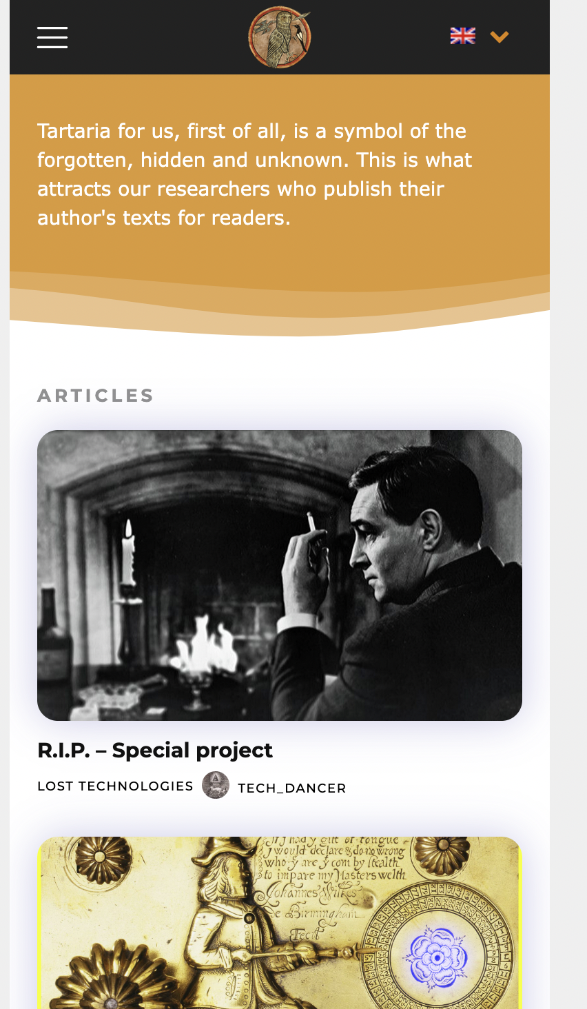
but im getting this desktop version on home page (same as all other pages – desktop versions not mobile ones)

-
This reply was modified 4 years by
sil2.
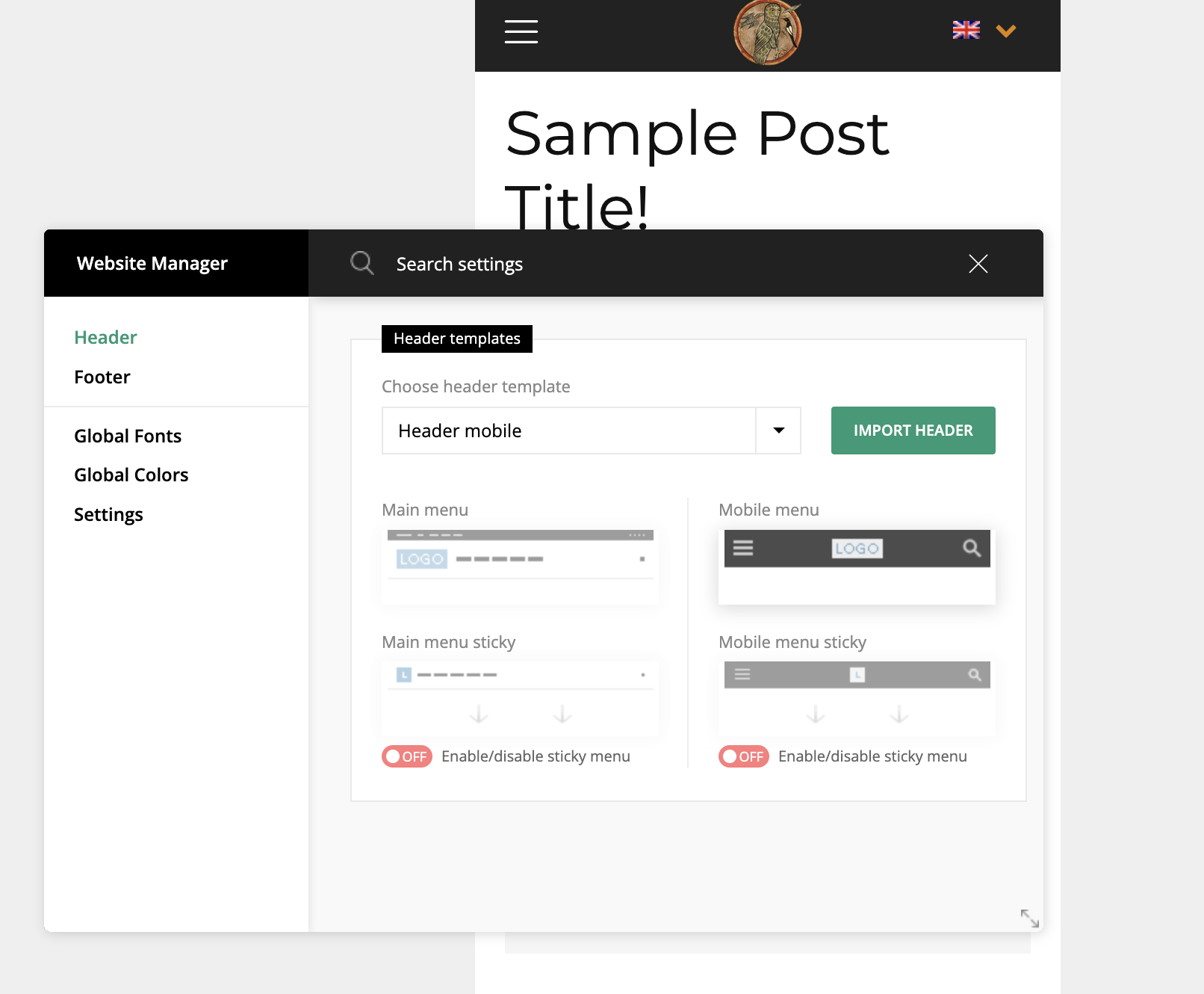
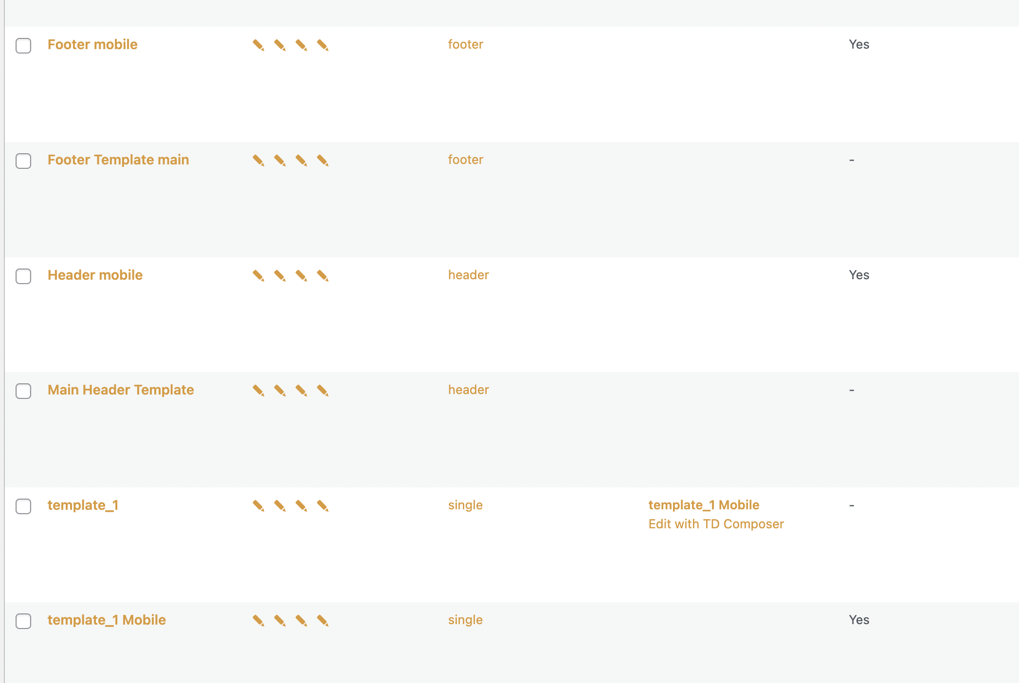
sil2I created mobile versions for header footer, home page, and all other pages for all language variants in tagdiv composer.
But my mobile phone still showing me desktop versions!
my site http://www.tart-aria.info

Calin Hi,
Indeed this can be a cache issue if this is resolved only after you clear the cache.
Normally, when a post is published all cache should be cleared and for all devices.
Maybe there are some specific settings that need to be done.
Please check this article will help you: https://www.webnots.com/fix-mobile-responsiveness-issue-with-w3-total-cache-plugin/
Thank you!
Calin Hi,
Indeed, if you are using the mobile theme plugin and you want to optimize the mobile-theme.eot fonts, then you need to add the swap manually in the theme plugin, the file that needs to be edited is this one -> wp-content\plugins\td-composer\mobile\style.css -> https://i.imgur.com/dkOzlUg.png you need to add the font-display: swap; like this -> https://i.imgur.com/flkHuFP.png
This should help you!
Calin Hi ialv,
Normally the Google Analytics 4 for AMP need to be configurate in your Google Analytics account. In our theme all you need to do is to set the provided code from Google Analytics in the amp section to be used (our theme do not have options for setting the Google Analytics 4 for AMP, only provide a field that will add the code in the website sources).
For amp you can set in in one of those two places.
1. In the amp plugin -> https://i.imgur.com/auCeiWH.png
or
2. In the theme panel if the mobile theme plugin is used for the amp -> https://i.imgur.com/PnG35oq.png
Similar articles that can help:
-> https://www.seroundtable.com/google-analytics-4-google-amp-33467.html
-> https://tech.behindmatters.com/google-analytics-4-support-for-amp-pages/
-> https://www.thyngster.com/how-to-track-amp-pages-with-google-analytics-4
Thank you!
Calin Hi Norua,
I just made some tests on my mobile and now, I see that the responsive version is apply, at least for me -> https://i.imgur.com/HOPkgzW.png -> https://i.imgur.com/zrtxEEg.png -> https://i.imgur.com/F5MdMbs.png
For you the problem is still persisting?
If yes, then we’ll like to take a closer look, for this please contact us via email at contact@tagdiv.com, please include the link of this topic and some screenshots or a video to see how is the mobile version displaying for you.
Thank you!



