
- NewspaperThe Newspaper Mobile Theme: Introduction
- NewspaperThe Mobile Theme
- NewspaperModules Builder in Newspaper Theme
- NewspaperFilters and sorting for taxonomies
- NewspaperHow to Add a Logo in Newspaper
- NewspaperBig Grid Flex Settings
- NewspaperHeader Builder
- NewspapertagDiv AMP Plugin Tutorial
- NewspaperNewspaper theme documentation
- NewspaperBest Of Forums
- NewspaperCache plugin – install and configure
- NewspaperFont Customization
- NewspaperTheme Colors Introduction
- NewspaperBackground Introduction
- NewspaperHeader ads
- NewspaperPost template ads
- NewspaperCustom ad spots
- NewspaperMain Menu
- NewspaperHow to Install Newspaper via FTP
- NewspaperHow to Install Newspaper via WordPress
 Calin Calin
 Hello,
Please make sure that you do not have a plugin conflict with untested plugins, please deactivate all non theme/tested plugins, also if you are using child theme, clear all cache and try again.
Please make sure that you are using the amp and mobile theme
Thank you!
 oneshiyi347
How do I edit this menu from the td-composer?
Change the background, the colours, etc..
There are no options for it. Help?
 Maggo
Maggo Hey Calin,
Could you check with your mobile phone? Because on my mobile phone it is not showing the mobile theme startpage. It starts showing the mobile theme as soon as I click on a category page. But not the homepage. The mobile theme is enabled on the startpage.
Thank you.
 Jumich
Hi,
could you be so kind an help me please? On my category page: https://radioklinika.pl/category/fitoterapia I’ve paste describtion. On desktop text is aligned to left (as I want to and as I formated it), but on mobile text is alignet to center. What shuld I do to align text on mobile to left?
Regads
 jas4512
 hi there
https://lexkim.com/terminator-6-dark-fate/
I’m using template 8 for posts, my featured image shows nicely on desktop but when viewed on mobile there is nothing for featured image. just big blank grey on the mobile. i really LOVE template 8 for post but i would like to show feat image on mobile as well! please help!
Calin Hello,
Unfortunately there are no settings for this in Newsmag theme, sorry! this can be achieve only with custom css:
For mobile version you’ll need to use thus custom css -> http://prntscr.com/ps5a4o
.category .td-block-span4 {

    width: 50% !important;

}
-> http://prntscr.com/ps5aif
Unfortunately in order to achieve 4 articles inline on desktop you’ll need to make some customization in theme files.
Thank you for your understanding!
 Vlad S
 Hello !
They do not appear on desktop because they were not configured to work with desktop. If you look on your website from a mobile phone you will be able to see them.
Thank you for your understanding !
Vlad S Hello !
They do not appear on desktop because they were not configured to work with desktop. If you look on your website from a mobile phone you will be able to see them.
Thank you for your understanding !
 divaspathak
I have newspaper Mobile site enabled and an amp version, but sometimes when i open my site from mobile device, i see the site breaking, it shows something like this. https://ibb.co/KqYPw7z
I don’t know what again and again causes this.
Calin Hello,
I’ve just checked your mobile logo and this is the one from the desktop version, so in order to have a bigger logo, you can upload a logo for mobile in theme panel, with size 140x48px -> http://prntscr.com/ps3h2x or you can use a cloud header from tagDiv Cloud Library, edit it with tagDiv Composer and make it to look how you like ->http://prntscr.com/ps3hz5
Thank you!
 ken-3
ken-3Hello, I’m developing a site and doing user testing during the menu phase to ensure ease of use. It seems about half of my mobile testers don’t get the fact that you have to press the arrows to get the drop down menu. Instead they just hit the category topic which takes them to that single page. Is there a way to deactivate a category page, so then you have to hit the arrows to generate the drop down menu? Or what would you suggest as best practices for people that don’t understand you have to hit the little drop arrows to get the drop down menu?
Site is http://www.new.razorclamming.com
At present I’m using mega menus so photos show up when you hit the menu title. But I would prefer to use pages on some topics.
 dimitrisv
I managed to hide the image, yet I would like to also claim the space of the image for the title of the search results.
I did try
.td-module-thumb{
display: none;
width:1px;
}
.entry-thumb{
display:none;
width:0px;
height:0px;
}
But to no avail.
Also the php that creates this is fixed only for the mobile version (see header-amp.php). It appears that for the pc browser version this is customisable but I cannot find where it is in the panel. Thank you!
 Duvelix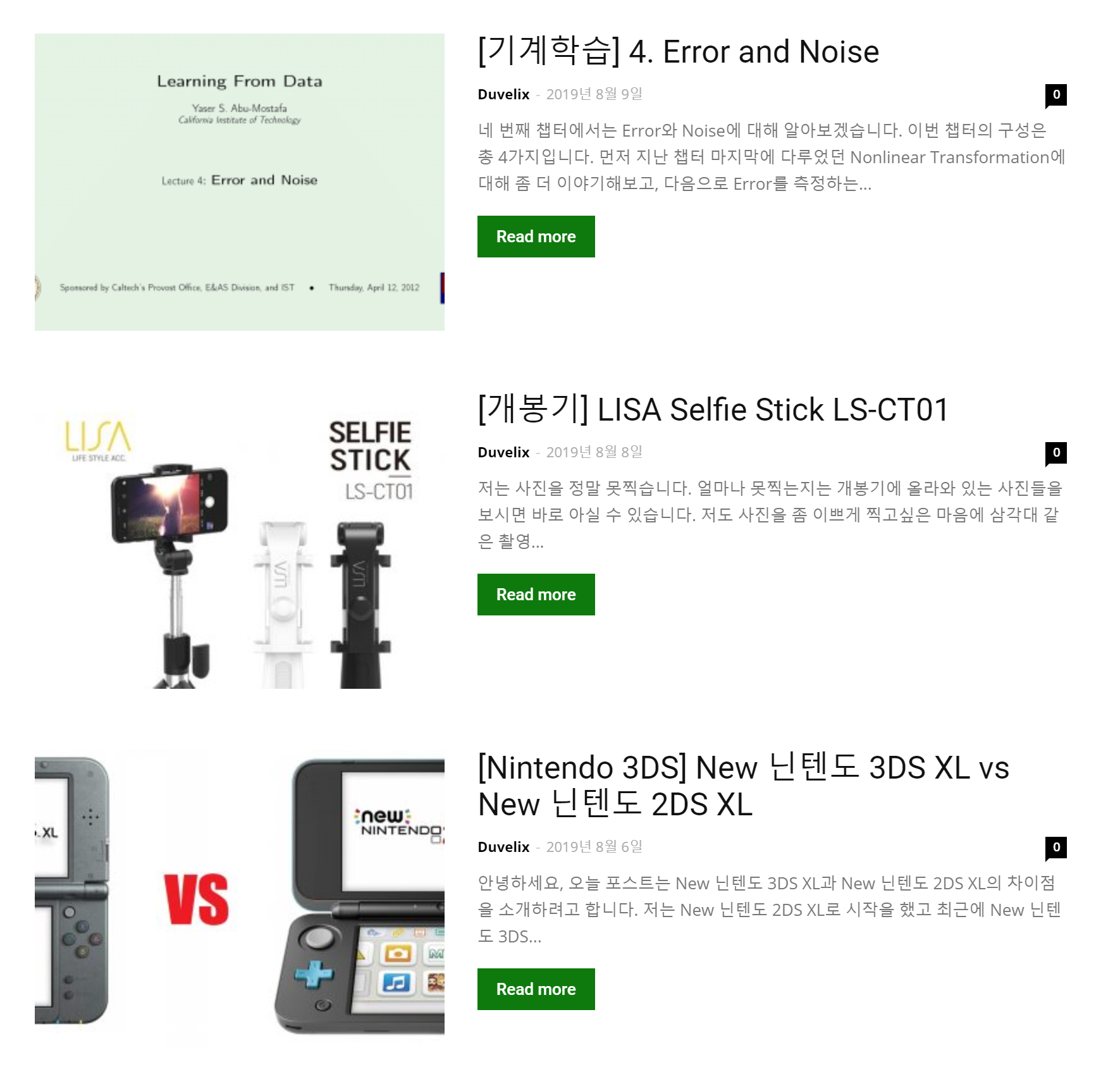
Hello, I am using Block 12 of the Newspaper Theme.
As you can see in the picture, there is a problem that the picture looks strange because the current thumbnail size does not fit.
I’m curious about the size and ratio of thumbnail images recommended by the Newspaper Theme.
It would be nice if you could tell me what size looks good on both PC and mobile environments.
 sejpost
I have a 728×90 header banner and a 300×90 mobile version at the top of my site at http://www.coronadotimes.com. However, the mobile banner does not consistently show on a phone…why is that?
Here is the code for the header banner:
<div class="td-all-devices SP_Full"><a rel="nofollow" target="_blank" href="https://www.coronadoshoresco.com/?utm_source=coronadotimes&utm_medium=bn&utm_campaign=generic&utm_content=header_bn"><img src="/wp-content/uploads/2019/10/Header-Shores-v2.jpg" /></a></div>
<div class="td-all-devices SP_Mobile"><a rel="nofollow" target="_blank" href="https://www.coronadoshoresco.com/?utm_source=coronadotimes&utm_medium=bn&utm_campaign=generic&utm_content=header_mobile_bn"><img src="/wp-content/uploads/2019/11/Shores-Mobile-Header.jpg" /></a>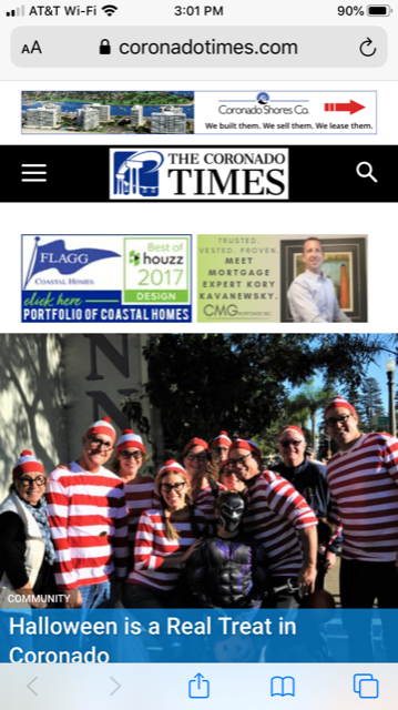
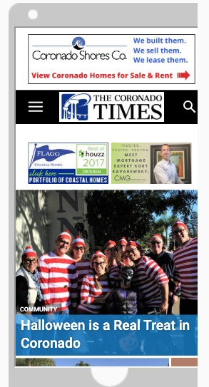
Any advice on how to make sure the mobile banner shows on phones, etc.?
Code:
<div class=”td-all-devices SP_Full”> </div>
<div class=”td-all-devices SP_Mobile”>
Thanks!
jas4512hi there
style 8 is my favourite but the featured does not show up when browsing on mobile. just large black grey area. how do i show the image on mobile too?
Maggo Still an issue. Safari on my laptop still shows the mobile theme. Things I tried but didn’t help:
– I changed the user agent in the browser
– Cleared the cache
– Deleted all the cookies
That does not occur on my laptop with Firefox.
Other websites don’t show their mobile theme while I use Safari on the laptop.
Maggo Right now I cleared the cache at my hosting provider. I hope that helps. Could you check from your end if it shows the website correctly? Mobile Theme on phones and responsive on everything else? As soon as I get access to the tablet again I will check on my end.
Maggo As far as I know I don’t use any cache plugins. The only installed plugins I have are:
AMP (deactivated)
tagDiv Cloud Library
tagDiv Composer
tagDiv Mobile Theme
tagDiv Newsletter
tagDiv Social Counter
 reflector
After importing a header, customizing it in TD Composer (all 4 zones), and setting it as my “cloud library template” in the header section of the theme panel, the mobile theme refuses to adopt the new header. What steps am I missing?
 TariqulSuman
 Hello,
I would like to show my top header menu in responsive mobile view.
How can I do that?
 vichung2018
 Please follow this link
https://demo.tagdiv.com/newsmag_video/category/tagdiv-festivals/
I will disable top grid. But i want grid 4 cols on desktop and grid 2 cols on mobile for list content BELOW Top post.
https://prnt.sc/pr81x3
 Benedict Paramanand
Hello,
My URL is sustainabilitynext.in
On PC my website seems OK.
But on mobile, as it uses the responsive theme of Newspaper Theme,
the logo on the header is too small.
Is there any setting to make it appear bigger.
Calin Hi,
You can have a different menu only if you are using the mobile theme plugin also using only the amp plugin with the option “AMP” you’ll use the responsive version on mobile and the mobile theme template only for amp, so in order to have a different menu you’ll need to yous the option “mobile + amp”.
Thank you!
Calin Hello,
From what I can see the menu on mobile is working normal -> https://www.screencast.com/t/tVoa4RciHm
If you are not using the mobile theme plugin then you can change the font size on mobile from -> http://prntscr.com/pr0e0i
The the sub-menu should be display on mobile menu too -> http://prntscr.com/pr0fn3
Thank you!
