
- ApiPractical example – How to add a new Block and Module
- Apitd_api_block::delete
- Apitd_api_block::update_key
- Apitd_api_block::update
- Apitd_api_block::add
- ApiAPI – Blocks – Introduction
- Apitd_api_thumb::update_key
- Apitd_api_thumb::update
- Apitd_api_thumb::add
- ApiAPI – Thumbnail – Introduction
- Apitd_api_category_top_posts_style::update_key
- Apitd_api_category_top_posts_style::update
- Apitd_api_category_top_posts_style::add
- ApiAPI – Category top section style – Introduction
- Apitd_api_module::update_key
- Apitd_api_module::update
- Apitd_api_module::add
- ApiAPI – Modules – Introduction
- ApiUsing the Theme API in plugins
- ApiThe Theme API
 Anamaria
 Hello,
You can import this section and delete what you don’t want https://cloud.tagdiv.com/#/single/page/Blocks/2650
Thank you!
Anamaria Hello,
Please activate the tagdiv standard pack plugin. Also, if you want to disable it the tagdiv Standard pack plugin, then please replace the blocks 1 – 25 with flex blocks and big grid with big grid flex.
Thank you!
 Frydenborg
I am looking for the two first blocks in right rolumn (single template) in the free news theme, but it seems that they are not added, even though other templates from this theme has been added. Can this template be added?
https://demo.tagdiv.com/newspaper_free_news_pro/2023/12/14/td-post-the-biggest-hollywood-celebrities-visit-the-ranches-of-california/
Thanks in advance.
 Calin
Calin Hi Alex,
Yes, the option has been fixed -https://i.imgur.com/OGfcnc3.png – https://tagdiv.com/newspaper/?utm_source=forum&utm_medium=menu&utm_campaign=forum_loggedin&utm_content=52878 – https://i.imgur.com/4kBJjnv.png
As for the new suggestion, a similar option for the featured images for blocks modules is on our list (unfortunately is not yet assigned, so I d not know if will be add in the coming update or not), I believe that this will be add on each flex block, also I added your suggestion with the theme panel option and I hope this option will be add in the coming updates.
Thank you!
Calin Hi Teachy,
I will like to help you related to mobile versions that our theme can provide:
The theme has by default a responsive version and this can be checked (and some options from elements/blocks can be adjusted).
Now the theme is also providing a an option to create mobile pages and mobile cloud templates. – https://tagdiv.com/newspaper-10-3-7-update-brings-customizable-and-fast-mobile-pages/
And the last one is the tagDiv Mobile Theme plugin.
Now When the tagDiv Mobile theme plugin is enabled this one will apply. If the plugins is disable and you have a mobile page/template, then that one will be apply.
If none of them is enabled, then the responsive version will be used.
Thank you!
Anamaria Hello,
The options from the theme panel are for standard templates. If you have cloud templates, you must make all the changes using tagdiv Composer https://forum.tagdiv.com/tagdiv-composer-tutorial/ -> https://forum.tagdiv.com/how-use-tagdiv-cloud-library-templates/. Also, if the block is not from our theme, then to change the color, you need to use a custom code CSS.
Using our theme, you can choose from 3 mobile versions
-> mobile responsive => https://www.screencast.com/t/oJ2ShOp47
-> mobile theme plugin => https://forum.tagdiv.com/the-mobile-theme/
-> mobile page => https://tagdiv.com/newspaper-10-3-7-update-brings-customizable-and-fast-mobile-pages/ The option that you need to use.
Suppose you created the mobile pages with tagDiv Composer. In that case, when you install the Mobile Theme plugin, your pages will be overwritten by the plugin (the mobile theme comes with its templates for page, post, category, etc, so your current templates from the desktop theme will get converted to the mobile theme layout, the page content is made without builders in mobile editor => https://www.screencast.com/t/xbgZG8kH also, the options that are provided to edit the mobile theme version are limited (this keeps the things simple)).
This is a video about Responsive Newspaper Theme, AMP & Mobile Theme, Mobile Pages & Templates -> https://www.youtube.com/watch?v=SpGkOnJeNZY.
So, the mobile responsive is what you see when that you select the viewport on phone => https://www.screencast.com/t/matV17hH, so some settings may apply for each viewport(where is the border blue), and others are not(where the border is black).
The mobile page has the mobile templates from Cloud Library => https://www.screencast.com/t/YCcZ8rL8
The Mobile responsive version of the theme and the mobile page editor can be edit with tagDiv Composer, the mobile theme plugin cannot.
For example, you can have the mobile theme plugin activated and use the mobile page/mobile responsive version for the homepage/pages, but for the categories pages/404 page, you can’t use the mobile page/mobile responsive version if you have the mobile theme plugin activated.
Thank you!
Calin Hi,
For applying the css only on slider please try like this:
.td_block_slide .td-theme-slider.iosSlider-col-3 .td-module-title {

    font-size: 48px;

}
I hope this will help you!
Anamaria Hello,
You can translate them from Theme Panel -> Translations -> Translations -> https://i.imgur.com/ezhjmLq.png and the title of the blocks or other elements you need to edit the pages/templates with tagDiv Composer to change the translation.
Thank you!
Anamaria Hello,
Please use the special filter for the category – current category. You can find more information about it here: https://forum.tagdiv.com/flex-block-settings-guide/
For each category, there is a special filter for the current category, which dynamically displays the posts from that category within each category.
If there is an offset set, please check the block with “No posts” and delete it. Leave it empty with no space or value: https://app.screencast.com/Gh9jDf6t0XtLS
You can find the documentation here: https://forum.tagdiv.com/offset-feature/
Thank you!
Anamaria Hello,
For this error wp_booster error: please install and activated the tagdiv Styandard pack plugin.
td_api_base::mark_used_on_page : a component with the ID: single_template_1 is not set.
/wp-content/plugins/td-composer/legacy/common/wp_booster/td_api.php
Please block /wp-json/tdw/save_css
If an attacker wants to target this URL /wp-json/tdw/save_css they can do so. Even if the website uses a different theme, the attacker can still try that URL. We could add an option to be able to enable/disable the Live CSS, it will be considered. But for now in order to remove it this can only be done with a modification to the composer plugin. I think that all that removing it requires is to comment this line of code – https://prnt.sc/RtwvL5Nc4ikR -> https://prnt.sc/ymZmhdUfp57U But as I mentioned, the attacker can still try to access the URL.
Thank you!
Anamaria Hi,
If you are referring to delete the featured image on the post template and to have it on the block, then you need to use the Single Post Template.
You need to duplicate the single post template and assign the template with the featured image on the posts you want and the other on the posts you don’t want to have them. The same steps are for all templates -> https://forum.tagdiv.com/topic/how-to-add-different-sidebare-for-different-posts-with-the-same-category/
Thank you!
 ventz
ventzHello, I need an urgent support as im getting the following error on the website
wp_booster error:

td_api_base::mark_used_on_page : a component with the ID: single_template_1 is not set.

/wp-content/plugins/td-composer/legacy/common/wp_booster/td_api.php
Also wordfence has blocked over 20000 times the following
Amsterdam, XSite Scripting in POST body: /wp-json/tdw/save_css
Help
 Alex
AlexHi Calin,
In the theme version: 12.6.6, your dev fixed the reported issue CPT Featured Image Preload not working, thank you.
– For further Pages optimization, can you please check with the dev, if there is a way to Preload an image of a Flex Block 1 (for example).
To have <link rel=”preload” fetchpriority=”high” as=”image”…> included in the header.
Would be good if the dev can add a Check box under the “General” settings tab, below the “Cache-Cache block results” section, for example.
So if the user checks the box, the first image of this block element gets preload (or he can create a dropdown in a similar manner as caching time selection, how many images to preload).
Does this make sesne?
(!) As previously discussed, this post is only for Calin.
Other TD team members, please do not respond.
AlexHi Calin,
In addition to the previously reported bug with the Webp option in theme panel, I have found another bug.
Environment:
1. Theme version: 12.6.6
2. Webp format is generated by Ewww Image Optimizer as per your guide. – All images become Webp and all are lazyloaded.
4. For CWV / speed, we must disable lazyload for the first image (in the first flex or any block / logo is text). For this we use define( ‘EIO_LAZY_FOLD’, 1 ); in wp-config as per Ewww’s guide – under Exclude Images header.
5. The result is that the first image on the page converts to Web but is not lazyload – so this is correct. The Theme’s option Use Webp Format is meant to show this first image in Webp, because it exists on the server.
Issue:
The theme stops using the webp file for the first image when any caching system is on. This includes the “Cache block results” option on the block, WP super cache as per your guide.
How to test:
1. Make sure you have caching enabled – WP super cache as per your guide. Also can enable “Cache block results” on the actual block.
2. If you are logged-in, you will see a webp. If you are logged out – the theme will also be showing webp for some time, but a little later – once the cache is generated – the theme will start showing jpg (despite having webp on the server).
– I have tested this on various websites and demo sites. On the dev sites that do not have caching, there is no problems.
(!) As previously discussed, this post is only for Calin.
Other TD team members, please do not respond.
Thank you.
 vairafiq
Hello there,
If I var_dump() the post title it prints nicely with special characters. But in page source I have found special characters are converted to a wired string.
‘She’s Cooking & Catering LLC’ in main page
in page source it shows ‘She's Cooking & Catering LLC’
This is the post url i am referring to https://bippermedia.com/restaurants/united-states/virginia/virginia/shes-cooking-catering-llc-reviews-shes-cooking-catering-llc-at/?dsf
Screenshot: https://prnt.sc/1JRofpp1_4PC
Thank you
 jayflyer
Is it possible to place a block on different section on desktop and mobile ?
on desktop i have the email opt-in form right below flex block.
but on mobile, it’s pushed down all the way down below a category block: https://imgur.com/a/fhNvsUh
is there a way for me to place this email opt-in block right below first flex block on mobile as well?
 SchoolVolley
 Hi, Instagram block hasn’t been displayed for a month in my site http://www.schoolvolley.it (bottom right). Also in “theme panel–>instagram personal” is not possible remove connection to reinstall it. Is written “expired 143 days ago” (??) There is a bug?
Regards,
Angelo
 reedesign
I have added a poster image to a video in the block settings. On the post with the video, I have set the page not to show the Featured Image, but used the same image as the video’s poster image. However, the post preview shows the image I set as the Featured Image, as well as the video that also has the same image. How do I correct this?
Thanks!
 nolandolce
Hello, we created a survey monkey survey and used the raw HTML block. It shows fine in designer but then on the actual website it doesn’t appear: https://rareparenting.com/reader-survey/
Please let me know?
Calin Hi,
Hmm, normally there shouldn’t be a problem, we checked the demos to the live sound and everything seemed to be fine – https://i.imgur.com/iAlp9Gq.jpeg, but it is possible that this problem only occurs when monitors with a high resolution are used or some situation of this kind.
I’m glad you found the solution with “em” for fonts instead of “px”, from what I’ve seen this is a very used solution in adjusting the font according to the screen sizes. If this solution works well and only the slider block is affected, what I can suggest is: use a custom css that will apply only per slider to can adjust the size of fonts based on screen, here is a concept that can be used:
html { font-size: 62.5%; }

body { font-size: 1em;}
@media (max-width: 300px) {
html { font-size: 70%; }
}
@media (min-width: 500px) {
html { font-size: 80%; }
}
@media (min-width: 700px) {
html { font-size: 100%; }
}
@media (min-width: 1200px) {
html { font-size: 140%; }
}
Other suggestions are to try this:
1vw = 1% of viewport width
1vh = 1% of viewport height
1vmin = 1vw or 1vh, whichever is smaller
1vmax = 1vw or 1vh, whichever is larger
I hope this will help!
Anamaria Hello,
You need to go in the theme panel -> theme colors and try to change this color https://i.imgur.com/SzTpjhZ.png
Did you add the block from composer?
The social icons can be edited with tagdiv Composer to change the color.
The prebuilt website you installed needs to be edited d with tagdiv Composer, because the settings from theme panel are for the standard template https://forum.tagdiv.com/tagdiv-composer-tutorial/
A solution for sending a screenshot/video is this:
Download, capture, and send: https://www.techsmith.com/jing-tool.html
After making the screenshot, you will have a link; paste it here.
Thank you!
 simchris
Hi, folks
I think I brought this up previously, and thought it was sorted. But the fix I did previously seems to not work now.
Essentially, with Chrome/Windows11, if I increase the system font to something like 118% for accessibilty on my high dpi display, this actually increases the font size in slider breaking layout; this is with ‘zoom’ at 100%.
Previously, I was able to set back to 100%, clear browser cache, set back to 118% and would not have the problem. However, it does not seem to work now, and most folk would not think to do that and just see something kinda funky.
I believw it’s this element, which looks to have a pixel size of 24px — would changing to ’em’ help with this, or some kind of wrap element in CSS?
code
<div class="slide-meta "><h2 class="entry-title td-module-title">
e.g., screencap
NewYorkNetwire.com/temp/temp052324.png
This is on our test site double checking all our mods, and custom code, and plugins work with PHP 8.2x before we start to deploy on our oooold sites to upgrade from PHP 7.2x. Live site, just not promoting it or updating it properly with main content at the moment until we double check all this kind of shenanigans. 🙂
Setting the Windows 11 > accessibility > font size back to 100% fixes it, but obviously a lot of folks with high dpi monitors have to increase the font size to actually use the internet now. The slider block seems to be the only element affected by this.
And yeah, many folks hate sliders. But, for our news portals we still like them as we can slide bwteen several featured items vs just having a single one, to keep featured items up top longer.
Thanks for any suggestions on fix!
 random123
 I’ve got it! You had to use a color and make the transparency as transparent as possible. Doing “clear” defaulted to black. 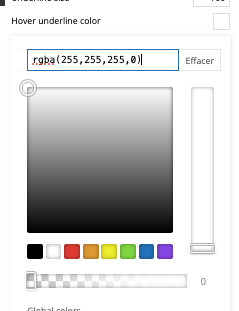
I have another question, please. On mobile, on the article template, I put “hide author’s name” in module 2 of Flex block 4. This doesn’t work. When I activate the “hide name” option, nothing happens. Same thing when I save. What can I do?
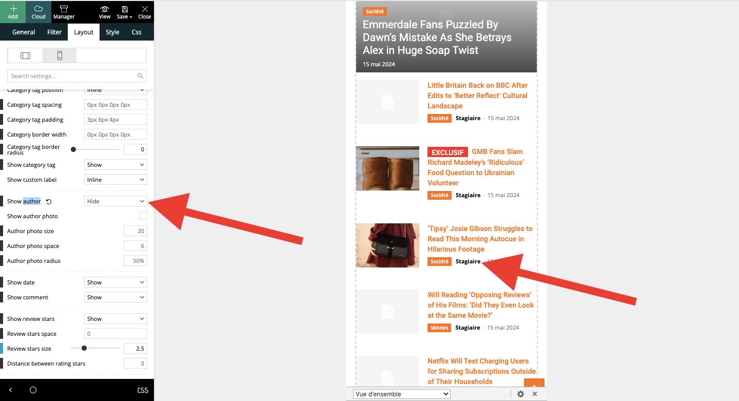
random123 No, if you look at the block above, there’s no black effect.
Anamaria Hello,
Does this hover background also apply to other blocks?
Thank you!



