- NewspaperCreate Custom Code with the browser’s Inspector or the Live CSS Box
- NewspaperScroll Animation
- NewspaperWP Rocket and Newspaper Theme: Optimization Guide
- NewspaperHow to setup Twitch for Social Counter
- NewspaperModal Popup
- NewspaperFlex Block Settings Guide
- NewspaperAutoptimize Plugin – install and configuration
- NewspaperAdding Multiple Authors to Your Articles
- NewspaperDesign your Post Pages using the Cloud Library Templates
- NewspaperBig Grid Flex Settings
- NewspapertagDiv Composer Tutorial
- NewspaperTheme modules and blocks
- NewspaperThe Mobile Theme
- NewspaperCompare theme files – Winmerge tutorial
- NewspaperUsing Other Ads
- NewspaperBlock settings tutorial
- Using custom fonts
- Using typekit fonts
- NewspaperChild Theme Support
- NewspaperHow to Make the Site Faster
 Calin
Calin Hi,
This can be a situation caused by some settings from the cache plugin, please clear the cache and see if the problem persists. If it persists, please disable the cache plugin and see if the problem persists, is resolved, then enable the cache plugin and check the settings one by one. It is possible to be related to the cache option for the unused css.
Calin Hi,
This can be a situation caused by some settings from the cache plugin, please clear the cache and see if the problem persists. If it persists, please disable the cache plugin and see if the problem persists, is resolved, then enable the cache plugin and check the settings one by one. It is possible to be related to the cache option for the unused css.
 LA VERDAD NOTICIAS
🚨🚨 🚨 Images are not displaying correctly in grid components. Please fix this immediately 🚨🚨 🚨
 Nagarig
Hi team, suddenly our Home page is not showing grids/tiles/blocks which are placed on the upper side. Tried clearing cache, updating template, etc. Please Help.
 Hüdai
HüdaiHi,
On my website, the “Stay Connected” box on the right sidebar scrolls up when I move down the page, leaving that area empty. I want this box to stay fixed (remain visible while scrolling). How can I achieve this with CSS or theme settings?
Link: https://hizliresim.com/qo1d2ff
Thank you:)
Calin Hi, for that select the flex block 1 and look in the css layout and remove the left margin – https://i.imgur.com/WUnjvJg.png then select the below row and check the css tab – https://i.imgur.com/zKnkeOh.png and remove the left and right paddings
Calin Hi,
1. This is how it is supposed to work. Normally, the live search uses the icon, and when it is clicked, the search input is displayed, and the results are displayed. When it’s used to display the form, then the live results are no longer provided in absolute position because the input field is no longer in absolute position and the results are displayed inside the header, not over it. If you want to have the live search results over the content, please add an inner row above the search element, then drag the search in the inner ro column – https://i.imgur.com/c7ehXTw.png https://i.imgur.com/oSthP8j.png then you need to set the inner column as absolute position – https://i.imgur.com/JfRgEHG.png. After that it may be need to add some negative margin top for the inner column, I think around -30 https://i.imgur.com/h8gZ3bk.png then the results will be https://i.imgur.com/BfS9tK6.png
2. Unfortunately, this is how the back to top style 2 was made, only back to top option 1 will go over the footer.
To set the login button to the left, please use this custom css:
.td_woo_menu_login .tdw-wml-guest .tdw-wml-menu-content {

        flex-direction: row-reverse;

}
Thank you!
Calin Hi,
The code cna be set in the theme panel > custom code> custom css https://i.imgur.com/pzvtepn.png (the simplest and easiest way), or you can also set it in live css, or in tagDiv Composer on that page/template inside the RAW CSS element.
 beccruse
 Hi Calin,
Thanks for the quick response! Where can I add the css to have it apply across all posts?
 Antonio Ungaro
 Calin thank you for your reply.
Lazy load is already excluded for that image, so this is not the source of the issue.
The real problem is that the LCP element in Newspaper is generated as a background-image inside a <span> (.entry-thumb) instead of a proper tag.
Because of this:
Google PageSpeed Insights reports that the image is “not immediately discoverable in the HTML”, and it keeps recommending that fetchpriority=”high” should be applied.
This recommendation cannot be satisfied as long as the LCP element is a CSS background and not a native . Preloading helps partially, but PageSpeed still flags the issue, because the image is not directly represented in the DOM as an
.
Could you please provide a solution or option within Newspaper to render the LCP image as an (with fetchpriority=”high”) instead of only as a background image? This seems to be the only way to properly fix the LCP problem reported by PageSpeed.
Best regards,
Antonio
Calin Hi,
It is possible that on an td_flex_block_4 to have set in a css option a different value than a number. But just in case our developer will check it out!
Thanks!
Calin Hi,
Please check the layout and css tabs for the row selected – https://i.imgur.com/vZuyqzr.png also, you can check the column css tab – https://i.imgur.com/O6bXVAp.png
Thank you!
 digit
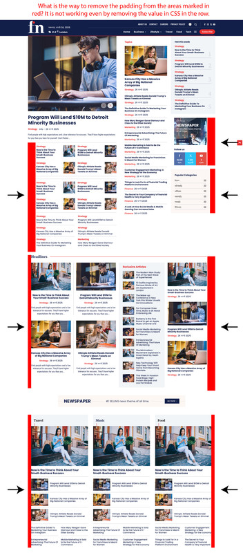
digitWhat is the way to remove the padding from the areas marked in red in the ‘Free News’ template? It is not working even after removing the value in CSS in the row.
Screenshot: https://i.postimg.cc/y6DF8VNj/csd.jpg
Calin Hi,
You can use the css:
.td-cs-content .wp-block-image {

display: block;

}
You can use the block or inline-block css.
Thank you!
Calin Hi,
2. What you need to do is to change the mobile menu icon – https://i.imgur.com/SHimyDh.png https://i.imgur.com/yQtfClG.png
3. The live search on the element is a bit different; it can be used to display the results in a dropdown element – https://i.imgur.com/j8jVsGG.png or under the element input, to make it to have the element input and display results as you want, you ned to use this custom css:
.td-header-desktop-wrap .tdb_header_search {

    top: -30px;

    position: absolute;

    z-index: 999;

}
Personally, I will recommend the option from the theme.
Thank you!
Calin Hello,
Maybe the theme does not have all those features and some of the themes may be overwhelmed to have them, but in the meantime, I will let you know what the theme has.
We do not have a personal dark mode, but there are many plugins for dark mode that can be used -> https://www.wpexplorer.com/dark-mode-plugins/
The theme has the Table of Contents element, it can be added/removed/edited using tagDiv Composer on the single post template – https://i.imgur.com/nwqwWSg.png
“Another thing: I’d love to create styled content boxes (like quote blocks, info boxes, tips, etc.). There’s no easy way to do this in the Newspaper theme. If there’s a built-in way to create that inside Composer without extra CSS, I haven’t found it yet.”
It can be done using the tagDiv elements, for example, you can use the row or inner row to hold more elements and set inside it a column text, maybe an image, a button and adjust them according to your needs – https://i.imgur.com/aNpQ57W.png also, you can use the cloud to import a section or an existing block. When you have a block layout that you like you can save it in tagDiv Composer so you can reuse it on other pages or templates- https://i.imgur.com/hXsFCUX.png
Also, for the mobile version the theme provides the responsive version, the possibility to create a separate mobile page/template using tagDiv Composer and also the tagDiv Mobile theme light version (3 options for mobile).
Thank you!
 forevermogulmag
 Thanks for the reply. I’m actually already aware of those features you mentioned. What I was trying to get at is that I need help implementing them properly on my site. I had sent an email a while back asking for guidance and a quote for services, so I’ll follow up on that email.
That aside, I still feel like the theme is missing a few modern features or maybe I’m just not seeing them?
Dark mode is one. I noticed one of the other themes switches to dark mode automatically based on the visitor’s system settings (like on Mac), which is great. This would be a nice feature.
There’s also no Table of Contents block that I can find, which is kind of expected nowadays — especially for long-form content and SEO.
Another thing: I’d love to create styled content boxes (like quote blocks, info boxes, tips, etc.). There’s no easy way to do this in the Newspaper theme. If there’s a built-in way to create that inside Composer without extra CSS, I haven’t found it yet.
Other features I’ve seen in newer themes like JNews and Foxiz that seem missing:
Text-to-speech for articles
GIF thumbnails that actually animate
Smart sticky nav or TOC sidebar
Font size/accessibility toggles
Reusable block templates inside Composer
More lightweight mobile-first optimization
I still really like using Newspaper, but it’s starting to feel a bit behind compared to what other newer themes are doing. Would love to know if any of this is on the roadmap.
Thanks again!
Calin Hello,
For the empty gap at the footer, I will need a link to your website where I can investigate the gap and determine its cause.
The shadow can be removed from Style tab, set Shadow 0 – https://i.imgur.com/wQkD3xM.png remove the border from the General tab – https://i.imgur.com/vIkk4Ey.png set border radius for input – https://i.imgur.com/Dk0sbA5.png and for the button – https://i.imgur.com/Rbfh7zA.png for button position use this custom css:
.tdb_header_search .tdb-head-search-form-btn  {

    position: absolute;

}
I see that icon is a standalone element, so you can drag and drop it in the left zone of the text.
The theme has a responsive version, just check the mobile viewport – https://i.imgur.com/GpDhAsx.png but if you want to have a separate conetnet for mobile or you want to edit some elements only for mobile you can create a mobile page/template https://tagdiv.com/newspaper-10-3-7-update-brings-customizable-and-fast-mobile-pages/ also is providing a dedicate plugin (tagDiv Mobile theme) but this is limted in options and edits making it very simple.
Thank you!
Calin Hi,
If you want to hide a row or element, you can use the hide option from css tab (this should be used on each viewport in part) https://i.imgur.com/PkfjOzB.png to see the hidden elements, please check the show hidden elements from Manager – https://i.imgur.com/8OgtOeL.png
Thank you!
 cloverjim
 Hi,
1. Is this search tool only for WooCommerce products? If yes, is there a search tool for the entire site content? Or are there separate search tools for articles and for the shop?
2. How can I rotate the search button like in the image?
https://s34.picofile.com/file/8486559426/Screenshot_2025_08_21_182855.png
3. For widgets/tools that are left-aligned but I want to use their right-aligned version, what CSS code can I use? I mean, is there a universal CSS code that can make all left-aligned widgets right-aligned on the site?
Also, which is better to use: the rtl.css file I sent, or to use short custom CSS snippets like the ones you suggested, for example:
body .tdw-block-inner .tdw-wml-wrap .tdw-wml-menu {
text-align: right;
}
or
body .tdw-search-form .tdw-search-form-inner .wpb_button {

    position: absolute;

}
Thank you.
Calin Hi,
If you are using a single post template, you can use the tagDiv Composer to edit the template and relocate the review position to a different location – https://i.imgur.com/rkYfWhQ.png
Or if you want to review via block, then the only way will be to use custom css to change the place or create your module https://forum.tagdiv.com/meta-info-modules-blocks/
Thank you!
Calin Hi,
Unfortunately, the button can be moved only with css, you can use this css:
body .tdw-search-form .tdw-search-form-inner .wpb_button {
position: absolute;
}
You can set the css in tagDiv Composer in css zone – https://i.imgur.com/TUjcyHr.png
To have the same space between menu elements, please set the Elements space 0 and use Elements padding 0 15px – https://i.imgur.com/qCwmxpM.png adjust the padding after your needs.
The login elements can be set to the right using this custom css:
body .tdw-block-inner .tdw-wml-wrap  .tdw-wml-menu{

    text-align: right;

}
The code can be set in tagDiv Composer in css zone – https://i.imgur.com/JddsYrk.png
To adjust the space between the shop and my account element, select the shop cart and select the cs tab, then remove the left 30px margin and set 30 to the right margin – https://i.imgur.com/fIGCFt4.png https://i.imgur.com/Yu3OYD1.png (it is possible to me more elements that need to be fixed like this, because the css was set for LTR direction and does not need to be changed for RTL)
Thank you!
Calin Hi,
Ok, so the first step is to have an RTL language selected on wordpress, for example, I will select Arabic – https://i.imgur.com/90vPjA9.png, then go to Cloud templates and click on + on Header templates – https://i.imgur.com/XguMYXz.png, then search for “makeup” https://i.imgur.com/GW3D4L2.png open the template in tagDiv Composer – https://i.imgur.com/Kuk7maO.png, then it should look like this https://i.imgur.com/gpGfdsC.png then just drag and elements in the palce you want (change logo) …. for example drag the left column with the menu in the right – https://i.imgur.com/TK0k9vI.png https://i.imgur.com/AM5hv6u.png the menu elements to be display from ltr to rtl use this custom css :
.rtl .tdb_header_menu .tdb-menu {

       flex-direction: row-reverse;

}
I hope this will help you!
Calin HI,
Most of the time, those were the settings interfering with the theme, but if the problem persists, then I think you’ll need to manually check the settings until you find those that are causing this situation.
The layout shift is usually caused by Remove Unused CSS or JS Delay/Defer in LiteSpeed. Try this :LiteSpeed → Page Optimization → CSS
– Set Remove Unused CSS = OFF
– Use Optimize CSS Delivery = ON (Critical CSS per URL)
– Purge CCSS/UCSS.
LiteSpeed → Page Optimization → JS
– Turn Delay JS = OFF (or exclude Newspaper/tagDiv scripts like /wp-content/themes/Newspaper/, td-*).
– Turn Load JS Deferred = OFF if issue persists.
LiteSpeed → Page Optimization → Media
– Localize Google Fonts = ON, Font Display = Swap, and preload main fonts.
LiteSpeed → Cache → Mobile
– Enable Cache Mobile + Separate Mobile View.
Then clear all caches and retest. Most Newspaper sites fix the shift by disabling UCSS and excluding tagDiv JS from Delay/Defer.
Thank you!
Hüdai Hello,
I disabled the following options in LiteSpeed Cache → Page Optimization as suggested:
Load CSS Asynchronously → Disabled
Combine CSS → Disabled
Combine JS → Disabled
Then I cleared all caches (LiteSpeed + browser), but the issue still persists. The page layout shifts to the left when loading (see attached screenshot).
Is there any other setting or solution I should try to fix this?
Thank you!