
When you start building a website it’s important to use a that is suited for your content with the optimal impact on your visitors. Through this guide, you can learn how to use the theme’s tagDiv Composer Flex Block elements.
There are 5 Flex Block elements you can choose from to create your own customized blocks. You can alter the size of your thumbnails, the column layout, the number of posts shown and much more.
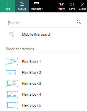
Add a Flex Block to the page by dragging it onto the row into the preview area. Choose the type of Flex Block you want to use, based on the General style shown by the small thumbnail.
Each of the small thumbs offers a general quick look at the style of the block you can create.
The block settings are divided into 5 tabs: General, Filter, Layout, Style, and CSS. However, don’t confuse the Flex Blocks with the Flex Big Grids as they have a different layout.
1. Pre-Made Flex Block Style Presets
Use the General tab for a quick setup of your Flex Block, as it comes with a set of premade styles
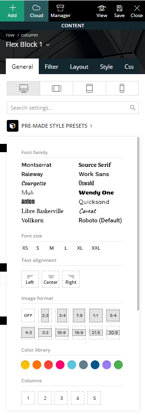
This section provides a quick panel to set the overall fonts, text alignment, image format, a quick global color accent, the number of columns for your block.
You can also choose the actual layout style and select to show or hide individual meta information. The panel shows different options based on the chosen Flex Block.
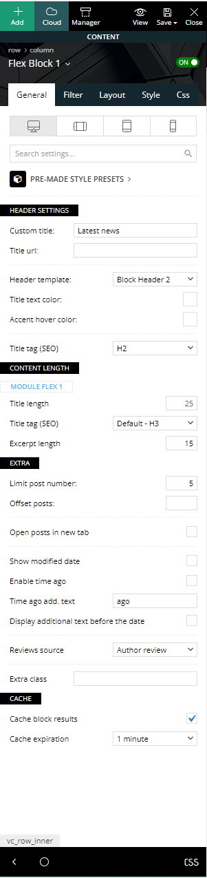
General Settings
The General tab offers broad settings and it’s the same across all of the Flex Blocks. It includes the following:
- Custom title (optional) – Set a title for this block; if you leave it blank the block does not display any title.
- Title URL (optional) – Set a custom URL for the block title.
- Header template – You can choose from one of the 18 available header styles. If you’ve set a title for the block, this changes the style of that section.
- Title background color (optional) – Choose a custom title background color for this block. The title background color also affects the hover color of the posts displayed as well as the Ajax filter hover color.
- Title text color (optional) – Choose a custom title text color.
- Title tag (SEO) – This is for the HTML tag of the title text.
- Content-Length – Select the title and excerpt length for each of the modules used on the block.
- Limit post number – If the field is empty, the limit post number is the number from WordPress Settings > Reading
- Offset posts – Start the count with an offset. If you have a block that shows five posts before this one, you can make this one start from the 6’th post (by using offset 5)
- Open posts in new tab – The posts will be opened in a new tab. This option adds target blank on image thumb and post title links.
- Extra class – This input field can be used to add a specific or unique class for your block which can be used to add additional customizations to the block.
- Cache – Enabling the cache option on the Flex Block reduces database requests by caching the output.
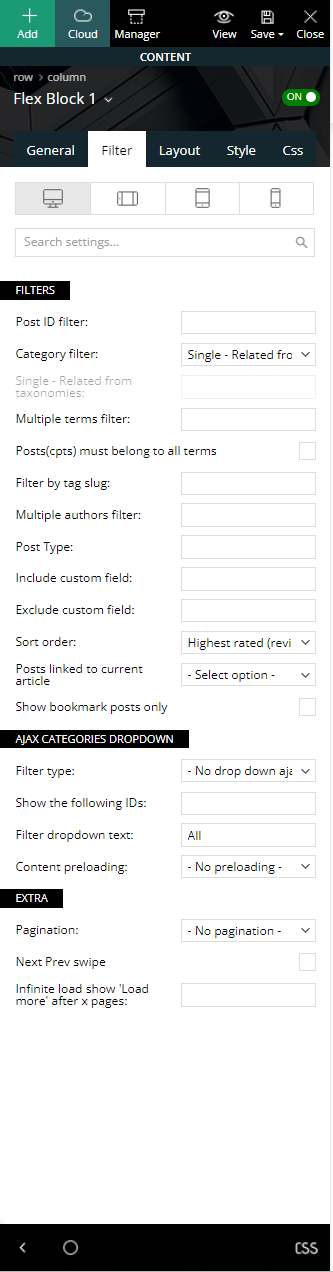
2. Filter
The Filter tab is the section where you can choose which content to show for your block.
-
-
- Post ID filter – Use the posts’ ID to filter your block by specific posts. You can get the post ID by accessing WP Admin > Posts section, hover the post title and check the link displayed on the browser left-bottom area. Use the URL to extract the IDs. To exclude posts from a block add a ‘-’ symbol in front of each ID.
- Category Filter – Choose a specific category for the block from a drop-down menu containing all the existing categories.
Special filters for :
1. Single Post Template: (you should place the shortcode in a single post template)
Single – More from author: You can display and sort articles by the same author on the Flex Block within the single template.
Single – Related by category: The articles can be displayed and sorted by the current post category.
Single – Related from tags: The articles can be sorted by the current post tags.
Single – Related from taxonomy: The articles can be shown based on the present post’s taxonomy.
Single – Siblings: This will display all the sibling posts of your current posts.
2. Category Template: Category – Current category; (you should place the shortcode in a category template)
3. Author Template: Author – Current author; (you should place the shortcode in an author template)
4. Tag Template: Tag – Current tag; (you should place the shortcode in a tag template)
5. Date Template: Date – Current date; (you should place the shortcode in a date template) ;
6. Search Template: Search – Current search. (you should place the shortcode in a search template) ;
7. Taxonomy Template: Taxonomy – Current taxonomy. (you should place the shortcode in a taxonomy template) ;
- Multiple terms filter – This option allows you to filter the posts by multiple categories. The procedure is similar to the one used on Post ID filter. Add the category IDs separated by commas (ex: 13,23,18). If you want to exclude categories, add a ‘-’ symbol in front of each ID. If you want to display posts from a category and remove the posts included in one of its sub-categories, first add the parent category ID (ex. Fashion category – 341) and after it places the sub-category ID (ex. Daily subcategory id: 342) with a ‘-’ symbol in front. If you decide to use the ‘Multiple terms filter,’ the standard Category Filter is ignored.
- Posts(cpts) must belong to all terms – Displayed posts(cpts) must belong to all taxonomies terms.
- Filter by tag slug – Filter the posts by their tags and enter the tag slugs separated by commas (ex: tag1, tag2, tag3).
- Multiple authors filter – This allows you to filter the posts by author(s). Enter the author IDs separated by commas (ex: 13,23,18).
- Post type – Use this filter if you want to display custom post types. Add the name of the post type. This is provided by the plugin used to create the CPT, or by the user if it’s custom-made. Usage: post, page, event – write 1 or more post types delimited by commas.
- Include custom field – Include posts by specific Custom Field ( ACF true_false type ). If the CF meta value is true the post will be displayed on block.
- Exclude custom field – Exclude posts by specific Custom Field ( ACF true_false type ). If the CF meta value is true the post will be excluded.
-
Sort order
This option lets you order the posts. Most of these options are self-explanatory, but there are a few options that have requirements:
-
- Standard sorting options:
- Latest posts – It shows articles from newest to oldest.
- Oldest posts – It is the reverse of the previous sorting option.
- Modified date – It displays articles according to the most recent update time of the posts.
- Alphabetical A > Z – Your articles are sorted by their name in alphabetical order.
- Random posts – This sorting option brings up posts randomly on each loading of the page. Every time you refresh the page, there are different articles on it. As a note. Do not use this sorting option together with pagination as it could result in duplicate posts.
- Random posts from the last 7 days – This field brings up random posts based on the ones published in the last 7 days.
-
Sorting options that feature extra requirements:
- Popular (all time) – this sorting option requires the post views to be active. If views are disabled, this option does not work.
- Popular (last 7 days) – you have to enable the 7 days post sorting from Theme Panel > Block Settings > 7 Days Post Sorting.
- Popular (last 24 hours) – displays the articles which have the most views in the last 24 hours
- Popular (last 48 hours) – displays the articles which have the most views in the last 48 hours
- Popular (jetpack + stats module required) – does not work with other settings/pagination and it requires Jetpack – Stats Module to be installed.
- Featured – it displays posts included in the Featured category which is automatically created by the theme. If you delete this category and you want to restore it, create a new category with the name of ‘Featured’ and a slug ‘featured’.
- Random posts today – this field requires the post views to be active.
- Highest rated – requires review posts, to see how you can set a review please check the following guide.
- Highest rated (reviews) – The highest rated (reviews) sort option shows posts from highest to lowest based on the reviews by the author.
- Lowest rated (reviews) – It is the opposite of the previous sorting option.
- Highest rated (user reviews) –The highest-rated (reviews) sort option arranges posts in descending order according to user reviews.
- Lowest rated (user reviews) – It represents the opposite of the previous sorting option.
- Most commented – requires comments to be active on posts. You can enable/disable the comments from Theme Panel > Post Settings > Post and Custom Post Types.
- Standard sorting options:
- Posts linked to current article – The option works only on a single template and this relationship can be created only if the element “Posts Form Link To Post” is used. This element can be used in a post submission form.
- Parent post – Display the parent post of the current child post.
- Child posts – Display the posts that are children of the current parent post.
- Show bookmark posts only – It exclusively displays the posts that have been added to favorites.
- Show exclusive posts only – This displays posts that are restricted with a content locker.
Ajax Categories Dropdown:
Filter type – Display a list of Categories, Taxonomies, Authors or Tags next to the title. The user is able to see posts filtered on this block, that are dynamically loaded with Ajax without leaving the page. The Ajax filters (except by popularity) require an additional parameter.
- Show the following IDs – the Ajax drop down shows only the (author ids, categories IDs or tag IDs) that you enter here separated by commas. If no IDs are provided in the input below, the filter shows all the available items (ex: all authors, all categories etc..)
- Filter drop-down text – lets you choose the name for the first item from the drop-down Ajax list. By default, this is named ‘All.’
- Content preloading – When the preloading section is active, the theme loads the first page content for each of the Ajax filters at the initial page load.
Extra:
- Pagination – You can choose to add pagination to your block.
- Next Prev ajax – adds two navigation arrows to navigate through posts.
- Load More button – the “Load more” button appears at the bottom of the Flex Block allowing users to see more posts
- Infinite Load – automatically loads more posts when the user gets to the end of the Flex Block.
- Infinite load show ‘Load more’ after x pages – if you select infinite load you can use this option to make it stop after some pages, the “Load more” button appears at the page bottom allowing users to load more posts. Notice: For the Infinite Load you may need to specify after how many pages a button shows up, otherwise it loads posts until they are finished.
- Next Prev swipe – Adds the ability for the user to slide to the left or right to load more posts (NOTE! You have to enable the option Pagination: Next Prev ajax)
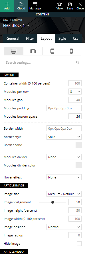
3. Layout
The Layout tab is the section allows you to customize your Flex Block’s form. A Flex Block layout can be made out of 1 or 2 modules. You can find settings in this section not only for each Flex Block in particular but for every module used on the particular Flex Block as well.
Individual Flex Blocks have more or less the following options depending on the Flex Block type selected. For the sake of keeping this guide as short as possible, we only mention the most important ones as there are lots of customization options to choose from.
-
Overall layout
This section allows you to choose the number of columns or modules per column your block displays, the spacing (in pixels) between each module, setting margins and padding around your columns and adding a divider between elements.
If the Flex Block you’ve chosen is made out of 2 modules, there is a second layout section for the second module for more in-depth customization of the block.
-
Article image
This section lets you control the thumbnails shown for your content. There are 4 thumbnail sizes for the Flex Block element you can choose in this section appropriately named small, default, large or full.
After you choose the image size, you can also play around with its vertical alignment, image width, and height (in percentage), image position, image radius, or select to hide the image altogether if you choose to.
-
Article meta information
The meta information refers to the post titles, author, date, excerpt and other information about the post shown in a particular block.
You can choose the meta info positioning, alignment, as well as set margins and padding for each of the individual elements such as article title, category tag, author, date, and excerpt. If you want to hide certain elements, you can do it, too.
The author section allows you to use the author image as well as adjust its size.
Flex blocks 1 and 5 can also have a read more button added in this section.
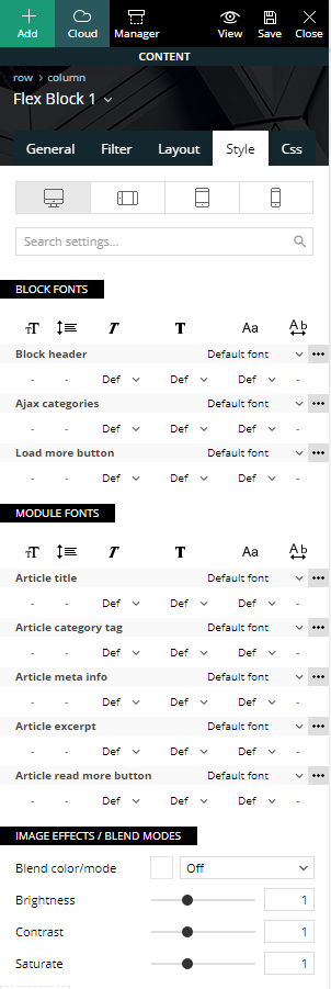
4. Style
The style tab is all about styling the layout allowing you to change fonts and colors for your newly created block element.
-
Block fonts
The top section allows you to change the font size, font family, line height, font weight, letter spacing, and text transform. This section covers the fonts for the Block header, Ajax categories and the load more button.
-
Module fonts
The module fonts section controls the font settings for each module in particular for the article title, the category tags, the meta information, excerpts as well as the read more button if present.
-
Colors
The color settings allow you to change individual colors for each of the layout sections. You can change the text color, background colors, hover colors, as well as adding a shadow effect and shadow offset.
5. CSS
The CSS tab refers to the block CSS as a whole and allows you to change it accordingly. This section includes the CSS box model where you can control the margins, padding, and border for the block.
Extra settings include border settings (color, style, radius, and width), shadows (shadow size, color, offset), the block overall background color or image (as well as their position and opacity).
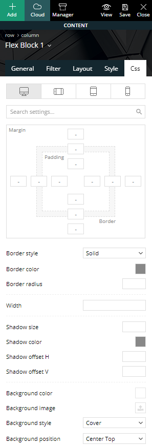
The color overlay feature adds a gradient on top of your block where you can choose multiple colors to add all new creative gradients to take your block style to the next level.
The display option allows you to show or hide a particular block. This is useful if you want to hide a particular block for a specific device using the top device tabs.