
- NewspaperThe Newspaper Mobile Theme: Introduction
- NewspaperThe Mobile Theme
- NewsmagMain menu
- NewspaperMain Menu
- NewspaperHow to Add a Logo in Newspaper
- NewspaperBig Grid Flex Settings
- NewspaperHeader Builder
- NewsmagIntroduction
- NewsmagLogo & Favicon
- NewsmagBackground introduction
- NewsmagTheme colors introduction
- TutorialsWhat is Ajax preloading?
- NewspaperFont Customization
- NewspaperTheme Colors Introduction
- NewspaperBackground Introduction
- NewspaperHow to Install Newspaper via FTP
- NewspaperHow to Install Newspaper via WordPress
 Alex
Alex Hi All,
INP was not only recently added, so Anamaria is incorrect. INP only recently became a mandatory factor.
INP has been available for a long time (at least 6 months) to test/see. Therefore the data was available to figure out what in Newspaper causes its poor score.
It is shame it was not fixed by March 2024, when INP became a mandatory factor.
Judging from poor INP on some of our websites, it can be caused by mobile menu, mobile search and modal pop-up blocks. There can of course be a number of other blocks/factors that cause it eg java driven items etc.
-
This reply was modified 2 years by
Alex.
 AmiciNetwork
Hello!
We are developing a news site based on this theme, I would like to customize the color of the top menu which currently appears black to me and I would like to turn it into white.
 Anamaria
 Hi,
To change the font and color for the mobile menu please go to Theme Panel -> Theme Colors -> Mobile menu/mobile search => https://www.screencast.com/t/0CvSgXp9H to set a background image go in Theme Panel -> Background -> Mobile menu/mobile search => https://www.screencast.com/t/uvDejzbX to change the font from Theme Fonts => https://www.screencast.com/t/ANBQe7hQhJd
Thank you!
 KamAnamaria
 Hello,
I checked the website, and it is underconstruction.
The social icons from the mobile menu come from the Theme Panel -> Social/Apis -> Social Networks -> https://i.imgur.com/kKYIECB.png. Remove/edit them as needed.
If you using the Flex Block or Big Grid Flex in the layout is the option “Show author”, and you can choose to hide => https://www.screencast.com/t/6UPXQbiTO2
You can customize the category template. For the category template, please use a posts loop; if you have set a posts loop, it will display all posts in this category. Alternatively, you can use Flex Block/Big Grid Flex and set the filter to “Category -Current category” => https://i.imgur.com/7P99qx0.png. This is why the block will display posts for each category.
Thank you!
 episodeplus
Hello there, I’m currently facing a few problems. Could you please help me with the following:
The video post thumbnail shows as a blank white.
How can I hide social icons on the slider menu (mobile)?
How do I hide the admin/author on all blog posts?
How can I display posts from the relevant category on category pages? Additionally, changing the layout of one category affects all category pages.
Thank you for your assistance!
 Sadique Ali
How can I change mobile menu?
Desktop menu:https://app.screencast.com/tJ4jmGbfUU8jH
Mobile Menu:https://app.screencast.com/3QaS3rCkFO4x8
I want to change mobile menu like the desktop, but its still showing demo template menu in mobile version, How can I change it?
 Bettina
 Hello @skarem100 !
Edit the homepage with the tagdiv Composer, go to the mobile viewport, click on that menu icon and change the menu from that dropdown: https://app.screencast.com/QU8PVGPjHw4b0
Save and view the results.
Thank you!
 skarem100
 Hi and hope you are doing well. How can I change the menu items for mobile responsive view? Currently they are the same as my Desktop view.
Regards
 nieveslgil
Hello,
I have setup Newsmag on my site:https://costatropical.tv/
The mobile version of my site was showing correct but suddenly the blocks in the home page are dissapear. Now it is only showing Latest articles and Reccomended videos which are panels “Homepage Latest Articles”.. Mobile version does not show menus either.
Please advise
Thanks!
 Calin
Calin Hi birkasi, if you situation with the mobile menu is the same, then yes, please exclude the mentioned files.
Related to js for ads, are those from AdSense? If so, there are some AdSense codes that are auto ads and will be set in the place where they consider is the best place, if are regular ads, then just make sure that after you set back the unminify js all the cache and CDN are purge.
I hope this will help you!
Calin Hi RahulDasOp, yes, this can be done using the popup element instead of mobile menu, using the popup element you can create a page with all elements and layout you want to be display on it, and you can use tagDiv Composer to make that layout.
I hope this will help you!
 Ishola
The Mobile Menu Modal seems to be skipping a few of my mobile responsive pages. Am I missing a global switch somewhere? Thanks.
 maidigitalcreations
Website: maiwanderlustlife.com
I don’t understand where I go to change this. I made the mobile version look exactly the way I wanted it too (header and footer = white background, menu = blue background). The blog posts look different.
Issues/Questions:
1. Header and footer are not white on blog post.
2. The menu color is different on the blog post.
3. How do I change the category label color?
4. Is the theme panel: mobile theme section where I make changes because I reviewed it and I don’t understand where the different colors came about.
 stringbenderb5
Can you please watch the short video below to see the issue?
How can this be fixed?
 rahuldas
Can I make my mobile menu from
this- https://imgur.com/mTy7s0d
to this- https://imgur.com/Z73yFlC
Anamaria Hello,
You need to edit the page called Mega Menu Mobile and delete the button https://i.imgur.com/JP9a8KK.png with a right-click.
Please let me know the results.
Thank you!
 haipo
haipo Hi Anamaria
The problem is here again
and now I can replicate the root cause, but I don’t manage to fix it:
If I add a sticky row and add a menu in it, then the mobile menu disapears.
I tried to bypass this problem with no luck.
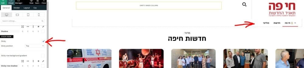
–
Maybe you have a resolution for that?
–
Thanks,
Yaron
haipoHi team
When using the RTL template
And display in bobile
The mbile header shows and then disapears after one second.
I didn’t find a way to make it stable.
–
Please advise how to resolve that.
Example:
https://dev2.haipo.co.il/item/485841
–
Thaks
Yaron
 Ahmet Hakan Kablama
I built menu for Mobile and Desktop. However, I want to hide the built-in icon element from logged in users. There is no built-in setting for this. Is there some kind of “Extra class” for this?
 spurvis
We got a notice about mixed content (https and http). This was the offending URL… http://coinweektest.wpengine.com/wp-content/uploads/2023/03/bghd.jpg. I believe it is the Background image for the mobile menu, but it is not in the Theme Panel : Backgrounds: Mobile menu/search background. Also looked through the Style.css file and saw nothing. Anyone have any ideas on where this might be and how to change the URL?
Help much appreciated
<div class="tdi_9_rand_style td-element-style" ><div class="td-element-style-before"><style>@media (max-width:767px){.tdi_9_rand_style>.td-element-style-before{content:''!important;width:100%!important;height:100%!important;position:absolute!important;top:0!important;left:0!important;display:block!important;z-index:0!important;background-image:url("http://coinweektest.wpengine.com/wp-content/uploads/2023/03/bghd.jpg")!important;opacity:0.2!important;background-size:cover!important;background-position:center top!important}}</style></div><style>@media (max-width:767px){.tdi_9_rand_style{background-color:#000000!important}}</style></div><div class="vc_column tdi_12 wpb_column vc_column_container tdc-column td-pb-span4">
Anamaria Hello,
The widget is not displayed on mobile because you added the element in the header mobile, and this section is applied only to the desktop and tablet versions. For mobile, you need to select the viewport for the phone to add in the Mobile menu -> https://i.imgur.com/8Cntjoz.png
Also, I noticed that you use a standard template, and for those, the elements from the sidebar are loaded to the bottom of the post -> https://i.imgur.com/lSRmRMS.png if you want to have the widget first, you need to use a cloud template.
Thank you!
Calin Hi,
Yes, the shortcode is correctly set in your screenshot. This is the method 1 mentioned in the guide that I provided and the most easy to use.
If you want to have the responsive version displayed on mobile, then please do not use the tagDiv Mobile Theme plugin, this will remove the sidebar element from mobile or as an alternative you can add for the mobile menu the gtranslate elements in mobile menu – https://i.imgur.com/t8A6p4d.png
Thank you!
Anamaria Hello,
The social icons from the mobile menu are coming from the Theme Panel -> Social/Apis -> Social Networks -> https://i.imgur.com/kKYIECB.png remove/edit them after your needs.
Thank you!
 upmy-life
Hello,
I have a header main menu on my site (https://upmy.life).
When I click on the “Phone viewport” then I have a mobile menu instead, with the same menu elements, that’s ok.
BUT I have a new line at the top of this mobile menu with small social icons (Evernote, Facebook…).
Screenshot : http://tinyurl.com/2depfhn5
How can i remove them ?
Thanks



