
- NewspaperThe Newspaper Mobile Theme: Introduction
- NewspaperThe Mobile Theme
- NewspaperModules Builder in Newspaper Theme
- NewspaperFilters and sorting for taxonomies
- NewspaperHow to Add a Logo in Newspaper
- NewspaperBig Grid Flex Settings
- NewspaperHeader Builder
- NewspapertagDiv AMP Plugin Tutorial
- NewspaperNewspaper theme documentation
- NewspaperBest Of Forums
- NewspaperCache plugin – install and configure
- NewspaperFont Customization
- NewspaperTheme Colors Introduction
- NewspaperBackground Introduction
- NewspaperHeader ads
- NewspaperPost template ads
- NewspaperCustom ad spots
- NewspaperMain Menu
- NewspaperHow to Install Newspaper via FTP
- NewspaperHow to Install Newspaper via WordPress
 Anamaria
 Hello,
Unfortunately, at the moment using the mobile theme plugin, you can’t edit the settings on the blocks.
You can do that using a mobile responsive version or mobile page.
Thank you for your understanding!
 dharma3d
On mobile theme I have a header ad, but there is some white space above and below. I would like it with no space. How can I do it?
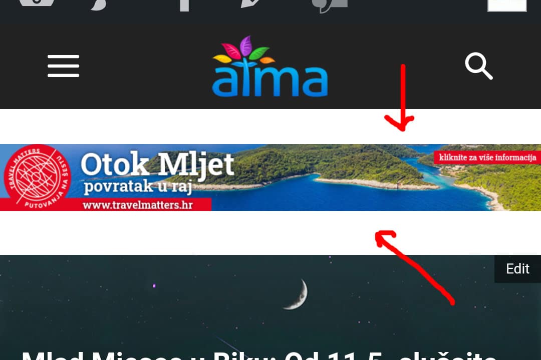
Second related question is – How can I check the CSS for mobile theme so I can customize a few CSS things? With regular theme I would go to Chrome on my desktop PC and do Ctrl+Shift+I
My website is https://atma.hr/
 Bettina
 Hello!
You can have a sticky menu only in a responsive version or mobile pages. Please check this topic: https://forum.tagdiv.com/topic/mobile-menu-58/
If you have installed Mobile Theme plugin, then you can not modify or customize it so much because Mobile Theme has its own design template.
For more information, check our documentation here:
– https://forum.tagdiv.com/the-mobile-theme/
– https://www.youtube.com/watch?v=SpGkOnJeNZY
– https://tagdiv.com/newspaper-10-3-7-update-brings-customizable-and-fast-mobile-pages/
Thank you for understanding!
Bettina Hello!
1. Mobile – Displays content using the Mobile Theme on small screen devices (no AMP)
2. Mobile+Amp – Displays content using the Mobile Theme on both mobiles and AMP
3. AMP – Uses the responsive version of the theme on small screen devices and Mobile Theme only on AMP.
For more information about those plugins, you can find in our documentation:
– https://forum.tagdiv.com/tagdiv-amp-plugin-tutorial/
– https://forum.tagdiv.com/the-mobile-theme/
– https://www.youtube.com/watch?v=SpGkOnJeNZY
Thank you!
 anshul
 Hi Vlad,
Thanks for the prompt reply. It’s not specifically related to this post, but its for every post I have. It’s an issue with the mobile page. It shows okay on the web version. I have not set specific numbers.
Regards,
Anshul Nischal
 Calin
Calin Hi,
Please make sure that all theme requirements are set like in our guide https://forum.tagdiv.com/newsmag-login-how-to-enable-the-user-registration/
If this is still not display, please try this custom css:
.td-menu-mob-open-menu #td-mobile-nav {

height: calc(100% + 1px);

}
Please set this code in theme panel> Custom code> Custom css.
Hope this will help you!
Thank you!
 queenmonique
my website is http://www.trendtraderclub.com is working perfect on my computer but with the mobile version there are some issues. the mobile version that i edited and saved on my pc as a mobile page is not shown on my mobile phone. My mobile phone has a totally different design than the one I saved on the mobile page when I edited it on the pc. what exactly am i doing wrong?
 Vlad S
 Hello !
I have investigated your website and as you can see here this works on AMP too: https://www.screencast.com/t/gujR7UkWV014
If you have used Mobile Theme plugin please note that your mobile page content must be added in the mobile editor as you can see here: https://www.screencast.com/t/Zy49V5vfYW This can be found at the bottom of every page when editing.
Thank you!
 luke-tt
Hi,
if I click “sticky” in the mobile menu, the menu turns white and I can see nothing.
See here please: https://www.screencast.com/t/WKRVPocbWM
Thanks in advance,
Luke
Anamaria Hello,
I already replied to your own topic about the same problem, please check https://forum.tagdiv.com/topic/problem-with-mobile-theme-15/
Thank you!
Anamaria Hello, @billions1nly,
I just checked the website and it looks like you are using the mobile responsive version https://www.screencast.com/t/X576F53sIws3 -> https://www.screencast.com/t/3PZelMI1 -> https://www.screencast.com/t/wbdpj7J4
When you deactivate the Mobile Theme plugin, your responsive mobile version will be similar to the desktop version and all should be alright.
Thank you!
 Colleric
I’m having problems with Nginx fast cgi as it server mobile pages on desktop.
Also, I can’t pass the google core vitals test no matter what I do.
 engrwaseemraja
I have issue with my Newspaper X mobile theme it is not properly compatible with wpdiscuz comment plugin even i am using the latest version of theme and not showing the comment section properly. Please check in the bottom of this link: https://thecivilengineerings.com/bar-bending-schedule-formulas-bbs-formula/?amp
And when I exit this mobile version then embedded YouTube video size will be disturbed but before it was looking fine in mobile version you can check here: https://thecivilengineerings.com/bar-bending-schedule-formulas-bbs-formula/?noamp=mobile you can see here the video size convert from landscape to portrait position. I need this video size in landscape position same as mobile version because it was looking good.
Please guide me what i can do for fix it. I am extremely waiting for your urgent response
 sirms
sirmsHi, I want to set up a custom block on the front page where the news articles should be in. The reason for that is that I want the text to dynamically adapt so I do not have to go in manually and edit it for each post I post.
I have looked at a plugin that does this for me: https://wordpress.org/plugins/wp-responsive-slab-text/
But I do not know how to set up custom blocks on the page. I must have the ability to store them so that I can easily switch between different types of blocks and with an API.
Screenshot desktop: https://www.screencast.com/t/utLK5hhuk
Screenshot mobile: https://www.screencast.com/t/0K8eFk6tecG7
 nbiga samir
Hello.
I activated the ”WP Super Cache” plugin on my website.
I activated the mobile version of NewsPaper.
The problem is that ”WP Super Cache” is showing the mobile cache in the desktop version. How to solve?
 sparky263
I am trying to get a single line out of two combined fields, as in this example (https://onlineinvestmentconference.com/cartier-resources-webinar-for-german-investors-sept-2019/) >>> “Online webinar presented” + date.
The words “Online Webinar presented” are saved as a subtitle and then displayed as the subtitle shortcode, along with the date. The way I have done it now is to insert a two column inner row, with the subtitle in the first column and the date in the second.
The problem is that if I want align both fields left on the mobile version, on the desktop version the first column aligns to the left and leaves a gap. (Images A+B)
If I right align the left column, and left align the right column so as to have them appear as one contiguous phrase (phrase 1 + date together) in desktop mode, on mobile the top column of course also aligns right and right column aligns left, which looks weird.
Is using an inner row with two columns like this the best way to do this, or can I somehow concatenate the two shortcodes into one column so whether they are in desktop or mobile versions, both line up together to the left without a space between?
https://onlineinvestmentconference.com/files/A-2021-05-09_8-25-39.jpg
https://onlineinvestmentconference.com/files/B-2021-05-09_8-35-02.jpg
https://onlineinvestmentconference.com/files/C-2021-05-09_8-35-59.jpg
https://onlineinvestmentconference.com/files/D-2021-05-09_8-40-17.jpg
 Buopso News
https://buopsonews.com is the website and we are geeting critical Erro. pages and websites are opening in desktop version but the main website and posts are not showing critical error in mobile version. posts are also showing this.
 mortgageman
Is there any css for sticky mobile theme header and desktop header.
The setting on td composer is set to sticky for mobile and desktop, but it’s not working.
I’m using the mobile theme and td composer custom-built theme for desktop.
 rakplanet
Dear Concern,
My site is ktvprotidin.com. i am using mobile theme for mobile and I have notice “Multiple taxonomies filter:” in block filter is not working for mobile theme. But the desktop view works fine.
I just tried to exclud a category by placing (-183) in “Multiple taxonomies filter:” field. it works in desktop but not in Mobile theme.
Please advice.
Raihan
 epicured
Hello,
I’ve spent the past few weeks trying to improve our Google Pagespeed performance and while it has gotten somewhat better in a few metrics, we’re still far off from where we should be.
We’re currently using our latest posts as our homepage instead of a separate page. When we install the tagdiv Mobile theme, it creates cumulative shift layout issues so we have it deactivated.
I tried to create a separate page to use as the homepage with the same design. I created a copy version for the mobile site and connected it to our page as your guide instructs, but it won’t show any articles on mobile, even though we are not using the mobile theme. I read on the forum that the mobile theme could be causing this issue, but it’s clearly something else altogether.
I have also tried to run your CSS Analyzer for the page to improve Google Pagespeed metrics, but it keeps timing out at different points and won’t finish. I have deactivated plugins for caching and other things to try to get your CSS Analyzer to work, but it keeps timing out.
All things considered, I feel like I’ve done everything I reasonably can from my end and yet our Google Pagespeed scores are still poor and now of the options I have found from reading the forum and your guides has produced a solution.
I would greatly appreciate it if you could please help us out with this.
Thank you
 sumitkumarsid@gmail.com
 Hi Team,
Please help me, how i can design like the way it designed the below content-
Prepare time: 20 min
Cook: 2 hr 30 min
Ready in: 2 hr 50 min
on https://demo.tagdiv.com/newspaper_recipes/td-
post-girl-scout-cookie-samoa-shake/
I have tried by typing text in the editor in a single row.
But the content is disturbing on mobile. for ref- https://dashofturmeric.in/orange-chiffon-cake/
On your above given ref- https://demo.tagdiv.com/newspaper_gourmet_pro/mini-pineapple-upside-down-cakes/ –
The row below image is not there which is available on https://demo.tagdiv.com/newspaper_recipes/td-post-girl-scout-cookie-samoa-shake/
i.e. Prepare, Cook and Ready Time.
Please support me, how I can built like the row which is developed there below to the image.
Thanks in Advance
 discdemo
 By the way, i turned off amp legacy because of no mobile plugin issue.
Well, the view on mobile is pretty good. What is difference between using amp+mobile plugin, vs not?
Thx.
 Umut
UmutHi I get CLS 0,25 problem.
What do you recomend me ?
 EXB
EXBHello,
I’m trying to display 3 featured articles (which are the last 3 articles) in the front page Grid and below, under latest articles, to show the next ones without repeating the previous 3. So I did this:

But unfortunately it doesn’t change anything, the 3 featured articles and 3 latest articles are the same:

I would like the latest articles section to start at the 4th latest post. What do I do wrong?
Thank you
 sathuinfotech
Dear sir,
i had create so many time but not work properly. please sent me clear video on how to setup newspaper theme.



