
- NewspaperThe Newspaper Mobile Theme: Introduction
- NewspaperThe Mobile Theme
- NewspaperModules Builder in Newspaper Theme
- NewspaperFilters and sorting for taxonomies
- NewspaperHow to Add a Logo in Newspaper
- NewspaperBig Grid Flex Settings
- NewspaperHeader Builder
- NewspapertagDiv AMP Plugin Tutorial
- NewspaperNewspaper theme documentation
- NewspaperBest Of Forums
- NewspaperCache plugin – install and configure
- NewspaperFont Customization
- NewspaperTheme Colors Introduction
- NewspaperBackground Introduction
- NewspaperHeader ads
- NewspaperPost template ads
- NewspaperCustom ad spots
- NewspaperMain Menu
- NewspaperHow to Install Newspaper via FTP
- NewspaperHow to Install Newspaper via WordPress
 Anamaria
 Hi,
This is a video about Responsive Newspaper Theme, AMP & Mobile Theme, Mobile Pages & Templates -> https://www.youtube.com/watch?v=SpGkOnJeNZY
Thank you!
 urishtaujjain
 First of all thanks to Calin for guiding me, my pagespeed result score is great for desktop-96,mobile score is down and but lighthouse result is different, why is it so, I have attached lighthouse screenshots, please have a look at it and what issue we can solve in this? Please help
Anamaria Hi,
Usually, this happens with cache plugins. If the cache plugin does not have mobile support then the mobile version can be delivered instead.
The solution would be to use the recommended WP Super Cache plugin instead and activate these settings (especially the mobile device support): https://forum.tagdiv.com/cache-plugin-install-and-configure/
Also, you can check this https://i.imgur.com/Es7nHNh.png
Thank you!
 Mark Gilbert
 Thanks – I deleted AMP and will have a look at mobile theme, but the standard theme seems be responsive enough.
 saasi-xyz
How do I show the default Urban Observer home page?
Anamaria Hi,
This decision must be made by you. For example, if you want the mobile version to be simpler, you can use a mobile theme. Additionally, as you mentioned, we no longer recommend AMP since it is deprecated
Thank you!
Mark GilbertHello – could you update me on AMP and mobile theme? I don’t currently have either implemented. Would I benefit from using them (though I think I read AMP was now deprecated)?
My site: https://jazzjournal.co.uk
Thanks
urishtaujjain First of all thanks to Calin for guiding me, my pagespeed result score is great for mobile-91 and desktop-96 but lighthouse result is different, why is it so, I have attached lighthouse screenshots, please have a look at it and what issue we can solve in this? Please help
Anamaria Hi,
Usually, this happens with cache plugins. If the cache plugin does not have mobile support then the mobile version can be delivered instead.
The solution would be to use the recommended WP Super Cache plugin instead and activate these settings (especially the mobile device support): https://forum.tagdiv.com/cache-plugin-install-and-configure/
Thank you!
 Culturedarm
Hello,
For the desktop version of my site at https://culturedarm.com/ I use a Bandcamp shortcode to embed music down the right hand side of some posts. To this end I have been using the html tag <div style=”float: right> in order to get my post text to wrap around the embedded music. An illustration of how this works can be found at:
https://culturedarm.com/suk-hong-pedigree/
and here’s an image:
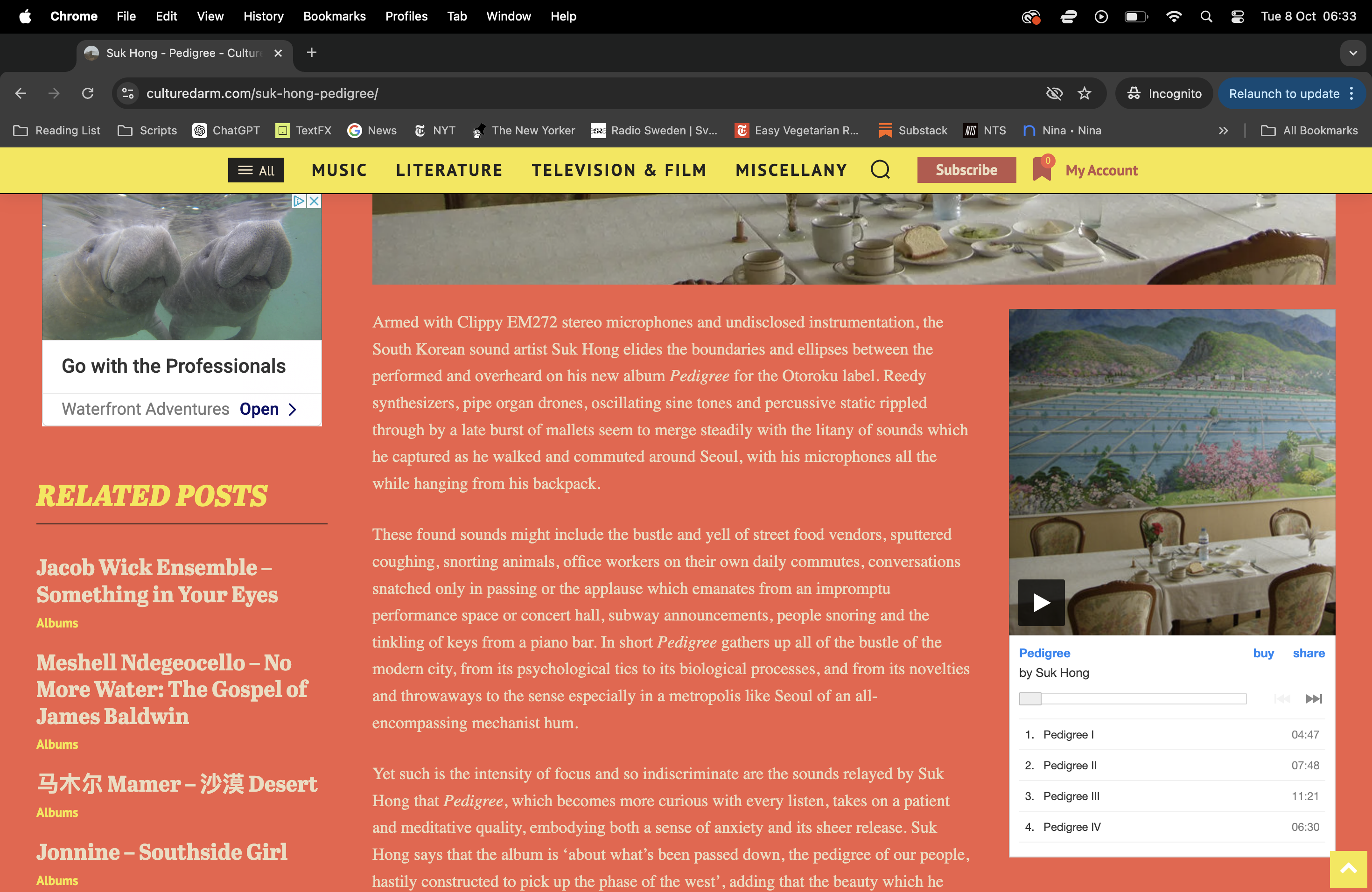
The problem with this is that on mobile, the shortcode is also embedding to the right and obviously the text isn’t wrapping because there isn’t space. The music is also embedding above my text, which is understandable because that’s where the shortcode is effectively placed. But the result looks like this, which is especially unattractive when the embed comes immediately after the featured image:
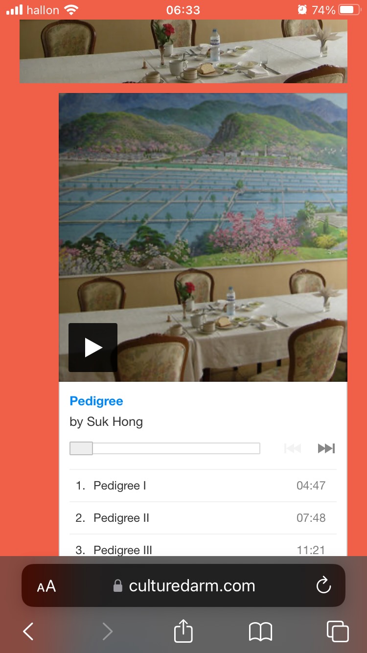
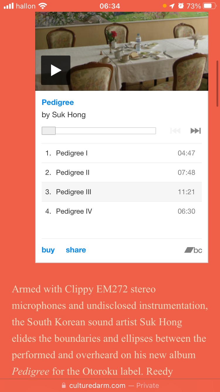
Ideally I would like the embedded Bandcamp music to be centered on mobile devices while remaining right-aligned on desktop. I also wonder whether there’s a way to tell the shortcode to fall beneath the text on mobile when it is aligned to the right. Is there any custom code I can add to this effect?
Thanks for the help.
 Ryan Lee
I have finished setting up the mobile page using the Newspaper theme. I didn’t use the tagDiv Mobile Theme plug-in.
However, sometimes when accessing the site on mobile, it displays the web page, and when accessing on a PC, it displays the mobile page. Do you know how to deal with this issue?
Anamaria Hello,
Please let me know how you want the page to look on mobile. Normally, you design on the phone viewport and hide some elements that you don’t want on mobile, and vice versa for desktop.
Thank you!
 Calin
Calin Ok, I checked the pagespeed results and now the score looks fantastic.
Now it seems that the above code is not fixing the problem on mobile only from desktop, were seems to be now a problem only with the first module.
Please add this extra code in the theme panel for phone -> https://i.imgur.com/o0yNNA8.png:
.td-big-grid-meta,

.td_module_mx1 .meta-info {

    padding-top: 16px;

    background: #111;

}
and for desktop please use this code – https://i.imgur.com/TOTynbt.png :
.td-big-thumb .td-big-grid-meta {

    background: #111;

}
Let me know the results!
Anamaria Hello,
Please check with the tagDiv Composer and disable the H1. For example, H1 from logo(header, footer, mobile, sticky): https://forum.tagdiv.com/topic/6-h1-tags-on-front-page-bing-have-deindexed-my-site/
Thank you!
Calin Hello,
1. Unfortunately this can not be overwrite, it can be edited only in the plugin file and it must be done after each theme update.
2. When the tagDiv Mobile theme plugin is used then you need to use only the Mobile editor elements – https://i.imgur.com/1Y5BWO2.png – https://forum.tagdiv.com/mobile-theme-introduction/ – https://forum.tagdiv.com/the-mobile-theme/
Thank you!
 Azael222
Hi, How can the same layout can been show on desktops and tablets, and a different one only on smartphones?
I am using the TagDiv Composer for the Desktop site and the mobile but the mobile page also is showing up on the tablet. I notice when using a pre-designed Template (Homepage – Magazine Pro) it is possible accomplish what i want without using a mobile page.
Thanks for the help!
 moviemail
1. How Can I overwrite single.php page for mobile while I am using “tagDiv Mobile Theme”, I do not want to edit inside plugin.
2. How can I add more section news in mobile home page while I am using “tagDiv Mobile Theme”
Calin Hi,
Ok, for mobile change the color for trending now and set it to have a background color #222, after that please replace the above provide css with this one:
body.page .td-grid-style-1 .td-module-thumb a:last-child:before,

.td_module_mx1 .td-module-thumb a:last-child:before {

    background: linear-gradient(#0000006e, #000);

opacity: 0.9;

height: 140%;

}
Clear all cache and let me know the results!
urishtaujjain Please guide me for mobile contrast isssue
Anamaria Hello,
First of all, we no longer recommend AMP because it is deprecated https://developer.bigcommerce.com/docs/storefront/wordpress/platform-integration/enabling-amp
The w3 validator unfortunately does not provide accurate results anymore.We have stopped trusting it altogether. Please use google’s structure data testing tool You can test any major site you can think about and you will see the w3c validator providing errors for each one.
Please check with the tagDiv Composer and disable the H1. For example, H1 from logo(header, footer, mobile, sticky): https://forum.tagdiv.com/topic/6-h1-tags-on-front-page-bing-have-deindexed-my-site/
Thank you!
Calin Hi,
I just cheek the website and now I no longer see the images on blocks and grids – https://i.imgur.com/Zi3Irwt.png and sems that are not loading at all. Now checking the page speed this is wow – https://i.imgur.com/5Mz6Klk.png -https://i.imgur.com/1dUjQKR.png
Related to the list you provided after you checked the theme using the plugin for theme checker, this is not quite related.
Now for Background and foreground colors do not have a sufficient contrast ratio from mobile the color on mobile should be stranger then desktop. On desktop should be at least 4.5 but on mobile needs to be over 7.
Thank you!
urishtaujjain desktop issue has been solved but mobile contrast issue is still showing
i need your support for this-https://we.tl/t-c9yfyF2yk7
 josemiguelsf
Instead just an X is shown
 bogdan.martiniuc
 Hi,
It does not work.
On mobile, i don’t have a cart with scroll bar and both checkout and cart buttons are out of the viewport.
Thanks
 Jerrypai
Hi there,
I just manage to build my website with liberty case theme from this tagdiv
But when I manage setup this theme for android version, I face problem with mobile menu
At mobile menu above the menu there is a part for login / join , how to delete this login / join element
You can see my website by at https://yslnews.com to see the mobile menu



