
- NewspaperCreate Custom Code with the browser’s Inspector or the Live CSS Box
- NewspaperScroll Animation
- NewspaperWP Rocket and Newspaper Theme: Optimization Guide
- NewspaperHow to setup Twitch for Social Counter
- NewspaperModal Popup
- NewspaperFlex Block Settings Guide
- NewspaperAutoptimize Plugin – install and configuration
- NewspaperAdding Multiple Authors to Your Articles
- NewspaperDesign your Post Pages using the Cloud Library Templates
- NewspaperBig Grid Flex Settings
- NewsmagtagDiv Composer Tutorial
- TutorialsFrom WPBakery to tagDiv Composer
- NewspapertagDiv Composer Tutorial
- NewspaperTheme modules and blocks
- TutorialsDefault Block Settings Guide
- NewspaperThe Mobile Theme
- NewspaperCompare theme files – Winmerge tutorial
- NewsmagBlock settings tutorial
- NewsmagLogo & Favicon
- NewsmagFooter templates
 zeus
zeus  efromdc
Is there a block that can create a mason grid on a standard smartphone of at least two columns and a title? If not do you have some css that can apply to a page that has a mason grid w/ two columns but who’s viewport is smaller than a tablet? AND display text? The text can be 10px as thats fine for mobile…
The text is secondary but the two column mason for mobile is my priority. The thumbnail size can be VERY small, thats fine. My goal is a quick visual summary of my latests posts and every configuration I can see on mobile only has one column…
If there IS a two column config on mobile w/o css? That would be fine too…
Thanks!- eFromC
 cbur2107
 Shoot … noticed it’s happening without the homepage post.
Can you see anything in that CSS that would have caused it?
cbur2107 That didn’t work.
Could it be any of this custom CSS? I will try to remove it all later, but it would be like searching for a needle in a haystack adding it back if it is.
************
.td-header-top-menu, .td-header-top-menu a, .td-header-wrap .td-header-top-menu-full .td-header-top-menu, .td-header-wrap .td-header-top-menu-full a, .td-header-style-8 .td-header-top-menu, .td-header-style-8 .td-header-top-menu a {
font-weight: bold;
}
.post header .entry-title {
font-weight: bold;
}
.td-trending-now-title {
font-weight: bold;
}
.block-title > span, .block-title > a, .block-title > label, .widgettitle, .widgettitle:after, .td-trending-now-title, .td-trending-now-wrapper:hover .td-trending-now-title, .wpb_tabs li.ui-tabs-active a, .wpb_tabs li:hover a, .vc_tta-container .vc_tta-color-grey.vc_tta-tabs-position-top.vc_tta-style-classic .vc_tta-tabs-container .vc_tta-tab.vc_active > a, .vc_tta-container .vc_tta-color-grey.vc_tta-tabs-position-top.vc_tta-style-classic .vc_tta-tabs-container .vc_tta-tab:hover > a, .td-related-title .td-cur-simple-item, .woocommerce .product .products h2, .td-subcat-filter .td-subcat-dropdown:hover .td-subcat-more {
background-image: url(“http://sportsmockery.com/wp-content/uploads/2015/10/stars-tew-proper.png”);
}
.td-related-title {
margin-bottom: 0px;
}
.entry-crumbs a {
color: #bc0000;
}
.entry-crumbs
{
color: #000000;
}
.td-footer-wrapper {
padding-top: 0px;
}
.aligncenter {
margin-bottom: 10px;
}
.td-main-content-wrap {
padding-bottom: 0px;
}
.td_block_big_grid_1, .td_block_big_grid_2, .td_block_big_grid_3, .td_block_big_grid_4, .td_block_big_grid_5, .td_block_big_grid_6, .td_block_big_grid_7, .td_block_big_grid_8 {
padding-bottom: 1px;
}
.block-title {
margin-bottom: 0px;
}
.td_block_wrap {
padding-bottom: 1px;
}
.td_block_14 .td-block-row:last-child {
margin-bottom: 1px;
}
.td-a-rec-id-sidebar > div {
margin-bottom: 5px;
}
.wpb_row, .wpb_content_element, ul.wpb_thumbnails-fluid > li, .last_toggle_el_margin, .wpb_button {
margin-bottom: 5px;
}
.sep {
font-size: 200%;
}
.td-page-content blockquote p, .td-post-content blockquote p, .wpb_text_column blockquote p, .td_block_text_with_title blockquote p, .bbpress blockquote p, .woocommerce #tab-description blockquote p, .mce-content-body blockquote p, .comment-content blockquote p {
font-size: 16px;}
.td_module_wrap {
padding-bottom: 1px;
}
 lighterside
 Bogdan, either I suck at explaining things, or you just aren’t understanding.
First, how could you have really this problem on my website without having login credentials? If you are referring to editing CSS in Chrome’s browser inspector, then yes, that obviously works for me too. But those edits are cosmetic and temporary as you know.
What ISN’T working… is when I enter ANY code in the tablet panels. My custom edits just don’t show up in chrome at all. And it’s not because my code is typed in wrong. So please, let’s move on from browser answers.
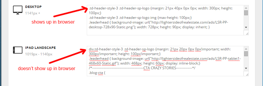
CSS entered into either “Tablet” CSS areas in the theme panel simply isn’t being recognized or reported by the browser.
That’s the problem I’m having.
I’m thinking it’s something that can’t be troubleshot from the browser. I can give credentials if need be.
 Bogdan B.
 Hello Hannah,
It is fairly easy to do:
1) Unfortunately there is no option for that in the theme but you can stop the slider pagination by editing the theme files like so: http://screencast.com/t/gDUPtKnnQdE . Simply change the value from true to false and you’re done.
2) The easiest method is with CSS You can use this code to achieve this effect:
 .td-gallery-slide-copywrite{

opacity:0;

}

.td-slide-galery-figure:hover .td-gallery-slide-copywrite{

opacity:1

}
Simply add the code in the theme panel – custom css
Thank you!
Bogdan B. Hello,
This is a default behavior of the theme to adjust the title to the tablet portrait and mobile version. So under 1018 pixels it will resize your header. In order to change this behavior you need to use CSS:
@media (max-width: 1018px){

.td-post-template-default .td-post-header header .entry-title {

    font-size: 18px!important;

    line-height: 26px!important;

}

}
Thank you!
Bogdan B. Hi,
If the problem is still there, it can be caused by the page speed. CSS loads in cascades by default so if the load speed is realy slow you will see every step of the cascading styles. You can try to improve the pagespeed by following this topic: https://forum.tagdiv.com/how-to-make-the-site-faster/
You can also check to see if a plugin does not slow down your website, or you can check your server configuration.
The best way to eliminate this effect is still to use the style.css and create a back-up of it so it will not be lost in an update.
I hope this helps.
Thank you!
 navi88
 Hi Bogdan,
Ok, but when I disable that plugin it still loads slow. I think you have implemented custom css in wrong position. Is there another solution to this? I do not have to use speed booster plugin. But I don’t want to write to style.css because when I upgrade theme, my css settings will be gone.
Bogdan B. Bogdan B. Hello,
This is a side-effect of the TD speed booster plugin. What this plugin does is move css and js to the footer of the page so they will be loaded last and improve site speed.This is a known issue with speedbooster and is on our list of fixes for the near future.
As a workaround you can make your color changes directly in the style.css file.
Thank you!
navi88 Hi Bogdan,
Thx for reply.
Yes, I’ve tried to do it like that, but I have speed problems with css loading. It loads default color first, then it loads new color. I’ve opened new thread regarding this issue.
Can you please check this? It’s a major issue for any custom css that I insert.
Regards,
Ivan
Bogdan B. Hello,
The trending now block title is affected by the headers background color : http://screencast.com/t/g1kLqw00R
This option will change all headers. If you want to target just the trending now title you will have to use custom css:
.td-trending-now-title {

    background-color: red;}
Thank you!
navi88When I put in custom css in the backend, in the fields designated for that, they load in the front end, but there is problem with speed. The theme first load from it’s style.css then it loads from backend. I think theme has custom css wrongly implemented. Can you please check this?
example:
In custom css field i put h1 {color:red} and it loads color black first then red 3 seconds later.
Bogdan B. Hello,
1) Please send an email at contact@tagdiv.com and provide your envato key and the username you used to buy the theme.
2) The tabs were modified so the default color (grey) would keep the style of the theme. any other color except grey will use the visual composer styling. If you want the look of the grey style but with different colors, you can use css to change them:
.vc_tta-container .vc_tta-color-grey.vc_tta-tabs-position-top.vc_tta-style-classic .vc_tta-tabs-container .vc_tta-tab > a{

background-color:black;

color:white;

border:1px solid white;

}
result: http://screencast.com/t/upOiuewDkz3
3) If you create your sidebar in visual composer it is different from posts. You need to add an extra class to the row: https://forum.tagdiv.com/smart-sidebar-2/
4)The hover color for the news ticker is affected by the color set in the theme panel: http://screencast.com/t/jkS3x0wJKTB . You can either change it from the theme panel or use custom css to keep your style and only affect the news ticker.
.td-trending-now-title, .td-trending-now-wrapper:hover .td-trending-now-title{

background-color:#1e73be!important;

}
Thank you!
Bogdan B. Hello,
I tried your code on my end and it applies. If i edit your website the css applies also: http://screencast.com/t/42EdAyKx
Maybe something on your end requires a more specific approach.
Please use your code like this:
div.td-header-style-3 .td-header-sp-logo{

margin: 21px 20px 0px 0px!important;

width: 300px!important;

height: 100px!important;

}
Thank you!
 Andrei L.
 Hi
Try this css in theme panel > custom css, the result should be like here: http://screencast.com/t/wHhihENgW
.page-id-29 .widget .bbp-submit-wrapper{

width:282px;

}

.page-id-29 .apsl-login-networks, .theme-4 .apsl-icon-block.icon-twitter, .theme-4 .apsl-icon-block.icon-facebook{

width: 205px!important;

display:block

}
Thanks!
 Alin [tagDiv]
 Hi,
I have checked your site again and the css resources are not loaded anymore in the footer. I’m not sure what you did as they were loaded in the footer yesterday.
I suggest to get someone to help you with this, as it is not so easy and we cannot offer custom work sorry! The speed booster plugin is optional so if you don’t need it you can disable it.
Thanks!
Bogdan B. Hello John,
It actually depends on the version of the theme you are updating from. If you update from version 4 to 6, then all customization will be lost. If you altered the theme files, then even if you already had version 6 and update to 6.5.1 they will still be replaced in the new version if you did not use a child theme. The ‘update script’ you mentioned is only for updating from version 4 of the theme so I assume you have this version if you mentioned the scrpit. In this case, unfortunately all your customization will not work anymore.
Newspaper 6 is a whole new theme so an update from 4 to 6 may cause the same issues as switching to another theme (but we did try to maintain compatibility where ever possible).
Always make a full backup of your current installation – https://codex.wordpress.org/WordPress_Backups and then do a clean update, meaning that we recommend that you delete the old version of the theme before uploading the new one – https://forum.tagdiv.com/how-to-update-the-theme-2/ update also the plugins that come with the theme files from the /plugins folder. In the “how to update” guide is specified that you will have to run the script that will import from database your settings.
The shortcodes have been changed so old ones will not work anymore. Please note that old files customization or custom css will not work with the new version and you will have to adjust or re-add them.
Bottom line is that newspaper 6 is a whole new theme built from scratch.
The child theme is recommended for custom modifications but if the files you alter are going to be changed in a future update, you will have to check which file was modified by checking the changelog for each update and then adjust the file in your child theme if needed.
Hope this helps!
Thank you!
Alin [tagDiv] Hi,
You will need custom modifications for this. I will provide an example for desktop screens as the thumbnails are to small on tablets and phones and it will not look fine. If you need this also for those devices I suggest to get a freelancer to help you.
You can add an extra class to the row and use it to target block 15 if you want this only for that page – http://screencast.com/t/gqXHi6ubETDr and use this custom css in Theme Panel > Custom Css – http://screencast.com/t/h6vs0VDn
@media (min-width: 1020px) {

.yourclass .td_block_15 .entry-title {

position: absolute;

top: 35px;

text-align: center;

padding: 3px;

}

.yourclass .td_block_15 .entry-title a {

color: #fff;

font-size: 13px;

}

}
Thanks!
 Catalin
 Hello sejpost,
You must put the code within Theme panel->Custom CSS area like that: http://screencast.com/t/asPnUiCt7
Thanks.
Catalin Hi ferdyjakal,
You must put the code below within Theme Panel->Custom Css area like this:
http://screencast.com/t/yCPlsueuS
Thanks.
 sejpost
 Where do I go to add the CSS? Is this an editor file within my WP dashboard? If so, do I just put this code anywhere in a certain CSS file?
The CSS file in the parent or child theme?
@media (min-width: 768px){
.menu-item-57 {
display: none;
}
}
—-
I found this in my parent theme CSS:
}
@media (min-width: 1019px) and (max-width: 1140px) {
.td-block-row [class*=”td-block-span”] {
padding-right: 20px;
padding-left: 20px;
}
}
@media (min-width: 768px) and (max-width: 1018px) {
.td-block-row [class*=”td-block-span”] {
padding-right: 14px;
padding-left: 14px;
}
}
@media (max-width: 767px) {
.td-block-row [class*=”td-block-span”] {
padding-right: 0;
padding-left: 0;
}
}
.td-block-span4 {
/* 1/3 – used when the block is on td-3-col */
width: 33.33333333%;
}
.td-block-span6 {
/* half – used when the block is on td-2-col */
width: 50%;
}
/* responsive landscape tablet */
@media (min-width: 1019px) and (max-width: 1140px) {
lighterside Thanks Bogdan, and I understand all that. I’m using the same inspector in chrome and not seeing my code.
Those examples you screencapped are Newspaper CSS entries, not mine.
If you look at my code in my original post, it is different than what’s on your screenshots.
Can you please re-read and let me know?
Thank you sir.
 Tommy
Tommy HAllo,
sorry for the delay.
To whom it may concern, the problem was solved adding this css
.iosSlider .entry-thumb {
max-width: none;
}
Best regards

