
- NewspaperThe Newspaper Mobile Theme: Introduction
- NewspaperThe Mobile Theme
- NewsmagMain menu
- NewspaperMain Menu
- NewspaperHow to Add a Logo in Newspaper
- NewspaperBig Grid Flex Settings
- NewspaperHeader Builder
- NewsmagIntroduction
- NewsmagLogo & Favicon
- NewsmagBackground introduction
- NewsmagTheme colors introduction
- TutorialsWhat is Ajax preloading?
- NewspaperFont Customization
- NewspaperTheme Colors Introduction
- NewspaperBackground Introduction
- NewspaperHow to Install Newspaper via FTP
- NewspaperHow to Install Newspaper via WordPress
 Anamaria
 Hello,
Have you created a modal for the mobile menu? If yes, you can add the login element to the page there.
Thank you!
 theheritagelab
Hello,
I have added the header-login (popup one) to my site’s header and on the desktop it works fine.
How can I get it to appear on mobile screens (I’ve turned off mobile menu from theme panel) in which am using only the header logo + a hamburger icon to open a custom list of topics (via page ID modal).
 Seczen
Hello,
every time I’m choosing a menu for a mobile menu element and click save, my selection is not saved and the list of available menus returns to –select menu- state instead of showing the menu I’ve chosen. Is it a bug or am I making some kind of mistake?
 scohen
Hello, photos are not showing and header/menu isn’t responding on mobile but everything looks fine when I am in the editor in tagdiv composer. This just started happening. How can i fix this? thank you
 SEQU3R
Hello. I have a problem with newspaper. The site doesn’t look alike on view on pc when editing homepage. It looks like it is loading from site defaults, from newspaper theme and the tagdiv doesn’t change anything on mobile. I don’t use JetPack, so this isn’t a problem.
Plugins I use:
– All in one seo
– AMP
– Classic editor
– Elementor
– Essential addons for elementor
– EWWW Image optimizer
– Copy and delete posts
– max mega menu
– nitropack
– premium addons for elementor
– royal elementor addons
– simple local avatars
– sitekit google
– snippet shortcodes
– tagdiv cloud library
– tagdiv composer
– tagdiv mobile theme
– tagdiv newsletter
– tagdiv opt-in builder
– tagdiv shop
– tagdiv social counter
– tagdiv standard pack
– wp statistics
– translatepress
– wpcode lite
– wpdatatables
I tried to on/off NitroPack, but still this didn’t worked.
URL of the site: https://superiongg.pl
 Tommycreative
 Good morning, thank you for your support.
On desktop the problem seems not to have reoccurred, while on mobile some pages are still not displaying correctly, with the mobile theme setting I built.
In addition there are also a couple of display issues:
Within the article, where there is a gallery, the second photo in the gallery never displays:
https://prnt.sc/8A-rpSYjO5yl
In the main menu on desktop, I entered the megamenu display but for the sports and accessories section, but again there is a display problem. A part of the menu is displayed with a white stripe at the top (for example in sports the word Dakar is also at the top):
https://prnt.sc/CpoktJxRngTx
Is it possible to fix these display problems please?
Thank you very much.
Thomas
 nguyenxuan
 Oh, i just discovered Fixed TOC plugin on my website that display error too.
The cause is a conflict with Modal popup (mobile menu).
I tried changing another header, the result was that both TOC and the stars displayed normally.
-
This reply was modified 1 year by
nguyenxuan.
nguyenxuan Thanks for your quick response.
I checked again, sure, Schema Pro plugin settings only for posts. And modal page settings not any star.
Post: https://locphatland.com/son-tien-view/ -> have 64 star Reviews -> on mobile, below search bar (menu) there are 64
Other post: https://locphatland.com/ky-gui-homyland-riverside/ -> have 1 star Reviews -> below search bar there is 1
=> So, “maybe you can exclude that from appearing or use some CSS code to hide it only from there” please help me that.
nguyenxuanHello i am using header cali.
And the plugin Schema Pro (by Brainstorm Force) sticks stars on posts.
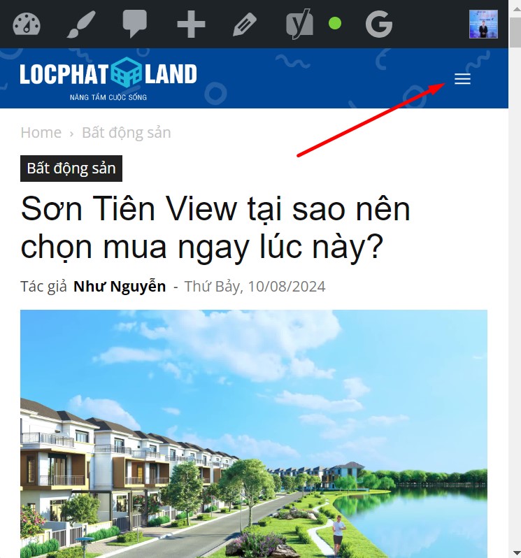
However, on the mobile, when entering any article, for example: https://locphatland.com/son-tien-view/
You click on the menu icon, stars appear below the search bar (I’ve never seen this before with a regular menu and header). How to turn off this display, without turning off the display of post stars?
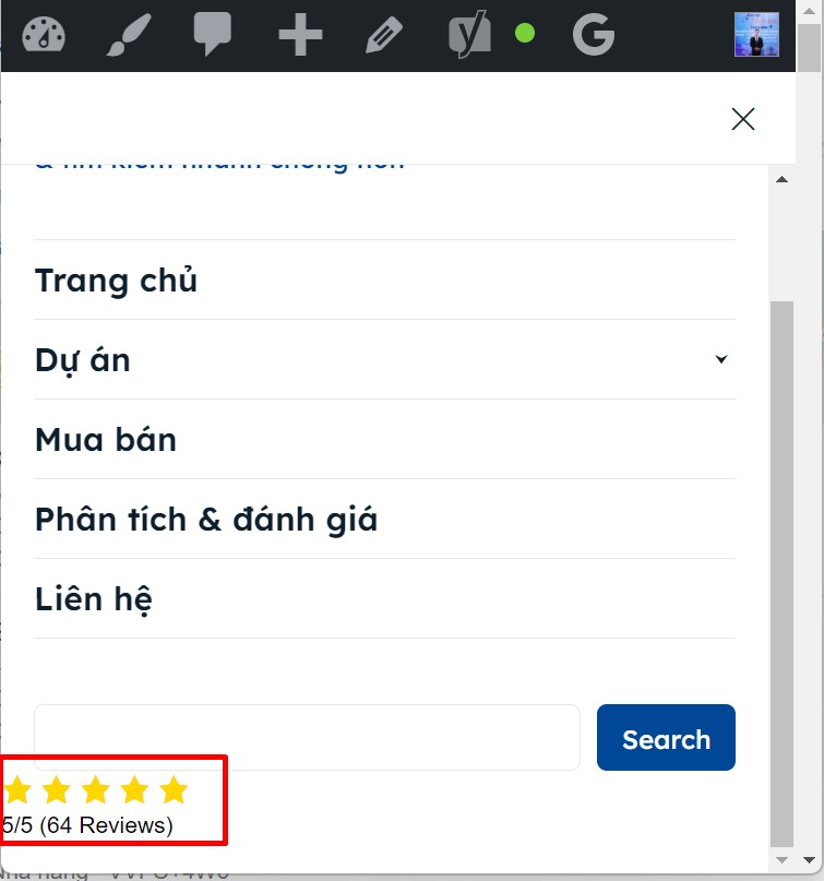
Thanks in advance 🙂
Anamaria Hello Paolo,
Normally, for all social icons is added the name https://i.imgur.com/8aREMDY.png
The social icons from the mobile menu come from the Theme Panel -> Social/Apis -> Social Networks -> https://i.imgur.com/kKYIECB.png. Remove/edit them as needed.
Flex block shows the image like a background image, not using the parameter img and this one wouldn’t need a description.
Thank you!
 museooggi
 Hi Anamaria,
thank you for the prompt reply and the assistance!
I followed your recommendation and used the live header search, problem solved!
For social icons, on reading your screenshot I eventually realized my problem is in the social icons that appear in the mobile menu (clicking on the “sandwich” top-left), as next to facebook and linkedin there there is also the email icon/link which is not in the social icons in the footer desktop version. I am looking in the theme/composer settings but I can’t find from where can I manage that menu. Of course I don’t mean the menu itself, I am trying to reach and manage those icons that appear just above the menu.
Regarding the other errors, I understand what you said regarding the design of the theme, although with the only addition of a free plugin I am using it’s scoring pretty high, just below the pass threshold.
Is there any way I can add some code to flex blocks so that the image too has a description attached to the link?
Again thank you so much for the help!
Paolo
 Samilyjones
Add items to the mobile menu. We have added more pages to the mobile menu but they are not displayed. We do not know where the problem is.
The web is: https://www.diarioelcanal.com/
Best Regards
Samuel Soler
 davtas
 When I click on the hamburger menu “More” in the mobile view it does not show me the menu items. Seems like it is inactive. Please tell me how to solve this. It was displayed properly before. But suddenly this was happened from the last night. I could now see the menu items after clicking hamburger menu in the mobile view.
 petar777
 Hello,
I recorded a video to show you what I mean:
1. https://www.loom.com/share/b2f65cbb47ac446fafe8361ea93bb3af?sid=e8f728a8-6d98-4ef2-bcb5-6bdf56c456e1 here you can see the layout shift with the preload option and drop items in more enabled.
2. https://www.loom.com/share/b9e13bcb47b449bf886247fdb88ae311?sid=b44a883d-a10e-4137-9ff6-f55063044525 here you can see the website loading without a layout shift without drop items in more and preload options enabled.
My question is – is there a way to fix that issue with the layout shift, if not – how can I edit the breakpoints to show the mobile menu earlier?
 thebackbenchers
 Thank you so much for guiding, i am not a technical person but your screenshot helped me, I fixed the mobile hear now it’s looking awesome and exactlylike what I wanted, what I did is in Manager > I imported Defaut PRO which made the mobile header just like what I wanted,
BUT it also changed the Desktop version of my Metropolitan to Default PRO header, which is really what I don’t want. See here – https://prnt.sc/li4OR-8wYvi2
This is my humble request to you to fix this, I tried almost hundred times but I failed that is why I am asking you to help me.
I need the desktop & tablet version to have metropolitan header and mobile menu to Default PRO main demo header.
Please help me –
Anamaria Hello,
You can copy the logo from the desktop with right-click and paste it on the mobile header and check if the issue persists.
Also, please provide the link to your website and some screenshots.
Thank you!
 Bettina
 Hello Bhanu Srivastav!
Edit the homepage with the tagdiv Composer, click on the mobile viewport: https://app.screencast.com/JBjQfi2ZDQYb0
You can drag & drop the elements there in the columns as you like: https://app.screencast.com/EFQi0bSEe2XIo and apply those settings from the screenshots provided. There you should write “auto”. Or you can set for each column the percentage you would like, for example: 25%, 50%, 25%. Please note that you should apply the change to the mobile menu sticky: https://app.screencast.com/ZifloqbIxB9gz or you can copy-paste the entire row. Right-click on the row already modified -> copy, go to the mobile menu sticky, click on the row word, right-click paste after. Delete the first row.
Thank you!
thebackbenchersHi,
Greetings of the Day!
I need a help from you, I installed newspaper theme and loved the “Metropolitan” premade site, I imported it and I am loving it, it’s too beautiful. Thank you so much for making such a wonderful theme 🙂
But on mobile the header is looking abrupt. The position of elements are looking bad,
Please provide me a CSS code of something to fix following things from this – https://prnt.sc/EJroFrPrmgKv
1) Hamburger menu in left
2) Search in right
3) Logo in middle
Exactly like main demo of newspaper i need, like this : https://prnt.sc/MbNM2UtQPupS
Please help me, it will be very kind of you.
Thanks and have a wonderful day!
Regards
Bhanu Srivastav
 random123
 I understand that this isn’t part of the support as it’s part of the services you sell, but I’d still have liked to have some documentation related to the litespeed cache extension.
As for your video on the CSS analyzer, I don’t have it in my menu. Is this normal?
I don’t understand why when I disable the cache, the speed score is so bad. It’s below 70. How can this be? Why is the mobile theme so slow?
thank you
Anamaria Hello,
Please check this topic https://forum.tagdiv.com/topic/how-to-edit-menu-login-and-mobile-menu-in-metropolitan-pro/
Thank you!
 Ericky
Hello, I have activated the improve CSS delivery and remove unused CSS features using WP Rocket, but I noticed that some things are broken in the system. So I want to exclude these broken things, but I don’t know what to write in the exclusion field. I would be very happy if you help me.
First of all, the menu icons at the top of my site cannot be clicked on mobile. Also, the comments section can be broken from time to time on both desktop and mobile.
In addition, when using the site on mobile, something white can appear and disappear just below the header area. So there is also an intervention in the header area.
 nangluv
Hi there,
I just wanna to create mobile menu with login to other site button but I dont know how to do it.
Anyone can help me?
Thanks so much !
site: https://blog.lazo.vn/
https://ibb.co/r7sJxgk

 gidantrip
Hello.
I use tagdiv custom header.
On desktop is all ok, on mobile I need to show a simple text above logo but it appears only logo and hambuger menu.
its possibile to do that?
 danilloleite
 I liked it, thank you for the video, but I think you didn’t understand my question. I’m using your Mobile plugin, which disables almost everything, including shortcodes, and on some specific pages I need them. How do I prevent the Mobile plugin from showing these specific pages? If I’m using WordPress blocks, there’s a menu on the right side with a button from you, “Don’t use the Mobile plugin for this page.” Okay? It works, but where is this option in the Classic Editor or in your Page Builder?
 Calin
Calin Hmm, it looks that you are using the mobile theme plugin and this was why the general code was not apply.
From what I se now you’ll need just one small edit, please add this css :
you can add the width in this code
.td-main-menu-logo img {

max-height: 100px;

bottom: unset;

width: 100%;

}

#td-outer-wrap .td-header-wrap {

    height: 100px;

}
This should make the logo look the same as on desktop.


