- NewspaperThe Newspaper Mobile Theme: Introduction
- NewspaperThe Mobile Theme
- NewspaperModules Builder in Newspaper Theme
- NewspaperFilters and sorting for taxonomies
- NewspaperHow to Add a Logo in Newspaper
- NewspaperBig Grid Flex Settings
- NewspaperHeader Builder
- NewspapertagDiv AMP Plugin Tutorial
- TutorialsFrom WPBakery to tagDiv Composer
- NewsmagSmart list ads
- NewspaperNewspaper theme documentation
- NewspaperBest Of Forums
- NewspaperCache plugin – install and configure
- NewsmagIntroduction
- NewsmagMain menu
- NewsmagLogo & Favicon
- NewsmagHeader ads
- NewsmagSmart sidebar
- NewsmagSharing buttons
- NewsmagCategory tag on modules/blocks
 a123gfh
 I followed your instructions exactly but it still doesn’t work. I can email the admin account for you to check. You can log in with your phone to detect the error (domain https://quanphanbon.com)
My mistake was: using my iPhone to click on the Menu, nothing appeared and it seemed to freeze. but that menu still appears on my computer when I try to switch to mobile editor.
 Bettina
 Hello @dweb35 !
We have 3 options for mobile versions that you can use:
1. Responsive version: A responsive version of your website looks similar to the desktop version. TagDiv Composer is used to edit the page.Click on the mobile viewport: https://www.screencast.com/t/XDQJedlggSB. There, you can see your mobile version and edit or adjust the elements to look better.
2. Mobile pages: https://tagdiv.com/newspaper-10-3-7-update-brings-customizable-and-fast-mobile-pages
3. Mobile theme plugin: The Mobile Theme is a performance-optimized theme included in the main Newspaper theme that only loads on mobile devices. It comes with its own templates and designs for pages, posts, categories, etc., so your current templates from the desktop theme will get converted to the mobile theme layout. Please see https://forum.tagdiv.com/the-mobile-theme/ and https://forum.tagdiv.com/mobile-theme-introduction/ for more information.
A full explanation is here: https://www.youtube.com/watch?v=SpGkOnJeNZY
If you need to use mobile version 1 or 2, then you need to uninstall the Mobile Theme plugin and AMP.
If you use cloud templates, please edit your homepage with TagDiv Composer, scroll till footer, click on footer zone and you can edit it.
If you use the mobile theme plugin, then check in the Newspaper-> Theme panel-> Translations-> Translations and replace the words on the right side.
Thank you!
 TransportOnline
 Solved! By removing the plugin for mobile theme.
 thayashi
 Hello, I did these steps and deactivated all the plugins and it didn’t change much, it’s still the same, don’t you have support that can check directly? because I don’t understand why this only happens on mobile
TransportOnlineI am struggling now for days with this issue. I have created a homepage with tagDiv. Watched it in mobile version,. saved it but when I go to the mobile version of the website is totaly different from what I designed.
Also I can’t change the blocks that do show up in the mobile version.
Also the footer of the mobile version is totaly different from the dekstop version. And I can’t seem to get it right.
What am I doing wrong here?
(testwebsite: test.transport-online.nl)
 dweb35
in the Newspaper theme I created a mobile template with tagDIV composer but I can’t activate it, when I see the mobile version it doesn’t match the one I created. I would like to see my desktop version on mobile too. Also, how can I change the words “About us” and “follows us” in the mobile footer? Thank you
Bettina Hello @drjqool !
I’ve checked your website, and the mobile theme layout does not load anymore.
I can see that you solved the issue, right?
Thank you!
Bettina Hello @Hector1 !
Please deactivate, delete, and reinstall the tagDiv mobile theme from Newspaper plugins and clear all cache. If the problem is still there, then make a test and deactivate ALL plugins except tagDiv ones, also if you are using a cache plugin, deactivate it, clear all cache and try again.
Let me know the results!
Thank you!
 drjqool
My site URL is jimmybydesign.com.
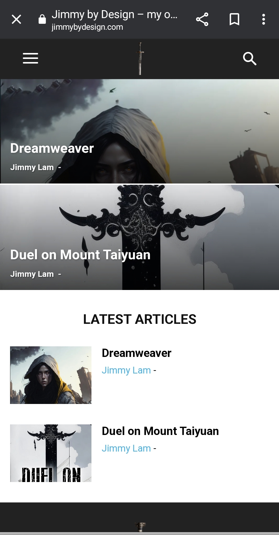
My problem is even after I set up my mobile homepage, what loads is something entirely different and I don’t know what I need to do to get this to load properly. Below are some screenshots of what I’m talking about.
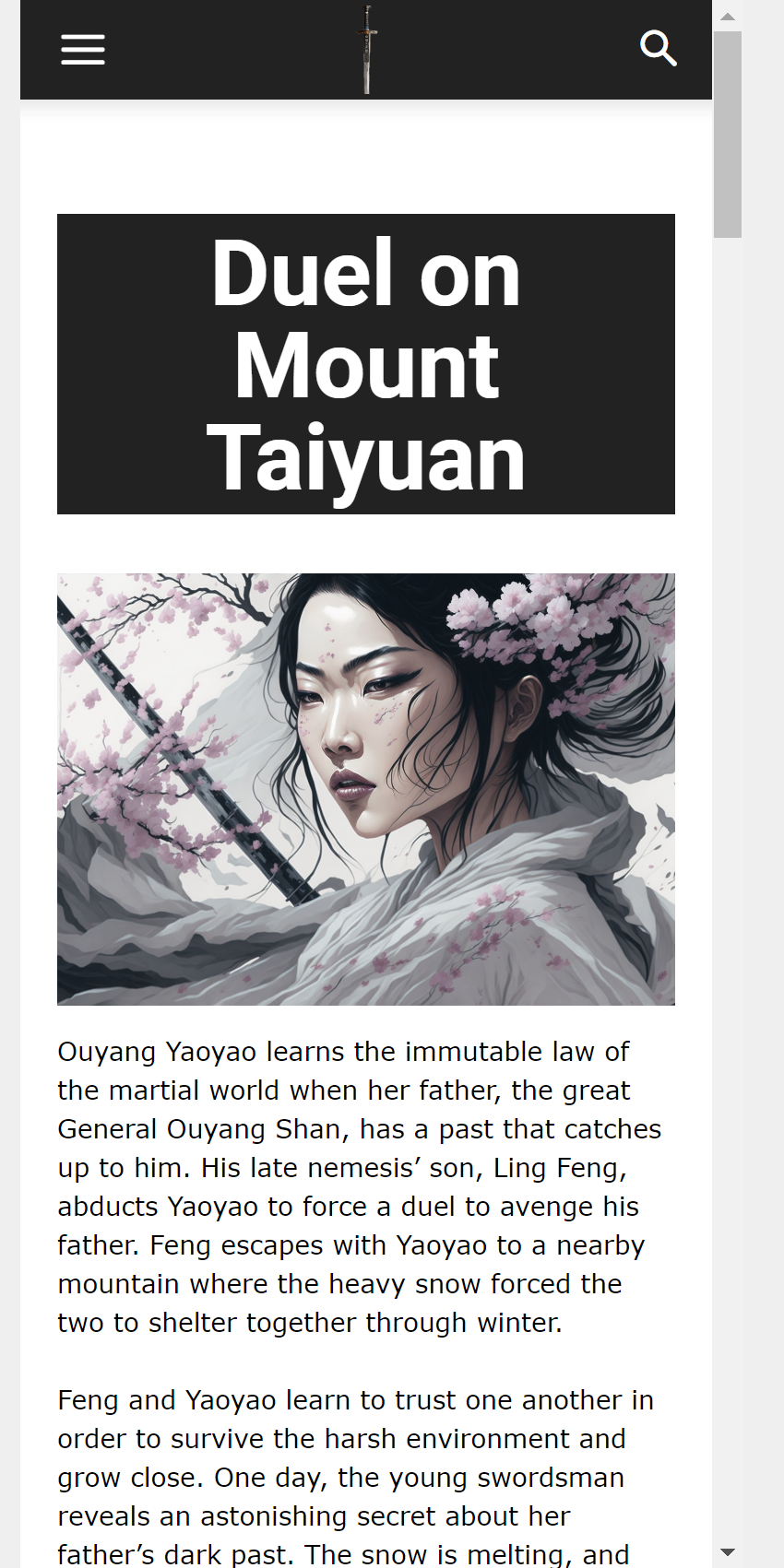
This is a screen shot of how the mobile homepage should look: https://jimmybydesign.com/wp-content/uploads/2023/12/chrome_2023-12-06_18-00-51.png
This is how it turns out if visiting the site via mobile: https://jimmybydesign.com/wp-content/uploads/2023/12/Screenshot_20231206_180206_Chrome.jpg
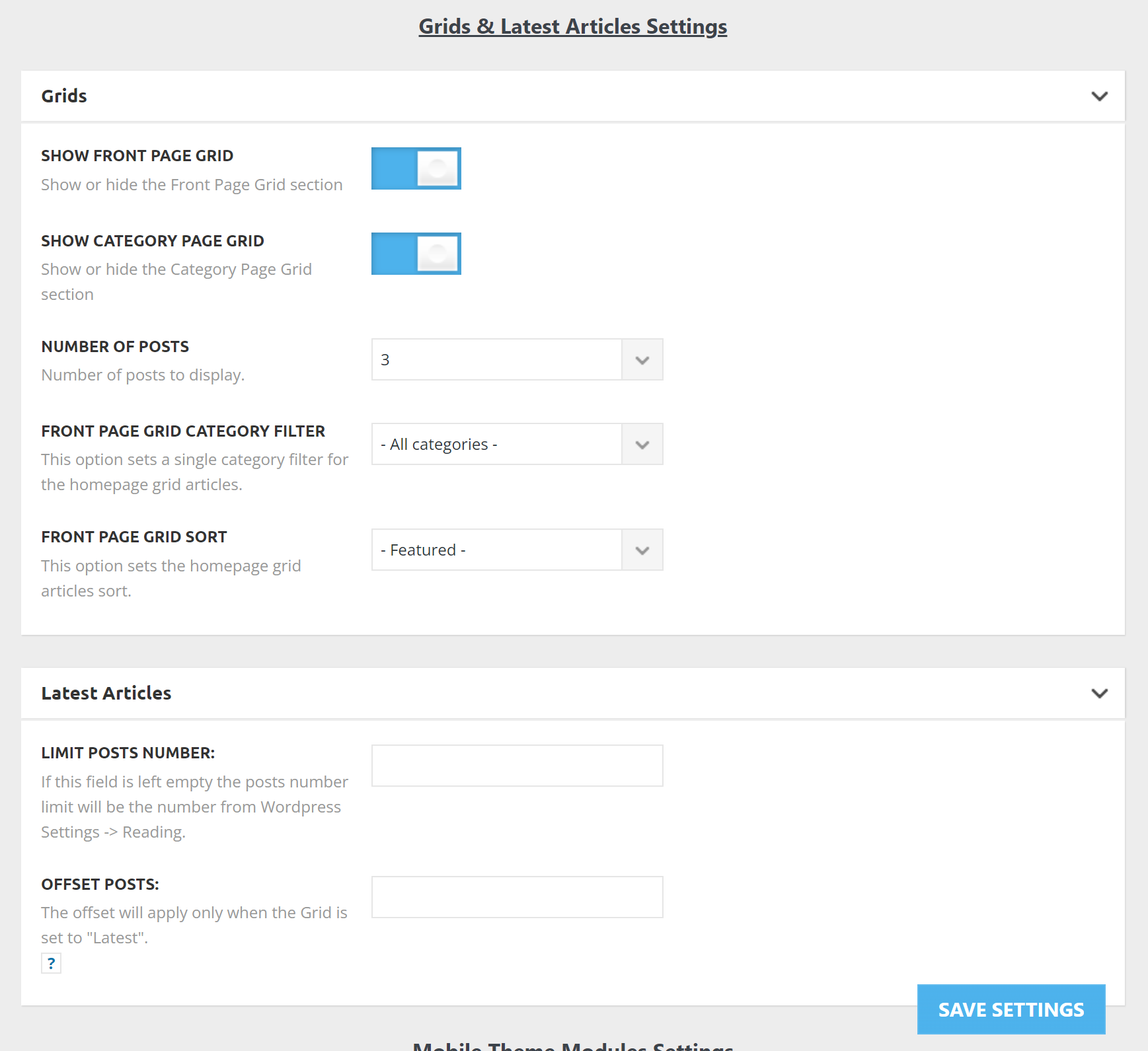
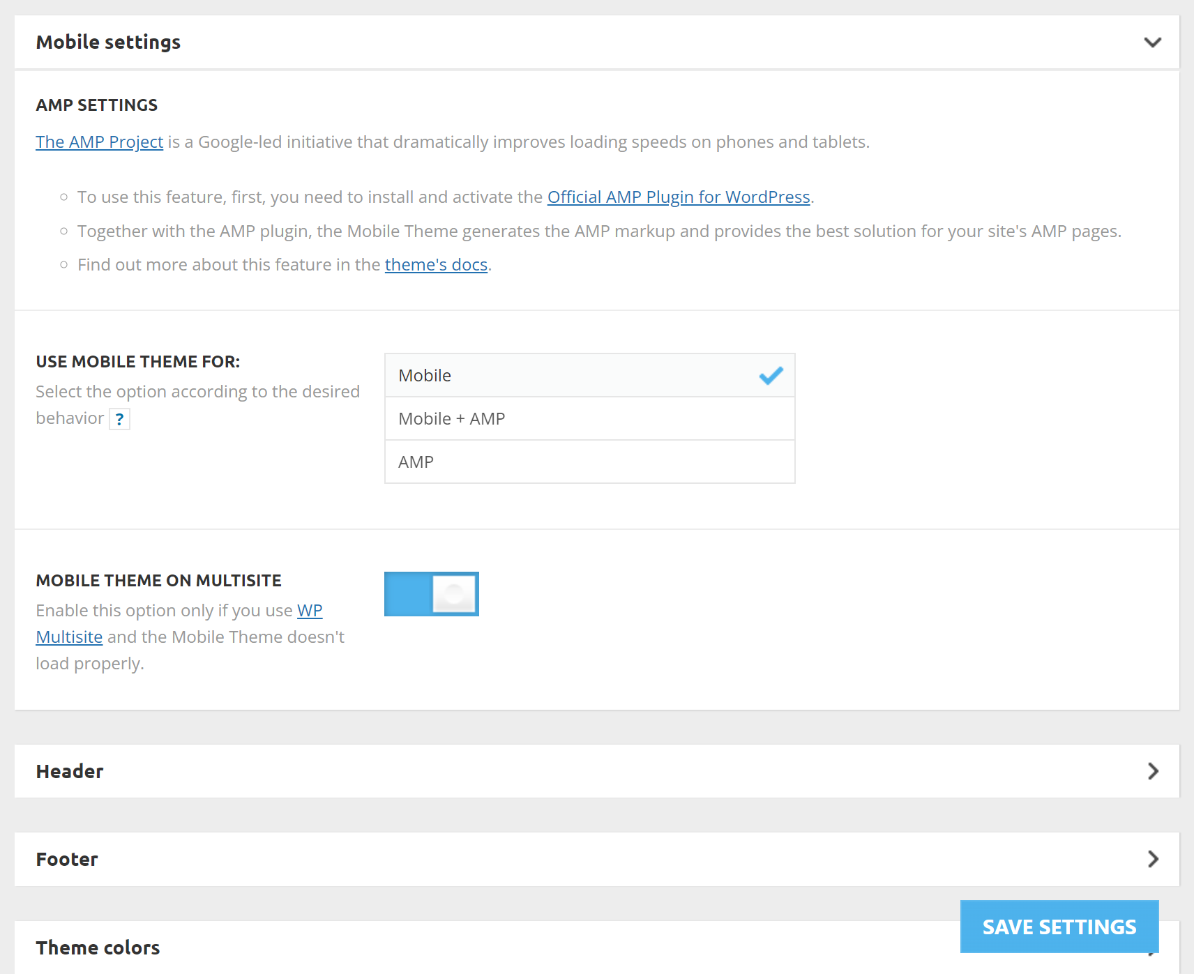
These are my mobile Newspaper theme panel settings:
https://jimmybydesign.com/wp-content/uploads/2023/12/chrome_2023-12-06_18-06-54.png
https://jimmybydesign.com/wp-content/uploads/2023/12/chrome_2023-12-06_18-07-55.png (FYI on this is I’ve set the Mobile theme on multi-site on/off but it doesn’t seem to affect anything. My mobile phone still loads that weird screenshot instead of the actual mobile version of the site.
Proof the mobile homepage is set up: https://jimmybydesign.com/wp-content/uploads/2023/12/chrome_2023-12-06_18-09-40.png
Please help!
 Hector1
After setting up the website, any update to the text, menu, or images completely disconfigures the website in both the web and mobile versions.
The website was finished and put online, however, no matter how small the change in the text, for example, the website is disconfigured, the banners appear out of order, the home areas are all mixed up
I’ve already increased the php memory and I’m also using a plugin to clear the cache
Bettina Hello @faridullah !
Please deactivate, delete, and reinstall the tagDiv mobile theme from Newspaper plugins and clear all cache. Check out this article: https://kinsta.com/knowledgebase/there-has-been-a-critical-error-on-your-website/
Thank you!
 faridullah
Some posts on my site (https://solution8tech.com) do not load and show the error “There has been a critical error on this website.” for example, the post https://solution8tech.com/google-photos-locked-folder-backing-up/. It is pertinent to mention here that there was no error when the posts were published, all posts were loading properly. I have removed the theme and plugins and re-installed them, but they are all in vain. The affected posts load properly on mobile devices
 c386
c386 Hi Calin,
Thank you for the quick response. I’m not keen on creating separate mobile pages; a single responsive page is so much easier to maintain.
Appreciate the suggestion nonetheless and thank you for pointing out the left bar that highlights which options can be edited per device. That’s a very useful touch.
 Calin
Calin Hello Evie,
When the mobile humburgar menu is touched an extra class should be set on the body – https://i.imgur.com/m0YkKkD.png and this should make the menu visible, now the problem can be related to the ios that the mentioned class to no longer be added.
Unfortunately I do not have an ios device to test it and now on simulators seems to work correctly.
Thank you!
 Anamaria
 Hi,
Using our theme you can choose from 3 mobile versions
-> mobile responsive => https://www.screencast.com/t/oJ2ShOp47
-> mobile theme plugin => https://forum.tagdiv.com/the-mobile-theme/
-> mobile page => https://tagdiv.com/newspaper-10-3-7-update-brings-customizable-and-fast-mobile-pages/
If you created the mobile pages with tagDiv Composer, then when you install the Mobile Theme plugin, your pages will be overwritten by the plugin (the mobile theme comes with its templates for page, post, category, etc so your current templates from the desktop theme will get converted to the mobile theme layout, the page content is made without builders in mobile editor => https://www.screencast.com/t/xbgZG8kH also, the options that are provided to edit the mobile theme version are limited (this keeps the things simple)).
This is a video about Responsive Newspaper Theme, AMP & Mobile Theme, Mobile Pages & Templates -> https://www.youtube.com/watch?v=SpGkOnJeNZY
So, the mobile responsive is what you see when that you select the viewport on phone => https://www.screencast.com/t/matV17hH, so some settings may apply for each viewport(where is the border blue), and others are not(where the border is black).
The mobile page has the mobile templates from Cloud Library => https://www.screencast.com/t/YCcZ8rL8
The Mobile responsive version of the theme and the mobile page editor can be edit with tagDiv Composer, the mobile theme plugin cannot.
For example, you can have the mobile theme plugin activated and use the mobile page/mobile responsive version for the homepage/pages, but for the categories pages/404 page, you can’t use the mobile page/mobile responsive version if you have the mobile theme plugin activated.
So, if you want to design the pages with tagDiv Composer, you can use the mobile page or mobile responsive version.
Thank you!
Calin Hi c386,
There was a different option added, now you can create mobile pages and mobile templates using tagDiv Composer and you can use the same content/layout or you can set a different content/layout – https://tagdiv.com/newspaper-10-3-7-update-brings-customizable-and-fast-mobile-pages/ also the options that can be edited per devices have a left bar like this one – https://i.imgur.com/ZDYeyLa.png
Thank you!
 platmm
Hello there! I know this has come up a few times here but I’m also getting an issue with the mobile menu. I’m using the “Reel News Pro” mobile header but it also shows up in “influencer” – anyone where after the hamburger menu is pressed, the screen shrinks, and then the menu appears.
It works perfectly on an Android and Mac Chrome but only shrinks the menu and does not display the menu in Mac Safari, Mac iOS (Safari and Chrome). The “Search” menu works fine everywhere where the page shrinks and the menu appears on top. Same situation under incognito.
php memories are 300M and all green in the Theme Panel. Any guidance would be helpful!
Thanks for your help!
Evie
 nitin sethi
Hello,
I had a query regarding the Mobile page template. So, the theme is already responsive and would fit properly on mobile devices. Is there a difference between the two in terms of page weight OR is it just another template made for mobile.
Thank You.
 meri
meriHi,
Is it possible to forbid the ads from showing on a specific post?
In other words, I want to exclude the page https://www.mondeoz.com/equipement-voyage/idee-de-cadeau-voyage/ from showing ads (because these ads are pointing to this page so it doesn’t make sense to show them on it).
How could I do that for desktop + mobile theme?
Thanks
c386 Apologies for bumping an old thread, but was this feature ever added?
On a Flex Block, for example, it would be handy to be able to specify a different ‘limit post number’ for desktop and mobile.
Bettina Hello Rob!
We have 3 options for mobile versions that you can use:
1. Responsive version: A responsive version of your website looks similar to the desktop version. TagDiv Composer is used to edit the page.Click on the mobile viewport: https://www.screencast.com/t/XDQJedlggSB. There, you can see your mobile version and edit or adjust the elements to look better.
2. Mobile pages: https://tagdiv.com/newspaper-10-3-7-update-brings-customizable-and-fast-mobile-pages
3. Mobile theme plugin: The Mobile Theme is a performance-optimized theme included in the main Newspaper theme that only loads on mobile devices. It comes with its own templates and designs for pages, posts, categories, etc., so your current templates from the desktop theme will get converted to the mobile theme layout. Please see https://forum.tagdiv.com/the-mobile-theme/ and https://forum.tagdiv.com/mobile-theme-introduction/ for more information.
A full explanation is here: https://www.youtube.com/watch?v=SpGkOnJeNZY
If you need to use mobile version 1 or 2, then you need to uninstall the Mobile Theme plugin and AMP.
Thank you!
 hadharm
 Actually, I have 2 column rows in one row already. Inside the right columns is another inner row with 3 columns for the icon boxes. But it seems there is no way out than to hide the right column with 3 inner column for mobile and add new inner column for mobile.
Thanks though
 bananaj
We often have many categories assigned to posts, and on mobile the category tags at the top form 2, 3 or 4 rows and take up much space.
Would be nice to be able to hide them in a drop down list or scroll horizontally when they are more than one row.
thanks
/J
 iamramgarhia
 Thank you for the answer i want to know how can i change text latest article in mobile theme please see the screenshot
https://prnt.sc/cN2WOvpiEnWh
Bettina Hello @iamramgarhia !
We have 3 options for mobile versions that you can use:
1. Responsive version: A responsive version of your website looks similar to the desktop version. TagDiv Composer is used to edit the page.Click on the mobile viewport: https://www.screencast.com/t/XDQJedlggSB. There, you can see your mobile version and edit or adjust the elements to look better.
2. Mobile pages: https://tagdiv.com/newspaper-10-3-7-update-brings-customizable-and-fast-mobile-pages
3. Mobile theme plugin: The Mobile Theme is a performance-optimized theme included in the main Newspaper theme that only loads on mobile devices. It comes with its own templates and designs for pages, posts, categories, etc., so your current templates from the desktop theme will get converted to the mobile theme layout. Please see https://forum.tagdiv.com/the-mobile-theme/ and https://forum.tagdiv.com/mobile-theme-introduction/ for more information.
A full explanation is here: https://www.youtube.com/watch?v=SpGkOnJeNZY
If you need to use mobile version 1 or 2, then you need to uninstall the Mobile Theme plugin and AMP.
From my point of view, if you don’t use the Mobile Theme plugin, then there is no reason or benefit to AMP. Unfortunately, AMP is not working with the cloud templates because the AMP’s layout is not fully customized.
The AMP version works best with default templates and not cloud templates. That’s why we integrated it with the Mobile theme plugin.
The feedback from our clients about AMP was negative and it is not used anymore, that’s why we didn’t add more customization options.
Thank you for understanding!