- NewspaperThe Newspaper Mobile Theme: Introduction
- NewspaperThe Mobile Theme
- NewspaperModules Builder in Newspaper Theme
- NewspaperFilters and sorting for taxonomies
- NewspaperHow to Add a Logo in Newspaper
- NewspaperBig Grid Flex Settings
- NewspaperHeader Builder
- NewspapertagDiv AMP Plugin Tutorial
- TutorialsFrom WPBakery to tagDiv Composer
- NewsmagSmart list ads
- NewspaperNewspaper theme documentation
- NewspaperBest Of Forums
- NewspaperCache plugin – install and configure
- NewsmagIntroduction
- NewsmagMain menu
- NewsmagLogo & Favicon
- NewsmagHeader ads
- NewsmagSmart sidebar
- NewsmagSharing buttons
- NewsmagCategory tag on modules/blocks
 johnu101
 Hi,
How to add Small Author Image mobile theme
Please help me
 Calin
Calin Hi,
This is a new option that was added in the amp plugin, if you want you can use it without problems, also for seo question, I think that you can find some answers in these articles:
-> https://yoast.com/video/ask-yoast-redirect-responsive-pages-to-amp/
-> https://seo-hacker.com/accelerated-mobile-pages-amp-important-implement/
-> https://www.quora.com/Will-redirecting-mobile-visits-to-AMP-pages-boost-my-ranking
Thank you!
Calin Hi,
These options can be remove on amp if you have enable the tagdiv Standard pack -> https://i.imgur.com/9Dmtf4d.png and you disable these options -> https://i.imgur.com/X78TGbY.png after that if you do not use before the tagDiv Standard Pack, then you can disable it again.
Indeed, the infinite scroll option is only for cloud templates, the amp plugin is using the mobile theme plugin and this one is made with standard templates not cloud templates, therefore this option for infinite loading will not work on amp version. Maybe it will be add in the coming updates.
Thank you!
Calin Hi,
I think that there is a misunderstanding, our theme already has this option to have a sticky menu on mobile version, if you are using a responsive version and a standard header, you need to set this option in theme panel -> https://i.imgur.com/bokz53x.png ; or if you are using a cloud header, use tagDiv Composer to edit it, click on manager then enable the sticky menu on mobile, after that click on the menu row and click on composer sidebar on “MOBILE MENU STICKY” then all you need to do is to set the sticky type on “Always” -> https://i.imgur.com/3XoZ8QV.png
Hope this will help you!
 0p1ck
0p1ckI’m using italy repot pro theme. footer is good in homepage, but in single page and categories page, footer change to vertical like in mobile theme. When i edit with tagdiv composer, is normal. Please help me
Sorry for bad english
 jtherieau
I am running WP 5.5, tagDiv Newspaper Version: 10.3.6.1 and Slider Revolution 6.2.17
Upon opening Slider Revolution I see this message:
WordPress 5.5 Important Info
If you updated to WP 5.5, please DON’T SAVE and projects in Slider Revolution or Essential Grid until updating to versions 6.2.18 and 3.0.0 respectively.
Problems observed in Slider Revolution:
1. When clicking the Navigation Options tab, all content on slide disappears. (Content reappears when exiting Navigation Options.)
2. Navigation elements (e.g. Arrows/Bullets) are not functioning. When enabled, there is no list of styles to choose from, nor do any arrows, bullets, etc display at runtime. I am unable to enable more than one at the same time (e.g. arrows AND bullets). When slider is closed and reopened, all settings have been reset to their default: OFF.
3. Device customization (Desktop/Notebook/Tablet/Mobile) is not functioning. Unable to enter any view but Desktop. When any other device is enabled, the previously enabled device is disabled. Thus I cannot customize individual device views.
That’s all I’ve found so far.
This appears to conform with https://www.themepunch.com/faq/wordpress-5-5-important-update-information/
1. Data can be lost when saving projects
A certain deprecated jQuery function in WordPress 5.5 is causing some settings in Slider Revolution and Essential Grid to be set to their default value upon opening the Slider Revolution editor or editing an Essential Grid project.
Don’t save any projects if you updated to WordPress 5.5 but haven’t updated Slider Revolution and Essential Grid yet.
2. Functionality and styling problems in Gutenberg
Furthermore, some functionality in the Gutenberg editor can be broken as a lot of things were changed there.
Will you have the updated version 6.2.18 of Slider Revolution soon?
thanks,
Jenn
 Howler
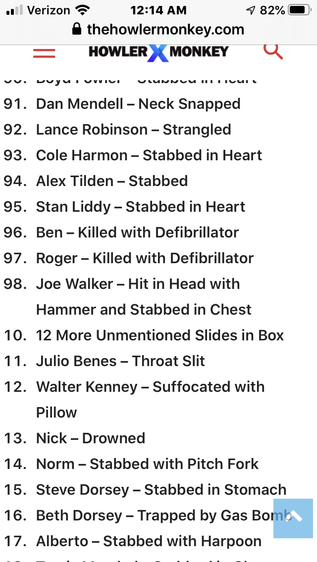
Hi, I have an ordered list (ol), and have set some of the item values set to different numbers (because there was a jump in numbers in the list), which shows up perfect in desktop, but not in mobile. The list is here: https://www.thehowlermonkey.com/how-many-people-did-dexter-kill/ And as you see, towards the end, the numbers go from 98 to 110 (as should be). But in mobile, the numbers go from 98 to 10. It’s like the li value can only hold 2 digits in mobile, versus 3. Can you look at this, and try to set a value yourself over 100 to see if it works in both desktop and mobile? (i.e.
- <li value=”110″>item 110
) Here is a screenshot of the mobile: https://www.thehowlermonkey.com/images/VALUE.PNG
 Patrianto
Please help, latest article on mobile version hiding, for the desktop version everything is fine. What should I do? I also use rocket-wp hoping to solve the problem, but there is no way out.
 salsero72
Hello,
how can I add a new menu (or horizontal menu block) in every page?
When in mobile view, main menu becomes a hamburger icon, while Top Menu disappears.
I’d like to create a third menu to be displays under the header, and to make it visible in every page.
I created one and put it using composer and made it visible in mobile mode,
but obviously it is displayed in homepage only.
Secondly: I’d like to show icons instead of text for this menu only.
Should I use just css:before? and squeeze text or is there a config somewhere?
Thanks
 ComicsBeat
WE recently upgraded to Newspaper 10 and now the mobile theme is not working – the images are full size and it’s completely unusable on mobile as you can see from the below screenshot. I’m guessing something is not connected properly? Could it be an AMP issue?
Any guidelines appreciated.
 Patrick93
I found an interesting option in the AMP plugin. “Redirect mobile visitors to AMP”.
In which cases does this setting make sense?
Does it make sense for SEO?
https://ibb.co/ZcQ4myJ
 nicolegoksel
There are several things I removed from the mobile template that are showing up on amp pages such as a list of the tags at the bottom of the article and the author’s logo. Where and how can I remove these items?
Also, it appears that infinite scroll is unavailable for AMP pages via plugin. I noticed that it’s an experiment within a few other plugins. Are there any workarounds or suggestions?
Here’s a sample page if it helps: https://www.hayatkolay.com/2020/09/09/limon-sirkesi-nerede-ve-nasil-kullanilir/?amp
Many thanks,
Nicole
 notjustpcs
 resolved! missed the button in theme panel ‘use mobile theme for’ had to change to amp only, not mobile + amp
notjustpcsHi,
My website – fake-booze.com – the mobile version does not display properly. It does not show the blocks at all. On the homepage, it does show recent posts but I want it to reflect the desktop site. On the other pages, it only shows the header and footer.
I have checked and the two mobile related plugins are installed and activated.
Do you have any why this is happening?
Thank you!
 Simion C.
 Hi,
That is not possible. The top grid has a limit of 6 posts, and the latest articles section cannot be disabled. It will require modifications to the mobile theme files in order to achieve that.
Please have a little more patience if possible, from what I know there will be more options added for the mobile theme in coming updates. If you do not like how the mobile theme looks at the moment, you could deactivate it in general, pr for the pages/posts you want.
Hopefully the capabilities you are looking for will be possible after the coming changes for the mobile theme.
Thank you!
Simion C. Hi,
Seems to work for me, I checked in the homepage with the mobile emulator https://prnt.sc/ue8al7
I also checked with a phone https://prnt.sc/ue8awd
Have you maybe solved the issue?
Thank you!
Simion C. Hi,
There would be no need for another setting that does the same thing, the one that exists is enough. The option disables the mobile theme per page/post, by default it is set to enable.
If you are using the latest theme version and the mobile theme plugin is active, and the respective option does not appear for you, please send us an email at contact@tagdiv.com and provide a link to the website as well as admin login. We will take a look. Include a link to this topic in the email.
Thank you!
Simion C. Hi,
With a setting that is not possible at the moment, you could try this code to make it fixed
.td-header-wrap {

position:static!important;

}
Enter that in the mobile theme CSS section, and check if it works correctly. If there are issues let me know.
Thank you!
 chabotjeff
Hi. I recently updated to the new version of Newspaper and downloaded the Default demo. I had to redo all of the custom settings I made. Now, I have to change the mobile menu background color to white. I have used #ffffff in all of the color settings in Theme Panel. Do you have a good solution for changing the mobile nav background color and hamburger bun / search icons to dark color on white? Thank you.
Simion C. Hi,
I believe I have found the problem, it seems that disabling the front mobile page grid in the theme panel https://prnt.sc/ue2c70 causes the content in the movile eidtor to not be displayed as well.
Could you enable the top front page grid and check if the content is also displayed? Let me know. I will make some more tests as well.
Thank you!
Simion C. Hi,
The mobile pages require content in the mobile editor https://tagdiv.com/mobile-theme-get-mobile-ready-with-newsmag-theme/ -> https://prnt.sc/ue1ssy
If you do not enter content for each page in the mobile editor, the pages will be empty on mobile when the mobile theme is active.
Thank you!
 Gmcarlson
For some reason, on my homepage and a couple of other pages, my mobile menu isn’t working. I’ll click on it and nothing shows up. I switched back from my custom header to the default header, and nothing seems to be working.
The site is Dudefluencer.com
 peranet
Good afternoon, I’ve been trying to improve the performance of my site for a while, and I’m somewhat desperate. I have followed some tutorials from this forum, but I am unable to improve the results.
I have the mobile theme active and I do not exceed 15 in Pagspeed. And regarding the desktop version I did not exceed 65.
I have installed Super Cache, Autoptimize, and use Cloudflare. Everything with the configuration here recommended.
Could you help me improve my results?
I have full control over the server so I can make all kinds of adjustments.
My site is https://rockandblog.net
Thank you very much!
 dvselas
Hi!
I’m using Gossip Demo as a basis for building a site with Newspaper theme.
Now trying to integrate fixed-width ads (I don’t have full access to responsive ads / variable size ads) into the right side column of several Cloud templates, specifically Medium Rectangle ads (300×250).
I see that the left column is set to 75%, the right column to 25%.
On large enough desktop screens, 25% is larger than 300px, so the MRs get displayed at the full size.
On mobile, the responsive layout let’s the right column flow beneath => also good.
But on tablet view, 25% is smaller than 300px, so the MRs overlap outside of the column.
What I would like to do, is:
* fix the right column to a minimum of 300px
* size the left column to the remaining space inside the row
Is there a good way to do this?
Cheers
 turma99
Hi! Something is doubling the AMP header ad in our most recent posts. All seems right with the ad script and I can’t figure out what’s causing the ad repetition.
Can you help me, please?