
- NewspaperThe Newspaper Mobile Theme: Introduction
- NewspaperThe Mobile Theme
- NewspaperModules Builder in Newspaper Theme
- NewspaperNewspaper theme documentation
- NewspaperTheme Colors Introduction
- NewspaperWhat’s Included in the Newspaper Theme Package
- NewspaperFilters and sorting for taxonomies
- NewspaperHow to Add a Logo in Newspaper
- NewspaperBig Grid Flex Settings
- NewspaperHeader Builder
- NewspapertagDiv AMP Plugin Tutorial
- NewspaperBest Of Forums
- NewspaperCache plugin – install and configure
- NewspaperFont Customization
- NewspaperBackground Introduction
- NewspaperHeader ads
- NewspaperPost template ads
- NewspaperCustom ad spots
- NewspaperMain Menu
- NewspaperHow to Install Newspaper via FTP
 besthomegear
 Thanks, Anamaria
As I see it to fix the Modal setting issue that is distorting the images loading on my site I can employ one of two options.
Option #1: (As you refer above – Make changes to WP Rocket settings)
All I need to do in the exclude modal images is in the disable box of WP Rocket – copy and paste this exact type: td-modal-image
No other letters or symbols?
Then I save and clear the cache in WP Rocket and that’s it right?
Option #2: Make changes to TagDiv “Post Settings” instead…
See this screenshot. I am paying for WP Rocket Premium to optimize my site in many ways, what if, I make the changes in TagDiv Modal settings instead?
Specifically, I would do this; disable “General Modal Image”, Disable “Modal image on MOBILE, and Disable “Smartlist” modal image. Disable All Three?
Wouldn’t this accomplish the same objective as reconfiguring my WP Rocket settings? Confirming, I really don’t need the modal options enabled to properly run the theme correct?
Thanks again for your prompt response and help!
Kevin
 Anamaria
 Hello,
Usually, this happens with cache plugins. If the cache plugin does not have mobile support then the mobile theme version can be delivered instead.
The solution would be to use the recommended WP Super Cache plugin instead and activate these settings (especially the mobile device support): https://forum.tagdiv.com/cache-plugin-install-and-configure/
Also, please let me know what plugin for the cache you use now.
I hope this helps.
Thank you!
 Calin
Calin Hello, usually the design looks like that when you are using the mobile theme plugin, please check it and if you have this plugin, please disable it, then the responsive version of theme will be used.
Thank you!
 Bettina
 Hello !
From my point of view, if you don’t use the Mobile Theme plugin, then there is no reason or benefit to AMP.
For sure, they can not be in a conflict. I suggest you to make a test and deactivate ALL plugins except tagDiv ones, also if you are using a cache plugin, deactivate it, clear all cache and try again.
Thank you!
Anamaria Hello,
You can’t have the same footer from the desktop on a mobile theme.
For the mobile theme you can customize it from Theme Panel-> Mobile Theme -> footer => https://i.imgur.com/7ABDfSe.png You can’t edit it with tagDiv Composer.
Thank you!
 cryptoedgewiki
i want the mobile theme fotter to be like the desktop footer
 viniciusyamada
Hello, how are you?
Well, it’s been a few days since an old problem happened again, a conflict between the AMP and Mobile Theme plugins.
I put the mobile version only for AMP users
How it should be: https://prnt.sc/6UZH814HrXZ7
How it turned out: https://prnt.sc/gscMgCv2rx4C or https://prnt.sc/co3H8xMOCt4t
I already tried uninstalling one and installing the other to see if the installation order would alternate.
 Brian
Brian Hey.
What type of theme is it? this is very confusing.
1) ” https://prnt.sc/3ks24GFyBBBF ” this my website footer. But when I am checking on mobile I can see another footer. ” https://prnt.sc/YrbFiKpLXRXz ”
But Last time you told me that type mobile design is coming from ” tagDiv Mobile Theme ” this plugin. And I have deactivated that. But i am still facing problems when I am checking on mobile version. Although I have selected footer from theme option ” https://prnt.sc/DXhXFA23xJ5o “. I have only one footer template that I have created using your Cloud template CPT ” https://prnt.sc/TlclmNxHcqBn ”
2) Same template issue I am facing on blog single page. I have created my own single page design. But I am seeing other content and style in the mobile version.
So, you just let me know from where I can disable fully your mobile style. I want to show same design that I have created for desktop version.
All these problems in your theme are delaying my project’s completion. your theme is super customizable, but not custom-development friendly. So, I need this answer very urgently.
-
This reply was modified 3 years by
Brian.
Anamaria Hello,
The page loading speed can depend on many factors, and each website is unique from this point of view. Let me explain some of these factors and maybe they give you some starting points for optimizing your website. A good choice for the page speed, could be the mobile layout which contains fewer elements because it can improve a bit your page speed.
There are many optimization guides provided by our users here in the forum, some made by us; you could check some of them
– https://www.infophilic.com/get-almost-100-pagespeed-newspaper-theme/
– https://forum.tagdiv.com/cache-plugin-install-and-configure/
– https://forum.tagdiv.com/how-to-make-the-site-faster/
– https://forum.tagdiv.com/topic/high-number-of-ajax-request/
– https://forum.tagdiv.com/topic/score-100100-pagespeed-with-newspaper-wordpress-theme/
– https://www.andraware.com/wp-rocket-for-newspaper-theme/
– https://forum.tagdiv.com/topic/page-speed-guide-for-2023-beginners-and-advanced/
– https://forum.tagdiv.com/topic/newspaper-theme-speedify-your-website/
– https://forum.tagdiv.com/topic/tutorial-chriss-custom-optimizations-for-functions-php-etc/
– https://forum.tagdiv.com/cloudflare-cdn/
– https://forum.tagdiv.com/topic/theme-causing-high-cpu-usage-2/
– https://forum.tagdiv.com/topic/sql-querys-high-cpu/
– https://forum.tagdiv.com/topic/newspaper-theme-slow-to-respond/
– https://premium.wpmudev.org/blog/optimizing-your-wordpress-database-a-complete-guide/
– https://underconstructionpage.com/optimize-wordpress-database/
– https://crunchify.com/better-optimize-wordpress-database-all-in-one-guide/
Also, pagespeed is not covered by support -> https://forum.tagdiv.com/newspaper-theme-support/
If you use Wp Rocket, you can try to exclude the following files
/jquery-?[0-9.](.*)(.min|.slim|.slim.min)?.js
/jquery-migrate(.min)?.js
/wp-content/plugins/td-composer/legacy/Newspaper/js/tagdiv_theme.min.js
tdBlocksArray
To be able to optimize and to remove CLS and LCP please check these guide => https://developers.google.com/web/tools/lighthouse/ -> https://www.sqlpac.com/en/documents/google-pagespeeds-lighthouse-6-new-features-lcp-cls.html -> https://web.dev/lighthouse-whats-new-6.0/ -> https://web.dev/lcp/ -> https://web.dev/cls/
Thank you!
besthomegear Hi AnnaMaria,
I will disable and clear ewww optimizer and check. Can you clarify mobile template question – where would i verify that on my site/theme?
thanks!
Kevin
besthomegearUsing the TagDiv Newspaper theme and without any known changes to plugins or theme, have just realized some (not all) of my posts are showing (in Mobile View only) as distorted pages – Zoomed so the page is not readable.
Here is a sample of a good Mobile page: https://besthomegear.com/10-best-gas-fire-pit-tables/
Here is a sample of a now distorted Mobile page: https://besthomegear.com/best-outdoor-griddle/
open either page on the desktop – No issues.
I have cleared and preloaded Cache this morning, with no changes.
If you open either sample page in Mobile (I use IOS) the second sample URL is an example of this issue. Appears the Margins are corrupted (enlarged) on only certain posts.
In Mobile View, I currently see almost all of my Product review pages, and Most of my How To guides with the same issue in Mobile View, No issues in Desktop. This is a huge problem that I can’t find a solution for, so big Thanks to anyone who knows what to fix, or where to look!
Kevin
Image #1
Image #2
P.S. Only thing that we recently changed on site was in Tag Div composer last week, where with AnaMaria’s help, I removed the “Breadcrumbs” content row (top of page below header) from All pages on my site, due to duplication of Yoast Breadcrumbs, but that seemed successful, so not sure that caused this to occur and why to only certain pages.
Anamaria Hello,
Unfortunately, no.
The modal popup doesn’t work with the mobile theme.
Thank you!
Anamaria Hi,
Please let me know what version you have now.
Using our theme, you can choose from 3 mobile versions
-> mobile responsive => https://www.screencast.com/t/oJ2ShOp47
-> mobile theme plugin => https://forum.tagdiv.com/the-mobile-theme/
-> mobile page => https://tagdiv.com/newspaper-10-3-7-update-brings-customizable-and-fast-mobile-pages/
Suppose you created the mobile pages with tagDiv Composer. In that case, when you install the Mobile Theme plugin, your pages will be overwritten by the plugin (the mobile theme comes with its templates for page, post, category, etc so your current templates from the desktop theme will get converted to the mobile theme layout, the page content is made without builders in mobile editor => https://www.screencast.com/t/xbgZG8kH also, the options that are provided to edit the mobile theme version are limited (this keeps the things simple)).
This is a video about Responsive Newspaper Theme, AMP & Mobile Theme, Mobile Pages & Templates -> https://www.youtube.com/watch?v=SpGkOnJeNZY
So, the mobile responsive is what you see then that you select the viewport on phone => https://www.screencast.com/t/matV17hH, so some settings may apply for each viewport(where is the border blue), and others are not(where the border is black).
The mobile page has the mobile templates from Cloud Library => https://www.screencast.com/t/YCcZ8rL8
Mobile responsive version of the theme and the mobile page editor can be edited with tagDiv Composer, the mobile theme plugin not.
For example, you can have the mobile theme plugin activated and use the mobile page/mobile responsive version for the homepage/pages, but for the categories pages/404 page you can’t use the mobile page/mobile responsive version if you have the mobile theme plugin activated.
So, if you want to design the pages with tagDiv Composer, you can use the mobile page or mobile responsive version.
Thank you!
 mtpnminer
Hello,how can i edit mobile page?and how can i chose which page be a mobile page?My theme is Newspaper
Thank you
 sabedott
Modal Pop Up work with tagDiv Mobile Theme?
 Ned Donev
 Hi Anamaria,
I use different parts of your templates. Header is from one template, Footer is from another template, Categories page is from a third template. I no longer remember the names of the templates, and I have renamed them to make it easier for me to work. Then I changed these different parts with tagdiv Composer beyond recognition and they look nothing like the original.
The above css code will do the job. Hopefully this will be the last thing that gets in the way of my site design.
And one more question, on the home page of the site I have a menu on the left side that I want to hide in the mobile version of the site. I looked for an option in the theme for this functionality, but I didn’t find it, and I did it again with css code:
@media only screen and (max-width: 800px) {
body .tdi_42 {
display: none;
}
}
Does such functionality exist, and if so where?
Thanks for the reply and have a nice day!
Bettina Hello!
The social icons from the mobile menu are coming from the Theme Panel -> Social/Apis -> Social Networks -> https://i.imgur.com/kKYIECB.png remove/edit them after your needs.
Thank you!
Bettina Hello!
The social icons from the mobile menu are coming from the Theme Panel -> Social/Apis -> Social Networks -> https://i.imgur.com/kKYIECB.png remove/edit them after your needs.
Thank you!
Anamaria Hi,
You can try to import a cloud header to have another menu for mobile and then you can edit it with tagdiv Composer https://forum.tagdiv.com/header-manager/, or if you want to have the standard one, then you need to edit it from Theme Panel -> Header and you can’t use other menu for mobile.
Thank you!
Brian Your theme is very confusing, My same menu should work in the mobile version. But it’s not working. Please let me know where I can find the way to add mobile menu. Please answer me ASAP.
Thanks.
 Iqtidar
Hi, I just checked my website on Pagesped Insights, link: https://pagespeed.web.dev/analysis/https-www-teslaoracle-com-2023-08-08-elon-musk-bids-farewell-to-tesla-cfo-and-master-of-coin-zachary-kirkhorn-after-13-long-years-at-the-company/i2nd18bkx4?form_factor=mobile
The huge Performance issue is originating from an issue with the theme. It is loading Full-Size images while it should load Medium by Default. I have even set it to Small/XSmall in some areas but no use.
This is creating increased load times and performance issues.
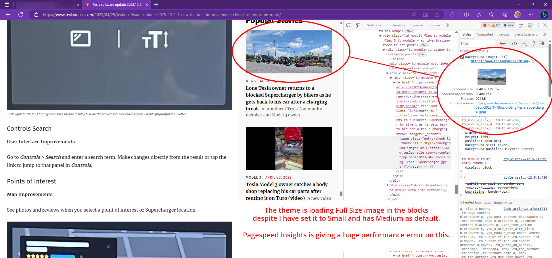
Please tell me how to fix this. A fast response will be appreciated.
Thanks.
 almyssilgado
 Hello Anamaria
I don’t know what you mind.
Currently, we use site post templete 11.
You can see the theme panel option here: https://tinyurl.com/22gzshlk
The video appears perfectly in desktop version, but in mobile doesn’t.
Anamaria Hello,
To change the font and color for the mobile menu please go to Theme Panel -> Theme Colors -> Mobile menu/mobile search => https://www.screencast.com/t/0CvSgXp9H to set a background image go in Theme Panel -> Background -> Mobile menu/mobile search => https://www.screencast.com/t/uvDejzbX to change the font from Theme Fonts => https://www.screencast.com/t/ANBQe7hQhJd
Thank you!
almyssilgadoHello
We use the theme newspaper on the web hola.tv.
Some time ago, the mobile version doesn’t show the embed videos as video post. The video appears in the version for computers, but not in the smartphone version.
We have removed the Google Adsense ads, thinking that this would be the problem, but it has not.
We have done all kinds of tests and nothing works.
Somebody could help me?
 SRK
SRKWebsite: Autobics.com
Theme: Newspaper Version: 12.5.1
Mobile Theme: Mobile+AMP
Greetings,
I’m encountering an issue with the mobile theme on my website and could use some help to resolve it.
Currently, my website functions perfectly on desktop devices. However, when I access it on my mobile phone, a problem arises. After the page loads, the page suddenly shrinks to approximately half the size of the screen. There are instances when the page even becomes nearly blank.
I explored the “Inspect” option in Chrome, using the dimensions of an iPhone SE. I found that modifying the height to “auto” in the following codes helps restore the site to full-screen mode when it’s reduced in size:
When screen appears as half:
<div id=”td-outer-wrap”__cpp=”1″ style=”width: 375px; height: 313px;”
Screenshot: Half Page
When the screen goes blank:
<div id=”td-outer-wrap”__cpp=”1″ style=”width: 375px; height: 0px;”
Screenshot: Blank Page
However, making this adjustment causes the content to become disorganized and overlap.
I’m not a website developer, so I’m hoping someone can guide me through resolving this issue in simple terms. If there’s a way to bring the page back to full-screen mode without disrupting the content layout, I’d greatly appreciate your advice.
Thank you in advance for your time and support. Your help is valuable to me as I work to improve my website’s mobile experience.
Thanks!


