- NewspaperThe Newspaper Mobile Theme: Introduction
- NewspaperThe Mobile Theme
- NewspaperModules Builder in Newspaper Theme
- NewspaperFilters and sorting for taxonomies
- NewspaperHow to Add a Logo in Newspaper
- NewspaperBig Grid Flex Settings
- NewspaperHeader Builder
- NewspapertagDiv AMP Plugin Tutorial
- NewspaperNewspaper theme documentation
- NewspaperBest Of Forums
- NewspaperCache plugin – install and configure
- NewspaperFont Customization
- NewspaperTheme Colors Introduction
- NewspaperBackground Introduction
- NewspaperHeader ads
- NewspaperPost template ads
- NewspaperCustom ad spots
- NewspaperMain Menu
- NewspaperHow to Install Newspaper via FTP
- NewspaperHow to Install Newspaper via WordPress
 Calin
Calin Hi,
I check your link and all is seems to be normal -> https://www.screencast.com/t/GG7LY8LHUdMy , maybe this is happening when you have the mobile theme activate, if is so please check our documentation about mobile them and mobile editor for non builder pages -> https://forum.tagdiv.com/the-mobile-theme/
Thank you.
 achmadsya
 Hi Simion, thanks, the icon column works well for the mobile site. However, it seems the vertical alignment on icon & title row is set to bottom in mobile site (https://evolution.keselamatankeluarga.com/tips-keselamatan/). Can you advise if I can align the icon to top alignment?
2. Well noted
3. I am thinking to build a layout similar to this website (http://www.safekids.co.uk/PetsToysPlayCategory.html). Can you advise the best way to make the image + Title + Description link?
Thanks
 Simion C.
 Hi,
A link to the website if possible and some more details about what I should check would be most helpful. I would have no idea what were these changes you made to the header and what is happening on mobile.
Thanks
 nexttvc
 <!doctype html >
<!–[if IE 8]> <html class=”ie8″ lang=”en”> <![endif]–>
<!–[if IE 9]> <html class=”ie9″ lang=”en”> <![endif]–>
<!–[if gt IE 8]><!–> <html <?php language_attributes(); ?>> <!–<![endif]–>
<head>
<title><?php wp_title(‘|’, true, ‘right’); ?></title>
<meta charset=”<?php bloginfo( ‘charset’ );?>” />
<meta name=”viewport” content=”width=device-width, initial-scale=1.0″>
<link rel=”pingback” href=”<?php bloginfo( ‘pingback_url’ ); ?>” />
<?php
wp_head(); /** we hook up in wp_booster @see td_wp_booster_functions::hook_wp_head */
?>
</head>
<body <?php body_class() ?> itemscope=”itemscope” itemtype=”<?php echo td_global::$http_or_https?>://schema.org/WebPage”>
<?php /* scroll to top */?>
<div class=”td-scroll-up”><i class=”td-icon-menu-up”></i></div>
<?php locate_template(‘parts/menu-mobile.php’, true);?>
<?php locate_template(‘parts/search.php’, true);?>
<div id=”td-outer-wrap” class=”td-theme-wrap”>
<?php //this is closing in the footer.php file ?>
<?php
/*
* loads the header template set in Theme Panel -> Header area
* the template files are located in ../parts/header
*/
td_api_header_style::_helper_show_header();
do_action(‘td_wp_booster_after_header’); //used by unique articles
This is the only code I have in my theme header php
 ib4ud2014
Hi guys,
My site isn’t loading pages when opened in mobile. It only shows the title and nothing else.
Example: https://www.irelandbeforeyoudie.com/about-us/
Posts and everything else is fine but pages are an issue.
Any ideas?
Many thanks
 insumedical
 Ajay
AjayHi, I have made some changes in header menu. The changes are showing perfectly correct on desktop but when I use my website on my mobile the changes are not getting updated immediately. Why it’s happening? Please help in solving my issue.
Calin Hi,
In order to can set a menu to mobile you need to have the mobile theme activate.
Thank you.
Simion C. Hi,
1. You mean two icon elements side by side? Then you could split the row in half, set a width of 50% for each column on mobile, also make them display inline
– https://www.screencast.com/t/MaNEpkxVi
– https://www.screencast.com/t/VrFpamJ9r
– https://www.screencast.com/t/nIaOtWs64zQp
That will make them side by side.
2. At the moment this is not possible, you can only use the predefined icons. This may be available in the future.
3. So something like an overall height setting for that element, a setting like that doesn’t exist. What exactly would you like to do with this element? Maybe there is another way. Let me know.
Thanks
Calin Hi,
Please make sure that you install the mobile theme plugin that from the same package were you install the theme version.
If you have the last version of theme ( 9.2.2 ) you can get the theme from the themeforest and get the them with all files.
Thank you for your understanding.
 Rikk
RikkFor Mobile speedtest, using pagespeed the below was found. However the corresponding scripts can not be identified using the functions.php script. Why are these slow. ON the Desktop speed tests im getting speeds of 90+ but mobile its like 20
…vendor/react-dom.min.js?ver=16.6.3(debrecentoday.com)
31 KB
1,230 ms
…tinymce/tinymce.min.js?ver=4800-20180716(debrecentoday.com)
111 KB
1,680 ms
…dist/blocks.min.js?ver=6.0.5(debrecentoday.com)
42 KB
930 ms
…vendor/lodash.min.js?ver=4.17.11(debrecentoday.com)
24 KB
930 ms
…vendor/wp-polyfill.min.js?ver=7.0.0(debrecentoday.com)
30 KB
1,080 ms
…jquery/jquery.js?ver=1.12.4(debrecentoday.com)
33 KB
1,230 ms
 likocorp
 Calin,
One more question about mobile devices view.
I have popup which works fine on desktop version. I use two variants of popup – shortcodes and styles. Both works fine. But on mobile devices these popup does not work at all. When I call it – it just reload my page and popup does not show. I do not use mobile theme now.
Popup plugin support wrote the following:
We checked your website and noticed that your theme is making some changes on mobile devices (you can see it when you reload the page).
The initial set elements are being replaced in the process, that's why the popup stops working, as it can't detect the replaced element.
Please, contact your theme developers and report them this issue.
Could you please advice me what to do?
Thank you
-
This reply was modified 7 years by
likocorp.
 jwoolley_87
 Is there any way in which I can have a video on desktop, but when viewed on mobile it shows an image?
Ive been having trouble with images in the header being blurry (I’m using the spa heaven demo). Even when I’ve replaced it with the one that came with the them it shows as blurry. Is there anything that could be causing this?
 cocktail
 For some reason the mobile menu option is missing. See attached: https://imgur.com/a/fCIehq4
 AhoraRoma
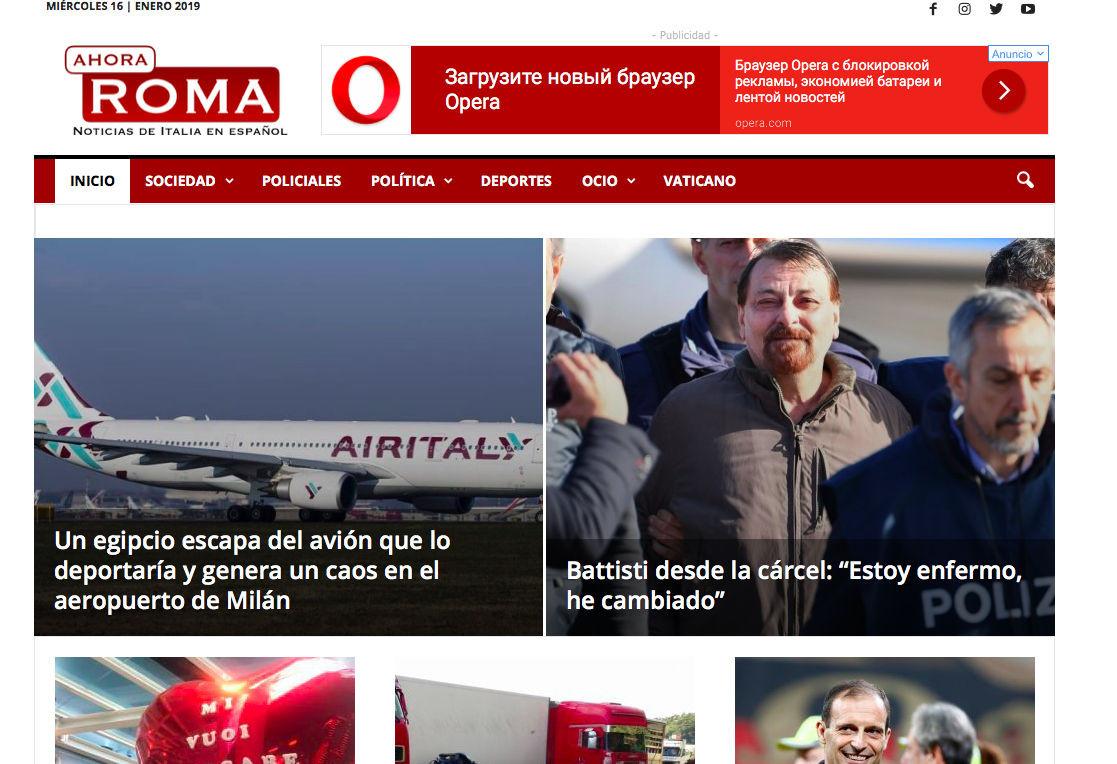
Hi, i dont get why at my mobile theres is this featured picture (first picture)
https://ahoraroma.com/wp-content/uploads/2019/01/IMG_2803.png
If the thumbails should be something like this:
https://ahoraroma.com/wp-content/uploads/2019/01/48425529_1996035870483228_525046802609602560_n-960×580.jpg
https://ahoraroma.com/wp-content/uploads/2019/01/48425529_1996035870483228_525046802609602560_n-300×160.jpg
this is the list of all thumbails for that picture:
https://ahoraroma.com/wp-content/uploads/2019/01/Captura-de-pantalla-2019-01-16-a-las-11.52.34.png
Desktop version is ok:
https://ahoraroma.com/wp-content/uploads/2019/01/Captura-de-pantalla-2019-01-16-a-las-11.43.07.png
But in mobile version the crop is not ok because the plane shpould be higher, but all thumbails seems to be ok at my library. Why?
Calin Hi,
You can use the mobile theme, make a new menu and add all links from desktop menu after that set it for mobile menu.
-> https://www.screencast.com/t/nGbMDT6xN
Hope this will help you!
Thanks.
achmadsyaHello,
Could you help with the following issue.
1. Any way to display two column icon in mobile view?
2. Any way to use custom icon?
3. When using image with title element, is there any way to set up the block/image and title height to specific pixel size?
Thanks
 ibrahimakyuz
Hi, I’ve installed WordPress Mobile theme plugin was not compatible with the newspaper version because it said that it was disabled. It gives me this error
Sample:
PLUGINS DISABLED AUTOMATICALLY
The following plugins were disabled because they are incompatible with this version of Newspaper:
tagDiv Mobile Theme
For update please check our
 BorislavBigi
Hi!
1. Can you give me guide or code for this http://prntscr.com/m7pp8y and for this http://prntscr.com/m7ppwe, i try to use style 15 but my ads doesnt show on bottom of article, p.s i added adsense code in template 15
2. i wanna make text logo on style 10 header. which resolutin of picture is best for desktop, retina and mobile and mobile retina.
 Mark Gilbert
 Yes, it looks great on desktop and mobile. But if you resize your desktop browser to tablet, portrait or landscape, the column lengths become uneven. Now I have just tested it on an iPad and worse, the headings and some excerpt text now overlays the images. Thanks
Calin Hi,
1. This is possible only with custom css , if you need help with this please provide a link to your website in this way I will be able to provide you the right css.
2. If you are using the mobile theme you need to set the content for page in mobile editor, please read our documentation for mobile theme -> https://forum.tagdiv.com/the-mobile-theme/
Thank you for your understanding.
insumedicalhttp://insuguid.com/
http://carloansinfor.com/
Android Phone Confirm…
1) Check mobile screen
2) amp page invisible
It is frustrating
I want a clear answer.
jwoolley_87 Thanks Calin,
When viewing in mobile the video doesn’t play automatically like on desktop. Is it possible to change this?
likocorpHello
I have two questions regarding mobile version.
1. Is it possible to remove “Single Post Review Summary” and “Single Post Review Overall”, post date, post author info, from all my posts from mobile version?
2. I have some pages made with Tagdiv Composer and in mobile version they are completly blank – no any element displays. How can I fix this?
Thank you!
Sergey
Simion C. Hi,
There were previous cases like the one you are describing. In most of them it was caused by the cloudflare rocket loader
– https://forum.tagdiv.com/topic/mobile-search-appearing-on-desktop/
If you use cloudflare try to disable the rocket loader, then check if the issue is fixed.
Thanks