
- NewspaperThe Newspaper Mobile Theme: Introduction
- NewspaperThe Mobile Theme
- NewspaperModules Builder in Newspaper Theme
- NewspaperFilters and sorting for taxonomies
- NewspaperHow to Add a Logo in Newspaper
- NewspaperBig Grid Flex Settings
- NewspaperHeader Builder
- NewspapertagDiv AMP Plugin Tutorial
- NewspaperNewspaper theme documentation
- NewspaperBest Of Forums
- NewspaperCache plugin – install and configure
- NewspaperFont Customization
- NewspaperTheme Colors Introduction
- NewspaperBackground Introduction
- NewspaperHeader ads
- NewspaperPost template ads
- NewspaperCustom ad spots
- NewspaperMain Menu
- NewspaperHow to Install Newspaper via FTP
- NewspaperHow to Install Newspaper via WordPress
 rs81
rs81 Hi Spu,
I have your same problem on my website, in particular I got “Render-Blocking Resources” to fix.
I saw your mobile performance is very good right now (76 mobile Google Page Insights).
Could you tell me which WP plugins did you install?
Thanks
 ThunderSky
 I am replying to my old question because I have a new question about logo header images
and I can’t find a way in my account to submit a New Question.
Question January 12, 2019 —
I’m using the Newsmag 4.7 Fashion Magazine Demo install but want to revamp it into more of a Commentary & articles site. I kept “Fashion” because I like the styling.
I want to use a HEADER LOGO up to 1024 px (or greater) in Width
& I have a version up to 2500 px wide by 500 px height.
I want a Retina Image HEADER Style (the LOGO is already IN the Header image) that is responsive, full width when the browser reports it & then responsive scaling of the header down to Mobile setting.
Besides changing CSS files, what is the most direct way to alter necessary files so that NewsMag offers another Header Style with my preferences?
Using Header Style 8, despite the media library settings for this Header Image, my header image, though loaded with correct W & H pixels, only loads to the default max LOGO image in Newsmag which I guess is 572px.
What is being loaded from the Media Library is correct — width=”1199″ height=”245″ —
<img src="https://www.mytest.com/wp-content/uploads/2019/01/olympus-header-copy5-2500.png" width="1199" height="245" />
BUT the Newsmag page surrounds the same image with this instead–
<div class="td-header-sp-logo">
            <h1 class="td-logo"><a href="https://www.mytest.com/">
		<img src="https://www.mytest.com/wp-content/uploads/2019/01/header-copy5-2500.png" alt="" width="572" />
		<span class="td-visual-hidden">View from Olympus</span>
	</a>
	</h1>        </div>
I’d like to apply something like this generated with the Demo install–
`
<div class="td-full-screen-header-image-wrap"><div id="td-full-screen-header-image" class="td-image-gradient"><div class="td_marker_animation" style="height: 0; width: 0"></div> </div></div>
Are there php files where I should also modify the generation page preferences besides overwriting the default CSS?
Thank you for having the patience to read this!
-
This reply was modified 7 years by
ThunderSky.
-
This reply was modified 7 years by
 Ladiesabroad
 I solved the problem above by changing the columns padding to 0 px, and paste this to the phones repsonsive CSS section.
But one last question anyway. The 8 px botton padding works pefect for the image block as well as for the column block. Exept from when the block after is a text block without a heading. The text then comes to close to the picture, both on desktop and mobile. Is this possible to adjust as well?
https://test.ladiesabroad.se/2019/01/gutte-pyrgos-pa-santorini-alltsa/
Thanks a million in advance.
 loudfact
Hi there,
We came across certain problems while customizing our website: LoudFact and need you guys assistance to resolve the issues.
1. Making Grid Sizes Even
currently grid size comes unevenly like this-:
https://www.screencast.com/t/9z3QRfDn
2. Grid from a category(want the auto-update from the specific category, current it only allows posts by id)
like with but with scroll option-:
https://www.screencast.com/t/y8BBCEGncd
3. Photo Grid Widget For Home Screen with auto-scrolling same like the posts
4. Created Footer with cloud templates
https://www.screencast.com/t/NOImfAnc0
but header background color came different on output
https://www.screencast.com/t/73Vw3jm9SK8N
5. Notify option in the comment and removal of website and links
https://www.screencast.com/t/Qpow5l99o6Iu
6. Looking For Side Navigation Menu Like This
the icon in the sticky menu:
https://www.screencast.com/t/n7V22ybmF
output:
https://www.screencast.com/t/vmkeGPiss
7. How to apply Single Page Cloud Template for different categories
8. Infinite Scrolling option in single page template related posts
https://www.screencast.com/t/cmapYXU0
9. Adding Gif header background in place of an image
10. PageSpeed Insights Mobile Performance Issue
 Mark Gilbert
Hi – I have created a homepage – http://jazzreview.co.uk – using Flex Block 3 which looks great on desktop and mobile but on tablet landscape the columns lengths change and on tablet portrait column lengths and header menu break. How do I solve this? Happy to have tablet portrait go to mobile format and menu (how do I set for that?) but tablet landscape would like columns to retain equal lengths. Thanks
 detaylibilgi
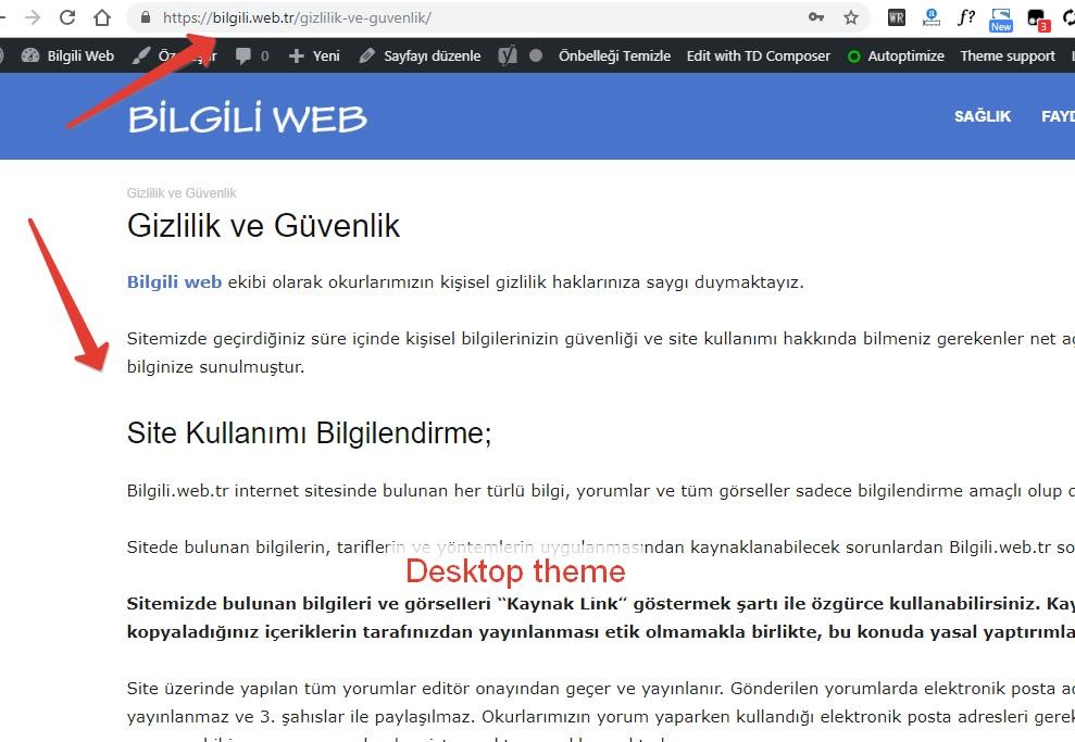
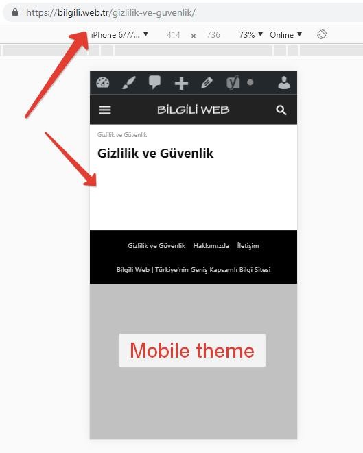
 I did a manual editing of pages using the mobile editor and the problem was solved. However, the contents of the page are not transferred to the mobile theme even if Page Builder is not used.
 GoingFor2
 To my knowledge, pages have always been like this on the mobile theme. Or at least any pages that use the Page Builder because the mobile theme doesn’t work with the page builder.
detaylibilgi9.2.2 After updating, the pages are empty in the mobile theme!
Only pages are problematic. There is no problem with blog content.
 rparlier
I have looked at previous posts on the same subject and tried my best to follow the directions that were given to correct the issue, but when I try and activate the plugin an error message pops up saying “PLUGINS DISABLED AUTOMATICALLY The following plugins were disabled because they are incompatible with this version of Newspaper.”
I have double-checked the version of Newspaper and am running version 9.1. I have deactivated, deleted, and reinstalled the most recent version of the plugin from the tagDiv website with the same error occurring. I am at a loss for what to do, and would really like to create a mobile-friendly interface for users.
GoingFor2I recently updated to 9.2.2, and now I have no Featured images on my homepage. Other images that are not a widget show up fine. I’ve cleared my cache multiple times to no avail, and it seems to only be a desktop issue. I’m running the mobile theme and that works fine, and even then I request a desktop version on my mobile phone, featured images appear there as well. Please help.
 meri
meri Hi,
I have a little problem with this code now since I’m using Gutenberg and shortcodes.
So my first block is a “shortcode block” with a shortcode creating 2 columns. In the left one I have my picture (that I want to hide on mobiles) and the text in the right one.
The look and feel is way better than before.
But now my 1st picture is showing on mobiles…
Can you kindly help?
LadiesabroadHello
Having updated to the Gutenberg editor I am experiencing some challenges with the paddings between the pictures.
1. Using two picture blocks after each other give me a padding twice the size I had before the upgrade. I find the smaller padding nicer.
2. I use columns block (not the picture gallery block) when I have two portrait format pictures; as this shows the pictures next to each other on desktop and one under the other on mobile. But I get a huge padding between the two pictures on desktop and also bigger padding between the column block and the next picture block than usually.
Is this something which will be changed in next theme updates? Is it possible to create a “same padding as before Gutenberg” adjustment by CSS code?
New padding with Gutenberg: https://test.ladiesabroad.se/2019/01/gutte-pyrgos-pa-santorini-alltsa/
Old (nice) padding: https://www.ladiesabroad.se/2019/01/hong-kong-utflykt-macao.html
Thanks from Lena
 oshaw
oshaw I’m not using the mobile theme.
 Calin
Calin Hi,
If you are using mobile theme please check this documentation too -> https://forum.tagdiv.com/the-mobile-theme/
If you want, you can send us an email at contact@tagdiv.com and provide admin login, as well as cPanel or FTP if possible. We will take a look. Include a link to this topic in the email.
Thanks
Calin Hi,
1. I think the best flex for mobile is that one that you can make it to look clean and nice.
You can use a flex block and set settings per each device
On desktop: https://www.screencast.com/t/6HKNJjl35i
On mobile: https://www.screencast.com/t/Ik42eacS3DgK
2. This can be made only with custom css https://www.screencast.com/t/cnSbKWPgrnC
3. Yes you can use a smart list and hide the number with custom css, or use a smart list template from tagDiv Cloud Library and set opacity 0 on number count
https://www.screencast.com/t/U202J60J2y8y
https://www.screencast.com/t/LXsIzFuYNPr4
Thank you for your understanding.
 matteoopc
Hello I upgraded the template with the new version and the td.mobile theme doesn’t work anymore.. and I cannot find the plugin inside the theme folder. Can you please help me?
Thanks,
 Catalin
 Hi,
I have checked your website again for more mobile devices and it seems to works as expected. Try to clear all the caches, purge CDN files and check the results.
Thanks for your understanding!
GoingFor2So, when I go up to my address bar and type in my website, GoingFor2.com, I brought to the mobile version of my site. Then, I click on an article, again, the mobile version of my site. Then, I use my mobile menu to go “home” or I use my sites logo at the top to go “home”, and I’m brought to the non-mobile version of my site. Why does it switch back? And how do I keep it from switching?
 yanaguita
Hi!
This blank space after the header in mobile version is normal? Or could be some bug in the code?
Screenshot: http://www.screencast.com/t/RUEg9ShQ
oshawI put ads up in several of the theme’s ad boxes today, and accidentally also added Adsense code to the header box. I don’t want an ad up there, so I removed it. After saving all settings, ads are appearing at the top of the screen, under the banner. I removed ads from all of the boxes, even the ones I wanted them in, and saved again. Still, even with all boxes empty, all ads were still appearing after saving. I’m not using a cache plugin. The closest I have is Fast Velocity Minify. I disabled it, just in case, and still the ads loaded. I even used the buttons under the empty ad boxes to disable on desktop, tablet, phone, etc. Still, the ad shows.
What can I do to remove that ad at the top of my website? I’m pretty sure it’s against Adsense rules to have an ad appearing above the fold on mobile, as this one does.
 BorislavBigi
Hi!
1. Which flex grid is best optimized for mobile theme, i like a lot 2 , 3 ,5 ? When i use other grids,
my website look so strange on mobile phone? P.S. I dont use mobile theme.
2. Is it posible to make separator like this http://prntscr.com/m5jr0p and if it ,can you give me guide?
3. i wanna create post like this http://prntscr.com/m5jre4 , but without this buttons ,just text and picture ,do i need smart list or?
Thanks for the answers! 🙂
 Simion C.
 Hi,
I could give you a code to remove them, they will appear by default and there is no setting to remove them. Please enter this code in Theme panel->Mobile theme->Custom CSS code section
.category .td-category-siblings {

display: none;

}
The result will be like this – https://www.screencast.com/t/kkQCcnp9uERh
Thanks
 David
DavidI added a menu that is linking to different parts of my page (one-pager). On Desktop this works great but the mobile menu of Newspaper is not able to handle my URLs. Example: mypage.com/#position1, mypage.com/#position2, mypage.com/#position3
Does anyone know a solution for this?
Thanks!
 Jose
JoseHello,
I have selected template 1, which includes a photo at the top. But it does not work, neither in pc nor in mobile Do you know where the error could be?
my web: encantadordeperros.com
images: https://fotos.subefotos.com/ec87bec17bb62a90dfb274a9deece5a2o.jpg
https://fotos.subefotos.com/73ad35a6cd8cd07ffd0abc8fed2e23d2o.jpg
Cheers
 89ieriko
 Hi,
I’ve tested it on 5 separate mobile devices and have replicated the same issue on all 5 devices using Google Chrome. Upon loading the site using Google Chrome on a mobile device, if you click the menu, the menu will not load correctly. if you refresh the page, click into another link and go back to the home page it will then work until next time you visit the page the first time where the issue can be replicated again.
Not sure why the issue is on Google Chrome only. Am wanting to purchase more Newsmag licenses for three more projects i’ve got but Google Chrome is a very popular app to be using for mobile access


