- NewspaperThe Newspaper Mobile Theme: Introduction
- NewspaperThe Mobile Theme
- NewspaperModules Builder in Newspaper Theme
- NewspaperFilters and sorting for taxonomies
- NewspaperHow to Add a Logo in Newspaper
- NewspaperBig Grid Flex Settings
- NewspaperHeader Builder
- NewspapertagDiv AMP Plugin Tutorial
- TutorialsFrom WPBakery to tagDiv Composer
- NewsmagSmart list ads
- NewspaperNewspaper theme documentation
- NewspaperBest Of Forums
- NewspaperCache plugin – install and configure
- NewsmagIntroduction
- NewsmagMain menu
- NewsmagLogo & Favicon
- NewsmagHeader ads
- NewsmagSmart sidebar
- NewsmagSharing buttons
- NewsmagCategory tag on modules/blocks
 Bogdan B.
 Hello,
The code will not work as it is. The code is an example of how it should be implemented. Our theme has different classes and the code needs to be adapted to our own theme code. If you do not have the proper skills to do so, we recommend hiring a freelancer to help out.
Our theme was not tested as a mobile app.
Thank you!
Bogdan B. Hello,
This happens because you use the mobile theme plugin. Please read this guide to learn how to use the plugin on pages: https://forum.tagdiv.com/the-mobile-theme/
Thank you!
 Twisted Pear
Is it possible for the theme to have swipe right/left to next/previous post on mobile?
 nafezhusseini
 that does not work for mobile
 Foxmediakit@gmail.com
I have tagdiv amp enabled and I cannot seem to edit the appearance of the for menu for mobile screens. The foot menu style i chose displays social icons. However it is all distorted. How do i fix this?
 asantana
Hi,
How can I make the three highlighted entries that appear in the upper part of the mobile theme do not repeat themselves in the last articles block?
Thanks
nafezhusseiniI have a column of 3, each column contains block 14 and a custom ad on top. the first ad is spaced correctly, but the other two are touching the blocks on mobile and i would like to fix that.
how can I make this change?
here is a photo of what it looks like, the “seven times winner for best burgers” is the ad
 GARVYITE
Since updating my website to the latest version of the theme my Homepage is not displaying any content just the top navigation. All my content on the mobile homepage is visible and works well but does not show up on desktop computers tested with different browsers. On some posts the content is missing on both mobile and desktop computers. You can see what I am talking about here. http://www.africanglobe.net
 Anonymous
Hello,
I had to make a presentation page for an upcoming event (http://techvibe.ro/techvibe-prime-cup/) that seems ok on desktop browsers, but when I’m checking it on mobile, only the header and the footer can be seen (from the normal website, not that page).
Any ideas on how to fix this?
Thank you so much.
 madworks
We created a mobile app using webview but we are having an issue with the menu header.
The header disappears until scrolling has stopped completely.
How can i change the behaviour of the header that it will always stay sticky in the webview app ?
 Simion C.
 Hi,
1. Since that is intended for mobile sharing, it will be displayed on mobile only
– https://www.screencast.com/t/34THKSYhF
This is the case for WhatsApp and Viber socials as well.
2. If you don’t use the optional mobile theme plugin, then you can place any elements on pages and they will be displayed on mobile as well.
If you use the mobile theme plugin then content for mobile pages is limited to the mobile editor and it’s capabilities
– https://www.screencast.com/t/6Z2evNxsXE
More about the mobile theme functionality here
– https://forum.tagdiv.com/the-mobile-theme/
Thanks
 Atelier Shen
 Hi Simon,
I have figured out the solution, provide as below:
When you set a FastCGI cache, make sure add a variable to specify agent, for now I’ll use $mobile_request
And we can add the code to http block:
set $mobile_request 0;

    if ($http_user_agent ~* "(android|bb\d+|meego).+mobile|avantgo|bada\/|blackberry|blazer|compal|elaine|fennec|hiptop|iemobile|ip(hone|od)|iris|kindle|lge |maemo|midp|mmp|mobile.+firefox|netfront|opera m(ob|in)i|palm( os)?|phone|p(ixi|re)\/|plucker|pocket|psp|series(4|6)0|symbian|treo|up\.(browser|link)|vodafone|wap|windows ce|xda|xiino") {
        set $mobile_request '1';
    }

    if ($mobile_request = '1') {
        set $skip_cache 1;
    }
next, find your fastcgi_cache_key section,
then add $mobile_request to the end of code.
For example:
fastcgi_cache_key "$scheme$request_method$host$request_uri$mobile_request";This should be working, just remember to reload the NIGNX server.
Hope this helps.
-
This reply was modified 8 years by
Atelier Shen.
Simion C. Hi,
The mobile theme is sensitive when it comes to caching. It is compatible with the WP Super Cache which is the only caching plugin we have tested up to this moment
– https://forum.tagdiv.com/the-mobile-theme/
You could consider using that caching plugin, or deactivate the mobile plugin which is not working properly in those circumstances.
Thank you!
Simion C. As I mentioned that is not possible with the current functionality of the theme mobile menu. Not all themes have the same design and implementation, each is different.
That example you provided was meant to display the mobile menu like that, the Newspaper theme has a different mobile menu.
 abc
abcHi.I have a question.
Q1.
I turn on sharing button of Line.
↓
https://drive.google.com/open?id=1xl4WrOqiYZpO0uR7EDN3U-wLuk20s9ra
But this button doesn’t appear.
↓
https://drive.google.com/open?id=1AQIQu4jScPPixgsjMOrlRZJ-3C8hv1UF
Why?
Q2.
I want to add archieve on mobile page
↓
https://drive.google.com/open?id=1HPP4XP3HHl8YzjCVy9nlAif9VksZVuh8
How can I set up ?
 m2sahin
hi,
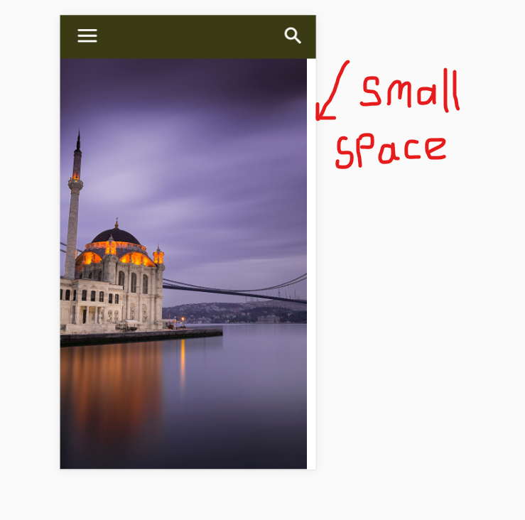
In mobile view, there is a small gap to the right of the screen in the slider. is not a problem when the page is first loaded. but then a small space appears to the right of the screen when I hit the search button. I struggled to solve it for hours. I tried on many phones. but it always happens.
what do you think? what is the reason for this?
https://i.hizliresim.com/Lb8N6Z.png
(I’m sorry to keep you busy)
Atelier ShenHi,
I’m using mobile theme, but there’s some problem when I use page caching. (I use Fastcgi_cache with Nginx)
If I enable the cache, the mobile theme will not show up. It shows original mobile layout instead.
But if I cached mobile theme first, the desktop version is gone, vice versa.
Is there any solution? Thank you!
 jakobe75
 On a mobile device, you have the option to “add to home screen” which is the purpose of having ios / retina icons. On this theme it is called bookmarklet located at: Newspaper – Theme panel — header —ios bookmarklet.
Adding to homescreen emulates a webapp experience. but with other scripts i have used, add to home screen will also hide the toolbar or give option to skin it especially in ios because the toolbar becomes huge.
jakobe75 yes, I realiazed this and figured an easy work around.
Here is a brief overview:
1. on desktop show the background video as you normally would.
2. use the icon at the top of TD composer to hide this from mobile devices
3. on mobile and tablets, again use the layout icons at the top of the TDcomposer to define the style for each mobile device, and add a custom row just for the mobile device.
4. Use an animated GIF an an image backgorund derived from the video to show only on mobile
5. hide it from from the desktop.
I have it working now and it’s a solid workaround. The gif qaulity could be better, but it is indeed working. I will work on the qaulity later.
tested on:
Android Note8
Iphone 6 and X
Android Nvidia Sheild Tablet 8″
Ipad standard size
SurfacePro 4
thanks for the helps
 jad
jad I want to remove mobile menu and choose the three main categories as main menu on desktop and mobile.
No hamburger, no modal and so on.
Regards
Simion C. Hi,
Indeed, when the mobile theme plugin is activated that will be the case. Each page will require 2 versions, desktop and mobile
– https://www.screencast.com/t/WPGMBMCWC
Page builders cannot be used on mobile pages. Note that the plugin is optional. It is useful if you want to display a different and simpler version on mobile devices.
If you want to display the same content from desktop, simply deactivate the plugin
– https://forum.tagdiv.com/the-mobile-theme/
Bogdan B. Hello,
If another plugin uses the same hook to install the plugin then you will have to disable all other plugins and install the mobile theme first. Then you cna install your other plugins.
Thank you!
Simion C. Hi,
That is how the menu is displayed on mobile by the theme. Once the hamburger menu icon is clicked a modal will appear displaying the menu, socials and login. Same for the search, with a modal window.
Something like that would not be possible based on the current mobile menu implementation.
 commandeleven
Hello,
While pages are displaying fine on the desktop, the mobile theme isn’t picking up the page content.
Please check:
https://www.commandeleven.com/about-2/
https://www.commandeleven.com/analysis/
https://www.commandeleven.com/research/
 friend–
When I try to install the Mobile Theme plugin for my Newspaper, the following error occurs:
Fatal error: Cannot redeclare class Mobile_Detect in /home/content/n3pnexwpnas03_data03/64/41601964/html/wp-content/plugins/td-mobile-plugin/Mobile_Detect.php on line 28
Any idea what might be causing it?