- NewspaperThe Newspaper Mobile Theme: Introduction
- NewspaperThe Mobile Theme
- NewspaperModules Builder in Newspaper Theme
- NewspaperFilters and sorting for taxonomies
- NewspaperHow to Add a Logo in Newspaper
- NewspaperBig Grid Flex Settings
- NewspaperHeader Builder
- NewspapertagDiv AMP Plugin Tutorial
- TutorialsFrom WPBakery to tagDiv Composer
- NewsmagSmart list ads
- NewspaperNewspaper theme documentation
- NewspaperBest Of Forums
- NewspaperCache plugin – install and configure
- NewsmagIntroduction
- NewsmagMain menu
- NewsmagLogo & Favicon
- NewsmagHeader ads
- NewsmagSmart sidebar
- NewsmagSharing buttons
- NewsmagCategory tag on modules/blocks
 Ryan Avery
The mobile Nav Icon/Nav burger doesn’t work half the time. When I tap on it the screen image jumps but nothing else happens. Then sometimes it works fine. I have tried it on iPhone, Ipad and an Android phone. Same issue, it works sometimes and sometimes it doesn’t
 MiguelPat
 Thank you!
Can you help me with the code to disable 2 categories from appearing at the mobile front page?
 UbiCrypto
Hello!
Could someone help me with the mobile version of my website? http://ubicrypto.com/
I think it has something to do with my disabling the Tag Div Mobile plugin. I disabled it because the business theme is not compatible with mobile.
The problem is that it does not load any of the pages because of a timeout. Has anyone come across this issue before?
Thanks,
 EquipaRefrigeracao
Hello,
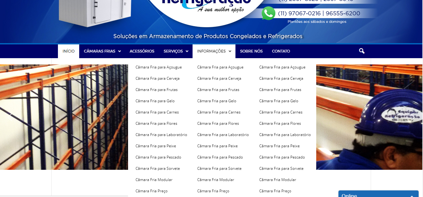
I would like to know how can I split the submenu into columns without plugins (the plugins is not working good because the default mobile menu).
I would like something like that: https://equiparrefrigeracao.com.br/wp-content/uploads/2017/09/how-to-do.jpg
My website is https://equiparrefrigeracao.com.br/
Thank you
 josecarlos
Hi,
I want to know if it´s possible to have one Slide Gallery format type for desktop and another Slide Gallery format for mobile?
I have the Tagdiv Slide Gallery format for desktop which is ok, but I need the “Default” type on Mobile.

Can you send me the code and Php file where I can do this, or can i do it with CSS?
Thanx so much for your help?
 Francis
 Hi Catalin,
Yes, we understand the mobile theme is not designed for iPad but it is triggered when we visit our website on iPad!
Our question is how we can disable the mobile theme when someone visits our website on iPad or other tablets. You understand what we mean?
Thank you.
 Aleksandar
 Hello,
This is happening only on mobile, please check with mobile and you will see that blue background on the right side when you scrool the page, it’s working normal on homepage, but on posts it looks very ugly when you accidentally move from right to left. Here is video: http://beograd.in/wp-content/uploads/2017/09/video-1505132889.mp4
Hope you can help with this.
Thanks
Best regards
 Catalin
 Hello nicobros,
Please notice that the mobile theme will be loaded only for devices which have maximum 767px as width. The mobile plugin has not been designed to be used for iPad or any other devices.
Thanks for your understanding!
 Bogdan B.
 Hello,
Sorry but the mobile theme has no filters or controls over the content displayed on the front page. It will show a list of your latest articles. If you want to change this rule, you will have to alter the code: https://www.screencast.com/t/3UZZP3qE0Fos
Thank you!
 SuperArmySoldiers
 Sorry I think I have not explained myself very well… the Mobile layout doesn’t seem to allow for 3 menus… I cant see any setting to allow ‘Top Menu’ ‘Main Menu’ ‘Footer Menu’
http://www.caffeinegaming.com
You can see on the desktop site 3 menus.
But on the mobile only 2.
Thanks!
 Eric V
 I uploaded my logo, normal and retina, and it seems fine at first. But when i scroll down on mobile and go back up, the logo is nog bright anymore. The edges are ragged. Why it this?
FrancisHi Team,
Thanks for your excellent theme. It looks great and is user friendly.
Yesterday, I tried to visit our website on iPad, we found that the mobile theme was triggered. It looks very ugly and it seems that mobile theme should not be shown on iPad.
We read through some of your questions here regarding this issue. We are sure we do not have any cache plugin with our site.
Could you advise how we can fix it? Below is our website for your reference, thank you!
Regards,
Nico
MiguelPatHi,
Is there anyway to avoid post from a certain category to appear at the tagDiv Mobile Theme homepage?
 Federico
 Chris sorry, I also tried with speed booster but it does not work … this is what comes out of the pagespeed:
https://www.ecomesifa.it/wp-includes/js/jquery/jquery.js
https://www.ecomesifa.it/…includes/js/jquery/jquery-migrate.min.js
Ottimizza la pubblicazione CSS degli elementi seguenti:
https://www.ecomesifa.it/…mponents/popovers/resources/popovers.css
https://www.ecomesifa.it/…live/assets/css/td_live_css_frontend.css
https://www.ecomesifa.it/…ontent/themes/Newspaper/mobile/style.css
https://www.ecomesifa.it/…ns/aawp/public/assets/css/styles.min.css
 Ali Zoghi
Hi
I shared the header of http://www.example.com/parent with http://www.example.com/child with switch-blog function of multisite. It means that the child site has no menu for itself and it uses the menu and header+footer of the parent site. There are some issues:
1) Mega menu ajax is not working
2) search button in mobile size is not working (I think again it relates to ajax call)
3) Sticky menu is not working
Would you please say me what is the problem and how can I solve them.
Catalin Hello Hero,
Notice that the Mega Menu works only for Desktop version and not for mobile devices, sorry! The same main menu will be displayed for mobile devices. If you want to have that arrow you should create a sub-category.
Thanks.
 AzharNadeem
 On mobile, just try to scroll right. It is scrolling and showing white space on right but it shouldn’t be scrolling.
SuperArmySoldiersHey,
Any way to have a button on the mobile site to switch to the desktop site?
Thanks
SuperArmySoldiersHey,
I need to display 3 menus on my mobile site. Same as my desktop site.
Top Menu
Main Menu
Footer Menu
But the theme seems to only allow to set 2 of them.
Any way to set all 3?
 Coin Hero
 I need the subcatogeries just for the mobile menu. At the desktop version i have the mega menu which works fine.
For the mobile menu i need the arrows and not the mega menu.
How can I figure this out?
AzharNadeemOn mobile, I can scroll the page to right but there is whitespace only.
http://www.sportscourant.com
Coin Hero ok thanks! How Can I change it that there is a mega menu at the desktop version BUT an arrow at the mobile version?
Catalin Hello Coin Hero,
I have inspected your website and I saw that your Mega Menu and mobile menu work as expected. Please notice that the arrow appears on the desktop version because you are using the Mega Menu and below the Wissen category will be displayed all the posts from this category. So, on the mobile menu, the arrow does not appear in front of this category because the Wissen does not have any subcategories and that’s why these does not exist.
I hope this helps!
Thanks for your understanding!
 llucson
 Solved. Just copy&paste the same html in mobile editor and solved. The page is visible in tag div mobile too. Thanks
 Jair Prandi
 I think there’s a problem. When you click on the Mobile menu icon, the link appears with # at the end.