- NewspaperThe Newspaper Mobile Theme: Introduction
- NewspaperThe Mobile Theme
- NewspaperModules Builder in Newspaper Theme
- NewspaperFilters and sorting for taxonomies
- NewspaperHow to Add a Logo in Newspaper
- NewspaperBig Grid Flex Settings
- NewspaperHeader Builder
- NewspapertagDiv AMP Plugin Tutorial
- NewspaperNewspaper theme documentation
- NewspaperBest Of Forums
- NewspaperCache plugin – install and configure
- NewspaperFont Customization
- NewspaperTheme Colors Introduction
- NewspaperBackground Introduction
- NewspaperHeader ads
- NewspaperPost template ads
- NewspaperCustom ad spots
- NewspaperMain Menu
- NewspaperHow to Install Newspaper via FTP
- NewspaperHow to Install Newspaper via WordPress
 frasercarly89
 Hey Lucian,
I’ve check with a few friends and they all say that my site looks alright now. This is what we all see:
http://www.screencast.com/t/11inp7dbS
Can you clear your cookies and cache of your browser and check to see if that is what you see?
I replaced my style.css code with the original, not minified – when I minify my style.CSS code, the mobile site completely messes up – do you know why? It appears as the above. It is recommended to minify in Chris’ pagespeed post (he outlines how to do it) – but it makes the mobile theme un-useable.
 Lucian
 Hi,
There is no mobile version, the code is the same for each viewport. I’ve tested this on mobiles also and its working fine there also. Please make sure that you empty all caches then try again.
Thanks
 kjohnson
 Sorry about that. You’re right, should’ve looked closer. It worked on desktop but not on mobile. Is there a line where I should put this same code for mobile?
-
This reply was modified 11 years by
kjohnson.
 Alin [tagDiv]
 Hi,
I don’t recommend to reduce to decrease this padding as it is part of the grid width. Modify it you will need to modify also the width of the theme. Unfortunately Newspaper has an fixed grid layout, responsive as it is fluid and style for desktop/tables/mobile screens. So changing the width would not be easy as it needs changing the width value for all elements on pages and for this you would need custom work.
Thanks!
 Natuurlijk Hosting
 Hi,
Yes, I flushed the cache – that seemed to work on my desktop.
But there is also a search button when I check the site on my mobile:
http://www.nieuwetijdskind.com/mobiel.jpg
I cleared the history and cookies on my iphone, but the issue still persists…
Any idea?
Sincerely, Niels
 simchris
 Presuming you placed relative link to the logo in the theme panel, for both desktop and mobile logos?
Some of these things don’t always work in local environment, depending on how you have your paths setup, etc.
Not having this issue on any of my sites, but yours may be setup in some odd way. Kind of hard to check since your website not yet live to test.
Try deleting the logo file in the theme folder to see if you even have the paths correct. Check paths to where you’re placing the new logo to see if logo location resolves.
When you go back to theme panel does it show preview of your logo once you’ve selected it ? If not, paths likely wrong.
Just a thought. Usually a caching issue, however, hence my comment. (SOrry). 🙂
 beautywarrior
Please let me know how can one display menu categories on header in mobile.
Thanks..
Alin [tagDiv] Hi,
I have checked your site and I see that you have customize your logo on mobile: http://screencast.com/t/fRnnExcv so I’m not sure what are you trying to do.
Please try this custom css for space between slider and instagram: http://screencast.com/t/MlhZ6xLG
@media (max-width: 767px) {

.home .td_normal_slide .td_mod_wrap  {

margin-bottom: 0px;

}

.home .td_normal_slide {

margin-bottom: 0px;

padding-bottom: 0px;

}

}
Thanks!
 David
DavidHi,
is there a possibility to add an article that sticks to a defined position and contains only ad code? What I’m looking for are ads in categories and timelines for mobile view. The only ad that occurres here is the one from the sidebar way down at the bottom or none with activated infinite load.
Thanks,
Loano
 Brain916
 I see,
What if I want to add an eBay code that will be displayed on desktops, but when on mobile it swaps out for a google adsense code?
Alin [tagDiv] Hi,
Those divs are recommend for non adsense code.
If you want to disable ads on mobiles you have an option in Theme Panel > Ads: http://screencast.com/t/IkYvbW6E
Thanks!
 googlybear
I’m having some issues with the mobile menu. It sometimes works, but sometimes doesn’t. For example, it might work on the home page but in a post page it won’t work. Then I’ll go to a category and have it work, then go to another category and not be able to open it. This is using an Android device’s internet and Chrome browsers. When I view the mobile responsive view on a desktop the mobile menu works perfectly.
I’ve already tried testing all my plugins and do not have minification of javascript enabled in my caching plugin or cloudflare. Rocket loader is also turned off.
Could you look into this and see what might be causing the issue? Website is: starbuckssecretmenu.net
Thank you!
 palfirevic
Hello
I’m using newspaper theme only on mobile version of my site. My desktop site is Gavick, but mobile version is newspaper. So I succeded to redirect to newspaper theme, but problem is when I turn on Visual Composer my whole site goes down.
I’ve managed to put block via short code, but big slide is impossible. So can you help me please?
 Bintmusic
 Thanks Lucian, is ok..!
looking google webmaster I saw that google shows another mistake
search/
looking into the code it seem it come from
<!– JS generated by theme –>
<script>
var td_blocks = []; //here we store all the items for the current page
var td_ad_background_click_link=””;
var td_ad_background_click_target=””;
var td_ajax_url=”http://www.site.com/wp-admin/admin-ajax.php”;
var td_get_template_directory_uri=”http://www.bintmusic.it/wp-content/themes/Newspaper”;
var tds_snap_menu=””;
var tds_header_style=””;
var tds_mobile_swipe=””;
var td_search_url=”http://www.site.com/search/”; <<<<<<<<<<<<<<<<<<<<<<<<<<<<<
Any suggestion?
Thanks
 mnguyen87
 I would like to know if anyone can help me move the logo to the top and center it. I was also wondering if there’s a tool for the desktop to edit the css for the mobile view.
mnguyen87Hello,
I have finally finished configuring my website to the way I want it to look. But when I view it on my phone everything seems a little off. The logo seems to be on the right side and there is a huge gap between the slide and instagram header. Some advice and tips would be greatly appreciated on to how to fix this.
website url: http://www.onefreshgeek.com
Brain916Hello, I wanted to disable the ads on Mobile (header), but no matter what I do they still show up. I deactivated all plugins, cleared cache etc and still nothing. Here is the beta test site:
http://www.sneakerfiles.com/oncourt/
Thanks in advance.
simchris Might be the popup script — mobile devices generally don’t like those.
 sbenson2129
My menu button in the top left of the menu bar on mobile no longer open’s my menu – http://higherperspectives.com
Any insight on how to get that menu working again?
googlybearIs there a way to make the pagination area on mobile view larger? I would like to make it more noticeable and easier to navigate, spanning the width of the screen if possible.
The top is how it currently looks and I would like for it to look like example #2.

Thanks for your help!
 mgrimshaw
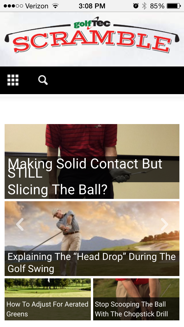
I am having an issue with Big Slide Main Font overlapping on mobile devices, please see screenshot here:
http://golftec-images.s3.amazonaws.com/2015/website/scramblemobile-bug.png
Have adjusted font sizes and line height to no avail.
Your suggestion would be greatly appreciated!
Thank you,
Alin [tagDiv] Hi,
A solution will be to add a link to your menu and display an image(logo) there – http://screencast.com/t/VE5x0uBDJ
Now you need to hide it on main menu and show it only for sticky menu via custom css(using menu item unique class) and also hide mobile logo that is used by default in sticky menu: http://screencast.com/t/UbdA7KAqv
For mobile screens will remain mobile logo that you have set in Theme Panel: http://screencast.com/t/LqFLma80C
@media (min-width: 768px){

.td-main-menu-logo.td-logo-sticky {

display: none;

}

}

.sf-menu .menu-item-1707{

display: none

}

.td-affix .menu-item-1707 {

display: block;

}

.menu-item-1707 img {

max-width: 50px;

max-height: 40px;

}
Thanks!
 Bichareh
 A lighter theme for mobiles would be great, without the whole code of the Desktop-Site. That would speed up the whole thing!!! 🙂
Just my two cents.
Btw…can you tell us some improvements/features you guys have on your list for the next update?
 felizubi
 iPhone being one of them it seems. Actually, now I’m thinking that in fact there isn’t much space on mobile screens to have the #ttop link without cover the text of an article…
Fz
 St
StHi,
I am wondering how to make a Home logo in sticky menu.
I know that I can make logo mobile. However, using the logo mobile, make the menu becomes 2 lines.
If I make the logo mobile very narrow, it does not look nice on mobile device.
Any solution for this?
thanks
st