- NewspaperThe Newspaper Mobile Theme: Introduction
- NewspaperThe Mobile Theme
- NewspaperModules Builder in Newspaper Theme
- NewspaperFilters and sorting for taxonomies
- NewspaperHow to Add a Logo in Newspaper
- NewspaperBig Grid Flex Settings
- NewspaperHeader Builder
- NewspapertagDiv AMP Plugin Tutorial
- TutorialsFrom WPBakery to tagDiv Composer
- NewsmagSmart list ads
- NewspaperNewspaper theme documentation
- NewspaperBest Of Forums
- NewspaperCache plugin – install and configure
- NewsmagIntroduction
- NewsmagMain menu
- NewsmagLogo & Favicon
- NewsmagHeader ads
- NewsmagSmart sidebar
- NewsmagSharing buttons
- NewsmagCategory tag on modules/blocks
 heyjohnboy
Hi. I am not using the mobile theme, just the responsive layout. When viewing the site on a mobile device the post in the left column of my desktop layout shows as the first post, but I want the post that is showing in the center column of my desktop layout to be the first post when viewing the site on a mobile device. How do I accomplish this? I am using the Downtown Pro theme. Thanks!
 uxengineer
Notice: Function amp_has_paired_endpoint was called incorrectly. Function called while AMP is disabled via amp_is_enabled filter. The service ID “paired_routing” is not recognized and cannot be retrieved. Please see Debugging in WordPress for more information. (This message was added in version 2.1.1.) in /data/wordpress/htdocs/wordpress/wp-includes/functions.php on line 6121
AMP Version version2.5.5
tagDiv Mobile Theme version 2.7
 attp
attp What was the fix here? In theme panel I have everything disabled and also no ad box elements in tagdiv editor. Still ads visible but only on mobile
attpI have this tagdiv offer advertisment paired with text – advertisement – that has an image of some shoes with tagdiv texts in it. I have every ad disabled everywhere + I dont have the tagdiv advertisement switch on the systetm status settings at all. The ads don’t appear on anything else but on my iphone, not even on mobile version via pc browser
 fatso
fatsoI am using Downtown Pro. I imported:
`
Page templates
Cloud Templates
Mobile Template
Section 2 – Cali Sight
`
I have the error on page: Flex Block BuilderThe Cloud Library Module Template set for this block is not valid or it no longer exists. Please select another Module Template.
I read advice here: https://forum.tagdiv.com/topic/flex-block-builder-problem/
and
I read advice here: https://forum.tagdiv.com/topic/flex-block-builderthe-cloud-library-module-template-set-for-this-block-is-not-va/
In Module template >> Edit
I have a drop down menu, however I do not have anything to select in that menu, extept - Select Module Template -
Nothing exists to select.
Please can someone at TagDiv offer the most authoritative response to resolve this? I have 4 pages to set up, and I would like to work quickly and efficiently through the issues to bring the service online expediently.
Thank you.
 Michael Wong
 I created a mobile menu using a modal popup element, but the top of the popup menu isn’t flush with the mobile browser; there’s space between the menu and the browser (https://imgur.com/gallery/OPB8wt6). There’s also a white border around the popup’s close button (https://imgur.com/gallery/LxSYiz2). My requirements are as follows:
https://adriennew5.sg-host.com/
1. Remove the space between the popup menu and the browser window.
2. Remove the white border around the popup’s close button.
 da zuoshou
 https://i.postimg.cc/50CXbrht/chrome-zd-AVr7m1YU.png
Specifically, the image portion of this link loads slowly, impacting LCP. Is there a local solution available? Website: http://www.yigeni.cc
另外,https://pagespeed.web.dev/测试结果:https://pagespeed.web.dev/analysis/https-www-yigeni-cc/rpqy39js1o?form_factor=mobile
 Calin
Calin Hi,
The default version for mobile is the responsive one.
Thank you!
Calin Hi,
Using the mobile theme and AMP is no longer recommended as it once was.
Mobile theme and amp ar limited you can use only the theme panel options under mobile theme
Also, for pages you need to set the content in mobile editor manually, content that must be created using the mobile editor, not other builders, and not copy/paste the page content in mobile editor.
Related to cache, when you are not using the responsive version, then you need to use a separate cache for the mobile version; otherwise, the mobile version will be displayed on desktop and the desktop version on mobile.
Thank you!
 enochjensen
Hi,
I recently upgraded the Newsmag theme and tried to use AMP to run my mobile side, but it left all the formatting stripped and was serving only raw unformatted articles. I followed all the steps via guides but still no luck when I activate AMP. http://www.larecording.com (AMP off, mobile theme on)
Calin Hi,
To use the responsive version, just make sure that you do not have the tagDiv Mobile theme plugin (or/amp amp plugin). After this is checked and confirmed, this plugin is not used, or in case it is, it is disabled and deleted. Please check if you have made any mobile pages https://tagdiv.com/newspaper-10-3-7-update-brings-customizable-and-fast-mobile-pages/ if you have mobile pages make sure those are not assigned on pages and cloud templates (for templates, is simple, you can see it in cloud templates if there are any mobile templates – https://i.imgur.com/mgvfs0y.png )
After that, just learn all the ache, the responsive version will be used.
The newspaper theme has three available solutions for the mobile version:
1. Responsive Desktop Version – The default responsive layout that adjusts to mobile screens using tagDiv Composer – https://i.imgur.com/apZQZ0o.png
2. Mobile Page/Template – A custom mobile layout that can be created using the tagDiv Composer.
3. tagDiv Mobile Theme Plugin – A separate mobile theme that provides a dedicated mobile experience but is limited in edits and changes.
Calin Hello,
First we need to see if you are using the responsive version of the theme, the mobile page template or the mobile theme plugin. If you are using the tagDiv Mobile theme plugin the mobile layout will be simple, if is a mobile page template, then this is edited using tagDiv Composer but is a separate page/template.
Now in case that it is the responsive version for each option from the element that can be set separate on responsive eversion you’ll see a left bar when you are on any view port except the desktop version https://i.imgur.com/kSwuXzD.png
Thank you!
Calin Hi,
This is because that page was not made using tagDiv Composer, therefore the sidebar is using widgets that can be edited from appearance > widgets.
The logo can be centered using tagDiv Composer. I just checked the website and it appears that you manage to center the logo on mobile https://i.imgur.com/OSORY7c.png
Thank you!
 ComicsBeat
Following up on my earlier question, I fixed the page with the mobile theme but it refuses to update. I would like to enable the default newspaper Mobile Theme while I figure out why the page isn’t working. But how do I do that? The plugin is activated.
Calin Hi,
This situation appears because you are using the tagDiv Mobile theme plugin instead of the responsive version. To have the same layout and content as on desktop, please go to plugins and look for the TD Mobile theme plugin, disable it, clear all cache, and the responsive version will be displayed.
I hope this will help you!
ComicsBeat So I did figure out how to adjust fonts on the mobile theme, however now my homepage on desktop is showing the mobile theme!
 andros1983
When I edit a page in Tagdiv, I can’t access Social Counter or other modules, but they do appear on the page later, as shown in the attached images.
https://postimg.cc/dLqt0ywL
https://postimg.cc/svVD2hs7
Also, I need to know how to center the logo image perfectly for the mobile version; it’s currently shifted to the left. I’ve also attached a photo.
https://postimg.cc/pp2XdFRm
 Portalinjo
I cant make any changes to my mobile newspaper theme. Changing things like header color work only when changed from theme panel.
I basically see one site when im editing on tagdiv and than a totally different looking site when I save and open from mobile phone.
Calin Hi,
This situation appears because you are using the tagDiv Mobile theme plugin instead of the responsive version. To have the same layout and content as on desktop, please go to plugins and look for the TD Mobile theme plugin, disable it, clear all cache, and the responsive version will be displayed.
I hope this will help you!
Calin Hi,
What you need to do is to check the settings on the mobile viewport and adjust them on each block that doesn’t look ok and on each column. For this edit, teh page using tagDiv Composer – https://i.imgur.com/D9Gawe6.png then select the mobile view port – https://i.imgur.com/Pks8bjA.png after that select the block that do not looks good, the one from your image I beelive taht has set on the column that is holding ist a custom width (300%) so on mobile should be 100%, to do this slect the element the in the side bacr in tagDiv Composer over the block name you see row > column click on column and look in Layout tab and css if there are any values set for width, if there are repalce them with 100%.
Also, the flex block can be edited per viewport for example, the number of modules per viewport – https://i.imgur.com/Lk9aW6X.png
 Grafimm
Good morning,
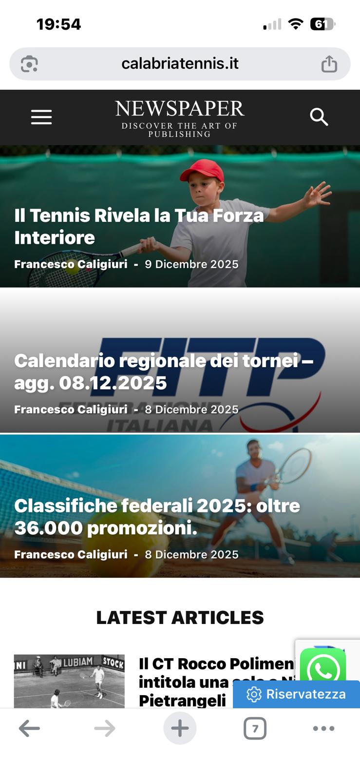
I would like to report that, when browsing from mobile devices, the website http://www.calabriatennis.it
displays a completely different display than when browsing from a desktop computer.
I’m attaching a screenshot showing how the image and layout are currently displayed on phones.
I remain available for any queries or further information.
I attach the link of the mobile screen of how it looks:
https://www.calabriatennis.it/wp-content/uploads/2025/12/1765474114.7331.jpg
Best regards,
Francesco Caligiuri
ComicsBeatI am using the responsive theme for mobile but the fonts aren’t working. However I can’t get the standard mobile to theme – and the selection area is greyed out, as you can see in the attached screenshots.
Hi Mick,
I just checked the website using my mobile, and for me, it’s happeing that the problem with the header is like this, the logo is over the mobile menu – https://i.imgur.com/6WCLGzs.png, so maybe in your case it’s ok, on mobile, but it appears to be a more global problem. Could you please check the settings from teh cache plugin?
 Sebshot69
 psw: neuro2026
https://neuro.swiss/wp-content/uploads/2025/12/Capture-decran-2025-12-15-a-14.30.22.png
This is a mobile mode code error affecting the menus… I’ve temporarily hidden it with this code: // Hide PHP warnings
error_reporting(E_ERROR | E_PARSE);
ini_set(‘display_errors’, ‘0’);
 hrhq2020
 Hi Calin,
Thanks for getting back to me.
The Links page is created using the TagDiv Composer. It page inherits the Header and Footer from the Newspaper Theme.
In mobile Chrome and Safari the menu and logo work properly – no layout shifting.
In the Instagram mobile app (iPhone & Android) the layout shifts, moving the Logo over the menu. The layout shift moves the content of the page up and stops the user selecting the most recent article.
Link: https://www.hrheadquarters.ie/wp-content/uploads/2025/12/IMG_1617DD712B27-1.jpeg
All the best,
Mick