
- NewspaperThe Newspaper Mobile Theme: Introduction
- NewspaperThe Mobile Theme
- NewspaperModules Builder in Newspaper Theme
- NewspaperFilters and sorting for taxonomies
- NewspaperHow to Add a Logo in Newspaper
- NewspaperBig Grid Flex Settings
- NewspaperHeader Builder
- NewspapertagDiv AMP Plugin Tutorial
- TutorialsFrom WPBakery to tagDiv Composer
- NewsmagSmart list ads
- NewspaperNewspaper theme documentation
- NewspaperBest Of Forums
- NewspaperCache plugin – install and configure
- NewsmagIntroduction
- NewsmagMain menu
- NewsmagLogo & Favicon
- NewsmagHeader ads
- NewsmagSmart sidebar
- NewsmagSharing buttons
- NewsmagCategory tag on modules/blocks
 dan009
Created a mobile page and added Flex box 1, went to Content – excerpt and set to 0, it shows still, set to 1, it hides for some but not for all.
The more I play with this theme the more bugs are popping out.
Sometimes the settings reset to default values.
 thalesbrandao
  Calin
Calin Hi thalesbrandao,
I checked the topic related to your problem and this is different; you have a fatal error related to the amp settings + mobile theme for the slug. The situation in this topic was related to the notice that had been displayed on the website.
Please check the suggestion I provided in your topic; it should resolve the problem.
Thank you!
Calin Hi,
Checking the error log provided, it seems the situation is caused by the option for amp from the tagDiv Mobile theme plugin (I believe it is related to the slg selected for amp). What I recommend is to use FTP or cPanel and remove the td Mobile theme plugin. After that, the website should be back.
Thank you!
thalesbrandao Ao procurar ajuda com esse problema, podem solicitar que você forneça algumas das seguintes informações:
WordPress versão 6.9
Tema atual: Newsmag (versão 5.4.3.4)
Plugin atual: tagDiv Mobile Theme (versão 2.7 | built on 04.11.2025 10:36) PHP versão 8.3.28
Detalhes do erro
================
Um erro do tipo E_ERROR foi causado na linha 300 do arquivo /home/cidadema/public_html/marketing/wp-content/plugins/td-mobile-plugin/td_mobile_theme.php. Mensagem de erro: Uncaught Error: Class “AMP_Theme_Support” not found in /home/cidadema/public_html/marketing/wp-content/plugins/td-mobile-plugin/td_mobile_theme.php:300
Stack trace:
#0 /home/cidadema/public_html/marketing/wp-includes/class-wp-hook.php(341): td_mobile_theme::{closure}(”)
#1 /home/cidadema/public_html/marketing/wp-includes/class-wp-hook.php(365): WP_Hook->apply_filters(NULL, Array)
#2 /home/cidadema/public_html/marketing/wp-includes/plugin.php(522): WP_Hook->do_action(Array)
#3 /home/cidadema/public_html/marketing/wp-content/plugins/td-composer/legacy/common/wp_booster/td_wp_booster_functions.php(34): do_action(‘td_global_after’)
#4 /home/cidadema/public_html/marketing/wp-content/plugins/td-composer/legacy/Newsmag/functions.php(22): require_once(‘/home/cidadema/…’)
#5 /home/cidadema/public_html/marketing/wp-content/plugins/td-composer/td-composer.php(191): require_once(‘/home/cidadema/…’)
#6 /home/cidadema/public_html/marketing/wp-includes/class-wp-hook.php(341): {closure}(”)
#7 /home/cidadema/public_html/marketing/wp-includes/class-wp-hook.php(365): WP_Hook->apply_filters(”, Array)
#8 /home/cidadema/public_html/marketing/wp-includes/plugin.php(522): WP_Hook->do_action(Array)
#9 /home/cidadema/public_html/marketing/wp-content/themes/Newsmag/includes/wp-booster/tagdiv-wp-booster-functions.php(3): do_action(‘td_wp_booster_l…’)
#10 /home/cidadema/public_html/marketing/wp-content/themes/Newsmag/functions.php(20): require_once(‘/home/cidadema/…’)
#11 /home/cidadema/public_html/marketing/wp-settings.php(710): include(‘/home/cidadema/…’)
#12 /home/cidadema/public_html/marketing/wp-config.php(106): require_once(‘/home/cidadema/…’)
#13 /home/cidadema/public_html/marketing/wp-load.php(50): require_once(‘/home/cidadema/…’)
#14 /home/cidadema/public_html/marketing/wp-admin/admin.php(35): require_once(‘/home/cidadema/…’)
#15 {main}
thrown
Calin Hi,
I just checked the website and I see that the background color on the icon box element is on both desktop and mobile. Therefore, I recommend checking it with the tagDiv Composer.
Thank you!
Calin Hi,
This situation usually appears because you are using the tagDiv Mobile theme plugin instead of the responsive version. To have the same layout and content as on desktop, please go to plugins and look for the tagDiv Mobile theme plugin, disable it, clear all cache, and the responsive version will be displayed.
I hope this will help you!
Calin Hi,
This happens because the logo element is different in the desktop header and the mobile header. To avoid having multiple H1s on the page, you need to disable the H1 on the logo in either the desktop or the mobile header so that only one logo has the H1 enabled.
Please check the “Disable H1 on logo” option for all logos except one. Only that single logo should have the H1 active.
Thank you!
 dlogan2023
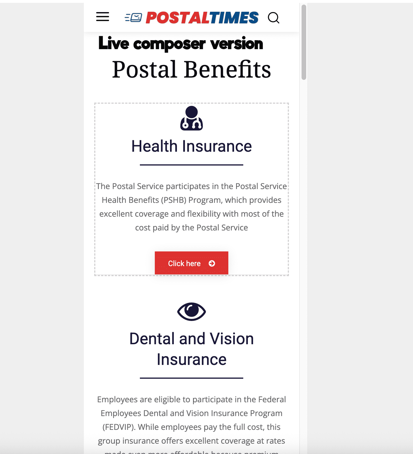
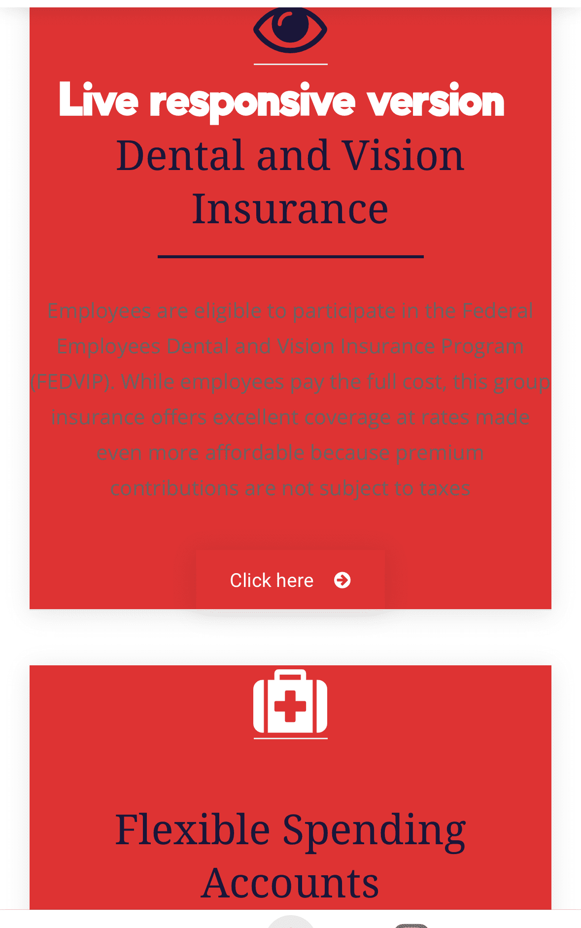
My responsive mobile pages are not following the colors settings I have set in the composer.
 dwhagood99
On my new site, when I open the URL it doesn’t match what I see when I’ve entered the WP backend to edit. Once I’ve logged into WP backend then in the browser the newpaper template looks as I expected. But if I open the URL on another pc in chrome it which hasnt been into the WP backend, then it doesnt look correct.
It has a mobile menu showing and looks like a mobile look, how do i turn that off so it only shows the desktop newspaper look?
Calin Hi,
I just checked the website using my mobile, and I do not see any arabic text. Did you manage to resolve it? If not, could you provide some screenshots?
 UKTN
UKTNHaving installed one of the pre-built website, I opted for the Observer theme but cannot remove the arabic text from the old theme on the mobile version. Cleared/flushe, cache but to no avail…..help?
Link to site: https://uktendernotice.com/
Calin Hi,
To cache mobile and desktop separately in LiteSpeed, enable “Separate View for Mobile Devices” in the LSCache plugin, ensure matching User-Agent rules in your .htaccess (or let the plugin handle it), and crucially, ensure LSCache directives come before other rules.
But, as mentioned above, on Cloudflare, you must enable ‘Cache by device type” (APO users) option; and this is only on the paid version.
Calin Hi,
By default, the H1 tag is applied to the logo. If you’re using Cloud, you can use the tagDiv Composer to remove the H1 from the logo (you need to do this for both mobile and desktop views).
Here’s an example: https://i.imgur.com/0BjZdOj.png
Thank you!
Calin Hi,
Please make sure that on mobile viewport you have exactly those settings, width and height 100% border 0 and position over content.
Thank you!
Calin Hi,
When you are not using the responsive version on mobile you need to make sure that the cache use have the option to cache and provide a cache separate for mobile, also for Cloudflare you need to have Enable ‘Cache by device type” (APO users) option; unfortunately, this is not in the free version.
Thank you!
Calin Hi,
I have tried the column order settings, they seem to work. For example in a row with 3 columns, with a custom order set for mobile https://prnt.sc/vgrhp0 -> https://prnt.sc/vgri6i Be sure to activate this setting for that respective row on mobile https://prnt.sc/vgrj33 It should work the same for you.
Flexibility Features for Rows and Columns
Thank you!
Calin Hi,
This situation appears because you are using the tagDiv Mobile theme plugin instead of the responsive version. To have the same layout and content as on desktop, please go to plugins and look for the tagDiv Mobile theme plugin, disable it, clear all cache, and the responsive version will be displayed.
I hope this will help you!
 Portalinjo
I created a custom mobile homepage with tagdiv composer and i set it up to be the homepage of the mobile version. Sometimes when I check my website I can see that the the custom homepage is not loading and instead website loads the responsive version of my desktop homepage. I have the mobile theme plugin disabled. I also use litespeed (cache on) and cloudflare.
my website is http://www.rezon.ba
 heyjohnboy
 Thank you Calin. On the second screenshot you shared (https://i.imgur.com/yZGWyLf.png), can you explain how the “Order” field works and what the available settings are? I tried switching that from “auto” to a number variable, but all it did was take the last row from the desktop layout and move it to the top on the mobile layout, no matter how what I entered into that field in place of “auto.”
 Mediv
MedivThe site on mobile opens totally different, it just loads articles instead of all the designs i made on desktop, what can i do?
 attp
attp Hey, thanks for the reply, but there is no image ad tab or any banner in my tagdiv composer. The ad still appears. There is nothing to remove, anywhere at all. It’s broken. No ad boxes, no ad elements, its 100% clean on all desktop/pc/mobile version but still the ad comes up on my phone.
-
This reply was modified 9 months by
attp.
Calin Hi,
This can be edited using tagDiv Composer. Select the mobile viewport and you can revert the row columns order – https://i.imgur.com/D1ottlk.png https://i.imgur.com/yZGWyLf.png Also, you can edit the column on each viewport. Currently, I think that on mobile, the width set for the desktop version is used.
Thank you!
Calin Hi,
Using the mobile theme and AMP is no longer recommended as it once was.
Mobile theme and amp are limited; you can use only the theme panel options under mobile theme.
I also made some tests – https://i.imgur.com/3dv4Uyw.png. Unfortunately, I cna not recreate the problem. Could you please let me know the settings you have on the mobile theme and amp to recreate it?
Thank you!
Calin Hi attp, please check this topic – https://forum.tagdiv.com/topic/cant-remove-tagdiv-advertisments-on-mobile/#post-538042



