
- NewspaperThe Newspaper Mobile Theme: Introduction
- NewspaperThe Mobile Theme
- NewspaperModules Builder in Newspaper Theme
- NewspaperFilters and sorting for taxonomies
- NewspaperHow to Add a Logo in Newspaper
- NewspaperBig Grid Flex Settings
- NewspaperHeader Builder
- NewspapertagDiv AMP Plugin Tutorial
- NewspaperNewspaper theme documentation
- NewspaperBest Of Forums
- NewspaperCache plugin – install and configure
- NewspaperFont Customization
- NewspaperTheme Colors Introduction
- NewspaperBackground Introduction
- NewspaperHeader ads
- NewspaperPost template ads
- NewspaperCustom ad spots
- NewspaperMain Menu
- NewspaperHow to Install Newspaper via FTP
- NewspaperHow to Install Newspaper via WordPress
 projectya
Hello,
I’m having trouble translating several elements on my website.
1.https://prnt.sc/9u7V_xKja8nB
2. https://prnt.sc/w6u67uZWkOXl
3. https://prnt.sc/DYlYuEW9HPml
4. https://prnt.sc/lIzo6YcZjTCW
5. https://prnt.sc/bLnrYJrdAw5Z
6. https://prnt.sc/i48-rjEdbfzM
7. https://prnt.sc/M8rlfJBVUsnX
8. How can I set up the mobile version of the website to display on phones because now it displays a demo
9. https://prnt.sc/3I_xMkjLg2nl
10. https://prnt.sc/8OL45j8c1KAW | How and where to set up a subscription plan?
11. https://prnt.sc/OBhucA1P_3uF
I’m mainly missing translations and don’t know where to get them. I’m asking for help.
 Calin
Calin Hi,
The issue isn’t with the block itself the problem is that the desktop main header is set as fixed and overlay, which causes it to remain stuck at the top and overlap the content, as shown here: https://i.imgur.com/FBgfNvF.png
Additionally, when you scroll down, the sticky header appears on top of the already fixed main header, creating further overlap.
Recommendation:
Disable the overlay and set the main header to the default setting instead: https://i.imgur.com/cIEVrc3.png
After saving the changes, proceed to edit the sticky header as shown here: https://i.imgur.com/ZpaAd9B.jpeg
Make sure to do the same for the mobile view. Switch to the mobile viewport and then edit the mobile header accordingly: https://i.imgur.com/q1qdqT1.png
 Game Press
 HI,
I know about all three of these solutions. I want to use the Mobile Page/Template, which I have set up and is also listed on the homepage as its mobile version, but despite all this, the Default Responsive Desktop Version is automatically loaded.
That’s why I’m asking if you have any idea where the error could be. I set up the cache, completely removed it and replaced the plugin, but the result is still the same.
I’m happy to provide admin access.
Thank You
 duck1970
 Hi Calin, I think I’ve more or less managed to create the mobile and header menus, solving points 2 and 3. But I couldn’t remove the NEWSPAPER tab. I did manage to keep the menu fixed without scrolling. However, I don’t know what I’ve done that broke the header. The main block isn’t visible in its entirety; it appears stacked. And I can’t find what I’ve done to get it back to the way it was, which showed the entire block. Can you help me figure out what I need to do to restore the first block? I’ve attached a photo.
Thanks and sorry for this inconvenience.
https://new.radiomarcabarcelona.com/capture/block.png
Calin Hi,
Here are the three available solutions for the mobile version:
1. Responsive Desktop Version – The default responsive layout that adjusts to mobile screens.
2.Mobile Page/Template – A custom mobile layout that can be created using the tagDiv Composer.
3. tagDiv Mobile Theme Plugin – A separate mobile theme that provides a dedicated mobile experience.
Note: When the tagDiv Mobile Theme Plugin is activated, it takes priority and will be displayed on mobile devices. If it’s not active, the system will check for a mobile page/template built with tagDiv Composer. If neither of these is in use, the responsive desktop version will be shown by default.
Related to the cache, please check in the cache plugin documentation if this supports mobile cache.
Calin Hi,
Can you pleae contact us in privat via email at contact@tagdiv.com and provide there some more scrrenshots, details and temporary wp-admin access to investigate the situation.
Usualy the mobile version is not the same with desktop version when the tagDiv Mobile theme plugin is used.
Thank you!
Calin Hello,
1. What you see is the sticky menu, which can be disabled using tagDiv Composer, checking the manager and disabling it https://forum.tagdiv.com/header-manager/ – https://i.imgur.com/ZXBFvVT.png. Do the same for both the desktop and mobile versions.
2. This situation appears because the header from desktop is using a different code nad the mobile header othere code, so those can be different, so what you can do is to use tagDiv Composer to edit the mobile header, edit the homepage, selct the mobile viewport and add a new row under the mobile header (make sure it’s under the header not content) an ad box element https://i.imgur.com/Oz1Ev58.png https://i.imgur.com/dxujNzQ.png
3. You need to have created a menu as in this guide https://forum.tagdiv.com/main-menu/, then use tagDiv Composer, edit the homepage and select the mobile viewport, then select the mobile menu and choose the created menu – https://i.imgur.com/MvNUaM8.png – https://i.imgur.com/KjMQiem.png – https://i.imgur.com/vFflmzh.png
Thank you!
Calin Hi,
Using the mentioned headers is good.
What I cna suggest is to try to see if you can check a mobile emulator on a desktop/laptop and let the browser console open to see if there are any errors or potential permissions policy violations.
Thank you!
 Scott-Pike
 I too are having the same issue.
I have cleared cache turned off mobile plugin.
Mobile comes up with blog posts of sports.
Scott-Pike It is working to allow me to make changes but the hotlinks to the 4 pictures do not work and my mobile site is not same as desktop.
Game Press Hi
Thank You for fast reply.
Yes, I use a separate mobile template that I created in Composer.
However, after clearing the Cache, the page I created is still not displayed, but a default one.
I don’t know what to set in the cache so that this doesn’t happen, because none of the options work.
As I said, it’s interesting that on the second website, where I have everything set up the same, the mobile version runs fine.
I don’t know if something can’t be dropped in the database. But I don’t really understand it.
duck1970Hi, I’m just finishing up my new website, and I have three questions to answer, which I’ll explain below.
2- In the web version, when you scroll, the NEWSPAPER tab appears in the menu. When you scroll to the top and stop scrolling, it disappears, leaving the menu with the tabs I created. How can I make the Newspaper tab not appear?
2- In the web version, I show a photo ad, but it doesn’t appear in the mobile version. What should I do to make it appear on mobile devices?
3- What do I need to do to display my menu on mobile devices? Currently, the menu isn’t displayed.
I’ve attached a photo with the three questions, and I’m leaving a link to the website under construction.
https://new.radiomarcabarcelona.com/capture/3_questions.png
https://new.radiomarcabarcelona.com
Thank you very much for your help. Best regards.
Calin Hi,
Just make sure you’re not using the tagDiv Mobile Theme plugin. If it’s disabled, the website will use the responsive version of the theme, and everything displayed on desktop will also be properly shown on mobile.
Thank you!
Calin Hi,
It’s recommended to use a separate cache for mobile devices if you’re using a mobile-specific theme or a mobile theme plugin. This is because the mobile and desktop versions of your site will be different, and using the same cache for both can cause display issues, the first version cached (either mobile or desktop) will be shown to all users.
However, if your website uses a responsive design (the same layout adapts to different screen sizes), then there’s no need to create a separate mobile cache.
Thank you!
Calin Hello,
If you’re using the tagDiv mobile theme plugin, please disable it. This will allow the responsive theme version to be used, and everything from the desktop version will appear on the mobile version.
If you’re using the mobile theme page https://tagdiv.com/newspaper-10-3-7-update-brings-customizable-and-fast-mobile-pages/ , please clear all cache and disable the cache plugin. After doing so, check if the mobile page is being used. If it is, you’ll need to adjust the cache settings to allow a separate cache for the mobile version.
Thank you!
Calin Hi,
The best approach to create the menu you’re looking for is not to edit the theme files directly, as any changes will be overwritten when the theme is updated. Instead, I recommend using TagDiv Composer along with the Popup Element. You can design your desired menu with the theme builder and use the Popup Element to display it as a mobile menu on mobile devices.
Regarding AMP, the situation is a bit more complicated since the template cannot be edited using the builder; modifications will need to be made directly in the theme files.
Thank you!
Calin Hello,
Upon checking the console, it appears that the website is unable to locate an image and is trying to load it from the following URLs:
I suggest verifying whether this image is set as a background under the mobile menu or search background in the EWSapper > Theme Pane > Background section. You can check here:
If the image is present, simply remove it and save the settings. Afterward, please clear all cache. This should help improve the website’s loading speed.
Once this is done, we can check if the website is loading faster and assess what further optimizations can be made.
Thank you!
 3 Narratives News
I’ve spent tireless hours trying to fix my mobile portion for the website, but it doesn’t work. Please help, what can I do to match my website with the mobile site – see 3narratives.com
Thanks in advance for your help,
Carlos
 vet
veti am using litespeed cashe plugin –
Do you recommend using (Separate Cache Mobile files)?
 europeantimes
 Hello TagDiv Support,
I’m reaching out regarding two critical PHP 8.4 compatibility issues in the td-cloud-library plugin bundled with the Newspaper theme. These are causing repeated deprecation warnings and notices on my site (europeantimes.news), even though the site functions partially.
After thorough debugging, I’ve identified the following issues:
—
### 1. **Deprecated Constructor in Mobile_Detect.php**
**File:**
/wp-content/plugins/td-cloud-library/includes/Mobile_Detect.php (line 684)
**Issue:**
The constructor uses implicitly nullable parameters, which is deprecated in PHP 8.4:
`php
function __construct($userAgent = null, $httpHeaders = null)
`
This triggers the following error:
`
PHP Deprecated: Mobile_Detect::__construct(): Implicitly marking parameter $headers as nullable is deprecated, the explicit nullable type must be used instead
`
**Recommended Fix:**
Update the constructor to use explicit nullable types:
`php
function __construct(?string $userAgent = null, ?array $httpHeaders = null)
`
—
### 2. **Text Domain Loaded Too Early**
**Issue:**
The td-cloud-library plugin loads its translations **before the init action**, which triggers a WordPress 6.7+ deprecation notice:
`
PHP Notice: Function _load_textdomain_just_in_time was called incorrectly. Translation loading for the ‘td-cloud-library’ domain was triggered too early.
`
**Cause:**
load_plugin_textdomain() is called directly when the plugin loads, not within the init hook.
**Recommended Fix:**
Move the translation loading to the init action:
`php
add_action(‘init’, function() {
load_plugin_textdomain(‘td-cloud-library’, false, dirname(plugin_basename(__FILE__)) . ‘/languages’);
});
`
—
### Environment
– WordPress: 6.8.2
– PHP: 8.4.6
– Theme: Newspaper (latest version)
– Plugin: td-cloud-library (bundled)
– Redis: Active (Redis Object Cache Pro)
—
### Request
Could you please:
1. Confirm if these issues are known and if a fix is already available?
2. Provide an updated version of td-cloud-library with full PHP 8.4 support?
3. Advise on any known conflicts with Redis or high-traffic automated sites?
These notices are not just noise — they impact performance and indicate deeper compatibility issues.
Thank you for your time and support. I look forward to your response.
Best regards,
europeantimesDear TagDiv Support,
I am contacting you regarding critical compatibility issues between the Newspaper theme and PHP 8.4, which are affecting the performance and stability of my site (europeantimes.news).
After thorough debugging, I have identified two major issues in the td-cloud-library plugin, which is bundled with your theme.
❌ 1. Deprecated Constructor in Mobile_Detect.php
File:
/wp-content/plugins/td-cloud-library/includes/Mobile_Detect.php
Issue:
The constructor uses implicitly nullable parameters, which is deprecated in PHP 8.4:
php
1
function __construct($userAgent = null, $httpHeaders = null)
Error:
1
PHP Deprecated: Mobile_Detect::__construct(): Implicitly marking parameter $headers as nullable is deprecated
Solution:
Update the constructor to use explicit nullable types:
php
1
function __construct(?string $userAgent = null, ?array $httpHeaders = null)
❌ 2. Text Domain Loaded Too Early
Issue:
The td-cloud-library plugin loads its translations before the init hook, which triggers a WordPress deprecation notice:
1
PHP Notice: Function _load_textdomain_just_in_time was called incorrectly. Translation loading for the ‘td-cloud-library’ domain was triggered too early.
Cause:
load_plugin_textdomain() is called directly when the plugin loads, not on the init action.
Solution:
Move the text domain loading to the init hook:
php
1
2
3
add_action(‘init’, function() {
load_plugin_textdomain(‘td-cloud-library’, false, dirname(plugin_basename(__FILE__)) . ‘/languages’);
});
✅ Impact
These issues generate hundreds of PHP notices and deprecation warnings
They contribute to performance degradation
They indicate the plugin is not fully compatible with PHP 8.4
🔧 Request
Please:
Provide an updated version of td-cloud-library with PHP 8.4 support
Or confirm if a fix is already available in a newer release
Advise if there are any known conflicts with Redis, WP-CLI, or high-traffic automated sites
I am using:
WordPress 6.8.2
PHP 8.4.6
Redis Object Cache
Newspaper Theme (latest version)
Thank you for your support. I look forward to your response.
Best regards,
 muterobert
 I have now set the color as the Mobile Toolbar Background, however I’m still seeing the same inconsistent behavior. Sometimes the sticky menu uses the right color, sometimes it doesn’t, and the top static menu never does: https://imgur.com/a/Rc81wQ2
Game PressHi Everyone,
I have a big problem with mobile my mobile theme on site https://gamepress.cz/
I created my own mobile site design, but it doesn’t load, interestingly, I have another site https://mobilepress.cz/ created that works exactly as set up. Both are on the same hosting and with the same plan. Both also have the same plugins and settings.
Can you advise what is wrong and why the site is not displaying as it should?
I am attaching images with descriptions below.


 adityabansal
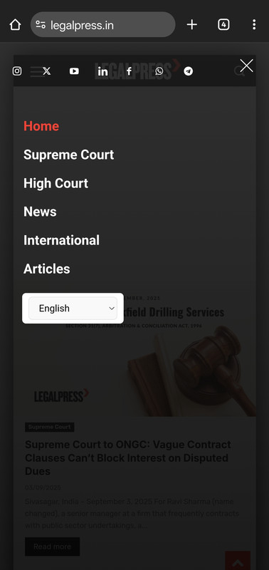
I want to customise mobile menu, I was able to reorder social icons using css, and customise gtranslate widget in this menu. But I couldn’t add more items in the list.
1. For example, I want to add short code of darkify plugin (gtranslate widget appeared automatically after activation of plugin) but for darkify plugin icon – how should I add it? I have the widget shortcode. Where should I do the changes to reflect it here?
2. Please can you also provide the same menu mobile AMP page location. AMP menu customisation.
muterobertI’m trying to make sure that mobile Safari picks up our brand color in the menu bar, but I’m seeing inconsistent behavior.
When looking at the static header at the top of the page, the menu bar area (with the time and battery) is using the site’s background color: https://imgur.com/a/5dj3ue7
But when the sticky header comes out after scrolling down, it correctly uses the header color: https://imgur.com/a/BItyQUd
I’ve tried setting the background color of the static header and sticky header to the same thing, but I’m seeing this inconsistent behavior. How can I fix this?
Here is the live page if it’s helpful for diagnosing the issue: https://alpha.roadtovr.com/



