- NewspaperThe Newspaper Mobile Theme: Introduction
- NewspaperThe Mobile Theme
- NewspaperModules Builder in Newspaper Theme
- NewspaperFilters and sorting for taxonomies
- NewspaperHow to Add a Logo in Newspaper
- NewspaperBig Grid Flex Settings
- NewspaperHeader Builder
- NewspapertagDiv AMP Plugin Tutorial
- TutorialsFrom WPBakery to tagDiv Composer
- NewsmagSmart list ads
- NewspaperNewspaper theme documentation
- NewspaperBest Of Forums
- NewspaperCache plugin – install and configure
- NewsmagIntroduction
- NewsmagMain menu
- NewsmagLogo & Favicon
- NewsmagHeader ads
- NewsmagSmart sidebar
- NewsmagSharing buttons
- NewsmagCategory tag on modules/blocks
 spurt
spurtCan not get menu and logo sticky in desktop and mobile version. How to?
 Path87
On my website I am detecting abnormal behavior in the featured image.
If I choose the “Default” or “Style 2” template in the theme settings panel, the featured image is resized to 50% height and 50% width when the page is loaded in frontend. However, this does not always happen: if you reload the page, it goes back to the 696×495 size (the correct dimension), if you reload again it becomes 348×247.5, if I reload again it remains 348×247.5, then it goes back to 696×495 and so on. Of course I’m talking about the website’s desktop mode. AMP and mobile view are perfect.
I’ve tried disabling all plugins, but the problem is still there. I have cleared the cache, but the problem is still there. If I choose another template for posts (“Style 3”, “Style 4” and so on) the featured image does not show any anomalies.
I also disabled the cache plugin (LiteSpeed) which uses the lazy load feature on both the featured image and all other images published, but the problem is still there. Also, this problem is only on the featured image, while all other images are loaded in the correct size.
I also checked the html code with browser console and the image is called to its original size (696×495) and the width and height tags in are set correctly as well. But however the image is displayed at 50% of the actual size.
I know that it is possible to use a template from the Cloud Library for set properly featured image size, but I cannot enable this feature, because in the past the website has crashed due to Cloud Library enabled and now I need to stay with the standard mode.
In the past everything worked fine. Maybe a bug?
 Kerry Adams
 So basically we are stuck with it?
That’s a pain. The mobile theme really doesn’t look/work that well on modern tablets with decent amounts of resolution on them.
 Piotrk87
Hi Team,
The text block below the header/page title is causing big LCP (couple of seconds on mobile). I am not sure what the cause can be, since it’s just a text block. Could you advise on that?
This relates for example to such a page: https://jakaoferta.pl/gdzie-przeniesc-numer-przeglad-bonusow-za-przeniesienie-numeru
Piotr
 caminoel
Hi,
I have trouble about sidebar photo widget, it is not responsive style and size is changed according to screen size which really make them unaligned.
Full screen https://ibb.co/F719CD1
ipad screen https://ibb.co/k21q2qx
mobile version https://ibb.co/SBQqFv6
Do we have any solution to make the picture on sidebar widget become responsive style.
 nycinsider
 https://www.nycinsiderguide.com/mobile-home
Here is a link.
When you compare desktop and mobile view, some blocks are not visible on the latter
nycinsider Hi,
Here is a screenshot https://postimg.cc/z39YCKZ5
The block in the image is only visible when in desktop or tab mode. It disappears completely when viewed on mobile. All the blocks on the page follow the same pattern.
 Bettina
 Hello!
If you use Mobile + AMP, then all the configuration can be done from our Theme Panel.
We have 3 options there, so could be easy to switch between them and it should cause no trouble.
Thank you!
 xxxLesy
 Thank you Bettina,
Site: https://www.student.si/
PS: https://developers.google.com/speed/pagespeed/insights/?url=https%3A%2F%2Fwww.student.si%2F
Notice on mobile PS it mostly pulls desktop view (big grid: 1 large article + 3 in row bellow) instead of mobile theme (1 banner + grid: 3 articles in a colum) resulting in huge LCP as it renders desktop size images.
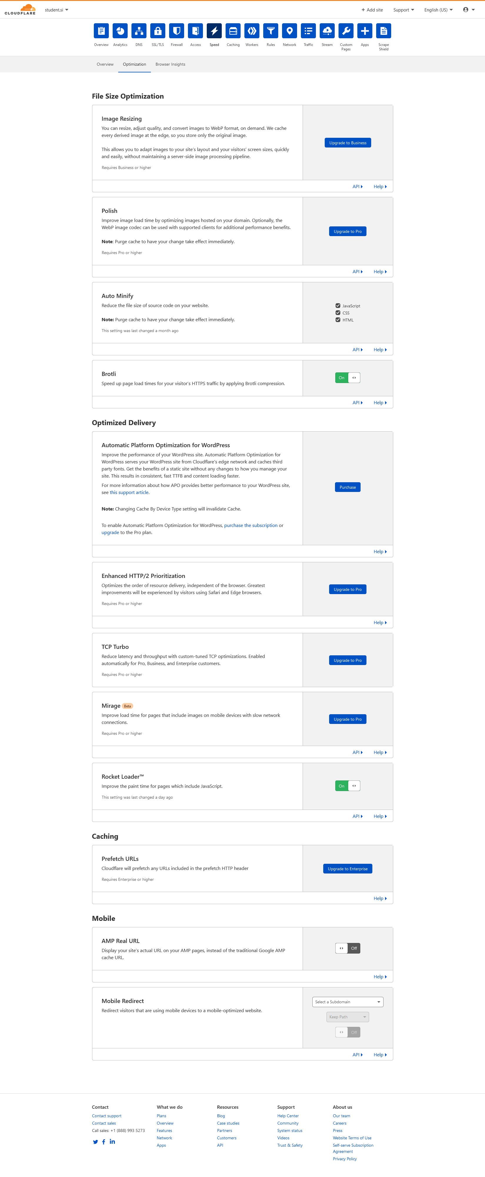
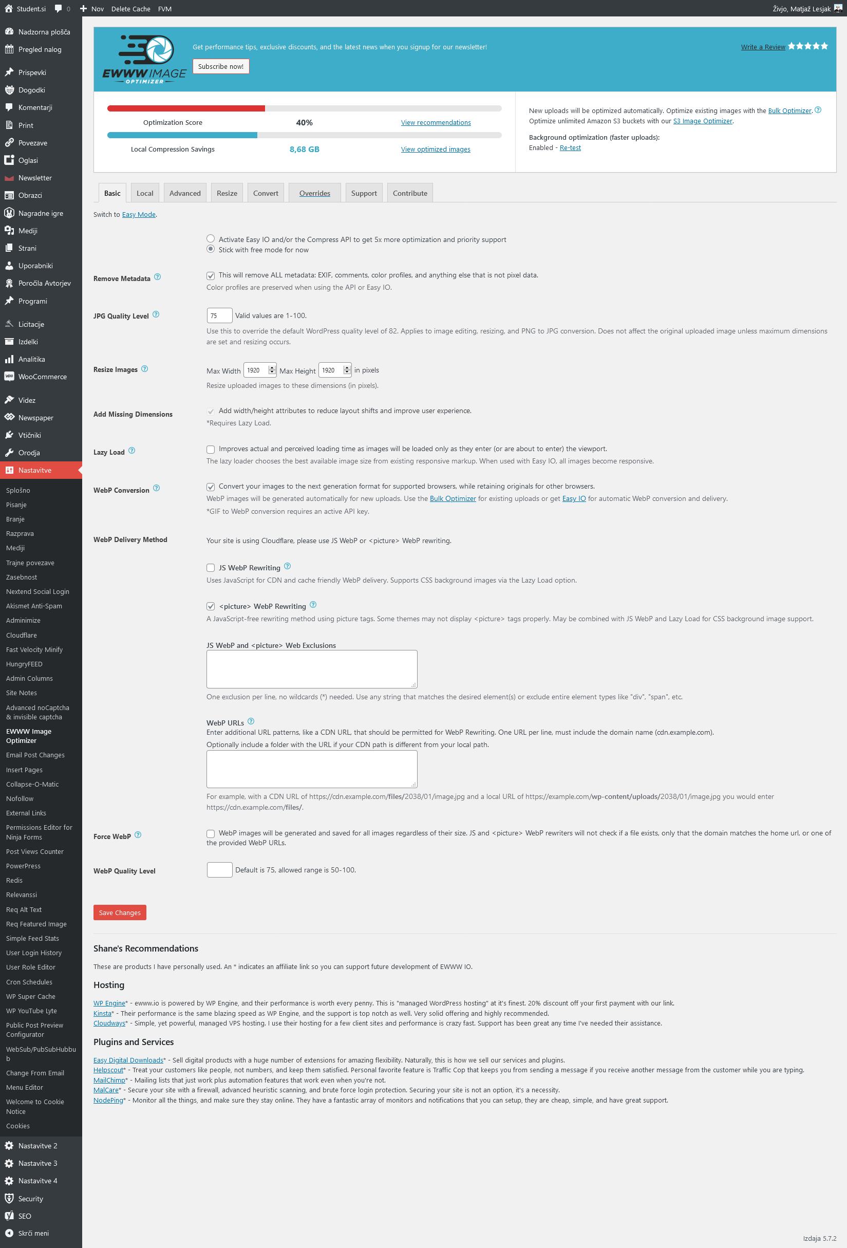
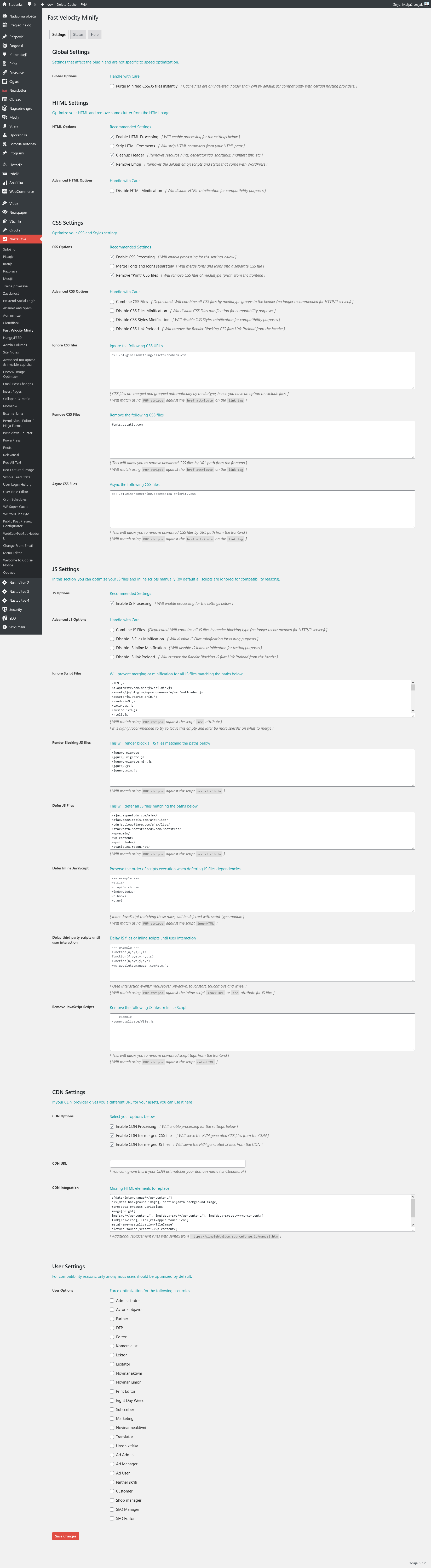
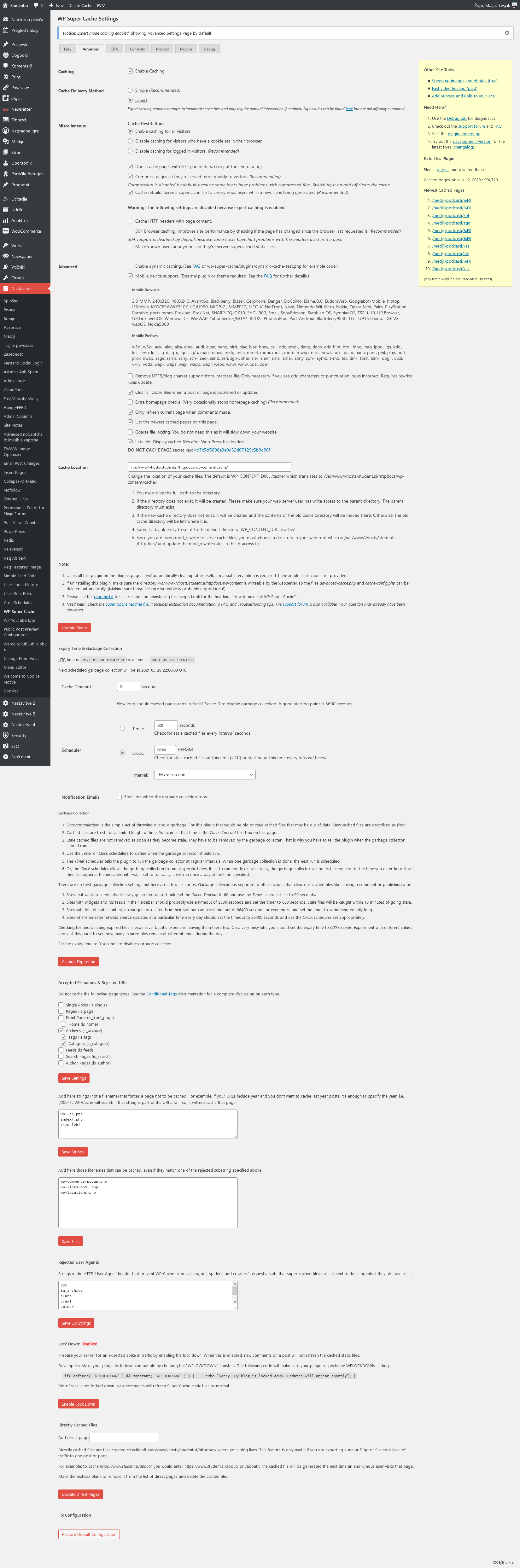
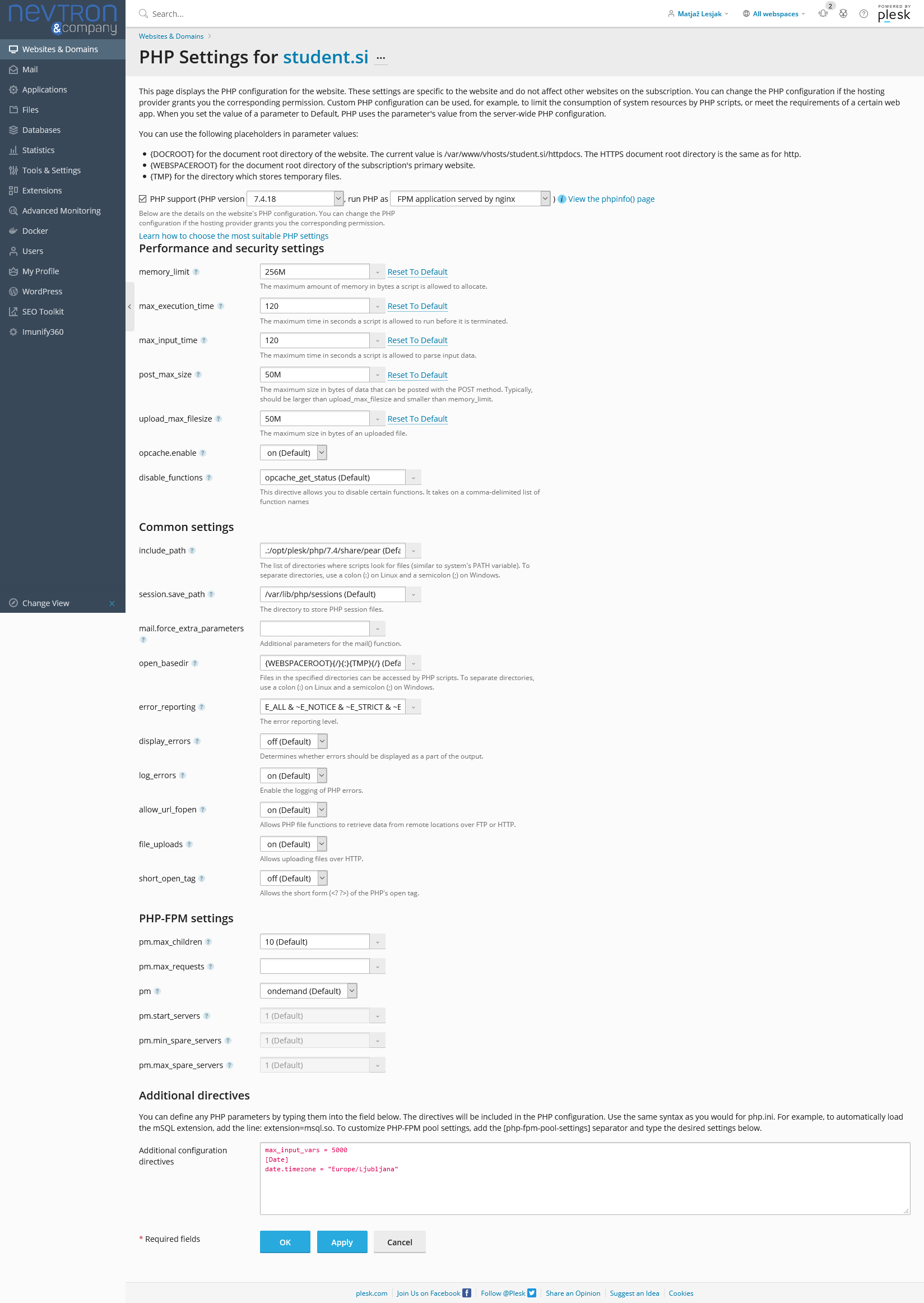
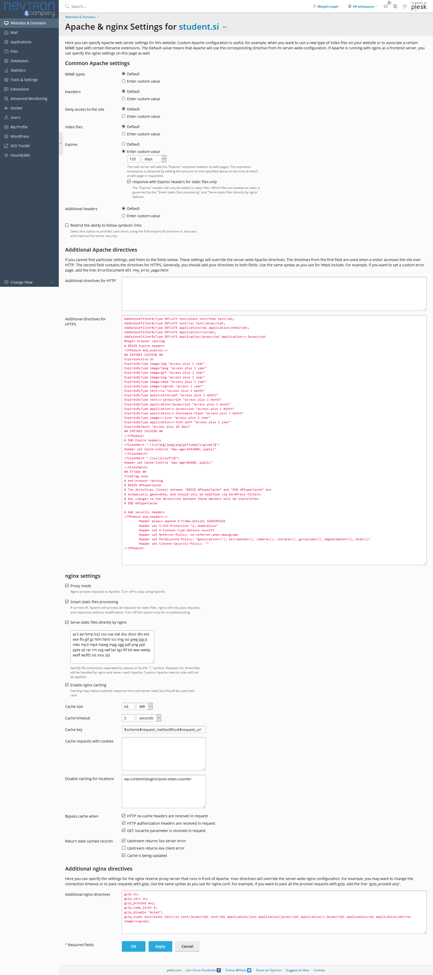
Relevant settings screenshots:
Cloudflare: https://student.si/wp-content/uploads/cloudflare-st.png
Ewww: https://student.si/wp-content/uploads/ewww-st.png
FVM: https://student.si/wp-content/uploads/fvm-st.png
Supercache: https://student.si/wp-content/uploads/supercache-st.png
Php: https://student.si/wp-content/uploads/php-settings.png
Apace & Nginx: https://student.si/wp-content/uploads/apache-nginx.png
-
This reply was modified 5 years by
xxxLesy.
Bettina  aneeshtheone
Hourly Malayalam is a news portal using newspaper theme. Newspaper theme AMP not working, in some categories shows amp symbols on goolge search, but after enter to category page single post shows “There has been a critical error on this website”. The same error happening on full website when I activate Mobile+AMP option. Web link: https://hourlyindia.com/
Bettina Hello!
Yes, your mobile version is looking like this: https://www.screencast.com/t/zYowBPo1y
Please clear your cache(also from your browser) and try again.
If you want to use a mobile page, then you need to assign it to your homepage. For more information about this mobile version please take a look in this article: https://tagdiv.com/newspaper-10-3-7-update-brings-customizable-and-fast-mobile-pages/
Thank you!
 davidcolq
 Hi,
Thank you for the response.
I’m not entirely certain, but the 100% Page Speed score appears to be from a blank rendered page, what do you think?
Can you perform a site-wide mobile page for every page/post on your site? I don’t see the point of optimising a single page for mobile when Google Page Experience is based on site-wide metrix.
Best Regards,
Dave
 Anamaria
 Hello,
To understand and to can investigate please send some screenshots with the page when you have logged in and some screenshots when you are not logged in.
Also, please include the link to your website to make a few tests, and let me know what version used for mobile (mobile theme, mobile page or mobile responsive).
Thank you!
Anamaria Hello,
If you want to use AMP only for posts, then you need to select from Theme Panel -> Mobile theme for AMP => https://www.screencast.com/t/rCGNDodtOi and from the AMP settings select for “Posts” => https://www.screencast.com/t/Q0Za3jqlHIX
Thank you!
 Atithya
 Is it necessary to configure AMP plugin to (Redirect mobile users to AMP), If I am using Newspaper Mobile theme with AMP?
If in future, AMP shuts, will it be easy to switch between amp and mobile? Will it affect the search console?
Anamaria Hello,
Please let us know what plugin you use for gravity form, also include the link to your website.
Also, please make sure you set the shortcode in the mobile editor as you can see here: https://www.screencast.com/t/Zy49V5vfYW
Thank you!
 GGiugliano
 Hi, my website is http://www.mondonapoli.it and from mobile there aren’t AMP page also if they are enable and we are in Google news.
 juarsenal
Hi, I’m setting up a new page with the Newspaper theme, and everything was going great until I tried opening the website on the cellphone. It is giving me a design I don’t want, and when I access as an admin in WordPress, it actually gives me the design I made. The problem is that most people that are going to visit my website are not going to have admin access, and I don’t want them to see the “logged out” version. I DON’T have any cache plug-ins, I tried on multiple phones and already made sure that the changes are being made. I need help with this, it seems that WordPress is not giving any support for this issue.
 ene.news
http://www.elacento.news
Hello i want to have only AMP in posts with the mobile theme
it’s that possible?
Or only deactivating mobile theme and leaving on AMP plugin it’s possible?
thanks!
nycinsiderHello,
I recently updated my theme and recreated my homepage. However, I can see that none of the blocks that are visible on my desktop view is showing on the mobile view.
How do I fix this?
Regards,
Joshua
 thepankajnegi
Hi Team,
How to add post view count in London news theme, I am not using Mobile theme and need to add post count view on both Desktop and Mobile.
website: https://test.ssbcrack.com/
Bettina Hello!
The Mobile Theme is a performance optimized theme included in the Newspaper main theme and it loads only for mobile devices. It comes with its own templates for page, post, category, etc so your current templates from the desktop theme will get converted to the mobile theme layout. For more details, please take a look here: https://forum.tagdiv.com/the-mobile-theme/
So, in order to edit Mobile Theme pages, there are only few settings in Newspaper -> Theme panel -> Mobile theme because you are not allowed to edit them with TagDiv Composer.
Thank you!
 AjitSirohi
 I am talking about Mobile Page when seen on a mobile. Website on Laptop is fine. Pl see the image that I have sent where I have explained. Please watch on the Mobile to understand the issue. Thanks.
 rgomez
Hello,
I have a gravity form under contact us, I added the shotcode inside the mobile theme section page, but still not showing.