
- NewspaperThe Newspaper Mobile Theme: Introduction
- NewspaperThe Mobile Theme
- NewspaperModules Builder in Newspaper Theme
- NewspaperFilters and sorting for taxonomies
- NewspaperHow to Add a Logo in Newspaper
- NewspaperBig Grid Flex Settings
- NewspaperHeader Builder
- NewspapertagDiv AMP Plugin Tutorial
- NewspaperNewspaper theme documentation
- NewspaperBest Of Forums
- NewspaperCache plugin – install and configure
- NewspaperFont Customization
- NewspaperTheme Colors Introduction
- NewspaperBackground Introduction
- NewspaperHeader ads
- NewspaperPost template ads
- NewspaperCustom ad spots
- NewspaperMain Menu
- NewspaperHow to Install Newspaper via FTP
- NewspaperHow to Install Newspaper via WordPress
 Calin
Calin Hi,
Please try this custom css -> https://i.imgur.com/6XlBNVm.png
.td-post-sharing-classic, .td-post-sharing {

    text-align: left!important;

}
Set the code in theme panel> mobile theme> custom code> css.
Hope it will help you!
 ddj
ddj I reinstalled the theme, and that seemed to fix the missing icons.
However, the navigation items no longer function in any way. This is on desktop and mobile.
Regarding the retina image, the Composer no longer allows me to add images. Clicking on “remove” works, but the upload button does nothing.
Calin Hi,
We are fine, thanks!
I’m happy for the results you achieve using our theme!
The thing is that when you are using the mobile theme plugin for mobile or amp, then you need to use the mobile editor to set the content for pages to be display on amp and mobile version -> https://i.imgur.com/XbaeEsq.png
Another solution is to disable the mobile theme plugin and use this option from amp -> https://i.imgur.com/SsgnGDY.png
Thank you!
 newspaper-user
Hey sir, i jist wanted to ask one more thing. Can we align social icons on the left side of the posts in Mobile Theme.
Just like this website has done: https://ibb.co/QbH1hS6
Is there any CSS code for this. I’m using Mobile Theme Plugin for Mobile Theme
Calin Hi,
I think that I provide some confusion with above answers, please let me explain again:
This file wp-content/plugins/td-composer/legacy/Newspaper/parts/header/td-login-modal.php is responsible for the login/register content when the login button is selected.
This file wp-content/plugins/td-composer/legacy/Newspaper/parts/login.php is responsible for the login/register using the responsive version for theme for mobile devices.
This file wp-content/plugins/td-composer/mobile/parts/login.php is responsible for the login/register using the mobile theme plugin layout.
And this file wp-content/plugins/td-composer/mobile/parts/register.phpis responsible with the mobile theme plugin to display the content for login/resister
Hope this will help you!
Thank you!
 Nagarig
 I have to edit the Homepage right?
So after adding the ad box. It shows double ad boxes if we go to the desktop view. https://snipboard.io/rOMXKp.jpg
We are trying to ad only to mobile view, because current Mobile view does not show header ad like desktop view.
-
This reply was modified 6 years by
Nagarig.
 line77
 yes it worked – all back to normal –
now I have another issue – I have installed the new header and it works fine on desktop but on mobile it shows the default logo and is not following the style of the main menu…..the same goes for the sticky menu – it remains unchanged in contrast to the edited version that I am using now – stinky menu shows the same sample logo and remains white while my current version is black…please advise
Calin Hi line77,
The problem with menu and footer it can be from mobile theme plugin, maybe you didn’t use it before and you you have this plugin enable, please check and let me know the results.
If this is not the case, please provide me a link where I can inspect the problem.
As for extra plugins, I do not know what to say, we can provide answers only for tested plugins, because we know how these are reacting when are using with our theme.
Thank you for your understanding!
 Vlad S
 Hello !
The Mobile theme was specially designed for optimization on mobile devices. Unfortunately on mobile theme you cannot do much changes of design. If you want to have the same design as on desktop mode you can achieve that by simply disabling the mobile theme.
You will have to recreate your pages into the Mobile editor or completely disable the mobile theme. The mobile editor will not render shortcodes !
Also you can disable mobile theme on certain pages or posts by following this setting: 
Please take a look here: https://forum.tagdiv.com/the-mobile-theme/
Mobile theme plugin can be disabled from Newspaper Plugins as you can see here: https://www.screencast.com/t/LnkZCEVC
Thank you !
 mouthing off magazine
 Hey Vlad,
Thankfully, I’ve managed to sort out my First Query. The Front Page is now in accordance with the rest of my pages.
However, the video component is still not showing up right on the mobile version. Here is a link to one of our video articles to check it out:
https://mouthingoffmagazine.com/mouthing-off-artists-spotlight-irene-shoshanne-carlucci/
While I’ve got you here though, there are a few more things I have noticed, that I’m having a difficulty solving.
1) In our contacts page I have placed my volunteering staff’s dedicated email addresses using the social media/mail icon. However, upon clicking the icon (which has the appropriate email attatched to it) it just comes up with a 404 error rather than opening up my mail to send an email.
Here is a link to see what I am talking about: https://mouthingoffmagazine.com/contact/
2) I have created a sidebar that I have placed for our articles. While I have changed the header style of the headers to match our theme, I have been unable to find an option to change the colour of the header to match the headers on our front/home page. (See First Link (Video) to see this sidebar)
3) I have recently minified our CSS, Javascript, HTML, etc. Using the W3 Total Cache. However, since then I have recieved AMP ‘validated URL’s’ erorr’s with the statement ‘Invalid markup removed’ occuring & my Error Index keeps having Invalid inline script errors, however, these always have the markup status of removed.
None of this seems to be causing any issues to the actual site and it appears to be in perfect working order. However, as someone who is quite new to all of this, I’m a little uneasy as whether this is just a small, insignifcant issue that sometimes occurs after minifying or whether this will cause greater issues down the line.
Apologies for all the questions & thank you for all of your help!
 gs271
gs271Hi I am working on studentlaundry.lavis.at
it looks ok on web version.
on mobile it is completely messed up:
https://imgur.com/gallery/EiY1UX2
the image is huge and not resized and the icons are totally misplaced.
Why is that? I had to play with padding and icon spacing a bit before to make the desktop version look symmetrical.
Regarding the image, I would actually like to change that also for the desktop version.
I would like the image to be smaller.
Was thinking about using the “hero” element, but could not place the checkmarks on it as I did.
Any suggestions to post an image as a background for a bullet list in a mobile friendly way?
best, Gregor
 Pixel Cities
 Hi,
The site is still in development, and has a re-direct plugin in use because a lite version is live at the moment.
But I have also a staging plugin in use, for testing purposes.
Here is the link to the staging site. I require the burger menu on the right hand side in mobile usage please.
ircatoday.com/stage
Regards
Mark
 Topy
TopyHi,
I accidentally delete the header logo in mobile. I try to add it back but cannot. When I add the header logo, I drag it to the header section of mobile but nothing happens. But I and drag it to other place.
Calin Hi,
You are using cloud templates, therefore to add an retina image will be done using tagDiv Composer -> https://i.imgur.com/oOvWgIY.jpg -> https://i.imgur.com/jJw1FR0.png make sure that you set it on sticky menu and mobile version too -> https://i.imgur.com/ORqY7Eq.png
For the problem with fonts, maybe the site was made on staging and after you moved the fonts are no longer recognize, what I suggest is to make a full backup to the theme and database, after that delete the theme and install it gain on the live website, if there is going something wrong restore the backup, but not before to check if the icons are displaying or not.
Thank you!
 andxtagdiv
Please clarify this for me:
I use two very different page designs on mobile/desktop. Mainly to reduce load size for mobile.
The bigger desktop design is for desktop and tablet but not for smartphone.
Am I understanding correctly that the design and content that is not meant smartphone, really does not load at all on smartphone? Or, does the desktop version load in the background as well?
Calin Hi,
If you are using a cloud header or a PRO Demo, you can edit with tagDiv Composer the homepage and remove the login element using the right click https://i.imgur.com/acOqrXR.png -> https://i.imgur.com/678Y1Wk.png and make sure that the option from theme panel is disable -> https://i.imgur.com/fRIb2xO.png this will remove the code for login, but if you are using a standard/default header style, this will be only hide.
If you are using the mobile theme plugin, you can disable this option from here -> https://i.imgur.com/s72HWmZ.png
Hope this will help you!
 vbrashier
Good morning, I need some help. My website, https://bluebonnetnews.com, is struggling since the new theme was installed. The AMP and mobile themes are not working properly. The AMP seems to cause my pages to look wrong, particularly in an Edge browser. I have attached this screen grab to show you. The picture on the left is what happens to the site after I post each and every post. I have to manually deactivate and reactivate the AMP plug-in to fix the problem. Also the mobile version of the site needs to look like the front page of the website (the photo on the right, or at least something remotely like it). The mobile version looks mostly normal when the mobile theme is not activated; however, the photos are then missing. The sidebars are also not showing up in the mobile version and I need that fixed.
Here is the link:
Calin Hi,
I just checked your website and the code is aping in source page https://i.imgur.com/W9sA3tt.png -> https://i.imgur.com/Pz7S9h1.png please note that if this is a new account with new amp ads, it can take a time until the ads will be active.
Also if you want you can set some more ads using the mobile ads section -> https://i.imgur.com/KaMmTXX.png these will be add on amp version too.
Thank you!
Calin Hi,
I think that I provide some confusion with above answers, please let me explain again:
This file wp-content/plugins/td-composer/legacy/Newspaper/parts/header/td-login-modal.php is responsible for the login/register content when the login button is selected.
This file wp-content/plugins/td-composer/legacy/Newspaper/parts/login.php is responsible for the login/register using the responsive version for theme for mobile devices.
This file wp-content/plugins/td-composer/mobile/parts/login.php is responsible for the login/register using the mobile theme plugin layout.
And this file wp-content/plugins/td-composer/mobile/parts/register.phpis responsible with the mobile theme plugin to display the content for login/resister
If you want to change the link from the sign in button you need to edit this file wp-content/plugins/td-composer/legacy/Newspaper/parts/login.php (because you are using the responsive version), what you need to do is to replace the id
What you need to do is to replace the id=”login-link-mob” with href=”your-url” https://i.imgur.com/QiPAxSi.png -> https://i.imgur.com/mlnxJey.png
Hope this will help you!
Thank you!
Calin Hi,
1. Mobile menu, then you are using the mobile theme plugin too, but this is not enable on all pages and posts, this one can be edited from theme panel> mobile theme > https://i.imgur.com/QI5Ew1T.png -> https://i.imgur.com/ukQ6DN7.png please make sure that the colors from there are set transparent also please check the colors from here too -> https://i.imgur.com/WQ1b3XT.png after that make sure you clear all cache and try again.
Let me know the results!
Thank you!
line77Hi,
Note sure why but the cell-phone menu is gone now and the footer content does not show content blocks – only log and about link – previously it all showed the menus and content that was shown on the desktop version of the site..I deactivated and activate plugins earlier to see why I CANNOT STILL IMPORT A CLOUD TEMPLATE (waiting for you to reply to my earlier email on this) and the mobile menu is gone now – what can be wrong???? Can a plugin like QISQUS damage the database? the desktop site works fine
vbrashier I have photos for ads in the sidebars. They are linked to my advertisers. They are not showing up in the mobile version. Plus my AMP settings are changing after each and every post I make. I am having to manually switch them back.
I need the mobile version to look like the front page of my website. How do I do that? I am nearly ready to throw in the towel and find another template. Please help.
 jatin_makhija
Hi Guys,
I have on my site (techpress.net) header live search enabled. However when i search a post it does not show the results in the results page, it does show live search results but not on the search page.
For example, visit my website and then click on search and type Jatin and click on search button, it will say no results.
But there is a post with my name which is shown in header live but not on the results page. similarly the other searches do not work.
How to make my search more effective on my website. Whats the difference between Header Live Search and Mobile Live Search.
 Seashore
Hi,
Using the Beauty Pro Single Post template, I find it difficult, if not impossible, to selelct the rows and elements in the top row, when looking in mobile view.
When looking at the page https://seashore.nl/nieuw/klantgegevens-en-de-wet-2/ in mobile view, you’ll notice that the Single Post Categories element and the Page Title element slide over each other. That should be edited in the css, but I can’t select the elements there this way, and hence, can’t edit the css.
I made a second template based on the Beauty Pro Single Post template without Single Post Categories element, so I can always use that. But still, it would be nice if I could display the categories above the title.
What would you suggest tow ork around this problem?
Regards, Martin.
 Roularta
Hi support!
I want to use the tagDiv Mobile Theme plugin, but I’m not able to because I run into the following error:
This version of the tagDiv Mobile Theme plugin is not supported by the current activated theme!
Please make sure you’ve updated the theme properly! Follow this guide.
See screenshot: 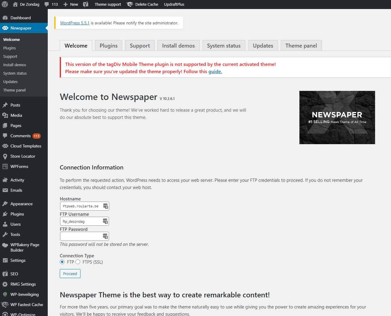
I’ve done what the error says and updated the Newspaper theme and it’s plugins to the latest versions.
See screenshot: 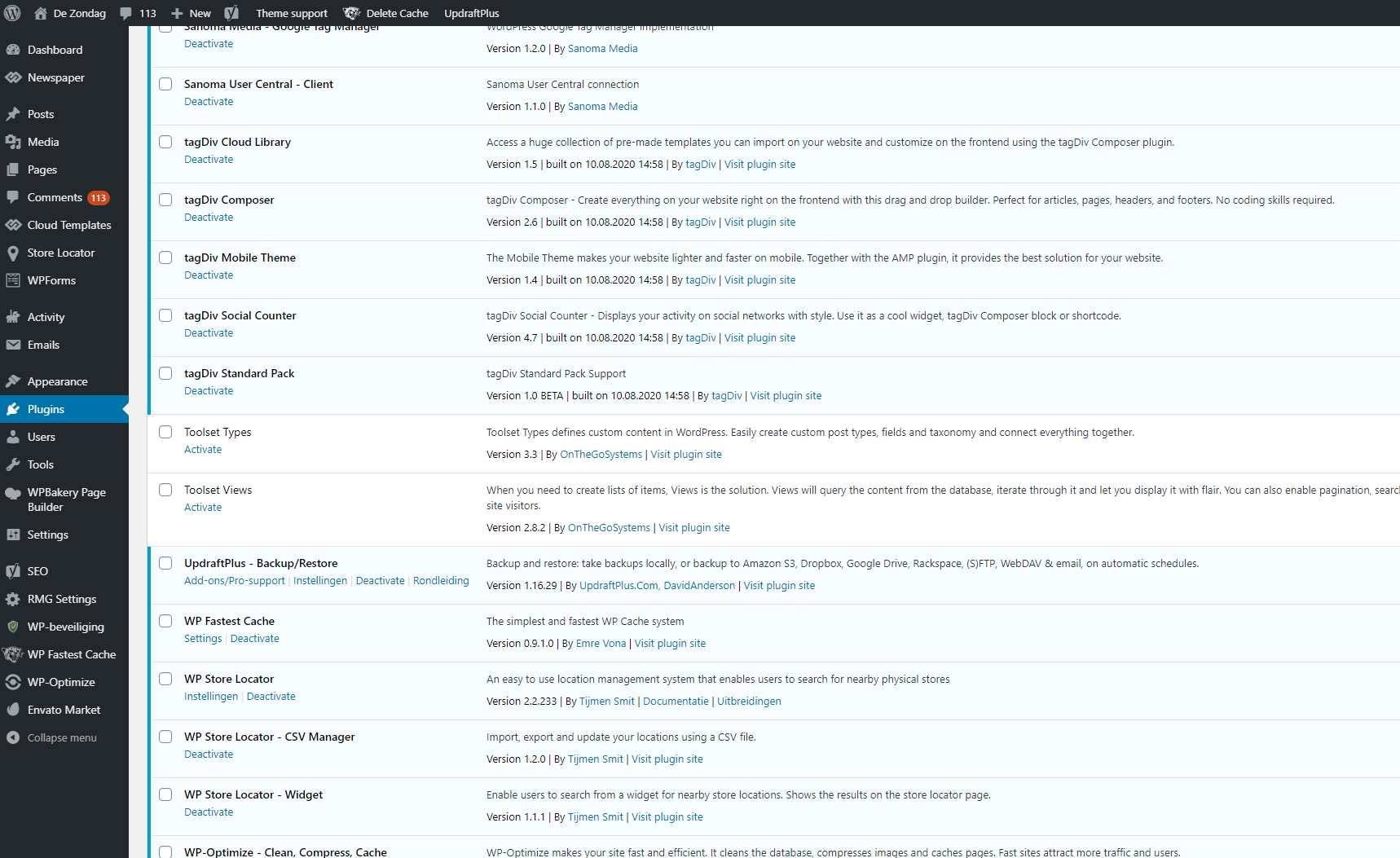
Do you have a clue what’s going on here?
Kind regards,
Sam from Roularta



