
- NewspaperCreate Custom Code with the browser’s Inspector or the Live CSS Box
- NewspaperScroll Animation
- NewspaperWP Rocket and Newspaper Theme: Optimization Guide
- NewspaperHow to setup Twitch for Social Counter
- NewspaperModal Popup
- NewspaperFlex Block Settings Guide
- NewspaperAutoptimize Plugin – install and configuration
- NewspaperAdding Multiple Authors to Your Articles
- NewspaperDesign your Post Pages using the Cloud Library Templates
- NewspaperBig Grid Flex Settings
- NewspapertagDiv Composer Tutorial
- NewspaperTheme modules and blocks
- NewspaperThe Mobile Theme
- NewspaperCompare theme files – Winmerge tutorial
- NewspaperUsing Other Ads
- NewspaperBlock settings tutorial
- Using custom fonts
- Using typekit fonts
- NewspaperChild Theme Support
- NewspaperHow to Make the Site Faster
 Bogdan B.
 Hello,
Please try to edit your table as it seems to be custom made and the css is not properly set. Internet explorer seems to ignore the table css. I suggest a different approach tho this element as tables are not recommended in a responsive environment. You can simply use visual composer single image elements and then transfer the shortcode in a text box in the sidebar. On pages you can create the element directly inside the page content.
Thank you!
 Simion C.
 Hi,
Unfortunately this is the way things work in WordPress, and the theme has no effect in this matter. I have tested with the default WordPress theme and the result is the same – https://www.screencast.com/t/XZ6dm8H41 When an image is inserted in a post is considered a new paragraph and it gets a margin-bottom property – https://www.screencast.com/t/L9vsTtNLJL You could remove the margin property with css but it would apply on every paragraph in the content – https://www.screencast.com/t/vRwVQRzfP – https://www.screencast.com/t/KnYLGfUJhk
Thanks
 Catalin
 Hello yopyop22,
If you want to remove the header and footer style you should use the code below and place it in Theme panel->Custom CSS area.
.page-id-246592 .td-header-header, .td_data_time, .td-footer-container, .td-sub-footer-container{

display:none!important;

}
The result is here -> https://www.screencast.com/t/0xiNaaxmdDnG
Thanks for the message!
Simion C. Hi,
@LeadingSport Sorry for misunderstanding, the text probably dissapears for some of the blocks because you have set a white background for the title – so you should go to each of the blocks that have this issue and clear that background https://www.screencast.com/t/OF0gaWMVfkui and return them to the default state, it should look like this – https://www.screencast.com/t/KQShdYNC1kfG
Then enter this code in Theme panel->Custom Css, it will remove the background color and border from all the blocks
.block-title {

border-bottom: none;

}

.block-title span {

background-color: transparent;

}
Result – https://www.screencast.com/t/xqsEWBjq6p
Please let me know if this works for you.
Thanks
Simion C. Hi,
You could try this code, it will increase the max menu size, if that is what you want just enter it in Theme panel->Custom Css
If you add more items in the mega menu it will show them all in the dropdown (within the limit of 400px)
.block-mega-child-cats {

max-height: 400px;

}
Result- https://www.screencast.com/t/caiacrXhkNDi
Thanks
 juliusuk
 Hi,
thanks Chris, i now tried this plugin as it was suggested in many threads. I installed the plugin and regenerated thumbnails, but did not solve this issue. Probably because the images loaded were large enough, but they scale wrongly inside the boxes.
Example: here this behaviour, which in this example only happens at viewport > 1140px. The pictures scale as they should on widths below this.
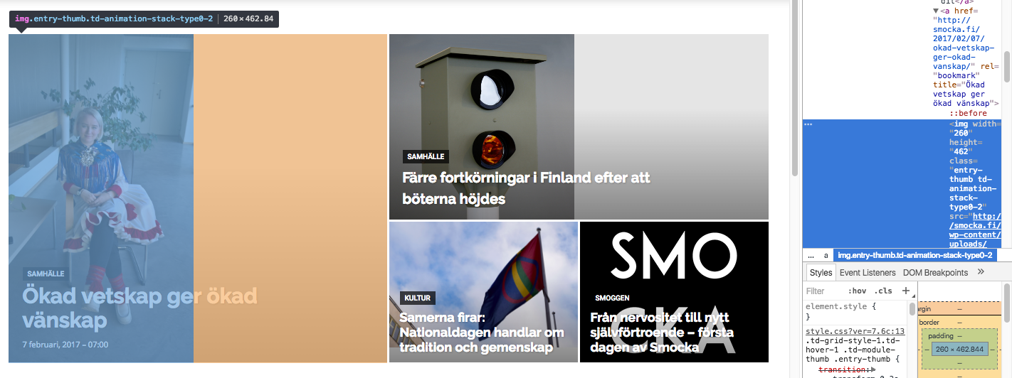
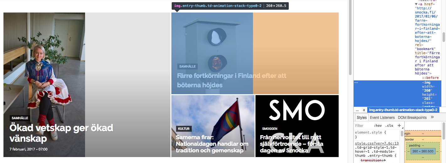
Both images in these boxes get width=”260px” written directly into the img-tag as properties. Don’t know if that is the issue (this also happens at the lower viewports where the layout works). However, the images that actually are loaded into the big grid are of widths 1400px (the one to the left) and 1022 px (the one to top right), i.e. large enough to fill the space if they were cropped to fit.
I’m trying to add “width 100%” or height “100%” at different places in css but this seems only to stretch images rather than crop them so this is not the solution.
I’m really puzzled why the center-top cropping that is described in some earlier threads is not taking place here?
Greetings,
Julius
 aberniz
 SOLVED!! It was only a matter of custom CSS. When I changed to another theme, that CSS code was missing and therefore it was looking all right.
I’ve just removed my custom CSS code, and it is now working perfect Learndash with Newspaper 7.
Thanks!
 XVanish
 Ok, then my only option is to get rid of the google fonts manually and CSS the rest 🙁
Thank you Bogdan!
Catalin Hello 3wmedia,
Do you are referring to the margin-top? If yes, notice that this white space is from the style of this demo. If you want to remove it, you should use the code below and place it in Theme panel->Cusotm CSS area.
@media (min-width: 1180px){

.td-recipes.td-boxed-layout #td-outer-wrap {

margin-top:0!important;

}

}
The result is here -> https://www.screencast.com/t/JCnQdprmOh3
If is not what you mean, please provide more details about your problem so I will be able to provide a more accurate response.
Thanks for the message!
 a98cr125
Every time I try to do a smaller image aligned either right or left it causes an unwanted space in the paragraph. Even if I move it and delete the space and move it back where it does not show the space in the editor, after saving it creates the space again. I have tried all sizing even custom, everything. Is this the TagDiv Image CSS that is causing this? An error in their coding? See example here it is the smaller Monster logo in the 3rd paragraph. THANKS FOR ANY HELP!!!
Simion C. Hi,
Like my colleague said above, you need to edit the file loop-single.php found in the theme folder – https://www.screencast.com/t/03wlQqibXwsV if you are using the default post template and add the code or codes provided above containing the custom ads in which you have added the ad code – https://www.screencast.com/t/SabRwdEK above the author box – https://www.screencast.com/t/iy5hBPUhx The result should look like this – https://www.screencast.com/t/3orYq4Nnhnl so you need to enter this following code in Theme panel->Custom Css to display the side by side
.single .post .td-a-rec-id-custom_ad_1,

.single .post .td-a-rec-id-custom_ad_2 {

display: inline-block;

}
If you are not using custom ad 1 or 2 fields you need to change the code accordingly
Result – https://www.screencast.com/t/ZFWW2yq8k
Thanks
Bogdan B. Hello,
The category templates do not have any editing options to add or remove content. They can be set using the theme panel settings: https://www.screencast.com/t/D5wbz3Dys0pE
If you want to add certain content to a certain category, you will have to edit the theme core files to do it. You can use the category id and place specific content for a specific category id like so.
You must first identify the correct file to edit. Each category can have multiple category templates or top post templates: https://www.screencast.com/t/cmYE5KzSyB depending on the place you want to add the button to and the templates used on your category setting, you can modify one of the files from the list
Next you can use a is_category function to wrsp your code around the function so you will only affect the desired category. https://developer.wordpress.org/reference/functions/is_category/
You will have to create the button code using html though. There are lots of button generators online that use html and css.
Thank you!
Bogdan B. Hello,
That is the contact form 7 plugin css and it gets moved to footer using the speedbooster plugin
Pleas use this guide: https://forum.tagdiv.com/how-to-make-the-site-faster/ and please read this topic carefully regarding the speedbooster plugin: https://forum.tagdiv.com/topic/tinymce-advanced-and-other-various-disabling-speed-boster/
Thank you!
Simion C. Hi,
You can do that using this code, it will make all the block titles transparent, just enter it in Theme panel->Custom Css
.block-title span {

background-color: transparent!important;

}
Result – https://www.screencast.com/t/1dCrfBVW7
Thanks
 munvik
 On pagespeed insight, mobile version said that following is blocking scripts:
/wp-includes/js/jquery/jquery.js
However, on desktop version, it said that 2 blocking script resources and 19 blocking CSS resources.
JS
/wp-includes/js/jquery/jquery.js
/…includes/js/jquery/jquery-migrate.min.js
And lots of CSS
Though I used speedbooster plugin and followed the guide but still it is showing. Whats wrong
Further, it said Minifying /themes/Newspaper/style.css?ver=7.6 could save 12.9KiB (14% reduction) after compression.
How to resolve these issues
 Dan-Skaf
 Hi Bogdan,
I was able to increase the height of the menu for mobile as well the height of the logo on my newly developed website:
I used the following CSS for Mobile:
.td-main-menu-logo img {

    max-height: 100px;

}
.td-header-wrap .td-header-main-menu {
height: 110px !important;
}
.td-main-page-wrap {
padding-top: 106px;
}
#td-top-mobile-toggle i {
line-height: 110px;
}
.header-search-wrap .td-icon-search {
line-height: 110px;
}
.td-post-template-4 .td-crumb-container {
padding-top: 52px;
}
However, When you scroll down, some of the header still shows at the top of the screen. I don’t know how to fully hide it like it hides with the default settings.
Can you please assist?

Bogdan B. Hello,
Please read this guide: https://forum.tagdiv.com/newsmag-how-to-use-visual-composer/ and you will see that we only recommend using visual composer on pages, not on posts. Posts already have text blocks (text does not need to be added in a text box to show on a post) and already provides lists (bulleted or not) from the tiny mce editor.
It can be changed with css but it;s simpler to just not use VC to set up simple text or lists.
2. again, please use the default post editor and not VC for lists and text.
Thank you!
Bogdan B. Hello,
This could be a plugin conflict so please disable all plugins except visual composer, clear cache and reset cdn files if you use it. Please also check any custom code you might have added to the theme panel or the theme files. If you use a child theme, please switch to the main theme to make sure it does not affect the proper functionality of the theme.
The theme scroll bar is a very very thin line that will not take up much of the screen but the css seems to be replaced with the bulky default scroll bar.
Thank you!
Bogdan B. Hello,
We understand but there is no solution for this yet. You can try a css trick in order for it not to take up so much space though. You can use this code in the theme panel-> custom css box:
.td-category-description{
max-height: 95px!important;
overflow-y: scroll;
overflow-x: hidden;
width:100%!important;
}
result: https://www.screencast.com/t/pcZFS4tq
I hope this helps.
Thanks
Simion C. Hi,
@LeadingSport Unfortunatelly I can not view your test page – https://www.screencast.com/t/2jtJ5YcomMx If you also have the Newspaper magazine demo installed take a look at the answer below
@brigitte67 That is the transparent block titles style of Newspaper magazine as seen in the demo – https://demo.tagdiv.com/newspaper_magazine/ if you want to cancel the background transparency you will have to edit the demo_style.css found in the theme folder->includes->demos->magazine and comment or remove a line of code – https://www.screencast.com/t/kTBWhN7ISu8 it should look like this if you choose to comment it – https://www.screencast.com/t/tMVupdlmd5
The result is that now you can see the background set in each of the block settings – https://www.screencast.com/t/arzXTAcVKfN
Thanks
Bogdan B. Hello,
I’m sorry but I cannot see what you modified and cannot tell why the css makes the 2 items drop on separate lines. by default these 2 items are on the same line. I cannot know what you edited and what the result is.
If you want to alter the default structure of the modules and blocks please note that you will also need css skills as the css will break when changing the structure of the code. You will have to adapt the css to your customization
Thank you!
Bogdan B. Hi,
Unfortunately it cannot be made to show up as the default entry for the comment title to show up is having 1 comment. this is the way it’s being coded. It is not hidden with css but rather it is a condition added in the code for it. you can force it to appear if you want but it will look strange as it will show 1 comment even though there are none like so: https://www.screencast.com/t/b13lqLbqO
Thank you!
Simion C. Hi,
Sorry for misunderstanding, try this code for that, enter it in Theme panel->Custom Css
.single .td-classic-facebook iframe {

width: 50px!important;

margin-right: 50px;

}
Result – https://www.screencast.com/t/sMSec7WFvDkm – https://www.screencast.com/t/uHL4t7Sa
Thanks
 nachtwache
I find it sometimes difficult to read white headlines over bright pictures.
Could this help (even though not all browsers are compatible=?
https://css-tricks.com/almanac/properties/m/mix-blend-mode/
As a future feature or as a manual fix (how to?)?
Simion C. Hi,
You could remove the left and right padding using this code if that is what you want, just enter it in Theme panel->Custom Css
.home .td-pb-span8.td-main-content {

padding-left: 0;

padding-right: 0;

}
Result – https://www.screencast.com/t/TdAkHzhp1x8
Thanks
