
- NewspaperThe Newspaper Mobile Theme: Introduction
- NewspaperThe Mobile Theme
- NewspaperModules Builder in Newspaper Theme
- NewspaperFilters and sorting for taxonomies
- NewspaperHow to Add a Logo in Newspaper
- NewspaperBig Grid Flex Settings
- NewspaperHeader Builder
- NewspapertagDiv AMP Plugin Tutorial
- NewspaperNewspaper theme documentation
- NewspaperBest Of Forums
- NewspaperCache plugin – install and configure
- NewspaperFont Customization
- NewspaperTheme Colors Introduction
- NewspaperBackground Introduction
- NewspaperHeader ads
- NewspaperPost template ads
- NewspaperCustom ad spots
- NewspaperMain Menu
- NewspaperHow to Install Newspaper via FTP
- NewspaperHow to Install Newspaper via WordPress
 vamsinani24
I’ve updated to 8.5.1 manually, and cleared cache and everything, but facing this issue.
I can access the website in the mobile theme template, but the wp-admin is showing error – ‘HTTP ERROR 500’. I’m able to access all posts, but the wp-admin is not working on mobile.
Also, I’m facing an issue with revolution slider
1. I’ve installed demo slider and selected categories, but it only shows sometimes, and once I change to other categories, it stops showing the slider.
2. Why can’t I use a template I create on my own rather than using demo sliders? Becuase the one I created is showing in the preview, but not in the tagdiv composer.
 hoo
hooHi, thank you for your time,, could you mind helping me:
1.- how can I attach screenshots to topic to explain my doubts better?
2.- Where is the option to reduce space between post featured image and post text(only in pc, with tag divi mobile, works fine)
3.-How activate “most recent bar” on mobile
4.-When I´m reading a post a float sidebar appears at right side. How can I disable it? it is smart sidebar? because it is disabled and still appears.
5.-I want to add tags on post related with the post, I mean how can I chose tags for each post.
Thank you
 Fatih
Fatih Hi,
I try this on my child theme. I did it on desktop version but i didn’t it on mobile theme. I did Catalin’s steps as same. Can you help me ?
Thanks,
 Staezione
Hi,
If i enable the related article option in post settings then there is something wrong with the mobile view.
The mobile theme isn’t fixed anymore and you can swipe left and right which disturbes the layout. If i disable related articles then the layout of the mobile theme is fixed again. Tried it also with all ads disabled, no succes.
Can this be a bug?
I’m using an Iphone SE so the screen of this device is quite small
Thanks
 Shay
ShayHi,
I have this white padding space between my header and the big grid 1 in mobile view. I wish to remove this white space in mobile view only (the space can remain in ipad and desktop view).
I have tried this CSS and pasted in the Theme panel>Advanced CSS>Phones but it has no effect:
.td-main-page-wrap {
padding-top: 0px;
}
Please see link: https://imgur.com/a/96YYt
Thank you for your help.
 mrtran
Hi,
When I upgrade to the latest theme version 8.5.1, some images not full frame on mobile screen (plz see image attach http://www.screencast.com/t/jFWq55gpL). I used child theme. Can everybody fix this issue?
Thank you so much!
 seomartin
How to remove top grid from mobile home static page (newspaper theme) ?
I just wanna the lastest posts 🙂
 dralim
My website http://www.tbtbangla.com is not showing frontpage content when browsing with mobile device .please help me
 nomoretechno
 Hi, I updated the theme this morning, plugins and cleared caches including cloudflare.
Still seeing a mobile page for desktop
 greggus
 Hi and thank you for your help.
Here is a link : http://www.lesarchersdethomas2.fr/
I want to avoid this : http://s1312.photobucket.com/user/oomfr/media/web-p1.jpg.html
and insteal switch to the mobile menu when the width of the screen is less than a desktop.
I hope you understand what i mean.
Best regards
 Olya
OlyaHello!
Today I installed the plugin mobile version. Glad that the site is now faster to load in your phone. But this plugin broke my site, here is the screenshot https://yadi.sk/i/-T1jDQgl3QSPa5
What is the reason? Prohibited do not install plug-ins, especially in the mobile version of this plugin works, it breaks only the computer version
 Bogdan B.
 Hello,
Te top grid shows featured articles. That means articles added to the featured category. The bottom module shows all the articles in a latest to oldest sorting option. There is no sorting option in our theme for these blocks.
If you want to customize it and avoid repetition, find out what the category ID is of your featured category. Say for instance that it is 26
Now, inside of Newspaper\mobile\front-page.php you will find this code:
$wp_query_args = array(

                'ignore_sticky_posts' => 1,

                'post_status' => 'publish',

                'posts_per_page' => $posts_per_page,

                'paged' => $paged,

            );
Make sure to add:
'category__not_in' => array( 26 ),
to the end of the array so that it looks like this:
$wp_query_args = array(

                'ignore_sticky_posts' => 1,

                'post_status' => 'publish',

                'posts_per_page' => $posts_per_page,

                'paged' => $paged,

                'category__not_in' => array( 26 ),

            );
Thanks.
 unit45host
Hi,
I dissabled the ads on mobiles, tablets and clicked on save.
but nothing happens, just the image running circles..
http://picpaste.com/1D71D2C0-E558-4889-A0EE-B6D2C1471139-NhwAEw9J.png
multiple times I tried, multiple browsers, multiple devices = same results
possible to swicth off the ajax savings button, and make a proper save button which is refreshing the page after saved the new options to the db ?
Thanks,
Bogdan B. Hello,
Our theme features a separate mobile theme implementation like so: https://forum.tagdiv.com/the-mobile-theme/
Thank you!
 brenbrinkman
When you go to my website through mobile, you get to see 3 articles, below that you can see the header ”latest articles”. But it shows the same 3 articles that are above them : http://www.screencast.com/t/OrFuRhXf
How can I change the settings of these?
 Catalin
 Hello mehedi57,
If you want to change the color for headings for mobile devices, you should use the media queries. As a hint, you should try using the code below and place it in Theme panel->Cusotm CSS Area.
@media (max-width:767px){

h1,h2,h3 {

color:red;

}

}
Thanks.
unit45host Hi Simion,
Thank you for reply.
Tha was just a half-solution, cos now some of the authors links jump on their on profile page but still some of them to the homepage.
And -as I wrote all plugins disabled, database leftovers cleaned so dunno what could cause the issue.
The authors list page ;
https://1000wordsmagazine.com/szerzoink/
1 author ( Anna Supol ) which profile not works ( from the 10 )
https://1000wordsmagazine.com/author/anna-supol/
Overall 35 authors the links for 18 not works or jumps to the home page. With all plugins dissabled.
And you maybe missed my 2nd question:
tagdiv’s mobile theme why not and when will give support to the tagdiv composer ( or at least the visual composer / wp backery / ) in the mobile view?
I open other topics/tickets ‘cos there more things not works properly…
Thank you, Zoltan
nomoretechnoHi, when i activated the tagdiv mobile plugin, It works great except when I view the site via desktop. The mobile view is replicated on desktop. How do i stop this?
greggusHi,
I’d like to show mobile menu when the screen width is < to 1018px. My menu contains too much items and when the screen is like a tablet one it splits the mega menu on 2 rows. Is there is a css code for this ? Something like :
@media (max-width: 1018px) {
#td-top-mobile-toggle {
display: inline-block;
position: relative;
}
}
Best regards
 xbass
xbassMobile (phone) layout is a ‘mobilized’ version of the desktop view version which is not ideal. How to get a mobile view purely made for mobile? (just full width featured images/titles on or under, on a black page)
Thanks
 fenomeno0chris
 Hello my problem fits perfectly to the headline of this topic, so I hope you’re not angry beppepicaro, if Im using your place to describe my issue.
Yesterday Ive updated my theme to 8.5.1 and its running fine except one thing.
The mobile layout has shrunken a little bit and it doesn’t look as good as before:
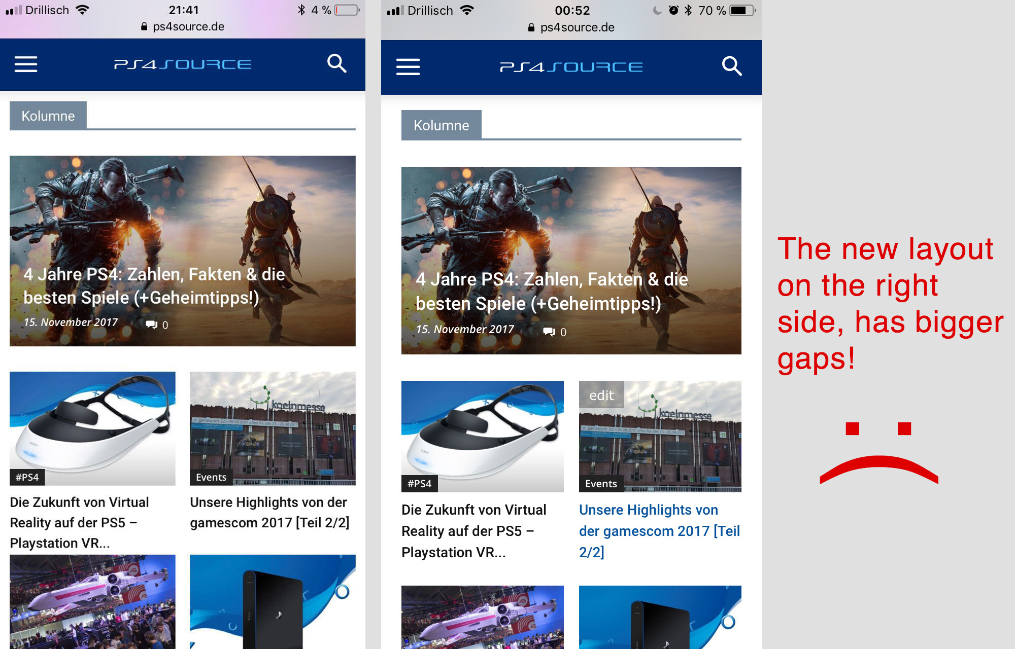
How can I fix it to the previous look?
Bogdan B. Hello,
If you want to remove the breadcrumbs and title of pages on the mobile theme , please use this css:
@media(max-width:767px){

.page .td-crumb-container, .page .td-page-title{

display:none;

}

}
Thanks.
 SF
SFHello
On a post list (numbered 1-6 with next and previous) there’s an intro which appears on every slide – we would like to reduce it on mobile or replace it on mobile or have a read more link or something… please can you help?
Thanks
Paul
 artimag
 Hi Bogdan,
I have done everything you have suggested and what in the documentation
written is about this topic.
Unfortunately, everything without success.
The mobile theme still appear on the tablets even if I disable all other plugins.
What else can I do?
Many thanks for your help!
seb
 mehedi57
 Actually, I don’t need anything new but I just want that my desktop version’s text color should work on the mobile version. Like I have set my H1, H2, H3 text color is blue but when I activate mobile theme this desktop text color doesn’t work.


