- NewspaperThe Newspaper Mobile Theme: Introduction
- NewspaperThe Mobile Theme
- NewspaperModules Builder in Newspaper Theme
- NewspaperFilters and sorting for taxonomies
- NewspaperHow to Add a Logo in Newspaper
- NewspaperBig Grid Flex Settings
- NewspaperHeader Builder
- NewspapertagDiv AMP Plugin Tutorial
- NewspaperNewspaper theme documentation
- NewspaperBest Of Forums
- NewspaperCache plugin – install and configure
- NewspaperFont Customization
- NewspaperTheme Colors Introduction
- NewspaperBackground Introduction
- NewspaperHeader ads
- NewspaperPost template ads
- NewspaperCustom ad spots
- NewspaperMain Menu
- NewspaperHow to Install Newspaper via FTP
- NewspaperHow to Install Newspaper via WordPress
 Simion C.
 Hi,
Seems to be displaying now from what I can see
– https://www.screencast.com/t/TKhEvc7HV
– https://www.screencast.com/t/G8bAgCm9Wiev
– https://www.screencast.com/t/p4l5Z35R
There would be no reason for the mobile theme plugin not to work for you as well. Unless maybe something like a plugin interfering with it, but that could be easily tested. Or maybe modifications made to the theme or mobile theme files.
Thanks
Simion C. Hi,
On mobile, if you would like to remove the menu toggle you will have to remove it from the code in the same files
– https://www.screencast.com/t/RQ4QS0DO7IAN
– https://www.screencast.com/t/ydQ9OG6s30
The result would be like this
– https://www.screencast.com/t/hZxlwkHdD
Thanks
Simion C. Hi,
It seems there is an issue with that smart list style on mobile. As a quick fix please enter this code in Theme panel->Advanced CSS in the phones section
.td_smart_list_3 .td-sml-figure {

float: none;

margin:auto;

}
Let us know if there still is a problem after entering the code. Sorry for any inconvenience caused.
Thanks
 Lukas
Lukas Hi I tried it right now. Followed each step of the tutorial + deactivated all non-theme related plugins. Once the cache is turned on, the mobile version is not displayed.
Also tried reinstalling the mobile version with no success.
Simion C. Hi,
It seems that the mobile theme is not working on the website. I have tested the latest version of WP Super Cache with the configuration as in the guide, and the latest theme version and plugins. The mobile theme works properly under these circumstances, logged in or not
– https://www.screencast.com/t/mOJh7Sjyb
It works every time, the problem is not happening. Please deactivate all plugins except the theme plugins and the caching plugin (clear the cache) then check if this has any effect. Additionally try deactivating an deleting the mobile plugin and installing it again from the latest theme package. Let us know the results.
Thanks
 Catalin
 Hello Sebastian,
If you want to have another main menu than the desktop menu, the only way would be to use our Mobile Theme which allows you to do this. For more information about our Mobile Theme, please check here -> https://forum.tagdiv.com/the-mobile-theme/
Hope this helps!
Thanks for your understanding!
 ldjohn
 Hi Simon
Thanks for the reply.
I am able to remove it from desktop view, however the menu keeps appearing in the top left hand corner on mobile devices.
 danna
danna Hey Simion,
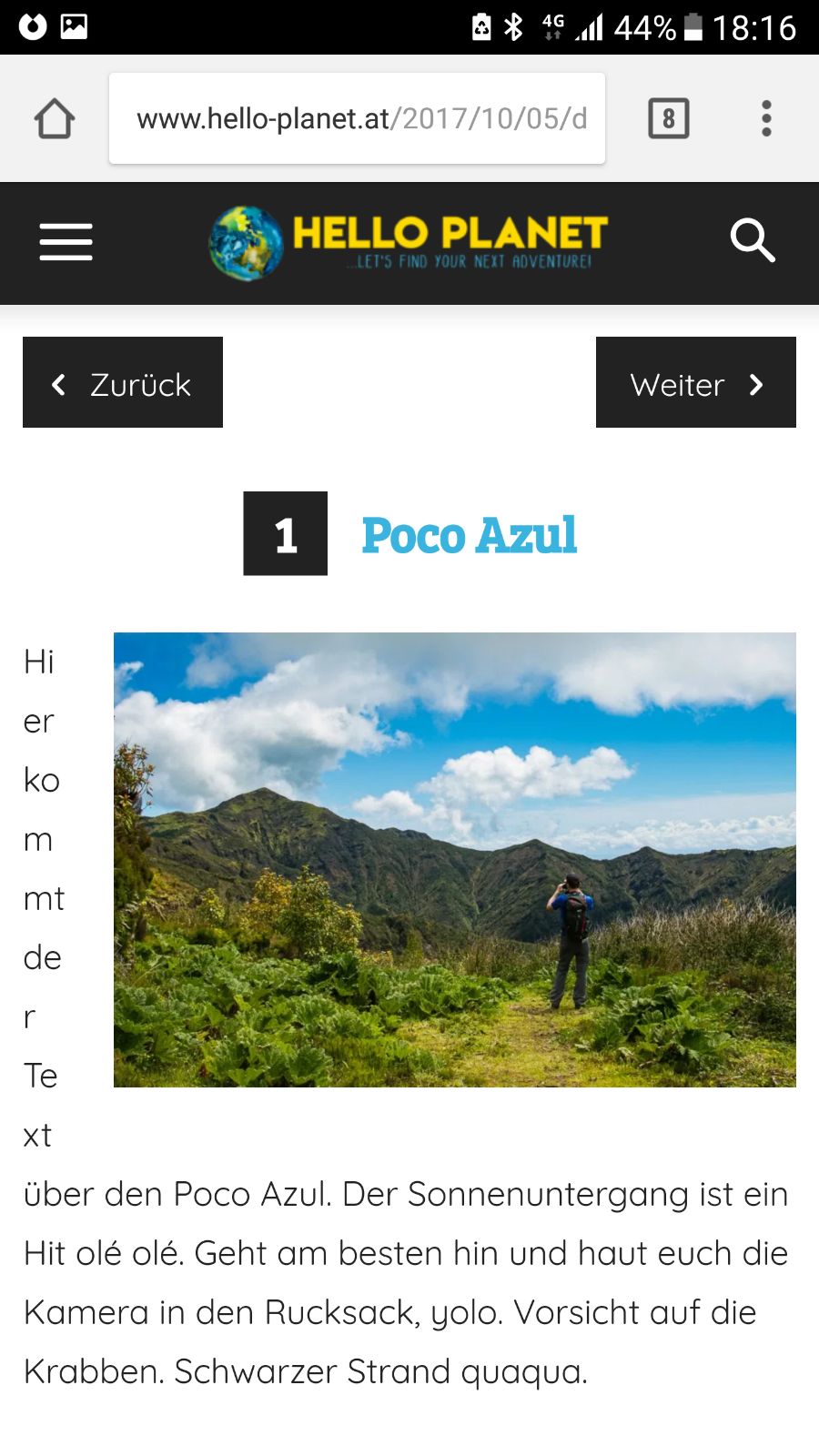
worked out fine, thx! There’s only one problem with the layout on certain Mobile Devices (like here on the Galaxy S6) – do you maybe have a CSS Code to fix that?
http://www.hello-planet.at/wp-content/uploads/2017/10/187bf660-4deb-492a-95be-17c5488396f8.jpg
Link to the Article is: http://www.hello-planet.at/2017/10/05/destination-post-mit-smartlist/
All the best and thanks,
Daniel
 naimbic
Warning: strpos(): Empty needle in /home/tokyocamii/www/wp-content/plugins/wpml-string-translation/classes/mo-scan/components/wpml-st-mo-component-details.php on line 123
Any idea for these warning?
thanks
Lukas Hi Simion,
Here is the link to the website: http://www.techbyte.sk. If you want to have a look at the theme from the inside, please let me know. This issue is very weird. We would love to use the mobile theme plugin, as it just makes more sense (design, and function-wise).
Thanks in advance,
Lukas
 sonic-media
Hi!
Is there a way to show a different menue on mobile devices as on the desktop site?
I want other buttons and links in there.
I want to choose what is my mobile menue.
Best regards
Sebastian
 Rico1780
Hello,
I would like to know if the mobile-related issue with WP Super Cache has been resolved.
Activating the WP Super Cache plugin, the desktop version of the site was viewed as a mobile version.
Thanks
Simion C. Hi,
This is highly unusual. That should not happen since the mobile theme plugin is deactivated. Try clearing all caching installed, and purge CDN files if you use it.
Thanks
 SheikhOvais
 I’ve deactivated mobile plugin, but it’s still loading it?
Simion C. Hi,
That probably is happening because there are no Featured posts. Please add posts to the Featured category and the mobile grid will display them
– https://forum.tagdiv.com/featured-posts-2/
More information about the mobile theme plugin here
– https://forum.tagdiv.com/the-mobile-theme/
Thanks
Simion C. Hi,
When you updated the theme to the latest version, the tagDiv composer was automatically activated
– https://forum.tagdiv.com/tagdiv-composer-tutorial/
This composer can cause Visual composer elements or features to not work properly, so you can try to deactivate it and check the results with the hidden blocks.
The mobile theme seems to be working at the moment, I see no problem with it
– https://www.screencast.com/t/Wd6uUEG3Q2J
Thanks
 MamasLT
 Hi there.
I have edited the code as it is in example above, I did get the Social login icons displayed in modal, but now when i press password recovery button or Create an account button, the modal does not show anything. It shows only the primary log in modal window, but nothing else. Any ideas here?
Also the URL of the code for mobile integration does not work. Could you please repost it?
Thanks!
ldjohnI want to hide the menu however if i select no menu in the theme options it still appears. How do i make it so i have no menu on desktop and mobile?
 kptmath
Can you help me why my mobile theme has no 3 Grid, instead direct latest news
Simion C. Hi,
Didn’t check that, that modification was necessary in older version of the caching plugin, but it seems it is not the case anymore. Something else must be causing the issue, if the mobile them plugin is not working properly. Please provide a link to your website so we can inspect it.
Thanks
 Yago88
I just updated my newspaper theme to 8.1 (Deactivated and deleted the theme, and uploaded and activated the updated version) and now my pages are the same in all devices. I had some blocks hide in mobile devices, and others in deskopt, but now all of them appears in both and I cant change it.
Also, I tried to install the mobile plugin to try other option, but its not working. Its installed and appear the Mobile tab in the theme panel, but doesnt work.
I deactivated all plugins to check if was something wrong, but same.
Simion C. Hi,
Inspecting the website you mention, it can be seen that there are different conditions that apply when the width is lower, like mobile devices
– https://www.screencast.com/t/TjUC88fUqO
This would the same code for smart list 2 for example
– https://www.screencast.com/t/wQL0tmoY
– https://www.screencast.com/t/60DSkdnPQUNP
You could modify it and experiment with different values, or use it as it is
@media screen and (max-width: 991px) and (min-width: 320px) {

.td-sml-current-item-nr {

    top: -55px !important;

    left: 0px !important;

    right: 0px !important;

    width: 60px !important;

    height: 60px !important;

    line-height: 55px !important;

    margin: 0 auto;

}}
Thanks
Simion C. Hi,
That can be caused by caching plugins. The mobile theme is sensitive when it comes to caching. You could try to use the WP Super Cache plugin if possible
– https://forum.tagdiv.com/cache-plugin-install-and-configure/
Thanks
 tagdivstar
Hi,
On mobile, when I open the menu page or search page then close it, “#” will appear at the end of the URL…
Is it normal?
 mradamrothwell
 That’s great thank you. Is there anyway to adjust the numbering and border so it automatically fits onto a mobile device as the circled number doesn’t quite fit right. Everything else adjusts nicely apart from that.