
- NewspaperThe Newspaper Mobile Theme: Introduction
- NewspaperThe Mobile Theme
- NewspaperModules Builder in Newspaper Theme
- NewspaperFilters and sorting for taxonomies
- NewspaperHow to Add a Logo in Newspaper
- NewspaperBig Grid Flex Settings
- NewspaperHeader Builder
- NewspapertagDiv AMP Plugin Tutorial
- NewspaperNewspaper theme documentation
- NewspaperBest Of Forums
- NewspaperCache plugin – install and configure
- NewspaperFont Customization
- NewspaperTheme Colors Introduction
- NewspaperBackground Introduction
- NewspaperHeader ads
- NewspaperPost template ads
- NewspaperCustom ad spots
- NewspaperMain Menu
- NewspaperHow to Install Newspaper via FTP
- NewspaperHow to Install Newspaper via WordPress
 Fontaine
 I’m surprised to see so many people having problems with the mobile menu. It’s starting to worry me because no solution is really being proposed.
 datingvergleich
 I am having the same issue with the TownTalk Child theme. LCP check is failing for mobile view in Google Page Speed tests. LCP for the mobile view of posts is about 5 seconds.
Obviously, this is mainly related to the tumb image on top of the posts. This image is loaded in full size and then resized to the mobile width.
My URL: https://www.dating-vergleich.com/alternativ/gleichklang/
There must be a better way to include this image. I assume, that all your child themes have this same issue.
Looking forward to a feedback on this.
Best regards
Joachim
 shuddhatm9
Hi, I am using the Gossip Child theme where I have been facing LCP issues since last month we figured out that your cloud library and composer are taking time to load so it will be a great help if you can help in optimising the plugins and minifying CSS.
my site URL is https://www.tellymantra.com
 Bettina
 Hello @Fontaine!
Did you choose the mobile menu there?
Make sure this option is enabled: https://app.screencast.com/tsqGya8uhcdGp
Click on that hamburger menu and choose a menu in the mobile viewport: https://prnt.sc/KM1WiaiJlPSD
Thank you!
Bettina Hello @Wriper!
Do you use an extra plugin for ads? Try to deactivate it, clear the cache and check if the ad is still there or not.
For the mobile theme plugin, we have only those options that could be found here: Newspaper -> Theme panel -> Mobile theme -> Mobile ads.
Thank you!
Bettina Hello @anshulrajora!
We have 3 options available for mobile versions that you can use:
1. Responsive version: A responsive version of your website looks similar to the desktop version. TagDiv Composer is used to edit the page.Click on the mobile viewport: https://www.screencast.com/t/XDQJedlggSB. There, you can see your mobile version and edit or adjust the elements to look better.
2. Mobile pages: https://tagdiv.com/newspaper-10-3-7-update-brings-customizable-and-fast-mobile-pages
3. Mobile theme plugin: The Mobile Theme is a performance-optimized theme included in the main Newspaper theme that only loads on mobile devices. It comes with its own templates and designs for pages, posts, categories, etc., so your current templates from the desktop theme will get converted to the mobile theme layout. Please see https://forum.tagdiv.com/the-mobile-theme/ and https://forum.tagdiv.com/mobile-theme-introduction/ for more information.
A full explanation is here: https://www.youtube.com/watch?v=SpGkOnJeNZY
If you need to use mobile version 1 or 2, then you need to uninstall the Mobile Theme plugin and AMP.
Thank you!
FontaineHello,
I’m having a problem with the menu on my mobile. It won’t open the menu. Do you have any idea how to save me?
The menu is ok on fixed but on mobile it needs a slight move but doesn’t open anything.
Thanks
 Wriper
Hello,
We have tried activating the “post grid” on newspaper mobile theme.
Suddenly, there is 300×250 blank space called. When inspecting it tell us it is an AD.
I have checked all places for codes in theme, deactivated ad inserter (it is not called by ad inserter plugin). Deactivated our AD tag scripts. I dont know what this is or what i am missing
Do you know which part of theme is activating this place? I tought this is our homepage ad from desktop but it is not i have tried to deactivate that block and nothing happens.
Screenshot 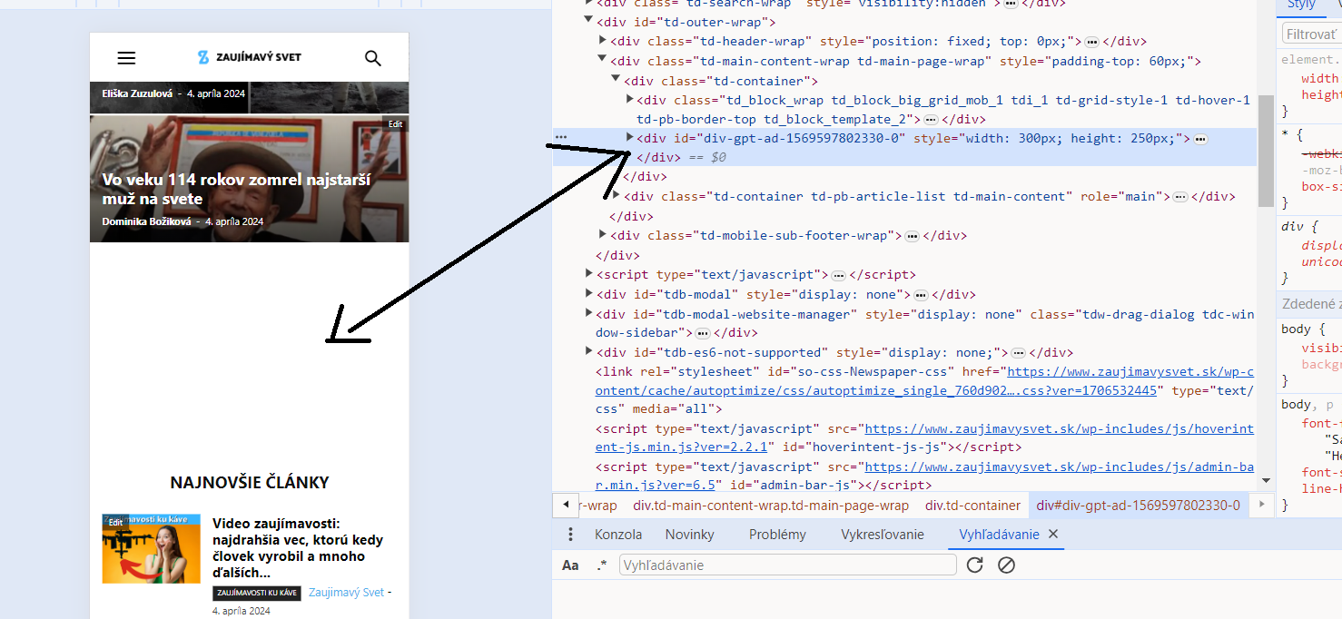
Thank you
 anshulrajora
Hi,
I have Installed “tagDiv Mobile Theme” and added the Mobile Template for Homepage, Category Page, Tag Page, Single Page & Author Page but when I am checking the settings on my mobile it’s not reflecting and showing a default structure. Also when I am trying to open the Menu in Mobile it’s responding too late.
 haipo
haipo Hi Bettina
In Tagdiv – mobile, images fly out of the frame – example:
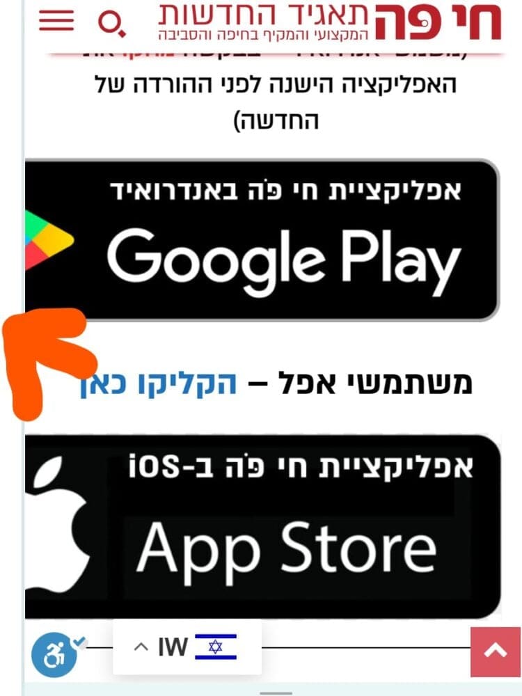
–
In my old version (publisher) – the frame alignes the images – example:
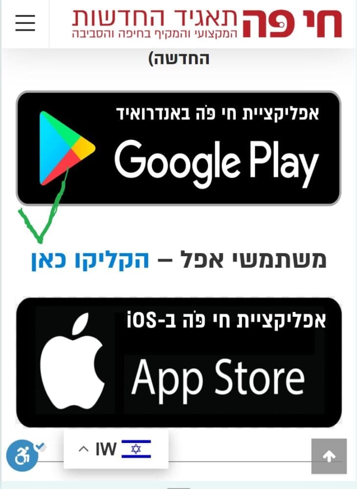
 artsetsu
Hi,
I am facing an issue with Image loading on a mobile device.
Here is the site URL: https://whatson.guide/
can you please have a look the matter?
Thank you.
 Anamaria
 Hi,
There are a lot of factors which can make your site slow. Make sure you use only some templates and fewer functionalities and options.
Some factors which you need to take into account are:
External factors: server speed, if you are using CDN or not, the external resources loaded by your website like ads, fonts, tracking scripts like Facebook Pixel, Google Analytics, Twitter analytics, Hotjar and so on.
Internal factors: the number of elements on the page, image size, image formats, if you are using mobile optimized layouts, console errors, if you are using the Standard Pack plugin or not, if you are using the PRO demo or a standard one.
Also, installing a demo doesn’t guarantee that you’ll achieve the same page speed as tested on our demos. You’ll need to perform optimizations. You can use caching plugins like Super Cache or the premium WP Rocket.
There are many optimization guides provided by our users here in the forum, some made by us; you could check some of them
– https://forum.tagdiv.com/cache-plugin-install-and-configure/
– https://forum.tagdiv.com/how-to-make-the-site-faster/
– https://forum.tagdiv.com/topic/high-number-of-ajax-request/
– https://www.infophilic.com/get-almost-100-pagespeed-newspaper-theme/
– https://forum.tagdiv.com/topic/score-100100-pagespeed-with-newspaper-wordpress-theme/
– https://www.andraware.com/wp-rocket-for-newspaper-theme/
– https://spraythemes.com/newspaper-theme/how-to-speed-up-the-newspaper-wordpress-theme-using-wp-rocket/
– https://forum.tagdiv.com/topic/page-speed-guide-for-2023-beginners-and-advanced/
– https://forum.tagdiv.com/topic/newspaper-theme-speedify-your-website/
– https://forum.tagdiv.com/topic/tutorial-chriss-custom-optimizations-for-functions-php-etc/
– https://forum.tagdiv.com/cloudflare-cdn/
– https://forum.tagdiv.com/topic/theme-causing-high-cpu-usage-2/
– https://forum.tagdiv.com/topic/sql-querys-high-cpu/
– https://forum.tagdiv.com/topic/newspaper-theme-slow-to-respond/
– https://premium.wpmudev.org/blog/optimizing-your-wordpress-database-a-complete-guide/
– https://underconstructionpage.com/optimize-wordpress-database/
– https://crunchify.com/better-optimize-wordpress-database-all-in-one-guide/
Also, pagespeed is not covered by support -> https://forum.tagdiv.com/newspaper-theme-support/
Thank you!
Anamaria Hi,
I checked, and now it seems to work well. Please try to set the mobile cache -> https://developers.cloudflare.com/automatic-platform-optimization/reference/cache-device-type/
Thank you!
Bettina Hello!
Check this guide: https://forum.tagdiv.com/thumbs-on-modules-and-blocks/
If you deactivate a dimension from there, next time when you will upload an image, it will not be resized to that dimension.
After changing the thumbnail sizes you need to regenerate your thumbnails using a plugin. Check this: https://forum.tagdiv.com/using-the-theme-with-existing-content/
NOTE: If the thumb specific for that block is not enabled, then the image won’t be displayed.
NOTE: The Mobile theme layout is not customizable as the responsive version or mobile pages. Please see https://forum.tagdiv.com/the-mobile-theme/ and https://forum.tagdiv.com/mobile-theme-introduction/ for more information.
Thank you!
Anamaria Hi,
To change the font and color for the mobile menu please go to Theme Panel -> Theme Colors -> Mobile menu/mobile search => https://www.screencast.com/t/0CvSgXp9H to set a background image go in Theme Panel -> Background -> Mobile menu/mobile search => https://www.screencast.com/t/uvDejzbX to change the font from Theme Fonts => https://www.screencast.com/t/ANBQe7hQhJd
To set the menu edit with tagdiv Composer, select the viewport for phone element and change the menu https://i.imgur.com/JJJ1WB7.png
Thank you!
Anamaria Hi,
To change the font and color for the mobile menu please go to Theme Panel -> Theme Colors -> Mobile menu/mobile search => https://www.screencast.com/t/0CvSgXp9H to set a background image go in Theme Panel -> Background -> Mobile menu/mobile search => https://www.screencast.com/t/uvDejzbX to change the font from Theme Fonts => https://www.screencast.com/t/ANBQe7hQhJd
To set the menu edit with tagdiv Composer, select the viewport for phone element and change the menu https://i.imgur.com/JJJ1WB7.png
Thank you!
 simchris
 We started building websites March of 1995; so have seen a lot come and go. AMP was a good idea if you had a busy site someplace with slow server, etc., but when Google basically ‘forced’ people to be on AMP for mobile search results (much like G+ was *required* for a local business listing), their “do no evil” mantra was dead and buried. So, they keep abandoning things (RIP, Feedburner), that I won’t invest in any of their tech unless no other choice. We were so happy to see AMP go the way of another bad idea, as far as I was concerned. The idea of having to waste huge amounts of time building second version of content was dumb when stuff like ‘print friendly’ pages have been around for 25+ years. Anyway… good riddance, I say 🙂
 assistti
 I have the same problem, I don’t know how to edit the menu when the mobile site has a registration and login option that I want to remove, can you tell me how?
 waleed9
Hello dears
It seems that with the last update to the theme, I did not notice some things that were different until now
Mobile templates do not appear as they did before, and there is no small pencil to modify or access them
I feel confused. I no longer know where my templates and pages that I allocated for mobile are
This is how it appears, it is something different and incomprehensible https://prnt.sc/RJFb_BfVgVGC
 OTAdmin1
I am trying to edit the appearance and contents of the menu that pops up when clicking the hamburger menu on the mobile site. Currently, it has a stock background image of a woman in a bathing suit, and the menu features categories that don’t exist on my site. How do I change the contents of the mobile menu, and how do I alter/remove the background image? When I click on that menu element in TagDiv Composer, it simply takes me to my live website instead of opening up a TC editing options window.
 curistorian
My shop pages, for example (https://www.houselore.com/product-category/art/) have the Attribute Filter checked to show the filter on mobile. However, when this shop page is opened on a mobile device, the attribute filters do not appear. How can I fix this?
simchrisReminder to folks it’s time to fully retire use of AMP as another failed abandoned Google attempt to take over the web when it was pointless and stupid for many sites where a print ready page would have worked just as well for mobile. It was a money grab to track folks usage by loading your content on their server. Ugh.
At this point, more than a year after AMP was retired as “end of life,” it’s time to move on.
Requires three things
a) setup proper 301 redirects to keep links if you had lots of inbound traffic, but frankly Google recommends simple 404 so they stop caching the /amp or ?amp URL — keep in mind normal htaccess redirect of /amp –> not /amp is tricky in case you have a post url slug of mycontent/amplify-your-cake — would kill that URL.
You need to try something like this in your root htaccess file, then *test* a amp url to make sure it redirects
e.g.,
RewriteEngine On
# Removes "amp" (or "amp/") from the end of the URL-path

RewriteRule (.*)amp/?$ /$1 [R=301,L]
this code also shared quite a bit online
RewriteCond %{REQUEST_URI} (.+)/amp(.*)$

RewriteRule ^ %1/ [R=301,L]
2) deactivate any ‘AMP’ plugins in WordPress – which will remove the rel= link in your post headers; to remove a loop
3) clear AMP cache with Google: https://developers.google.com/amp/cache/update-cache
// I don’t work here, just started to do this last year, and catching up on final nail in the AMP coffin for our other sites this month //
*also posted in Newspaper forum; but copied here for all the rest of us //
simchrisReminder to folks it’s time to fully retire use of AMP as another failed abandoned Google attempt to take over the web when it was pointless and stupid for many sites where a print ready page would have worked just as well for mobile. It was a money grab to track folks usage by loading your content on their server. Ugh.
At this point, more than a year after AMP was retired as “end of life,” it’s time to move on.
Requires three things
a) setup proper 301 redirects to keep links if you had lots of inbound traffic, but frankly Google recommends simple 404 so they stop caching the /amp or ?amp URL — keep in mind normal htaccess redirect of /amp –> not /amp is tricky in case you have a post url slug of mycontent/amplify-your-cake — would kill that URL.
You need to try something like this in your root htaccess file, then *test* a amp url to make sure it redirects
e.g.,
RewriteEngine On
# Removes "amp" (or "amp/") from the end of the URL-path

RewriteRule (.*)amp/?$ /$1 [R=301,L]
this code also shared quite a bit online
RewriteCond %{REQUEST_URI} (.+)/amp(.*)$

RewriteRule ^ %1/ [R=301,L]
2) deactivate any ‘AMP’ plugins in WordPress – which will remove the rel= link in your post headers; to remove a loop
3) clear AMP cache with Google: https://developers.google.com/amp/cache/update-cache
// I don’t work here, just started to do this last year, and catching up on final nail in the AMP coffin for our other sites this month //
Anamaria Hello,
Please delete the menu from the theme files. You need to assign the menu with tagdiv Composer like in our guide -> https://forum.tagdiv.com/main-menu/
Also, if you add the menu for mobi,e in the theme files, please delete it because it is not working https://i.imgur.com/oizfjVC.png
Edit the homepage with the tagdiv Composer, go to the mobile viewport, click on that menu icon and change the menu from that dropdown: https://app.screencast.com/QU8PVGPjHw4b0
Thank you!
 dmhgraphics
Hello,
The main menu has suddenly disappeared: https://paddlinglife.com. It should be displaying to the right of the logo.
It’s working fine on mobile.
The Header Menu (main) is assigned properly in nav-menus.php
Assistance would be appreciated.
Thank you


