- NewspaperThe Newspaper Mobile Theme: Introduction
- NewspaperThe Mobile Theme
- NewspaperModules Builder in Newspaper Theme
- NewspaperFilters and sorting for taxonomies
- NewspaperHow to Add a Logo in Newspaper
- NewspaperBig Grid Flex Settings
- NewspaperHeader Builder
- NewspapertagDiv AMP Plugin Tutorial
- NewspaperNewspaper theme documentation
- NewspaperBest Of Forums
- NewspaperCache plugin – install and configure
- NewspaperFont Customization
- NewspaperTheme Colors Introduction
- NewspaperBackground Introduction
- NewspaperHeader ads
- NewspaperPost template ads
- NewspaperCustom ad spots
- NewspaperMain Menu
- NewspaperHow to Install Newspaper via FTP
- NewspaperHow to Install Newspaper via WordPress
 George
Hi there,
I’m using Samsung Galaxy S4 and I see that I’m able to add element like single image but their second tab(design options) is not clickable.
Kindly advice.
Thanks!
 efromdc
Is there something that can force a desktop view on mobile instead of loading the responsive version? Something like
http://www.url.com/page?view=desktop
Thanks – eFromDC
efromdcIs there a block that can create a mason grid on a standard smartphone of at least two columns and a title? If not do you have some css that can apply to a page that has a mason grid w/ two columns but who’s viewport is smaller than a tablet? AND display text? The text can be 10px as thats fine for mobile…
The text is secondary but the two column mason for mobile is my priority. The thumbnail size can be VERY small, thats fine. My goal is a quick visual summary of my latests posts and every configuration I can see on mobile only has one column…
If there IS a two column config on mobile w/o css? That would be fine too…
Thanks!- eFromC
efromdc SocialAlerts.com/washingtondc
SocialAlerts.com/newyork
SocialAlerts.com/lasvegas
SocialAlerts.com/miami
Im using two different layouts – one for desktop and one for mobile – so look at each link of the four sites on BOTH desktop and mobile. I’m using a mobile detection plugin to send smartphone users into a more user friendly mobile page (the responsive appearance makes the images are too large on mobile…so I chose a different layout and push users to the respective mobile page).
 Bogdan B.
 Hello,
I have also tried Alin’s code and it worked : http://screencast.com/t/cJvtTfro
Make sure you use the class you give the row in your code. If you skip this step and do not change the code it will not work. You can also try it without a custom class but then it will apply on every block 15 in your website, not just on the specific page. However this only works for the desktop version. The mobile one has smaller images and is harder to fit the titles inside them.
Please check the steps again and make sure you did not miss anything.
Thank you!
 cbur2107
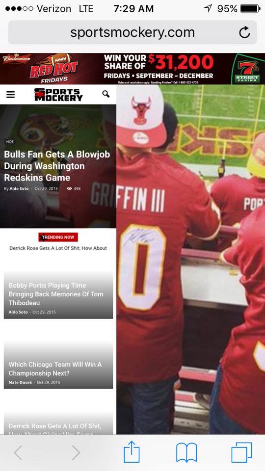
The homepage post widget for the homepage is great, only problem is it totally messes up my mobile.
Example: http://sportsmockery.com/wp-content/uploads/2015/10/12204794_905692468634_52261014_n.jpg
Do you know why this happens? I really want to use the homepage post on my site.
Thanks in advance.
Bogdan B. Hi,
Unfortunately the big grid you are pointing comes from the Newsmag theme. You can chose a different big grid for your homepage. Here you can try them out and there styles: http://demo.tagdiv.com/newspaper/big-grid-1/
As an alternative you can use the big grid slide block which resembles the one ion newsmag on the mobile version: http://demo.tagdiv.com/newspaper/big-grid-slide/ (it needs to be set to at least 8 posts)
You can force the slide to display like the one on newsmag but it is no easy task. You can follow this topic if you want to tackle this challenge: https://forum.tagdiv.com/topic/big-grid-on-the-mobile/
Thank you!
Bogdan B. Hello,
This is a default behavior of the theme to adjust the title to the tablet portrait and mobile version. So under 1018 pixels it will resize your header. In order to change this behavior you need to use CSS:
@media (max-width: 1018px){

.td-post-template-default .td-post-header header .entry-title {

    font-size: 18px!important;

    line-height: 26px!important;

}

}
Thank you!
 christrobin
The changes on font style for post title has no effect on mobile view. I see the changes been applied only to the desktop view . How to change the font style of post title for mobile?
 Alin [tagDiv]
 Hi,
Unfortunately the megamenu was not designed for mobile menu, so it will not display the page content there.
You could try to sort your submenu items in few categories – http://screencast.com/t/cJoRhJZNKil – http://screencast.com/t/d3mYTHqv4
Or you can use the unique class of the menu item to create something similar where you need – http://screencast.com/t/NG6Z87oNQkjz
@media (min-width: 768px){

.menu-item-690 ul {

overflow: overlay;

height: 500px;

}

}
Thanks!
 Andy
Andy Hi Alin,
Thank you.Please take a look at the “International” menu in my website(http://www.newsmug.in/) This worked perfectly in PC.However in Mobile I cant see the sub menu items at all.Please guide me how to make this work in mobile as well. In mobile if the sub menu items are displayed that’s just fine(For eg : Please take a look at my “state” menu in mobile.I want the sub menu items to be displayed like that)
Thanks,
Anand
Bogdan B. Hello,
Thank you for this solution. I am sure it will help a lot of people here on the forum with the mobile version of their website. It is a good alternative to showing the top menu on the mobile version. We hope in a future update we will be able to adjust our mobile version and implement a few options for it as well.
Thank you!
 Yannik97
Hey,
the top menu is deactivated in mobile view because it looks better without. But then there is no Login/Logout/Register button for users. So I changed the menu-mobile.php to this:
I think this isn’t the best solution but it works fine. When user is logged in there is a logout button and when user isn’t logged in there is a login/register button in mobile menu.
Hope it will help you.
<?php
/* ----------------------------------------------------------------------------
This is the mobile off canvas menu
*/
?>
<div id="td-mobile-nav">
<!-- mobile menu close -->
<div class="td-mobile-close">
<a href="#"><?php _etd('CLOSE', TD_THEME_NAME); ?></a>
<div class="td-nav-triangle"></div>
</div>
<div class="td-mobile-content">
<?php
wp_nav_menu(array(
'theme_location' => 'header-menu',
'menu_class'=> '',
'fallback_cb' => 'td_wp_no_mobile_menu'
));
//if no menu
function td_wp_no_mobile_menu() {
//this is the default menu
echo '<ul class="">';
echo '<li class="menu-item-first"><a href="' . esc_url(home_url( '/' )) . 'wp-admin/nav-menus.php">Click here - to use the wp menu builder</a></li>';
echo '</ul>';
}
?>
<ul>
<?php
if ( is_user_logged_in() ) {
echo '<li class="menu-item"><a href="' . wp_logout_url(home_url( '/' )) . '"> LOGOUT</a></li>';
} else {
echo '<li><a href="#login-form">LOGIN/REGISTER</a></li>';
}
?>
</ul>
</div>
</div> Healthills
Why this special character looks like this mobile ?
I just want the (TM)
Thanks
 Aleksandar
Hello,
I have problem with social shares in Newspaper theme. This is what visitors see when they are accessing with Chrome browser

And this is with Opera

But on another PC it’s showing correct on Chrome but not on Opera web browser.What could be the problem? On my mobile phone everything is OK.
I’m using theme version V 6.3
Thanks
Best regards
 Pravin
Hi
can anybody tell me if i want to execute a particular <div> content for only desktop viewers how can i achieve that.
that means if i hit my site form mobile then that div should not be executed
i.e. should not load since the loading time is getting more how can i reduce that
is there any other way?
 Andrei L.
 Hi
As a css rule to be aplied only for mobile devices you need to use media queries like here: http://screencast.com/t/jCUEnWX9XAE
@media(max-width: 768px){

.woocommerce-page div.product div.images,  .woocommerce-page div.product div.summary{

float: none!important;

width: 80%!important;

    margin-left: auto;

    margin-right: auto;

}

}
The Up-Sells products are controled by woocomerce and they have a width wich don’t allow three product on the same row but you can use this css to achieve that: http://screencast.com/t/8u5duk5wa
.woocommerce-page ul .product{

width: 29.25% !important;

}
Thanks!
Bogdan B. Hello,
1) The top menu containing the login widget is hiden on the mobile version. It was a design choice and it can be forced to appear using custom css:
@media (max-width: 767px){

.td-header-top-menu-full {

display: block !important;

}

.td-header-sp-top-menu {

display: block!important;

}

.menu-top-container {

display: none !important;

}

.td-header-sp-top-widget {

display: none !important;

}

}
Just add the code in the theme panel->custom css box.
2) and 3) please provide more details to your problems. Be more descriptive and provide a link to your website so we can inspect the problems and come up with a solution.
Thank you!
 Catalin
 Hi sejpost,
Yes, it is possible. First of all you must create a custom link within wordpress like this-> appearance->menu->custom link: http://screencast.com/t/cwbTeaDq and in next step please try a bit of css below:
@media (min-width: 768px){

.menu-item-57 {

display: none;

}

}
Attention: Every custom link newly created has a different id and you must target this in CSS for a result. This id you can find like this: http://screencast.com/t/Nz1kracbMa7a
The result: http://screencast.com/t/812JzGp9473 http://screencast.com/t/V6fAus84ivvx
For your second request, our theme has not been designed to display view of the desktop version in mobile version.
If is not what do you want, please provide more details.
Hope this helps.
Thanks.
-
This reply was modified 10 years by Catalin.
 meathead
Hi,
I can’t work out how to get the .summary .entry-summary column to go below the featured product image on the product page on small screens only?
It continues to be 2 narrow columns as it is on large screens.
I am sure it used be responsive before updates?
Any ideas how to make this happen?
Also, my Up-Sells always show in 2 columns instead of 3 as the related products do?
Any ideas how to fix this?
Cheers
Dawn
 MHMDMONTHR
hi i have 3 problems
1: login in the header doesn’t show for the mobile user
2: i cant activate the newspaper theme in my site stel told my when i try contact activate team
3:taps when i click on any tab text on the tab disabeer
 sejpost
Is it possible to add a link within the mobile menu that doesn’t appear on the desktop version of the main menu? Basically, we want to add a “sign up for newsletter’ link on the mobile menu, but we don’t want that in the main navigation on the desktop version.
Lastly, is there a way to view the desktop version from a mobile device?
Thanks.
 thelastpoet
 Thanks, I have managed to use posts and redirected to the desired pages.
One thing though, I have noticed the background picture on the travel demo is not responsive but moves to a central place when on mobile, is there any thing I can do to achieve responsiveness?
If I use a background image that has text, most of the words on the image will be cut off on mobile.
this is how it is on mobile –http://www.screencast.com/users/thelastpoet/folders/Default/media/71b1fd67-0c96-48f7-88d2-30368c75a4b6
These parts don’t show on mobile — http://www.screencast.com/users/thelastpoet/folders/Default/media/b884d9d2-e6e3-4e50-ae55-9d781636ccf6
-
This reply was modified 10 years by
thelastpoet.
Alin [tagDiv] Hi,
You can check the our demo and see how the mobile menu works – http://screencast.com/t/j13jVsaxT0i if you need another implementation I suggest to get a professional developer to help you with this as the time doesn’t allow us to provide custom work. Also the plugin you use for for menu affects the the theme as the theme has already a mobile version.
Thanks!
Alin [tagDiv] Hi,
I have tested this on my side and did not found any issues with Post Masonry Grids responsiveness, on mobile each post becomes full width – http://screencast.com/t/bsWNPG1G – http://screencast.com/t/in9ip2CziXgr
I have checked this by default, if you modified the grid or created a new one please check it. Also you can test this without any plugins active except of Visual Composer and clear cache.
Thanks!